Visualizing Forecast Uncertainty
Effective forecasting involves more than just predicting a single future value; it requires understanding the inherent uncertainty surrounding that prediction. Point forecasts alone can be misleading, especially when making critical decisions based on them. k-diagram provides a suite of specialized polar visualizations designed to dissect and illuminate various facets of forecast uncertainty.
From Theory to Practice: A Real-World Case Study
The visualization methods described in this guide were developed to solve practical challenges in interpreting complex, high-dimensional forecasts. For a detailed case study demonstrating how these plots are used to analyze the spatiotemporal uncertainty of a deep learning model for land subsidence forecasting, please refer to our research paper [1]. The paper showcases how these diagnostics can reveal critical trade-offs between models that are often invisible to standard aggregate metrics.
Why Polar Plots for Uncertainty?
Traditional Cartesian plots can become cluttered when visualizing multiple aspects of uncertainty across many data points or locations. k-diagram leverages the polar coordinate system to:
Provide a compact overview of uncertainty characteristics across the entire dataset (represented angularly).
Highlight patterns in uncertainty related to temporal or spatial dimensions (if mapped to the angle).
Visually emphasize drift, anomalies, and coverage in intuitive ways using radial distance and color.
This page details the functions within k-diagram focused on evaluating prediction intervals, diagnosing coverage failures, analyzing anomaly severity, and tracking how uncertainty evolves.
Summary of Uncertainty Functions
The following functions provide different perspectives on forecast uncertainty and related diagnostics:
Function |
Description |
|---|---|
Compares actual vs. predicted point values point-by-point. |
|
Visualizes magnitude and type of prediction anomalies. |
|
Calculates and plots overall interval coverage scores. |
|
Diagnoses interval coverage point-by-point on a polar plot. |
|
Visualizes the width of prediction intervals across samples. |
|
Shows consistency/variability of interval widths over time. |
|
Tracks how average uncertainty width changes over horizons. |
|
General plot for visualizing multiple series (e.g., quantiles). |
|
Visualizes drift of uncertainty using concentric rings over time. |
|
Shows the rate of change (velocity) of median predictions. |
|
Shows a unique visualization of the probability distribution. |
|
Draws arrows (vectors) on a polar grid. |
|
Visualizes a 2D density distribution distribution. |
Detailed Explanations
Let’s explore some of these functions in detail.
Actual vs. Predicted Comparison (plot_actual_vs_predicted())
Purpose: This plot provides a direct visual comparison between the actual observed ground truth values and the model’s point predictions (typically the median forecast, Q50) for each sample or location. It’s a fundamental diagnostic for assessing basic model accuracy and identifying systematic biases (see general discussion of “good” forecasts and verification practice [2][3])
Mathematical Concept: For each data point \(i\), we have an actual value \(y_i\) and a predicted value \(\hat{y}_i\). The plot displays both values radially at a corresponding angle \(\theta_i\). The difference, or error, \(e_i = y_i - \hat{y}_i\), is implicitly visualized by the gap between the plotted points/lines for actual and predicted values. Often, gray lines connect \(y_i\) and \(\hat{y}_i\) at each angle to emphasize the error magnitude and direction.
Interpretation:
Closeness: How close are the points or lines representing actual and predicted values? Closer alignment indicates better point-forecast accuracy.
Systematic Bias: Does the prediction line/dots consistently sit inside or outside the actual line/dots? This indicates a systematic under- or over-prediction bias.
Error Magnitude: The length of the connecting gray lines (if shown) or the radial distance between points directly shows the prediction error for each sample. Large gaps indicate poor predictions for those points.
Angular Patterns: If the angle \(\theta\) represents a meaningful dimension (like time index, season, or spatial grouping), look for patterns in accuracy or bias around the circle. Does the model perform better or worse at certain “angles”?
Use Cases:
Initial Performance Check: Get a quick overview of how well the point forecast aligns with reality across the dataset.
Bias Detection: Easily spot systematic over- or under-prediction.
Identifying Problematic Regions: If using angles meaningfully, locate specific periods or areas where point predictions are poor.
Communicating Basic Accuracy: Provides a simple visual for stakeholders before diving into complex uncertainty measures.
Advantages of Polar View:
Provides a compact, circular overview of performance across many samples.
Can make cyclical patterns (if angle relates to time, like month or hour) more apparent than a standard time series plot.
At the heart of any forecast evaluation lies a simple, fundamental question: “How close are the predictions to reality?” Before we dissect the complexities of uncertainty, we must first master the basics. This plot provides that essential, point-by-point comparison, visualizing the direct relationship between the ground truth and the model’s central forecast in an intuitive polar layout.
Practical Example
Imagine you are an environmental scientist monitoring the water level of a critical reservoir. You have a hydrological model that provides daily predictions for the upcoming year. A key task is to quickly assess if the model is systematically biased—does it consistently predict water levels that are too high or too low, especially during crucial dry or wet seasons?
This polar plot will wrap the entire year’s worth of data into a single view, with the angle representing the day of the year. It will simultaneously display the actual observed water levels and the model’s predictions, with the gap between them instantly revealing the model’s error for any given day.
>>> import numpy as np
>>> import pandas as pd
>>> import kdiagram as kd
>>>
>>> # --- 1. Simulate daily reservoir level data for a full year ---
>>> np.random.seed(42)
>>> n_days = 365
>>> time_index = pd.date_range("2024-01-01", periods=n_days, freq='D')
>>> # Actual level shows seasonal variation (high in spring, low in autumn)
>>> seasonal_cycle = 20 * np.sin((np.arange(n_days) - 80) * 2 * np.pi / 365)
>>> y_true = 75 + seasonal_cycle + np.random.normal(0, 2, n_days)
>>> # Simulate a model that has a slight delay and over-predicts in summer
>>> y_pred = 75 + 18 * np.sin((np.arange(n_days) - 90) * 2 * np.pi / 365) + 3
>>>
>>> df = pd.DataFrame({'observed_level': y_true, 'predicted_level': y_pred}, index=time_index)
>>>
>>> # --- 2. Generate the plot ---
>>> ax = kd.plot_actual_vs_predicted(
...     df,
...     actual_col='observed_level',
...     pred_col='predicted_level',
...     title='Reservoir Water Level: Actual vs. Predicted',
...     r_label='Water Level (meters)'
... )
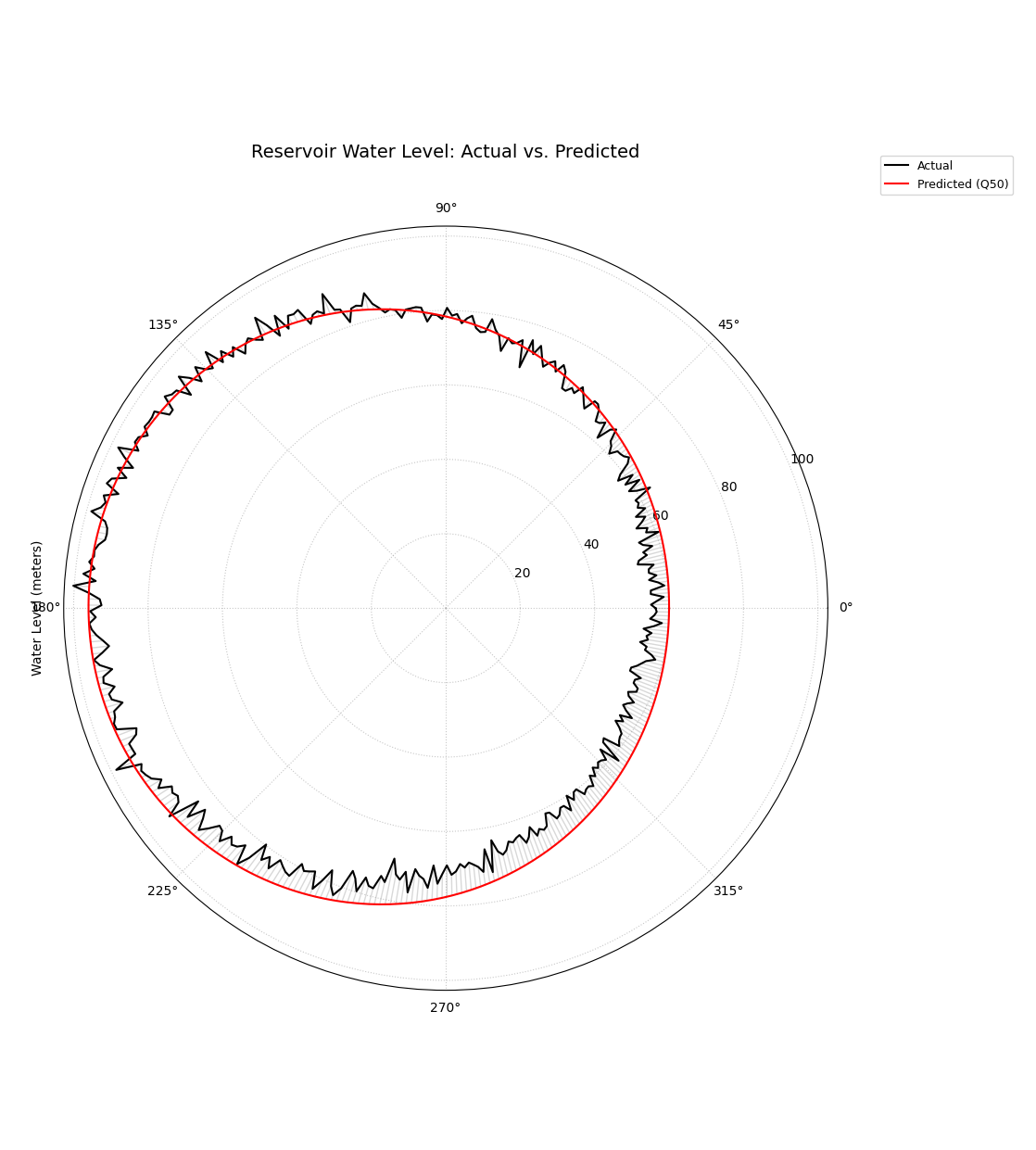
A polar plot where the angle represents the day of the year, showing the direct comparison between observed (black line) and predicted (red line) water levels.
This plot provides a foundational, high-level check of model performance. The degree of overlap between the two spirals reveals the model’s accuracy, while any consistent separation highlights systemic biases.
- Quick Interpretation:
The plot reveals that the model has successfully captured the main seasonal cycle of the reservoir level, as the predicted (red) and actual (black) lines follow the same general pattern. However, it also exposes a systematic, seasonal bias. The model tends to over-predict during the low-water season (bottom of the circle) and under-predict during the high-water season (top of the circle). Furthermore, the predicted line is much smoother, indicating the model does not capture the day-to-day noise present in the actual observations.
This initial check is indispensable. To see the full implementation and learn how to customize the plot’s appearance, please visit the gallery.
Example: See the gallery example and code: Actual vs. Predicted.
Anomaly Magnitude Analysis (plot_anomaly_magnitude())
Purpose: This diagnostic specifically focuses on prediction interval failures. It identifies instances where the actual observed value falls outside the predicted range [Qlow, Qup] and visualizes the location, type (under- or over-prediction), and severity (magnitude) of these anomalies. It answers: “When my model’s uncertainty bounds are wrong, how wrong are they, and where?” This aligns with the calibration–sharpness principle in probabilistic forecasting [4] and with practical verification guidance [3]; related uncertainty display ideas in time-series (e.g., fan charts) provide useful context [5]. Our framework operationalizes these ideas in polar form for high-dimensional settings [1].
Mathematical Concept: An anomaly exists if the actual value \(y_i\) is outside the interval defined by the lower (\(Q_{low,i}\)) and upper (\(Q_{up,i}\)) quantiles.
Under-prediction: \(y_i < Q_{low,i}\)
Over-prediction: \(y_i > Q_{up,i}\)
The magnitude (\(r_i\)) of the anomaly is the absolute distance from the actual value to the nearest violated bound:
Only points where \(r_i > 0\) are plotted. The radial coordinate of a plotted point is \(r_i\).
Interpretation:
Presence/Absence: Points only appear if an anomaly occurred. A sparse plot indicates good interval coverage. Dense clusters indicate regions of poor uncertainty estimation.
Radius: The distance from the center directly represents the severity of the anomaly. Points far from the center are large errors relative to the predicted bounds.
Color: Distinct colors (e.g., blues for under-prediction, reds for over-prediction) immediately classify the type of failure. Color intensity often also maps to the magnitude \(r_i\).
Angular Position: Shows where (which samples, locations, or times, based on the angle representation) these failures occur. Look for clustering at specific angles.
Use Cases:
Risk Assessment: Identify predictions where the actual outcome might be significantly worse than the uncertainty bounds suggested.
Model Calibration Check: Assess if the prediction intervals are meaningful. Frequent or large anomalies suggest poor calibration.
Pinpointing Failure Modes: Determine if the model tends to fail more by under-predicting or over-predicting, and under what conditions (angles).
Targeting Investigation: Guide further analysis or data collection efforts towards the specific samples/locations exhibiting the most severe anomalies.
Advantages of Polar View:
Provides a focused view solely on prediction interval failures.
Radial distance intuitively maps to error magnitude/severity.
Color effectively separates under- vs. over-prediction types.
Circular layout helps identify patterns or concentrations of anomalies across the angular dimension.
A good probabilistic forecast should provide an uncertainty interval that reliably contains the true outcome. But what happens when it fails? It’s not enough to know that it failed; we need to know how badly it failed. This specialized diagnostic plot focuses exclusively on these failures, or “anomalies,” to visualize their location, type, and, most importantly, their severity.
Practical Example
A logistics company uses a probabilistic model to forecast delivery times, providing customers with an estimated arrival window (e.g., “between 2 and 4 days”). An “anomaly” occurs when a package arrives outside this window. For the business, it is critical to understand these failures: (1) Are late arrivals (over-predictions) more common than early ones? (2) When a delivery is late, is it late by a few hours or by several days?
The anomaly magnitude plot will ignore all successful deliveries and create a focused visualization of only the failures, with the radial distance showing exactly how severe each miss was.
>>> import numpy as np
>>> import pandas as pd
>>> import kdiagram as kd
>>>
>>> # --- 1. Simulate delivery time forecast data ---
>>> np.random.seed(0)
>>> n_deliveries = 500
>>> # Actual delivery time in days
>>> y_true = np.random.lognormal(mean=1, sigma=0.5, size=n_deliveries) * 2
>>> # Predicted 80% interval [Q10, Q90]
>>> y_pred_q10 = y_true * 0.8 - np.random.uniform(0.5, 1, n_deliveries)
>>> y_pred_q90 = y_true * 1.2 + np.random.uniform(0.5, 1, n_deliveries)
>>>
>>> df = pd.DataFrame({
...     'actual_days': y_true, 'predicted_q10': y_pred_q10, 'predicted_q90': y_pred_q90
... })
>>> # --- 2. Manually introduce some severe anomalies ---
>>> late_indices = np.random.choice(n_deliveries, 30, replace=False)
>>> df.loc[late_indices, 'actual_days'] += np.random.uniform(2, 5, 30)
>>>
>>> # --- 3. Generate the plot ---
>>> ax = kd.plot_anomaly_magnitude(
...     df,
...     actual_col='actual_days',
...     q_cols=['predicted_q10', 'predicted_q90'],
...     title='Analysis of Delivery Time Anomalies',
...     cbar=True
... )
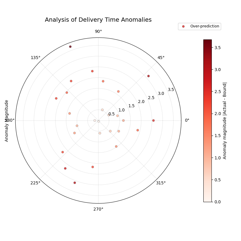
A polar scatter plot showing only the forecast failures, where the radius represents the severity of the miss and the color indicates the type (over- or under-prediction).
This plot acts as a magnifying glass for your model’s most significant errors. A sparse plot with points close to the center is ideal, while points far from the center demand immediate investigation.
- Quick Interpretation:
This plot, which focuses exclusively on forecast failures, provides a critical insight into the model’s reliability. The most striking feature is that all anomalies are of one type: over-predictions. This means that every time the delivery was outside its predicted window, it was because it arrived later than the latest estimated time. This reveals a systematic bias where the model is too optimistic. The plot also shows the severity of these failures, with most being 1-2 days late, but some severe anomalies are more than 3.5 days late, representing a significant service failure.
Focusing on the magnitude of failures is essential for risk assessment and building robust models. To learn more about this diagnostic, please explore the full example in the gallery.
Example: See the gallery example and code: Anomaly Magnitude.
Overall Coverage Scores (plot_coverage())
Purpose: This function calculates and visualizes the overall empirical coverage rate for one or more sets of predictions. It answers the fundamental question: “Across the entire dataset, what fraction of the time did the true observed values fall within the specified prediction interval bounds (e.g., Q10 to Q90)?” The notion links directly to calibration in probabilistic forecasting and its complement, sharpness [4], and standard verification practice [3]. For practical verification tooling in the climate/weather community, see Brady and Spring[6]. It allows comparing aggregate performance across models using various chart types.
Mathematical Concept: The empirical coverage for a given prediction interval \([Q_{low,i}, Q_{up,i}]\) and actual values \(y_i\) over \(N\) samples is calculated as:
Where \(\mathbf{1}\{\cdot\}\) is the indicator function, which is 1 if the condition (actual value \(y_i\) is within the bounds) is true, and 0 otherwise.
For point predictions \(\hat{y}_i\), coverage typically measures exact matches (often resulting in very low scores unless data is discrete): \(\text{Coverage} = \frac{1}{N} \sum_{i=1}^{N} \mathbf{1}\{y_i = \hat{y}_i\}\).
Interpretation:
Compare to Nominal Rate: The primary use is to compare the calculated empirical coverage rate against the nominal coverage rate implied by the quantiles used. For example, a Q10-Q90 interval has a nominal coverage of 80% (0.8).
If Empirical Coverage ≈ Nominal Coverage: The intervals are well- calibrated on average.
If Empirical Coverage > Nominal Coverage: The intervals are too wide (conservative) on average.
If Empirical Coverage < Nominal Coverage: The intervals are too narrow (overconfident) on average.
Model Comparison: When plotting multiple models, directly compare their coverage scores. A model closer to the nominal rate is generally better calibrated in terms of its average interval performance.
Chart Type:
bar or line: Good for direct comparison of scores between models.
pie: Shows the proportion of coverage relative to the sum (less common for direct calibration assessment).
radar: Provides a profile view comparing multiple models across the same metric (coverage).
Use Cases:
Quickly assessing the average calibration of prediction intervals for one or multiple models.
Comparing the overall reliability of uncertainty estimates from different forecasting methods.
Summarizing interval performance for reporting.
Advantages:
Provides a single, easily interpretable summary statistic for average interval performance per model.
Offers multiple visualization options (kind parameter) for flexible comparison.
Beyond looking at individual errors, a vital check for any probabilistic forecast is its overall coverage. This is a simple, powerful summary metric that answers the question: “If I create an 80% prediction interval, does the true value actually fall inside it 80% of the time?” This plot provides that summary, making it the perfect first step for comparing the aggregate reliability of different models.
Practical Example
A national weather service uses two competing numerical models, “Met-A” and “Met-B,” to generate an 80% confidence interval for the next day’s high temperature. Before issuing these forecasts to the public, they need to perform a quick check: over the past year, which model has been more reliable?
This plot will calculate the overall coverage score for each model—the fraction of days the actual high temperature fell within the predicted range—and display them on a comparative radar chart for an instant verdict.
>>> import numpy as np
>>> import kdiagram as kd
>>>
>>> # --- 1. Simulate a year of temperature forecasts ---
>>> np.random.seed(0)
>>> n_days = 365
>>> y_true = 15 + 10 * np.sin(np.arange(
...  n_days) * 2 * np.pi / 365) + np.random.normal(0, 3, n_days)
>>>
>>> # Met-A: An under-confident model (intervals too wide -> high coverage)
>>> interval_A = 10
>>> y_pred_A = np.array([y_true - interval_A/2, y_true, y_true + interval_A/2]
...    ).T + np.random.normal(0,1,(n_days,3))
>>> # Met-B: An over-confident model (intervals too narrow -> low coverage)
>>> interval_B = 5
>>> y_pred_B = np.array([y_true - interval_B/2,
... y_true, y_true + interval_B/2]).T + np.random.normal(0,1,(n_days,3))
>>>
>>> # --- 2. Generate the plot ---
>>> ax = kd.plot_coverage(
...     y_true,
...     y_pred_A,
...     y_pred_B,
...     q=[0.1, 0.5, 0.9],
...     names=['Met-A (Under-Confident)', 'Met-B (Over-Confident)'],
...     kind='radar',
...     cov_fill=True,
...     title='Overall Coverage for Temperature Forecasts (80% Interval)'
... )
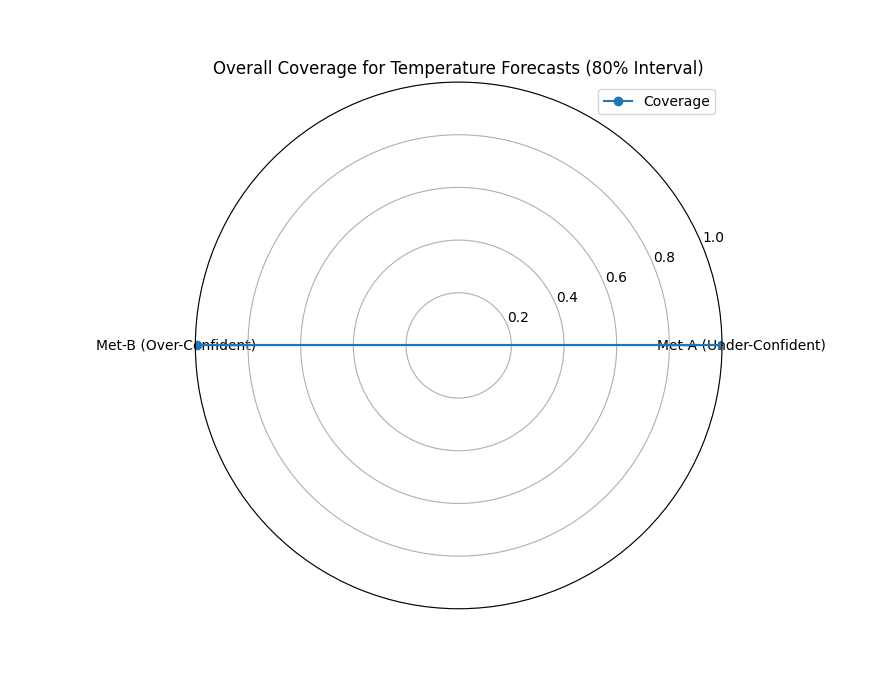
A radar chart providing a high-level comparison of the empirical coverage rates for two competing weather models against the nominal 80% target.
This plot provides a simple, aggregate score that is invaluable for a first-pass model comparison. Let’s see what the results tell us about each model’s average reliability.
- Quick Interpretation:
The plot provides a stark comparison of the two models’ reliability against the nominal target of an 80% interval. “Met-A” achieves a coverage score of 100%, which is far too high. This indicates the model is under-confident; its prediction intervals are excessively wide, capturing the true temperature every time but offering very little precision. In complete contrast, “Met-B” has a coverage of 0%, meaning it is extremely over-confident. Its prediction intervals are so narrow that they fail to capture the true temperature every single time. Neither model is well-calibrated.
This overall score is a great starting point. To see the full code and explore other chart types for this function, please visit the gallery.
Example: See the gallery example and code: Overall Coverage.
Point-wise Coverage Diagnostic (plot_coverage_diagnostic())
Purpose:
While plot_coverage() gives an overall
average, this function provides a granular, point-by-point diagnostic
of prediction interval coverage on a polar plot. It reveals where
(at which sample, location, or time, represented angularly) the intervals
succeeded or failed to capture the actual value—an operational view of
calibration beyond global scores [3][4].
The polar diagnostic follows our framework for high-dimensional settings
[1].
Mathematical Concept: For each data point \(i\), a binary coverage indicator \(c_i\) is calculated:
Each point \(i\) is then plotted at an angle \(\theta_i\) (determined by its index or an optional feature) and a radius \(r_i = c_i\). This means:
Covered points (\(c_i=1\)) are plotted at radius 1.
Uncovered points (\(c_i=0\)) are plotted at radius 0.
The plot also typically shows the overall coverage rate \(\bar{c} = \frac{1}{N} \sum c_i\) as a prominent reference circle.
Interpretation:
Radial Position: Instantly separates successes (radius 1) from failures (radius 0).
Angular Clusters: Look for clusters of points at radius 0. Such clusters indicate specific regions, times, or conditions (depending on what the angle represents) where the model’s prediction intervals systematically fail. Randomly scattered points at radius 0 suggest less systematic issues.
Average Coverage Line: The solid circular line drawn at radius \(\bar{c}\) represents the overall empirical coverage rate. Compare its position to:
The nominal coverage rate (e.g., 0.8 for an 80% interval).
Reference grid lines (often shown at 0.2, 0.4, 0.6, 0.8, 1.0).
Background Gradient (Optional): If enabled, the shaded gradient extending from the center to the average coverage line provides a strong visual cue for the overall performance level.
Point/Bar Color: Color (e.g., green for covered, red for uncovered using the default ‘RdYlGn’ cmap) reinforces the binary status.
Use Cases:
Diagnosing Coverage Failures: Go beyond the average rate to see where and how often intervals fail.
Identifying Systematic Issues: Detect if failures are concentrated in specific segments of the data (angles).
Visual Calibration Assessment: Provides a more intuitive feel for calibration than just a single number. Is the coverage rate met because most points are covered, or are there many failures balanced by overly wide intervals elsewhere?
Debugging Model Uncertainty: Pinpoint areas needing improved uncertainty quantification.
Advantages (Polar Context):
Excellent for visualizing the status of many points compactly.
The radial mapping (0 or 1) provides a very clear visual separation of coverage success/failure.
Angular clustering of failures is easily identifiable.
The average coverage line acts as an immediate visual benchmark against the plot boundaries (0 and 1) and reference grid lines.
While an overall coverage score tells us if a model is reliable on average, it doesn’t tell us when or why it might be failing. A model could achieve 80% overall coverage by being perfect in the winter but completely unreliable during summer heatwaves. This point-by-point diagnostic plot is designed to uncover these critical, conditional failures.
Practical Example
Continuing our weather forecast scenario, we want to perform a deeper dive on one of our models. Even if its overall coverage is close to the nominal 80%, we need to be sure it is reliable throughout the entire year. Is the model’s uncertainty estimation robust, or does it fail during specific seasons?
This diagnostic plot will visualize the coverage success (1) or failure (0) for every single day of the year, arranged on a circle. This will immediately reveal any seasonal clustering of failures, which would be invisible in an aggregate score.
>>> import numpy as np
>>> import pandas as pd
>>> import kdiagram as kd
>>>
>>> # --- 1. Simulate a forecast with seasonal miscalibration ---
>>> np.random.seed(42)
>>> n_days = 365
>>> days_of_year = np.arange(n_days)
>>> y_true = 15 + 10 * np.sin(days_of_year * 2 * np.pi / 365
...  ) + np.random.normal(0, 2, n_days)
>>>
>>> # Model produces intervals that are too narrow during summer (days 150-240)
>>> interval_width = np.ones(n_days) * 8
>>> interval_width[(days_of_year > 150) & (days_of_year < 240)] = 3 # Too narrow
>>>
>>> y_pred_q10 = y_true - interval_width / 2
>>> y_pred_q90 = y_true + interval_width / 2
>>>
>>> df = pd.DataFrame({
...     'temp_actual': y_true, 'temp_q10': y_pred_q10, 'temp_q90': y_pred_q90
... })
>>>
>>> # --- 2. Generate the plot ---
>>> ax = kd.plot_coverage_diagnostic(
...     df,
...     actual_col='temp_actual',
...     q_cols=['temp_q10', 'temp_q90'],
...     title='Point-wise Coverage Diagnostic for Temperature Forecast'
... )

A polar plot where each point on the circle is a day of the year. Points at radius 1 are successful coverages; points at radius 0 are failures.
This plot provides a granular, case-by-case report card for the model’s prediction intervals. A uniform scattering of failures is expected, but any clustering demands further investigation.
- Quick Interpretation:
This diagnostic provides a granular, day-by-day report card of the model’s interval performance. The key finding is that every single point is located at a radius of 1.0, and the average coverage line is also at 1.0. This indicates that the model’s prediction interval never failed; it successfully captured the true temperature every day of the year. While seemingly perfect, this is a strong indicator that the model is under-confident, producing prediction intervals that are likely too wide to be practically useful.
This kind of detailed diagnostic is essential for building models that are not just accurate on average, but truly robust. To learn more, explore the full example in the gallery.
Example: See the gallery example and code: Coverage Diagnostic.
Prediction Interval Width Visualization (plot_interval_width())
Purpose: This function creates a polar scatter focused on the magnitude of predicted uncertainty, visualizing the width (\(Q_{up}-Q_{low}\)) for each point at a given snapshot or horizon. Width is a proxy for sharpness—useful only when paired with good calibration [4]. As a complementary display to time-series fan charts [5], our polar view highlights spatial/ cross-sectional structure in uncertainty [1]. It answers: “How wide is the predicted uncertainty range for each point in my dataset?”
Mathematical Concept: For each data point \(i\), the interval width is calculated:
The point is plotted at an angle \(\theta_i\) (based on index) and a
radius \(r_i = w_i\). Optionally, a third variable \(z_i\)
from a specified z_col can determine the color of the point; otherwise,
the color typically represents the width \(w_i\) itself.
Interpretation:
Radius: The radial distance directly corresponds to the width of the prediction interval. Points far from the center represent samples with high predicted uncertainty (wide intervals). Points near the center have low predicted uncertainty (narrow intervals).
Color (with `z_col`): If a
z_col(e.g., the median prediction Q50, or the actual value) is provided, the color allows you to see how interval width relates to that variable. For example, are wider intervals (larger radius) associated with higher or lower median predictions (color)?Color (without `z_col`): If no
z_colis given, color usually maps to the width itself, reinforcing the radial information.Angular Patterns: Look for regions around the circle (representing subsets of data based on index order or a future theta_col implementation) that exhibit consistently high or low interval widths.
Use Cases:
Identifying samples or locations with the largest/smallest predicted uncertainty ranges at a specific time/horizon.
Visualizing the overall distribution of uncertainty magnitudes across the dataset.
Exploring potential relationships between uncertainty width and other factors (e.g., input features, predicted value magnitude) by using the
z_coloption.Assessing if uncertainty is relatively uniform or highly variable across samples.
Advantages (Polar Context):
Provides a compact overview of uncertainty magnitude for many points.
The radial distance offers a direct, intuitive mapping for interval width.
Facilitates the visual identification of angular patterns or clusters related to uncertainty levels.
Allows simultaneous visualization of location (angle), uncertainty width (radius), and a third variable (color via
z_col).
A key quality of a useful probabilistic forecast is sharpness—the ability to produce prediction intervals that are as narrow as possible while still being reliable. A wide, uncertain forecast has less value for decision-making than a sharp, precise one. This plot is the primary tool for visualizing the magnitude of this predicted uncertainty, or the “width” of the forecast, for every point in a dataset.
Practical Example
A water management authority has a probabilistic forecast for the daily river flow for the entire upcoming year. To plan for water allocation and flood mitigation, they need to understand the predicted uncertainty at a glance. Are the forecast intervals wider during the spring snowmelt season when flows are high and volatile? Are they narrow and confident during the dry summer months?
This plot will map each day of the year to an angle on a circle. The radius will represent the width of the prediction interval on that day, and the color will show the median predicted flow, instantly revealing any seasonal patterns in the model’s uncertainty.
>>> import numpy as np
>>> import pandas as pd
>>> import kdiagram as kd
>>>
>>> # --- 1. Simulate a year of daily river flow forecasts ---
>>> np.random.seed(1)
>>> n_days = 365
>>> day_of_year = np.arange(n_days)
>>> # Simulate seasonal flow (peaks in spring, day ~120) and uncertainty
>>> median_flow = 50 + 150 * np.exp(-((day_of_year - 120)**2) / (2 * 40**2))
>>> interval_width = 10 + 40 * np.exp(-((day_of_year - 120)**2) / (2 * 40**2))
>>>
>>> df = pd.DataFrame({
...     'day': day_of_year,
...     'q10_flow': median_flow - interval_width / 2 + np.random.randn(n_days) * 2,
...     'q50_flow': median_flow + np.random.randn(n_days) * 2,
...     'q90_flow': median_flow + interval_width / 2 + np.random.randn(n_days) * 2
... })
>>>
>>> # --- 2. Generate the plot ---
>>> ax = kd.plot_interval_width(
...     df,
...     q_cols=['q10_flow', 'q90_flow'],
...     z_col='q50_flow',
...     title='Annual Forecast Uncertainty for River Flow',
...     cmap='plasma'
... )
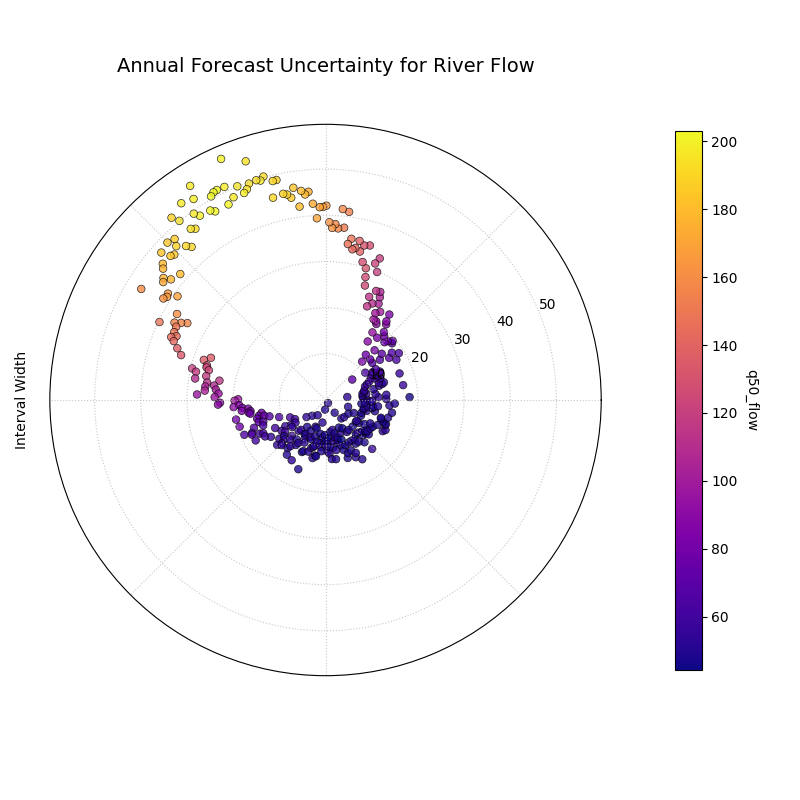
A polar scatter plot where the angle represents the day of the year, the radius is the prediction interval width, and the color is the median predicted river flow.
This visualization provides a complete map of the forecast’s sharpness over the entire year. By looking at the radius and color, we can diagnose how the model’s uncertainty relates to its central prediction.
- Quick Interpretation:
This plot reveals a strong and desirable seasonal pattern in the model’s predicted uncertainty. The interval width (radius) is small during the low-flow season, represented by the purple points clustered near the center. As the median predicted flow (color) increases towards its peak, the interval width also grows significantly, shown by the yellow points spiraling outwards. This clearly demonstrates that the model has learned a crucial and realistic relationship: the forecast uncertainty is correctly predicted to be much higher during periods of high river flow.
Understanding the magnitude and patterns of uncertainty is a critical step in trusting and acting upon a forecast. To see the full implementation, please explore the gallery example.
Example: See the gallery example and code: Interval Width.
Interval Width Consistency (plot_interval_consistency())
Purpose: This plot analyzes the temporal stability of the predicted uncertainty range. It visualizes how much the width of the prediction interval (\(Q_{up} - Q_{low}\)) fluctuates for each location or sample across multiple time steps or horizons. Consistent widths relate to sharpness (narrow, informative intervals) but must not come at the expense of calibration [4]. For broader context on depicting evolving forecast distributions, see fan-chart practice [5]. The polar stability diagnostic is part of our analytics framework [1].
Mathematical Concept: For each location/sample \(j\), the interval width is calculated for each available time step \(t\):
The plot then visualizes the variability of these widths \(w_{j,t}\) over the time steps \(t\) for each location \(j\). The radial coordinate \(r_j\) typically represents either:
Standard Deviation: \(r_j = \sigma_t(w_{j,t})\) - Measures the absolute variability of the width.
Coefficient of Variation (CV): \(r_j = \frac{\sigma_t(w_{j,t})}{\mu_t(w_{j,t})}\) - Measures the relative variability (standard deviation relative to the mean width). Set via the
use_cv=Trueparameter.
Each location \(j\) is plotted at an angle \(\theta_j\) (based on index) and radius \(r_j\). The color of the point often represents the average median prediction \(\mu_t(Q_{50,j,t})\) across the time steps, providing context.
Interpretation:
Radius: Points far from the center indicate locations where the prediction interval width is inconsistent or varies significantly across the different time steps/horizons considered. Points near the center have stable interval width predictions over time.
CV vs. Standard Deviation (`use_cv`):
If use_cv=False (default), radius shows absolute standard deviation. A large radius means large absolute fluctuations in width.
If use_cv=True, radius shows relative variability (CV). A large radius means the width fluctuates significantly compared to its average width. This helps compare consistency across locations that might have very different average interval widths.
Color (Context): If q50_cols are provided, color typically shows the average Q50 value. This helps answer questions like: “Does high inconsistency (large radius) tend to occur in locations with high or low average predicted values?”
Angular Clusters: Clusters of points with high/low radius might indicate spatial patterns in the stability of uncertainty predictions.
Use Cases:
Assessing Model Reliability Over Time: Identify locations where uncertainty estimates are unstable across forecast horizons.
Diagnosing Temporal Effects: Understand if interval predictions become more or less variable further into the future.
Comparing Relative vs. Absolute Stability: Use use_cv to distinguish between large absolute fluctuations and large relative fluctuations.
Identifying Locations for Scrutiny: Points with high inconsistency might warrant further investigation into why the uncertainty estimate is so variable for those locations/conditions.
Advantages (Polar Context):
Compactly displays the consistency profile across many locations.
Radial distance provides an intuitive measure of inconsistency (variability).
Allows visual identification of clusters based on consistency levels.
Color adds valuable context about the average prediction level associated with different consistency levels.
While the previous plot shows a snapshot of uncertainty for a single forecast period, this visualization tackles a different, crucial question: is the model’s assessment of its own uncertainty stable over time? A reliable model should produce uncertainty estimates that are consistent from one forecast cycle to the next. This plot is designed to diagnose this temporal consistency.
Practical Example
Let’s continue with our river flow scenario. We are now evaluating a model’s performance over five consecutive years, looking at multiple monitoring stations along the river. For each station, we have a forecast interval for each of the five years.
We need to identify stations where the model’s uncertainty predictions are stable and trustworthy, versus stations where the uncertainty fluctuates wildly from year to year. A model that is confident one year and highly uncertain the next for the same location may not be reliable for long-term planning.
>>> import numpy as np
>>> import pandas as pd
>>> import kdiagram as kd
>>>
>>> # --- 1. Simulate multi-year forecasts for multiple stations ---
>>> np.random.seed(42)
>>> n_stations = 150
>>> years = [2021, 2022, 2023, 2024, 2025]
>>> df = pd.DataFrame({'station_id': range(n_stations)})
>>>
>>> # Create stable and unstable stations
>>> stable_mask = np.arange(n_stations) < 75
>>> for year in years:
...     base_width = np.where(stable_mask, 10, 10 + np.random.uniform(-8, 8, n_stations))
...     median = np.where(stable_mask, 50, 80) + np.random.randn(n_stations)*5
...     df[f'q10_y{year}'] = median - base_width / 2
...     df[f'q90_y{year}'] = median + base_width / 2
...     df[f'q50_y{year}'] = median
>>>
>>> qlow_cols = [f'q10_y{y}' for y in years]
>>> qup_cols = [f'q90_y{y}' for y in years]
>>> q50_cols = [f'q50_y{y}' for y in years]
>>>
>>> # --- 2. Generate the plot ---
>>> ax = kd.plot_interval_consistency(
...     df,
...     qlow_cols=qlow_cols,
...     qup_cols=qup_cols,
...     q50_cols=q50_cols,
...     title='Consistency of River Flow Uncertainty (2021-2025)',
...     use_cv=True # Use Coefficient of Variation for relative stability
... )
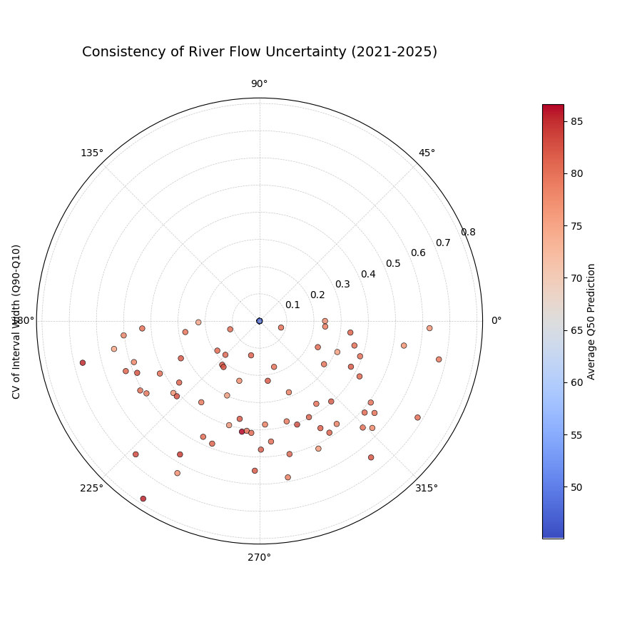
A polar scatter plot where each point is a monitoring station, the radius is the variability of its forecast uncertainty over five years, and the color is its average predicted flow.
This plot diagnoses the stability of the model’s confidence. Points far from the center represent stations where the model’s uncertainty estimates are volatile and less trustworthy over time.
- Quick Interpretation:
This plot assesses the year-to-year stability of the model’s uncertainty estimates, where a smaller radius (lower CV) is better. For the majority of monitoring stations, the model demonstrates good consistency, with points tightly clustered close to the center, indicating its uncertainty predictions are stable over time. However, the plot also highlights a few outlier stations with a much larger radius. These outliers represent locations where the model’s uncertainty forecasts are unstable and fluctuate significantly from year to year, warranting further investigation.
Assessing the long-term stability of a model’s uncertainty is key to building trust in its forecasts. To explore this example in more detail, please visit the gallery.
Example: See the gallery example and code: Interval Consistency.
Model Forecast Drift (plot_model_drift())
Purpose: This visualization focuses on model degradation over forecast horizons. It creates a polar bar chart to show how the average prediction uncertainty (specifically, the mean interval width \(\mathbb{E}[Q_{up} - Q_{low}]\)) changes as the forecast lead time increases—useful for diagnosing lead-time skill decay and concept/model aging effects (see lead-time verification practice and tooling [6]; general verification principles [3]; spatiotemporal forecasters where horizon behavior matters [7]). It helps diagnose concept drift or model aging effects related to uncertainty.
Mathematical Concept: For each distinct forecast horizon \(h\) (e.g., 1-step ahead, 2-steps ahead), the average interval width across all \(N\) samples is calculated:
Each horizon \(h\) is assigned a distinct angle \(\theta_h\) on
the polar plot. A bar is drawn at this angle with a height (radius)
proportional to the average width \(\bar{w}_h\). The color of the
bar typically also reflects this average width, or potentially another
aggregated metric for that horizon if color_metric_cols is used.
Interpretation:
Radial Growth: The key aspect is the change in bar height (radius) as the angle (horizon) progresses. A noticeable increase in radius for later horizons indicates that, on average, the model’s prediction intervals widen significantly as it forecasts further into the future. This signifies increasing uncertainty or model drift.
Bar Height Comparison: Directly compare the heights of bars for different horizons to quantify the average increase in uncertainty. Annotations usually display the exact average width \(\bar{w}_h\) for each horizon.
Stability: Bars of relatively similar height across horizons suggest that the model’s average uncertainty level is stable over the forecast lead times considered.
Use Cases:
Detecting Model Degradation: Identify if forecast uncertainty grows unacceptably large at longer lead times.
Assessing Forecast Reliability Horizon: Determine the practical limit of how far ahead the model provides reasonably certain forecasts.
Informing Retraining Strategy: Significant drift might indicate the need for more frequent model retraining or incorporating features that capture evolving dynamics.
Comparing Model Stability: Generate plots for different models to compare how their uncertainty characteristics drift over time.
Advantages (Polar Context):
The polar bar chart format makes the “outward drift” of average uncertainty across increasing horizons (angles) very intuitive to grasp.
Provides a concise summary comparing average uncertainty levels across multiple forecast lead times.
A critical aspect of evaluating any forecasting model is understanding how its performance degrades over longer prediction horizons. A model that is sharp and accurate for a one-day-ahead forecast may become unacceptably uncertain when predicting seven days ahead. This phenomenon is often called model drift, and this specialized polar bar chart is designed to diagnose it by visualizing how average uncertainty changes across different forecast lead times.
Practical Example
A supply chain manager for a large retail company needs to forecast the demand for a key product for one, two, three, and four weeks ahead to optimize inventory. It is expected that the forecast will become less certain for longer lead times, but the manager needs to quantify this degradation. How rapidly does the uncertainty grow?
This plot will show the average prediction interval width for each of the four forecast horizons. Each horizon is a bar on the polar chart, with its height (radius) representing the average uncertainty, providing an instant visual summary of the model’s drift.
>>> import numpy as np
>>> import pandas as pd
>>> import kdiagram as kd
>>>
>>> # --- 1. Simulate demand forecasts for multiple horizons ---
>>> np.random.seed(0)
>>> n_samples = 100
>>> horizons = ['1 Week', '2 Weeks', '3 Weeks', '4 Weeks']
>>> df = pd.DataFrame()
>>> q10_cols, q90_cols = [], []
>>>
>>> for i, horizon in enumerate(horizons):
...     # Uncertainty increases with each horizon
...     base_demand = 1000 + 50 * i
...     interval_width = 100 + 50 * i
...     q10 = base_demand - interval_width / 2 + np.random.randn(n_samples) * 20
...     q90 = base_demand + interval_width / 2 + np.random.randn(n_samples) * 20
...     df[f'q10_h{i+1}'] = q10
...     df[f'q90_h{i+1}'] = q90
...     q10_cols.append(f'q10_h{i+1}')
...     q90_cols.append(f'q90_h{i+1}')
>>>
>>> # --- 2. Generate the plot ---
>>> ax = kd.plot_model_drift(
...     df,
...     q10_cols=q10_cols,
...     q90_cols=q90_cols,
...     horizons=horizons,
...     title='Demand Forecast Uncertainty Drift by Horizon'
... )

A polar bar chart where each bar represents a forecast horizon. The increasing height of the bars shows that the average prediction uncertainty grows as the forecast lead time increases.
This plot provides a concise summary of how forecast quality changes over time. The outward progression of the bars gives an intuitive sense of the model’s performance degradation.
- Quick Interpretation:
This plot visualizes how the model’s average forecast uncertainty changes as it predicts further into the future. The result is a clear and unambiguous pattern of model drift: the height of the bars systematically increases from the “1 Week” horizon to the “4 Weeks” horizon. The annotations quantify this, showing the average uncertainty width growing from approximately 100 to over 250. This demonstrates that the forecast becomes progressively less certain and less precise at longer lead times, a critical finding for understanding the reliable range of the model.
Understanding model drift is key to defining a forecast’s reliable range and planning for model retraining. To see the full implementation, please explore the gallery.
Example: See the gallery example and code: Model Drift.
General Polar Series Visualization (plot_temporal_uncertainty())
Purpose: This is a general-purpose polar scatter utility for visualizing and comparing multiple data series (columns from a DataFrame) simultaneously. A common uncertainty use is plotting Q10/Q50/Q90 for the same horizon to show the spread at that time—contextualized by calibration–sharpness principles [4] and by conventional distribution displays like fan charts [5]. Quantile-based multi-horizon forecasting models (e.g., TFT) naturally produce such series [8].
Mathematical Concept:
For each data series \(k\) (corresponding to a column in q_cols)
and each sample \(i\), the value \(v_{i,k}\) is plotted at an
angle \(\theta_i\) (based on index) and radius \(r_{i,k} = v_{i,k}\).
If normalize=True, each series \(k\) is independently scaled
to the range [0, 1] before plotting using min-max scaling:
Each series \(k\) is assigned a distinct color.
Interpretation:
Series Comparison: Observe the relative radial positions of points belonging to different series (colors) at the same angle.
Uncertainty Spread (Quantile Use Case): When plotting Q10, Q50, and Q90 for a single horizon:
The radial distance between the points for Q10 (e.g., blue) and Q90 (e.g., red) at a specific angle represents the interval width (uncertainty) for that sample.
Look for how this spread varies around the circle (across samples).
The position of the Q50 points (e.g., green) shows the central tendency relative to the bounds.
Normalization Effect: If
normalize=True, the plot emphasizes the relative shapes and overlap of the series, regardless of their original scales. This is useful for comparing patterns but loses information about absolute magnitudes. Ifnormalize=False, the radial axis reflects the actual data values.Angular Patterns: Observe if specific series tend to be higher or lower at certain angles (samples/locations).
Use Cases:
Visualizing Uncertainty Intervals: Plot Qlow, Qmid, Qup for a single time step/horizon to see the uncertainty band across samples.
Comparing Multiple Models: Plot the point predictions (e.g., Q50) from several different models to compare their outputs side-by-side.
Plotting Related Variables: Visualize any set of related numerical columns from your DataFrame in a polar layout.
Advantages (Polar Context):
Allows overlaying multiple related data series in a single, compact plot.
Effective for visualizing the spread or range between different series (like quantiles) at each angular position.
Normalization option facilitates shape comparison for series with different scales.
Can reveal shared cyclical patterns among the plotted series.
While many plots in this package have a highly specific diagnostic purpose, it is often useful to have a general-purpose tool for simply visualizing and comparing multiple data series in a polar context. This function serves as that flexible utility. One of its primary use cases is to display the full spread of a probabilistic forecast by plotting several of its predicted quantiles simultaneously for a single time period.
Practical Example
A financial analyst is using a probabilistic model to forecast the next day’s price for a volatile stock. To understand the full range of predicted outcomes and assess risk, they need to visualize not just a single prediction interval, but the entire predicted distribution, represented by multiple quantiles (e.g., 10th, 25th, 50th, 75th, and 90th percentiles).
This plot will display all five quantile forecasts on the same polar axes. The radial distance between the different quantile series will vividly illustrate the shape and spread of the predicted uncertainty for each trading day.
>>> import numpy as np
>>> import pandas as pd
>>> import kdiagram as kd
>>>
>>> # --- 1. Simulate a multi-quantile stock price forecast ---
>>> np.random.seed(42)
>>> n_days = 100
>>> base_price = 150 + np.cumsum(np.random.randn(n_days) * 2)
>>> df = pd.DataFrame()
>>> quantiles = {'q10': -1.28, 'q25': -0.67, 'q50': 0, 'q75': 0.67, 'q90': 1.28}
>>>
>>> for name, z_score in quantiles.items():
...     df[name] = base_price + z_score * 5 + np.random.randn(n_days)
>>>
>>> # --- 2. Generate the plot ---
>>> ax = kd.plot_temporal_uncertainty(
...     df,
...     q_cols=['q10', 'q25', 'q50', 'q75', 'q90'],
...     normalize=False, # Plot actual price values
...     title='Daily Stock Price Forecast Distribution'
... )
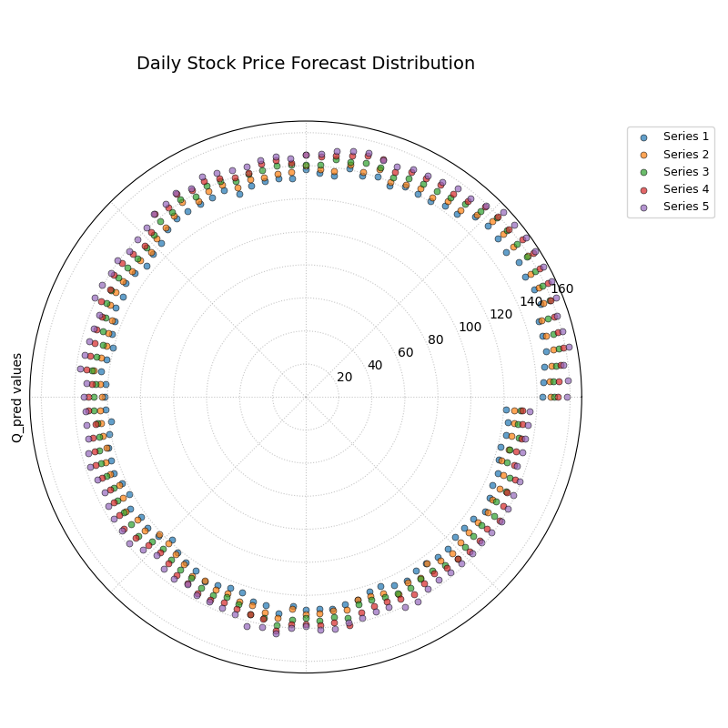
A polar scatter plot where each color represents a different predicted quantile (10th, 25th, 50th, 75th, 90th), visualizing the full spread of forecast uncertainty.
This plot allows us to see the entire predicted distribution at a glance. The radial distance between the outer and inner series shows the width of the uncertainty, while the spacing of the intermediate series reveals the shape of the distribution.
- Quick Interpretation:
This plot visualizes the full predicted stock price distribution for each day, with each colored series representing a different quantile forecast. The key insight is that the radial distance between the different quantile series—representing the spread of the uncertainty—appears relatively constant as you move around the circle. This suggests the model predicts a similar level of price volatility for each day in the forecast period, a characteristic known as homoscedastic uncertainty.
This flexible visualization is a powerful tool for exploring any set of related time series or distributions. To learn more, please see the full example in the gallery.
Example: See the gallery example and code: Temporal Uncertainty.
Multi-Time Uncertainty Drift Rings (plot_uncertainty_drift())
Purpose:
This plot shows how the spatial pattern of prediction uncertainty
(interval width) evolves across multiple time steps (e.g., years) for
all locations simultaneously. Unlike
plot_model_drift() (which averages
across space per horizon), each time step is a concentric ring so you
can compare uncertainty “maps” over time—useful in spatiotemporal settings
and environmental applications [9][7] and aligned
with our polar analytics framework [1]. For lead-time
skill context and evaluation workflows, see Brady and Spring[6]; for
discussion of evolving forecast distributions, see fan-chart literature
[5].
Mathematical Concept: For each location \(j\) and time step \(t\), the interval width is calculated: \(w_{j,t} = Q_{up,j,t} - Q_{low,j,t}\). These widths are typically normalized globally across all locations and times:
Each location \(j\) corresponds to an angle \(\theta_j\). For a given time step \(t\), the radius \(r_{j,t}\) for location \(j\) is determined by a base offset for that ring plus the scaled normalized width:
Where \(R_t\) is the base radius for ring \(t\) (increasing
with time, controlled by base_radius) and \(H\) is a scaling
factor (band_height) controlling the visual impact of the width.
Each ring \(t\) receives a distinct color from the specified
cmap.
Interpretation:
Concentric Rings: Each colored ring represents a specific time step, with inner rings typically corresponding to earlier times and outer rings to later times.
Ring Shape & Radius Variations: The deviations of a single ring from a perfect circle show the spatial variability of uncertainty at that specific time step. Points on a ring that bulge outwards represent locations with higher relative uncertainty (wider intervals) at that time.
Comparing Rings: Examine how the overall radius and “bumpiness” change from inner rings (earlier times) to outer rings (later times). If outer rings are consistently larger or more irregular, it suggests that uncertainty generally increases and/or becomes more spatially variable over time.
Angular Patterns: Trace specific angles (locations) across multiple rings. Does the radius consistently increase (growing uncertainty at that location)? Is it consistently large or small (persistently high/low uncertainty location)?
Use Cases:
Tracking the full spatial pattern of uncertainty as it evolves over multiple forecast periods.
Identifying specific locations where uncertainty grows or shrinks most dramatically over time.
Comparing the uncertainty landscape between different forecast horizons (e.g., visualizing the difference in uncertainty patterns between a 1-year and a 5-year forecast).
Complementing
plot_model_drift()by showing detailed spatial variations instead of just the average trend.
Advantages (Polar Context):
Uniquely effective at overlaying multiple temporal snapshots of the uncertainty field in a single, comparative view.
Concentric rings provide clear visual separation between time steps.
Radial variations within each ring clearly highlight spatial differences in relative uncertainty at that time.
Color coding aids in distinguishing and tracking specific time steps.
While some plots show how average uncertainty drifts over time, this visualization provides a much deeper insight: it shows how the entire spatial pattern of uncertainty evolves across multiple forecast periods. Each time step is drawn as a distinct concentric ring, allowing you to see a complete “map” of uncertainty and how that map changes from one period to the next.
Practical Example
An environmental agency is using a deep learning model to forecast land subsidence (the sinking of land) for hundreds of locations in a vulnerable coastal region over the next four years. They need to understand not just if the uncertainty is growing on average, but if specific areas are becoming dangerously unpredictable over time.
This plot will render the uncertainty forecast for each year as a separate ring. The “bumpiness” of each ring shows the spatial variability of uncertainty in that year, and comparing the rings reveals how this pattern drifts over the full forecast horizon.
>>> import numpy as np
>>> import pandas as pd
>>> import kdiagram as kd
>>>
>>> # --- 1. Simulate multi-year subsidence forecasts ---
>>> np.random.seed(1)
>>> n_locations = 200
>>> locations_angle = np.linspace(0, 360, n_locations)
>>> df = pd.DataFrame({'location_id': range(n_locations)})
>>> years = [2024, 2025, 2026, 2027]
>>> qlow_cols, qup_cols = [], []
>>>
>>> for i, year in enumerate(years):
...     # Uncertainty grows over time, especially in a specific region (90-180 deg)
...     regional_effect = (locations_angle > 90) & (locations_angle < 180)
...     base_width = 5 + 2 * i
...     width = base_width + np.where(regional_effect, 5 * i, 0)
...     median = 10 + np.random.uniform(0, 5, n_locations)
...     df[f'q10_{year}'] = median - width / 2
...     df[f'q90_{year}'] = median + width / 2
...     qlow_cols.append(f'q10_{year}')
...     qup_cols.append(f'q90_{year}')
>>>
>>> # --- 2. Generate the plot ---
>>> ax = kd.plot_uncertainty_drift(
...     df,
...     qlow_cols=qlow_cols,
...     qup_cols=qup_cols,
...     dt_labels=[str(y) for y in years],
...     title='Spatiotemporal Drift of Subsidence Uncertainty'
... )

Concentric rings representing four consecutive years, where the shape of each ring visualizes the spatial pattern of forecast uncertainty for that year.
This plot provides a powerful comparison of uncertainty “maps” across time. By tracing a single angle (a single location) from the inner rings to the outer rings, we can track how the uncertainty for that specific location is predicted to evolve.
- Quick Interpretation:
Each colored ring on this plot represents the spatial pattern of forecast uncertainty for a given year. The visualization reveals two key trends. First, the overall radius of the rings increases from the inner ring (2024) to the outer ring (2027), indicating that the average forecast uncertainty grows over the four-year horizon. Second, the shape of the rings shows that the uncertainty is not uniform, with “bumps” or outward bulges appearing in the same angular locations each year. These bumps become more pronounced over time, demonstrating a clear spatiotemporal drift where uncertainty is growing fastest in specific, identifiable regions.
This ability to visualize the evolution of an entire uncertainty field is crucial for complex spatiotemporal forecasting. To explore this example in more detail, please visit the gallery.
Example: See the gallery example and code: Uncertainty Drift.
Prediction Velocity Visualization (plot_velocity())
Purpose: This plot visualizes the rate of change (velocity) of the central forecast (typically Q50) across consecutive periods for each location— useful for spotting regime shifts and horizon-dependent behavior in spatiotemporal settings [7][9][1]. Typical implementations compute finite differences over arrays/data frames [10][11], then render with standard plotting backends [12]. It helps understand the predicted dynamics of the phenomenon being forecast, answering: “How fast is the predicted median value changing from one period to the next at each location?”
Mathematical Concept: For each location \(j\), the change in the median prediction between consecutive time steps \(t\) and \(t-1\) is calculated: \(\Delta Q_{50,j,t} = Q_{50,j,t} - Q_{50,j,t-1}\). The average velocity for location \(j\) over all time steps is the mean of these changes:
The point for location \(j\) is plotted at angle \(\theta_j\)
(based on index) and radius \(r_j = v_j\). The radius can be
normalized to [0, 1] if normalize=True. The color of the point can
represent either the velocity \(v_j\) itself, or the average
absolute magnitude of the Q50 predictions
\(\mathbb{E}_t [ |Q_{50,j,t}| ]\) (controlled by use_abs_color).
Interpretation:
Radius: Directly represents the average velocity (rate of change) of the Q50 prediction.
Points far from the center indicate locations with high average velocity (rapidly changing predictions).
Points near the center indicate locations with low average velocity (stable predictions).
If normalized, the radius shows relative velocity across locations.
Color (Mapped to Velocity): If
use_abs_color=False, color directly reflects the velocity value \(v_j\). Using a diverging colormap (like ‘coolwarm’) helps distinguish between positive average change (e.g., red/warm colors for increasing values) and negative average change (e.g., blue/cool colors for decreasing values).Color (Mapped to Q50 Magnitude): If
use_abs_color=True, color shows the average absolute value of the Q50 predictions themselves. This provides context: Is high velocity (large radius) associated with high or low absolute predicted values (color)?Angular Patterns: Look for clusters of points with similar radius (velocity) or color at specific angles, which might indicate spatial patterns in the predicted dynamics.
Use Cases:
Identifying spatial “hotspots” where the predicted phenomenon is changing most rapidly.
Locating areas of predicted stability or stagnation.
Analyzing and visualizing the spatial distribution of predicted trends or rates of change.
Contextualizing velocity with the underlying magnitude of the prediction (e.g., are flood level predictions rising faster in already high areas?).
Advantages (Polar Context):
Provides a compact overview comparing the rate of change across many locations or samples.
Radial distance gives an intuitive sense of the magnitude of change (velocity).
Color adds a critical second layer of information, either directional change or contextual magnitude.
Facilitates spotting spatial patterns or clusters related to the dynamics of the prediction.
While the previous plot shows how forecast uncertainty evolves, this visualization focuses on the central prediction itself. It is designed to reveal the rate of change, or “velocity,” of the phenomenon being forecasted. This is essential for moving beyond static predictions to understand the underlying dynamics of the system.
Practical Example
Continuing with our land subsidence scenario, the environmental agency now needs to identify which locations are predicted to sink the fastest over the next few years. This information is critical for prioritizing infrastructure monitoring and deploying mitigation measures. A location that is already heavily subsided but stable is a different kind of problem than a location that is currently stable but predicted to start sinking rapidly.
This plot will calculate the average rate of change (velocity) of the median subsidence forecast for each location. The radius will show how fast each location is sinking, and the color will provide context by showing the average total subsidence.
>>> import numpy as np
>>> import pandas as pd
>>> import kdiagram as kd
>>>
>>> # --- 1. Simulate multi-year median subsidence forecasts ---
>>> np.random.seed(42)
>>> n_locations = 200
>>> df = pd.DataFrame({'location_id': range(n_locations)})
>>> years = [2024, 2025, 2026, 2027]
>>> q50_cols = []
>>> # Create a base subsidence level
>>> base_subsidence = np.random.uniform(5, 20, n_locations)
>>> # Create a velocity that varies by location
>>> velocity = np.linspace(0.5, 5, n_locations)
>>>
>>> for i, year in enumerate(years):
...     df[f'q50_{year}'] = base_subsidence + velocity * i
...     q50_cols.append(f'q50_{year}')
>>>
>>> # --- 2. Generate the plot ---
>>> ax = kd.plot_velocity(
...     df,
...     q50_cols=q50_cols,
...     title='Predicted Velocity of Land Subsidence (2024-2027)',
...     use_abs_color=True, # Color by total subsidence
...     cmap='plasma'
... )
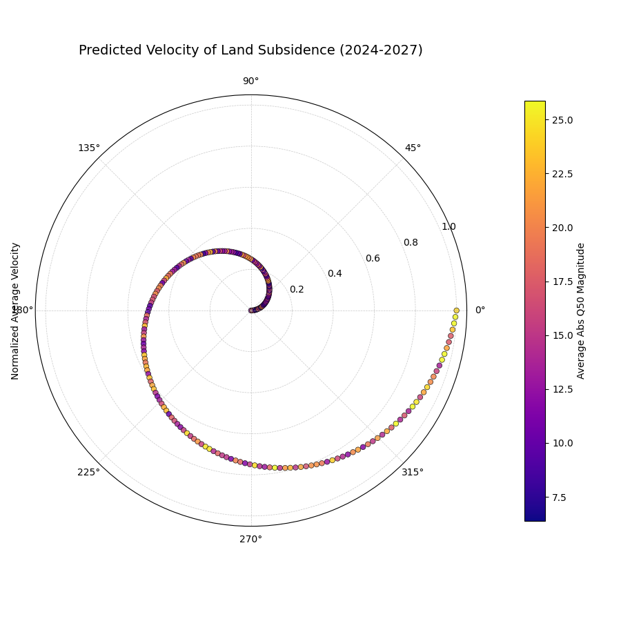
A polar scatter plot where each point is a location. The radius shows the predicted rate of sinking (velocity), and the color shows the average total subsidence magnitude.
This plot provides a rich, two-dimensional summary of the predicted dynamics. The radius immediately identifies the hotspots of rapid change, while the color provides crucial context about the absolute state of those locations.
- Quick Interpretation:
This plot reveals a powerful correlation between the rate of change and the total magnitude of the forecast. The smooth increase in radius from the center outwards shows that the locations are ordered by their predicted subsidence velocity, from most stable to fastest sinking. The color, which represents the average total subsidence, transitions along this same path from purple (low magnitude) to yellow (high magnitude). The key insight is that the locations with the highest rate of change are also the locations with the highest overall subsidence, indicating that the most problematic areas are also deteriorating the fastest.
Identifying the velocity of change is key to proactive decision-making. To see the full implementation of this dynamic analysis, please explore the gallery example.
Example: See the gallery example and code: Prediction Velocity.
Radial Density Ring (plot_radial_density_ring())
Purpose: This plot provides a unique visualization of the one-dimensional probability distribution of a continuous variable. It uses Kernel Density Estimation (KDE), a standard non-parametric method for density estimation [13], to create a smooth representation of the data’s distribution, answering the question: “What is the shape of this data’s distribution, and where are its most common values? In practice, density estimates and numerics rely on SciPy/NumPy [14][10].
Mathematical Concept:
The function first derives a one-dimensional data vector \(\mathbf{x}\)
based on the kind and target_cols parameters. For instance, with
kind='width', \(x_i = Q_{up,i} - Q_{low,i}\).
It then computes the Probability Density Function (PDF), \(\hat{f}_h(x)\), using a Gaussian kernel. This is an estimate of the true probability distribution from which the data samples are drawn.
The calculated PDF is then normalized to the range [0, 1] for
visual mapping to a color gradient:
In the plot, the radial distance from the center corresponds to the value \(x\), and the color at that radius is determined by \(\text{PDF}_{\text{norm}}(x)\).
Interpretation:
Radius: The radial axis represents the value of the metric being analyzed. The center corresponds to the minimum value in the data range, and the outer edge to the maximum.
Color: The color at any given radius represents the probability density for that value. Intense, saturated colors indicate high density, corresponding to peaks (modes) in the distribution where data is most concentrated. Faint, light colors indicate low density, corresponding to the tails of the distribution.
Angle: The angular dimension is purely for aesthetic effect and carries no information. The density is repeated around the full circle to create the “ring” visual.
Use Cases:
Error Distribution Analysis: Plot the distribution of forecast errors (e.g., \(y_i - \hat{y}_i\)). An ideal distribution is often a sharp peak centered at zero.
Uncertainty Characterization: Visualize the distribution of prediction interval widths. A narrow, single-peaked distribution suggests the model produces consistent uncertainty estimates. A wide or multi-modal distribution suggests variability.
Velocity/Change Analysis: Analyze the distribution of year-over- year changes or other calculated velocities to understand the typical magnitude and spread of change.
General Distribution Inspection: Quickly understand the shape (e.g., normal, skewed, bimodal) of any continuous variable.
Advantages of Polar View:
Provides a visually striking and compact representation of a 1D distribution.
Avoids the binning choices and jagged appearance of a traditional histogram.
The “ring” metaphor can be an intuitive way to view the entirety of a distribution’s shape at once.
While many plots show us data point-by-point, sometimes what we really need is a high-level, bird’s-eye view of a variable’s entire distribution. Is it symmetric and well-behaved, or skewed and unpredictable? The radial density ring transforms the familiar histogram into a smooth, continuous visualization, offering a unique and powerful way to understand the fundamental shape of your data.
Practical Example
An airline’s operations team relies on a model to predict flight times. To manage fuel reserves and crew schedules effectively, they need to understand the nature of the forecast errors. Are the errors normally distributed around zero, meaning small over- and under-predictions are equally common? Or is the distribution skewed, indicating a tendency for flights to be, for instance, much later than predicted but rarely much earlier?
This plot will visualize the entire probability distribution of the forecast errors. The location of the most intense color on the ring will reveal the most common error, while the shape will expose any dangerous asymmetries.
>>> import numpy as np
>>> import pandas as pd
>>> import kdiagram as kd
>>>
>>> # --- 1. Simulate flight time forecast errors ---
>>> np.random.seed(0)
>>> n_flights = 1000
>>> # Errors are mostly small, but with a "long tail" of significant delays
>>> errors_minutes = np.random.lognormal(mean=1.5, sigma=0.8, size=n_flights) - 5
>>>
>>> df = pd.DataFrame({'forecast_error': errors_minutes})
>>>
>>> # --- 2. Generate the plot ---
>>> ax = kd.plot_radial_density_ring(
...     df,
...     kind='direct',
...     target_cols='forecast_error',
...     title='Distribution of Flight Time Forecast Errors',
...     r_label='Error (Minutes)'
... )
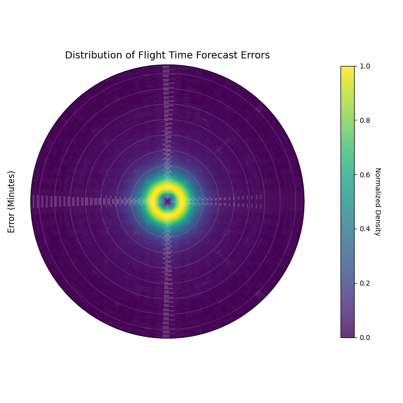
A polar density plot where the radius represents the forecast error in minutes and the color intensity shows the probability density, revealing the shape of the error distribution.
This plot provides a complete picture of the error distribution’s character. By examining the shape and peaks of the colored ring, we can diagnose the typical behavior of our model’s mistakes.
- Quick Interpretation:
This plot visualizes the probability distribution of the flight time forecast errors, where the radius is the error in minutes and bright colors indicate the most common outcomes. The most prominent feature is the single, bright ring located very near the center, which indicates that the vast majority of forecast errors are concentrated in a narrow band around zero. This is the signature of a high-quality forecast model that is both unbiased (centered on zero) and precise (the distribution is sharp and not wide).
Understanding the true shape of a distribution is key to robust decision-making. To explore this unique visualization further, please visit the gallery.
Example: See the gallery example and code: Radial Density Ring.
2D Density Analysis (plot_polar_heatmap())
Purpose: This function creates a polar heatmap, —part of our analytics framework [1]—to visualize the two-dimensional density distribution of data points. It is particularly powerful for uncovering relationships between a linear variable (mapped to the radius) and a cyclical or ordered variable (mapped to the angle). Depending on the dataset, a 2D KDE may be used [13],It answers the question: “Do high or low values of one metric tend to concentrate at specific times, seasons, or categories?”
Mathematical Concept: The plot is a 2D histogram in polar coordinates.
Coordinate Mapping: The data is mapped to polar coordinates. The radial variable \(r\) is taken from
r_col. The angular variable \(\theta_{data}\) fromtheta_colis converted to radians \([0, 2\pi]\). If a period \(P\) is provided (e.g., 24 for hours), the mapping is:(12)¶\[\theta_{rad} = \left( \frac{\theta_{data} \pmod P}{P} \right) \cdot 2\pi\]Binning and Counting: The polar space is divided into a grid of bins defined by
r_binsandtheta_bins. The function then counts the number of data points that fall into each polar sector \((r_j, \theta_k)\). The result is a count matrix \(\mathbf{C}\).
Interpretation:
Angle: Represents the cyclical or ordered feature (e.g., hour of the day, month of the year).
Radius: Represents the magnitude of the second variable (e.g., prediction error, rainfall amount).
Color: The color intensity of each polar bin corresponds to the count or density of data points within it. “Hot” or bright colors indicate a high concentration of data, revealing a strong relationship between the radial and angular variables in that region.
Use Cases:
Error Analysis: Identify if large forecast errors (radius) are more frequent at certain times of the day (angle).
Feature Correlation: Discover patterns between a cyclical feature and a measurement, like finding the time of day when wind speeds are highest.
Identifying “Hot Spots”: Pinpoint specific conditions where events of a certain magnitude are most likely to occur.
Advantages of Polar View:
Makes cyclical patterns immediately obvious, which can be harder to spot in a standard Cartesian heatmap.
Provides a compact and intuitive overview of a 2D distribution.
The most powerful insights often lie at the intersection of two variables. This polar heatmap is a specialized tool for exploring these two-dimensional relationships, designed to uncover “hot spots” or areas of high concentration in your data. It is particularly effective when one of the variables is cyclical, such as the hour of the day or the month of the year.
Practical Example
A city’s public safety department wants to optimize police patrol schedules. They hypothesize that the number of incidents is not uniform throughout the day but instead peaks at certain times and locations. To confirm this, they need to visualize the density of incidents based on both the hour of the day and the distance from the city center.
This polar heatmap is the perfect tool for this analysis. The angle will represent the hour of the day, the radius will be the distance from the city center, and the color will show the concentration of incidents, instantly revealing the times and locations of peak activity.
>>> import numpy as np
>>> import pandas as pd
>>> import kdiagram as kd
>>>
>>> # --- 1. Simulate public safety incident data ---
>>> np.random.seed(42)
>>> n_incidents = 5000
>>> # Incidents are concentrated during evening hours (e.g., 18:00 - 23:00)
>>> hour = np.random.normal(20, 2, n_incidents) % 24
>>> # Incidents are more common 2-5 km from the city center
>>> distance_km = np.random.gamma(shape=4, scale=1, size=n_incidents)
>>>
>>> df = pd.DataFrame({'hour_of_day': hour, 'distance_from_center_km': distance_km})
>>>
>>> # --- 2. Generate the plot ---
>>> ax = kd.plot_polar_heatmap(
...     df,
...     r_col='distance_from_center_km',
...     theta_col='hour_of_day',
...     theta_period=24,
...     title='Density of Incidents by Time and Location'
... )
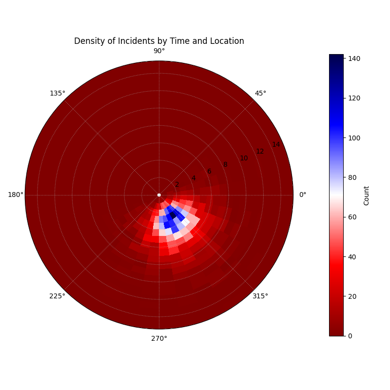
A polar heatmap where the angle is the hour of the day, the radius is the distance from the city center, and the color shows the count of incidents.
This plot turns a complex dataset into an intuitive map of activity. The bright “hot spots” on the map are a direct guide for resource allocation, showing exactly where and when patrols are needed most.
- Quick Interpretation:
This polar heatmap effectively visualizes the concentration of incidents based on the time of day (angle) and distance from the city center (radius). The key finding is the distinct “hot spot” of high activity, represented by the bright blue and white colors. This hot spot is clearly concentrated in the late evening hours (bottom-left quadrant of the plot) and occurs not in the immediate city center, but at a short distance of approximately 2-6 km away. This provides a clear, actionable insight for allocating public safety resources.
This ability to visualize 2D density is invaluable for discovering hidden patterns in spatiotemporal data. To learn more, please see the full example in the gallery.
Example: See Gallery for code and plot examples.
Visualizing Vector Fields (plot_polar_quiver())
Purpose: This function produces a polar quiver plot to visualize vector data (magnitude + direction)—handy for forecast revisions, error vectors, or physical flows within verification workflows (see tooling context [6]) and rendered with Matplotlib primitives [12]. It complements scalar uncertainty views by showing directional structure in model dynamics [1]. It is a resonable tool for understanding dynamic processes like forecast revisions, error vectors, or physical flows.
Mathematical Concept: Each arrow is a vector defined at an origin point in polar coordinates.
Vector Origin: The tail of each vector \(i\) is placed at the polar coordinate \((r_i, \theta_i)\), determined by the r_col and theta_col.
Vector Components: The vector itself is defined by its components in the local radial and tangential directions.
\(u_i\) (from u_col) is the vector’s component in the radial direction (pointing away from the center).
\(v_i\) (from v_col) is the vector’s component in the tangential direction (perpendicular to the radial line).
Magnitude: The color and/or length of the arrow typically represents the vector’s Euclidean magnitude, \(M_i\).
(13)¶\[M_i = \sqrt{u_i^2 + v_i^2}\]
Interpretation:
Arrow Position: The base of the arrow shows the location where the vector originates.
Arrow Direction: The arrow points in the direction of the vector. For forecast revisions, an arrow pointing outward means the forecast was revised upward; an inward arrow means a downward revision.
Arrow Length & Color: The size and color of the arrow represent the magnitude of the vector. Longer, more intense arrows indicate stronger flows or larger changes.
Use Cases:
Forecast Stability: Visualize how much forecasts change between updates. Small, randomly oriented arrows suggest a stable model. Large, consistently oriented arrows might indicate model drift.
Error Vector Analysis: Plot the error as a vector pointing from the predicted value to the actual value.
Flow Visualization: Model physical phenomena like wind or ocean currents in a polar context.
Advantages of Polar View:
Provides an intuitive way to visualize vector fields that have a natural central point or cyclical nature.
Can reveal large-scale rotational or radial patterns in the vector data.
Some phenomena are not just about static values, but about change, flow, or revision. These are vector quantities, possessing both magnitude and direction. The polar quiver plot is a specialized visualization designed to bring these dynamic processes to life, representing each data point not as a dot, but as an arrow showing its movement or change.
Practical Example
Oceanographers are studying ocean currents using data from a series of buoys. Each buoy reports its position (angle and distance from a central point) and the velocity of the current at its location. The velocity is a vector, with a component flowing radially (towards or away from the center) and a component flowing tangentially (rotating around the center).
To understand the overall ocean circulation pattern, they need to visualize this entire vector field. The polar quiver plot is the ideal tool, drawing an arrow at each buoy’s location that points in the direction of the current and whose size and color represent its speed.
>>> import numpy as np
>>> import pandas as pd
>>> import kdiagram as kd
>>>
>>> # --- 1. Simulate ocean current data from buoys ---
>>> np.random.seed(1)
>>> n_buoys = 75
>>> # Buoy positions
>>> r_pos = np.random.uniform(10, 50, n_buoys)
>>> theta_pos_deg = np.linspace(0, 330, n_buoys)
>>>
>>> # Simulate a large-scale rotational current (a gyre)
>>> u_radial = np.random.normal(0, 0.1, n_buoys) # Small radial flow
>>> v_tangential = 1.5 + np.sin(np.deg2rad(theta_pos_deg)) # Strong tangential flow
>>>
>>> df = pd.DataFrame({
...     'buoy_dist_km': r_pos, 'buoy_angle_deg': theta_pos_deg,
...     'radial_current_kmh': u_radial, 'tangential_current_kmh': v_tangential
... })
>>>
>>> # --- 2. Generate the plot ---
>>> ax = kd.plot_polar_quiver(
...     df,
...     r_col='buoy_dist_km',
...     theta_col='buoy_angle_deg',
...     u_col='radial_current_kmh',
...     v_col='tangential_current_kmh',
...     theta_period=360,
...     title='Ocean Current Velocity Field',
...     scale=40 # Adjust arrow size for visibility
... )
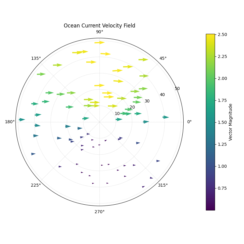
A polar quiver plot where arrows at each buoy location show the direction and magnitude of the ocean current.
This plot transforms raw numbers into an intuitive picture of a dynamic system. A single glance reveals the large-scale patterns of flow that would be impossible to see in a table of data.
- Quick Interpretation:
This quiver plot transforms the raw vector data into an intuitive map of the ocean current field. The direction of the arrows clearly reveals a large-scale, counter-clockwise rotational pattern across the entire area, which is characteristic of an ocean gyre. Furthermore, the color and size of the arrows, representing the current’s speed, show that the flow is not uniform; it is significantly stronger (bright yellow arrows) in the upper half of the plot and weaker (dark purple arrows) in the lower half.
Visualizing vector fields is essential in many scientific and engineering domains. To see the full implementation of this technique, please explore the gallery.
Example: See the gallery example and code: Polar Quiver Plot.
References