Anomaly Diagnostics Gallery
This gallery page showcases specialized plots from the
kdiagram.plot.anomaly module, designed for the
in-depth diagnosis of prediction interval failures. These
visualizations move beyond simple coverage scores to assess the
key characteristics of forecast anomalies: their magnitude (how
severe is the failure?), their type (was it an over- or
under-prediction?), and their clustering (are the failures
systematic?).
The plots provide intuitive diagnostics for visualizing anomaly severity through polar scatter plots, stylized “fiery ring” profiles, information-rich glyphs, and layered Cartesian profiles, allowing for a deeper understanding of a model’s failure modes.
Note
You need to run the code snippets locally to generate the plot
images referenced below. Ensure the image paths in the
.. image:: directives match where you save the plots.
Polar Anomaly Severity Plot (Scatter Version)
The plot_anomaly_severity() function is
a primary diagnostic tool for moving beyond simple coverage metrics.
It focuses exclusively on forecast failures (anomalies) and
visualizes four key dimensions of these failures simultaneously: their
location, magnitude, type, and clustering.
First, let’s break down the components of this diagnostic plot.
Plot Anatomy
Angle (θ): The angular axis represents the sample index, showing where in the dataset the failure occurred. A cluster of points in one angular region indicates a systematic, localized problem.
Radius (r): The radius of each point shows the Anomaly Magnitude—the absolute distance from the true value to the nearest violated interval bound. Points far from the center are severe failures.
Color: The color of a point represents its Local Anomaly Density. “Hotter” colors (e.g., bright yellow) indicate that the anomaly is part of a dense cluster of other failures—a “hotspot.”
Marker Shape: The marker’s shape distinguishes the Type of anomaly. By default, circles (o) are over-predictions (risk underestimated), while X’s are under-predictions.
With this framework, let’s explore how to use this plot to diagnose different, common types of forecast failures.
Use Case 1: The Ideal Case - Minor, Scattered Anomalies
The first use case is to identify a well-behaved model where the few prediction interval failures are small and randomly distributed. This serves as the benchmark for a low-risk forecast profile.
 1import kdiagram as kd
 2import numpy as np
 3import pandas as pd
 4import matplotlib.pyplot as plt
 5
 6np.random.seed(42)
 7n_samples = 400
 8
 9# 1) Start from a stable signal and define a fairly wide PI (±8)
10base   = np.random.normal(loc=50, scale=10, size=n_samples)
11q_low  = base - 8
12q_up   = base + 8
13
14# 2) Actuals mostly inside the band + a small random noise
15actual = base + np.random.normal(0, 2, size=n_samples)
16
17# 3) Inject a few *small* interval failures on random indices
18k = 24  # ~6% scattered anomalies
19over_idx  = np.random.choice(n_samples, size=k//2, replace=False)
20rest      = np.setdiff1d(np.arange(n_samples), over_idx)
21under_idx = np.random.choice(rest, size=k - k//2, replace=False)
22
23# Just outside the band by 0.2–2.0 units (minor misses)
24actual[over_idx]  = q_up[over_idx]  + np.random.uniform(0.2, 2.0, size=over_idx.size)
25actual[under_idx] = q_low[under_idx] - np.random.uniform(0.2, 2.0, size=under_idx.size)
26
27df = pd.DataFrame({"actual": actual, "q_low": q_low, "q_up": q_up})
28
29# 4) Plot
30ax = kd.plot_anomaly_severity(
31    df,
32    actual_col="actual",
33    q_low_col="q_low",
34    q_up_col="q_up",
35    window_size=21,
36    title="Use Case 1: A Well-Behaved Model (Minor, Scattered Anomalies)",
37    # savefig="gallery/images/gallery_anomaly_severity_good.png",
38)
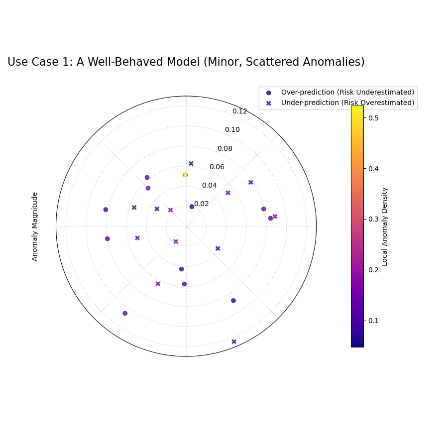
A sparse plot showing a few scattered anomalies with low magnitudes (close to the center) and cool colors (low density).
Use Case 2: Diagnosing a “Hotspot” of Severe Failures
A more dangerous failure mode occurs when a model is systematically wrong in a specific region of the data. The CAS score and this plot are designed to detect exactly this kind of “hotspot.”
Let’s simulate a model that performs well overall but has a cluster of large, severe failures in one particular segment of the data.
 1# --- 1. Simulate data with a failure hotspot ---
 2np.random.seed(0)
 3n_samples = 400
 4y_true = 100 + 20 * np.sin(np.linspace(0, 4 * np.pi, n_samples))
 5y_qlow = y_true - 10
 6y_qup = y_true + 10
 7
 8# Introduce a cluster of large over-prediction anomalies
 9cluster_slice = slice(100, 140)
10y_true[cluster_slice] = (
11    y_qup[cluster_slice]
12    + np.random.uniform(10, 25, 40)
13)
14df = pd.DataFrame({
15    "actual": y_true, "q_low": y_qlow, "q_up": y_qup
16})
17
18# --- 2. Plotting ---
19kd.plot_anomaly_severity(
20    df,
21    actual_col="actual",
22    q_low_col="q_low",
23    q_up_col="q_up",
24    window_size=31,
25    acov="half_circle",
26    title="Use Case 2: A Model with a Failure Hotspot",
27    savefig="gallery/images/gallery_anomaly_severity_hotspot.png",
28)
29plt.close()
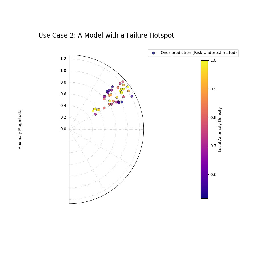
The plot reveals a clear “hotspot” where a cluster of severe anomalies (high radius, bright color) has occurred.
For a deeper understanding of the CAS score and its components, please refer back to the main Polar Anomaly Severity Plot (plot_anomaly_severity()) or Cluster-Aware Severity (CAS) Score (cluster_aware_severity_score()) section in the metrics guide.
Polar Anomaly Profile (“Fiery Ring”)
The plot_anomaly_profile() function
offers a stylized and aesthetically focused visualization of
forecast failures. It is designed to be a high-impact figure for
scientific papers, using the powerful metaphor of a “fiery ring”
to represent hotspots of clustered anomalies, with individual
failures erupting from it as “flares.”
First, let’s break down the components of this unique plot.
Plot Anatomy
Angle (θ): The angular axis represents the sample index, showing where in the dataset the failure occurred.
Central Ring: This colored ring sits at a fixed radius and visualizes the Local Anomaly Density. “Hotter” colors (e.g., bright yellow) on the ring indicate a “hotspot” where failures are highly clustered.
Flares: Each individual anomaly is drawn as a line or “flare” extending from the central ring. The flare’s properties encode two dimensions of the failure:
Length: Represents the Anomaly Magnitude. Longer flares are more severe failures.
Direction: Represents the Type of anomaly. Outward flares are over-predictions (risk underestimated), while inward flares are under-predictions.
With this framework, let’s explore how to use this plot to diagnose a model with complex, mixed failure modes.
Use Case: Diagnosing Mixed and Clustered Failure Modes
A use of this plot is to identify if a model suffers from different systematic biases in different parts of the data. A model might underestimate risk in one scenario (e.g., high-demand periods) and overestimate it in another.
Let’s simulate a forecast that has two distinct, separate clusters of failures: one of over-predictions and one of under-predictions.
 1import kdiagram as kd
 2import numpy as np
 3import pandas as pd
 4import matplotlib.pyplot as plt
 5
 6# --- 1. Simulate data with two distinct failure clusters ---
 7np.random.seed(30)
 8n_samples = 500
 9y_true = np.sin(np.linspace(0, 6 * np.pi, n_samples)) * 10 + 20
10y_qlow = y_true - 5
11y_qup = y_true + 5
12
13# Cluster 1: Over-predictions (true value > upper bound)
14y_true[100:130] += np.random.uniform(6, 12, 30)
15# Cluster 2: Under-predictions (true value < lower bound)
16y_true[300:330] -= np.random.uniform(6, 12, 30)
17
18df = pd.DataFrame({
19    "actual": y_true, "q10": y_qlow, "q90": y_qup
20})
21
22# --- 2. Plotting ---
23kd.plot_anomaly_profile(
24    df,
25    actual_col="actual",
26    q_low_col="q10",
27    q_up_col="q90",
28    window_size=31,
29    title="Use Case: Profile with Mixed Failure Types",
30    savefig="gallery/images/gallery_anomaly_profile.png",
31)
32plt.close()
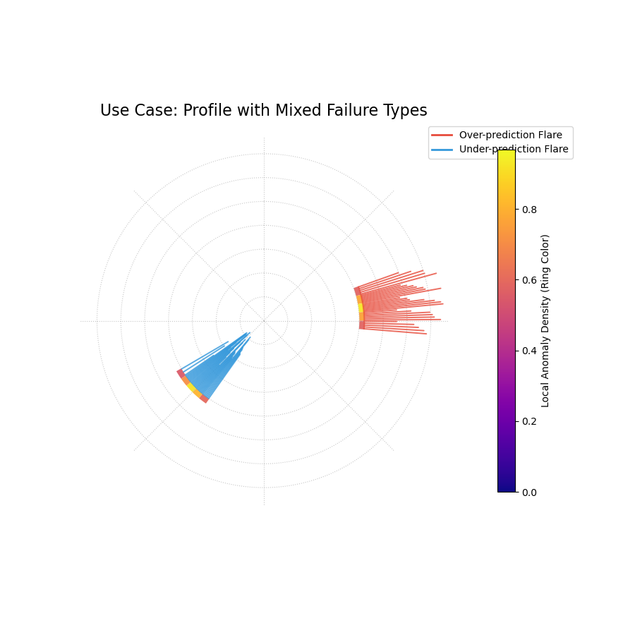
A “fiery ring” plot where the ring’s color shows anomaly hotspots, and flares show the magnitude and type of failures.
For a deeper understanding of the CAS score and its components, please refer back to the main Polar Anomaly Profile (plot_anomaly_profile()) or Cluster-Aware Severity (CAS) Score (cluster_aware_severity_score()) section in the metrics guide.
Polar Anomaly Glyph Plot
The plot_glyphs() function creates a
highly informative and scientifically rigorous diagnostic plot.
Instead of simple dots, each forecast failure (anomaly) is
represented by a glyph (a custom symbol). The glyph’s
properties—its location, shape, and color—encode multiple
characteristics of the anomaly simultaneously.
First, let’s break down the components of this advanced plot.
Plot Anatomy
Angle (θ): The angular position is determined by the sort_by parameter, providing a meaningful order to the data points (e.g., by time or a spatial coordinate).
Radius (r): The radius is determined by the metric specified in the radius parameter (e.g., ‘magnitude’, ‘severity’), normalized to [0, 1] for visual consistency.
Glyph Color: The color is determined by the metric specified in the color_by parameter. By default, this is the ‘local_density’, so “hotter” colors indicate a “hotspot” of clustered failures.
Glyph Shape: The shape of the marker provides an intuitive metaphor for the Type of anomaly:
▲ (up-triangle): Over-prediction, where the true value was higher than the upper bound (risk underestimated).
▼ (down-triangle): Under-prediction, where the true value was lower than the lower bound (risk overestimated).
This plot provides a dense, multi-dimensional summary of forecast failures, making it ideal for detailed analysis and publication.
Use Case: Diagnosing a Failure Hotspot with High Granularity
This plot is most powerful when you need to understand not just that a cluster of failures occurred, but also the specific nature of each failure within that cluster.
Let’s simulate a model that fails during a specific period (e.g., a summer heatwave that was not well-predicted), and use the glyph plot to dissect the resulting hotspot.
 1import kdiagram as kd
 2import numpy as np
 3import pandas as pd
 4import matplotlib.pyplot as plt
 5
 6# --- 1. Simulate temperature forecast data with a hotspot ---
 7np.random.seed(0)
 8n_samples = 365
 9time = pd.to_datetime(pd.date_range(
10    "2024-01-01", periods=n_samples)
11)
12y_true = 20 + 10 * np.sin(np.arange(n_samples) * 2 * np.pi / 365)
13y_qlow = y_true - 2
14y_qup = y_true + 2
15# Add a summer heatwave the model misses (over-prediction)
16y_true[180:210] += np.random.uniform(2.5, 5, 30)
17
18df = pd.DataFrame({
19    "time": time, "actual_temp": y_true,
20    "q10_temp": y_qlow, "q90_temp": y_qup
21})
22
23# --- 2. Plotting ---
24kd.plot_glyphs(
25    df,
26    actual_col="actual_temp",
27    q_low_col="q10_temp",
28    q_up_col="q90_temp",
29    sort_by=time,
30    radius="magnitude",
31    color_by="local_density",
32    title="Use Case: Glyph Plot of Seasonal Anomalies",
33    savefig="gallery/images/gallery_anomaly_glyphs.png",
34)
35plt.close()
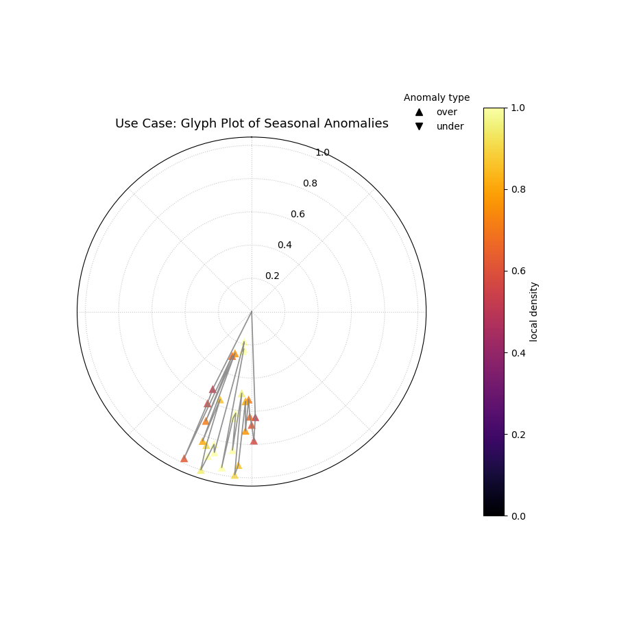
A polar glyph plot where each triangle represents a forecast failure. Its position, shape, and color reveal the failure’s location, type, magnitude, and clustering.
For a deeper understanding of the CAS score and its components, please refer back to the main Polar Anomaly Glyph Plot (plot_glyphs()) or Cluster-Aware Severity (CAS) Score (cluster_aware_severity_score()) section in the metrics guide.
Cartesian Anomaly Profile
The plot_cas_profile() function
creates a Cartesian Anomaly Profile, a powerful non-polar
alternative for diagnosing forecast failures. It is highly
effective for sequential data, such as time series, where the
x-axis can represent time or sample index. The plot visualizes an
anomaly’s location, magnitude, type, and clustering density.
First, let’s break down the components of this diagnostic plot.
Plot Anatomy
X-axis: The horizontal axis represents the sample index, showing when or where in the sequence the failure occurred.
Y-axis: The vertical axis represents the Anomaly Magnitude. The height of a point directly shows the severity of the failure.
Color: The color of a point represents its Local Anomaly Density. “Hotter” colors (e.g., bright yellow) indicate that the anomaly is part of a dense cluster of other failures—a “hotspot.”
Marker Shape: The marker’s shape distinguishes the Type of anomaly, using an intuitive metaphor:
▲ (up-triangle): Over-prediction (risk underestimated).
▼ (down-triangle): Under-prediction (risk overestimated).
This plot provides a direct, sequential view of forecast failures, making it easy to spot trends or regime changes in model performance over time.
Use Case: Diagnosing a Regime Change or Model Degradation
This plot is ideal for time-ordered data where you suspect a model’s performance may not be stationary. A model that performs well on historical data may fail when the underlying process changes.
Let’s simulate a forecast for a process that is stable for a long period and then suddenly becomes more volatile. We want to see if the model’s prediction intervals can adapt to this new regime.
 1import kdiagram as kd
 2import numpy as np
 3import pandas as pd
 4import matplotlib.pyplot as plt
 5
 6# --- 1. Simulate a time series with a failure hotspot ---
 7np.random.seed(0)
 8n_samples = 400
 9y_true = np.zeros(n_samples)
10y_qlow = y_true - 10
11y_qup = y_true + 10
12# Introduce a cluster of severe failures toward the end
13y_true[300:340] += np.random.uniform(12, 20, 40)
14
15df = pd.DataFrame({
16    "actual": y_true, "q10": y_qlow, "q90": y_qup
17})
18
19# --- 2. Plotting ---
20kd.plot_cas_profile(
21    df,
22    actual_col="actual",
23    q_low_col="q10",
24    q_up_col="q90",
25    window_size=21,
26    title="Use Case: Diagnosing a Failure Hotspot Over Time",
27    savefig="gallery/images/gallery_cas_profile.png",
28)
29plt.close()
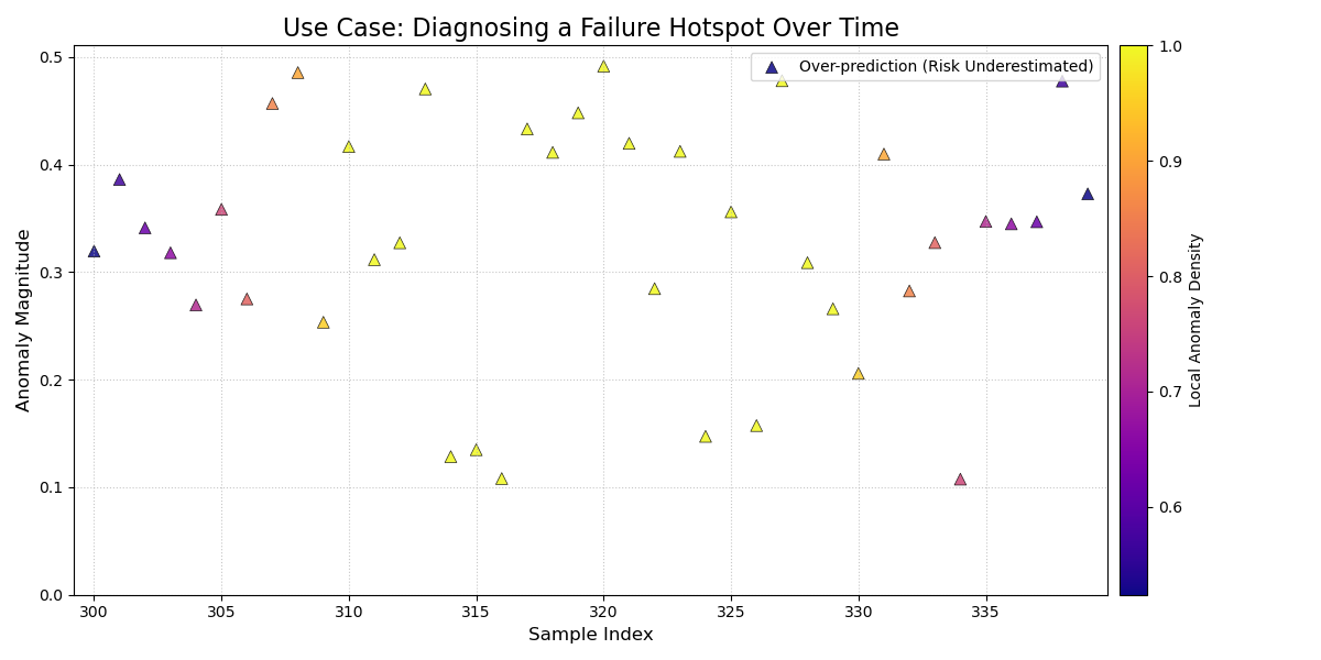
A Cartesian plot showing forecast failures over time, where the y-axis is the failure magnitude, and the color reveals failure hotspots.
For a deeper understanding of the CAS score and its components, please refer back to the main Cartesian Anomaly Profile (plot_cas_profile()) or Cluster-Aware Severity (CAS) Score (cluster_aware_severity_score()) section in the metrics guide.
Layered Anomaly Profile
The plot_cas_layers() function
creates the most comprehensive diagnostic in the anomaly suite.
It visualizes a forecast’s prediction interval, the true values,
and the calculated anomaly characteristics in a set of layered,
stacked panels. This is particularly effective for sequential
data, providing a clear, contextualized story of model
performance.
First, let’s break down the components of this multi-layered plot.
Plot Anatomy
Top Panel (Forecast Context): This panel displays the primary forecast.
A shaded gray area shows the prediction interval (q_low_col to q_up_col).
A dark line shows the true values (actual_col).
Anomalies are marked with colored triangles (▲ for over-predictions, ▼ for under-predictions). The color intensity of the marker corresponds to its severity score.
Bottom Panel (Severity Breakdown): This panel, linked by a shared x-axis, explains why the anomalies are severe.
Vertical bars show the per-sample severity score. Tall, hot-colored bars pinpoint the most critical failures.
A solid black line (show_density=True) traces the local anomaly density, highlighting the “hotspot” regions that contribute most to the severity scores.
This plot decomposes the CAS diagnostic into layers, providing a clear, sequential view of model performance.
Use Case 1: Diagnosing Performance During a Regime Shift
This plot’s primary strength is showing how a model’s performance and failure modes change over time or in response to specific events. It can clearly visualize a model’s breakdown during a “regime shift,” where the underlying data-generating process changes.
Let’s simulate a financial forecast where a model is stable during normal market conditions but fails catastrophically during a sudden market shock.
 1import kdiagram as kd
 2import numpy as np
 3import pandas as pd
 4import matplotlib.pyplot as plt
 5
 6# --- 1. Simulate a time series with a failure hotspot ---
 7np.random.seed(0)
 8n_samples = 400
 9x_axis = np.arange(n_samples)
10y_true = 20 * np.sin(x_axis * np.pi / 100)
11y_qlow = y_true - 10
12y_qup = y_true + 10
13# Introduce a cluster of severe failures (a "market shock")
14y_true[180:220] += np.random.uniform(12, 20, 40)
15
16df = pd.DataFrame({
17    "x": x_axis, "actual": y_true,
18    "q10": y_qlow, "q90": y_qup
19})
20
21# --- 2. Plotting ---
22axes = kd.plot_cas_layers(
23    df,
24    actual_col="actual",
25    q_low_col="q10",
26    q_up_col="q90",
27    sort_by="x",
28    title="Use Case 1: Model Failure During a Market Shock",
29    savefig="gallery/images/gallery_cas_layers_shock.png",
30)
31plt.close()
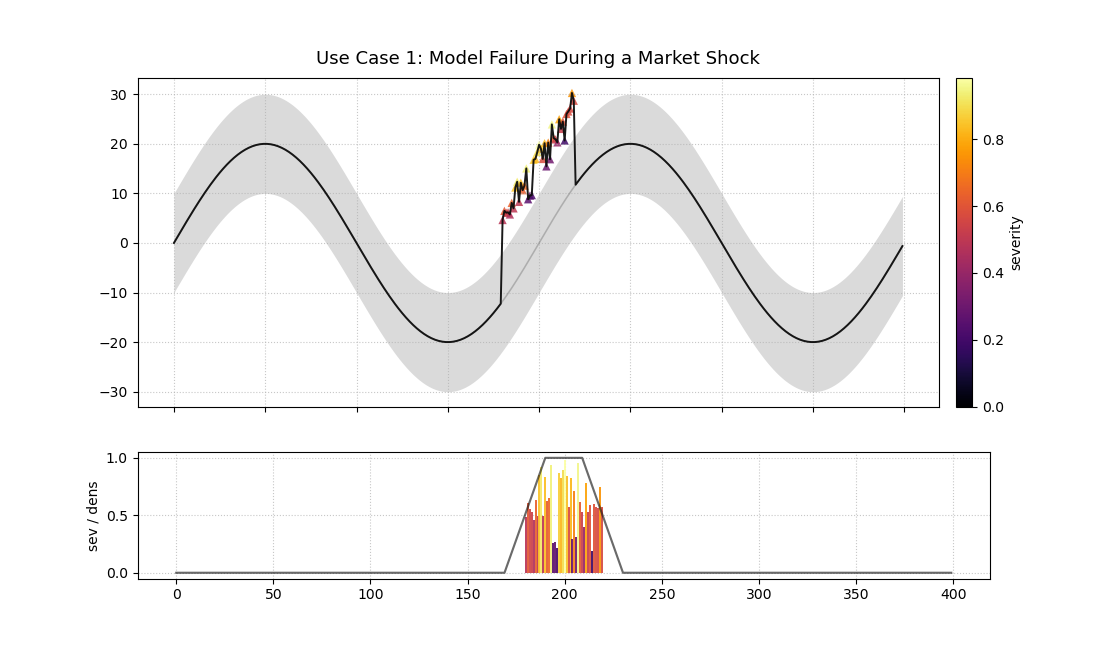
A two-panel plot. The top shows a time series forecast with anomalies. The bottom shows the severity of those anomalies.
Use Case 2: Comparing Anomaly Severity Across Categories
While ideal for time series, the x-axis can be ordered by any meaningful feature. This allows us to compare the severity of anomalies across different categories.
Let’s simulate product sales forecasts where a model performs well for one category but produces severe, clustered failures for another.
 1# --- 1. Simulate data for two product categories ---
 2np.random.seed(1)
 3n_cat_A = 150
 4n_cat_B = 150
 5# Category A: Well-behaved
 6y_true_A = np.random.normal(100, 10, n_cat_A)
 7y_qlow_A = y_true_A - 20
 8y_qup_A = y_true_A + 20
 9
10# Category B: Has severe over-prediction anomalies
11y_true_B = np.random.normal(150, 15, n_cat_B)
12y_qlow_B = y_true_B - 25
13y_qup_B = y_true_B + 25
14y_true_B[50:80] += np.random.uniform(30, 50, 30)
15
16df = pd.DataFrame({
17    "category": ["A"] * n_cat_A + ["B"] * n_cat_B,
18    "actual": np.concatenate([y_true_A, y_true_B]),
19    "q10": np.concatenate([y_qlow_A, y_qlow_B]),
20    "q90": np.concatenate([y_qup_A, y_qup_B]),
21})
22
23# --- 2. Plotting (sorted by category) ---
24axes = kd.plot_cas_layers(
25    df,
26    actual_col="actual",
27    q_low_col="q10",
28    q_up_col="q90",
29    sort_by="category",
30    title="Use Case 2: Anomaly Severity by Product Category",
31    savefig="gallery/images/gallery_cas_layers_category.png",
32)
33# Customize x-axis for categorical data
34ax, ax2 = axes
35ax.set_xticks([n_cat_A / 2, n_cat_A + n_cat_B / 2])
36ax.set_xticklabels(["Category A", "Category B"])
37ax.figure.savefig(
38    "gallery/images/gallery_cas_layers_category.png",
39    bbox_inches="tight"
40)
41plt.close()
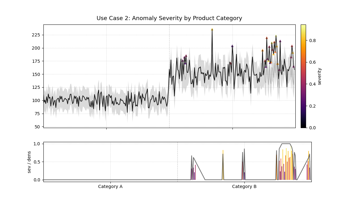
The plot is sorted by category, revealing that all severe anomalies are concentrated in Category B.
For a deeper understanding of the CAS score and its components, please refer back to the main Layered Anomaly Profile (plot_cas_layers()) or Cluster-Aware Severity (CAS) Score (cluster_aware_severity_score()) section in the metrics guide.
Application: Diagnosing Spatiotemporal Geohazard Forecasts
In high-stakes fields like geohazard forecasting, an aggregate metric of a model’s performance is not enough. A model that is “correct on average” can still be dangerously unreliable if all its failures are concentrated in the most vulnerable areas. Decision-makers need to understand the structure of forecast failures to manage risk effectively.
This application demonstrates how to combine the Polar Anomaly Glyph Plot and the Layered Anomaly Profile into a single dashboard to conduct a comprehensive diagnosis of a model’s reliability and biases.
The Problem: Forecasting Land Subsidence
Practical Example
A municipal government in a coastal city is using probabilistic forecasts to identify areas at high risk of land subsidence. This is a critical task for prioritizing infrastructure maintenance and implementing zoning regulations. An interval failure, or “anomaly,” has severe consequences:
Over-prediction (Risk Underestimation): If the model predicts less subsidence than actually occurs, critical infrastructure could be damaged without warning. This is the most dangerous type of error.
Under-prediction (Risk Overestimation): If the model predicts more subsidence than occurs, it could lead to the unnecessary and costly reinforcement of safe infrastructure.
The city is evaluating two models: a new, complex Deep Learning (DL) model that is highly reliable (well-calibrated) but sometimes imprecise, and a simpler Machine Learning (ML) model that is much sharper (more precise) but is suspected of having a systematic bias.
Translating the Problem into a Visual Dashboard
To make an informed decision, we need to move beyond simple coverage scores and dissect the nature of each model’s failures. A 2x2 dashboard will allow us to compare both the polar and Cartesian views of the anomaly profiles for each model side-by-side.
The following code simulates the models’ performance and creates the diagnostic dashboard.
 1import kdiagram as kd
 2import numpy as np
 3import pandas as pd
 4import matplotlib.pyplot as plt
 5
 6# --- 1. Simulate Land Subsidence Data ---
 7np.random.seed(42)
 8n_locations = 500
 9# Sort by a spatial feature, e.g., distance from coast
10distance_from_coast = np.linspace(0, 20, n_samples)
11
12# True subsidence is higher further from the coast
13y_true = 10 + (distance_from_coast**1.5) + np.random.normal(
14    0, 3, n_locations
15)
16
17# --- 2. Simulate Forecasts from Two Models ---
18# DL Model: Reliable but not very sharp (wide intervals)
19dl_qlow = y_true - 15
20dl_qup = y_true + 15
21
22# ML Model: Sharp (narrow intervals) but systematically biased
23# It underestimates the risk for high-subsidence areas
24ml_qlow = y_true - 4
25ml_qup = y_true + 4
26# Introduce the failure hotspot for high-subsidence areas
27hotspot_mask = distance_from_coast > 15
28y_true[hotspot_mask] += np.random.uniform(5, 15, hotspot_mask.sum())
29
30df_dl = pd.DataFrame({
31    'distance': distance_from_coast, 'actual': y_true,
32    'q_low': dl_qlow, 'q_up': dl_qup
33})
34df_ml = pd.DataFrame({
35    'distance': distance_from_coast, 'actual': y_true,
36    'q_low': ml_qlow, 'q_up': ml_qup
37})
38
39# --- 3. Create the 2x2 Dashboard ---
40fig = plt.figure(figsize=(18, 16))
41gs = fig.add_gridspec(2, 2)
42ax1 = fig.add_subplot(gs[0, 0], projection='polar')
43ax2 = fig.add_subplot(gs[0, 1], projection='polar')
44ax3 = fig.add_subplot(gs[1, 0])
45ax4 = fig.add_subplot(gs[1, 1])
46
47fig.suptitle("Land Subsidence Forecast Anomaly Dashboard",
48             fontsize=24, y=0.98)
49
50# Top Row: Polar Glyph Plots for each model
51kd.plot_glyphs(
52    df_dl, 'actual', 'q_low', 'q_up', ax=ax1,
53    sort_by='distance', title="DL Model (Reliable but Imprecise)"
54)
55kd.plot_glyphs(
56    df_ml, 'actual', 'q_low', 'q_up', ax=ax2,
57    sort_by='distance', title="ML Model (Sharp but Biased)"
58)
59
60# Bottom Row: Cartesian Anomaly Profiles for each model
61kd.plot_cas_profile(
62    df_dl, 'actual', 'q_low', 'q_up', ax=ax3,
63)
64kd.plot_cas_profile(
65    df_ml, 'actual', 'q_low', 'q_up', ax=ax4,
66)
67
68fig.tight_layout(pad=2.0)
69fig.savefig("gallery/images/gallery_anomaly_dashboard.png")
70plt.close(fig)
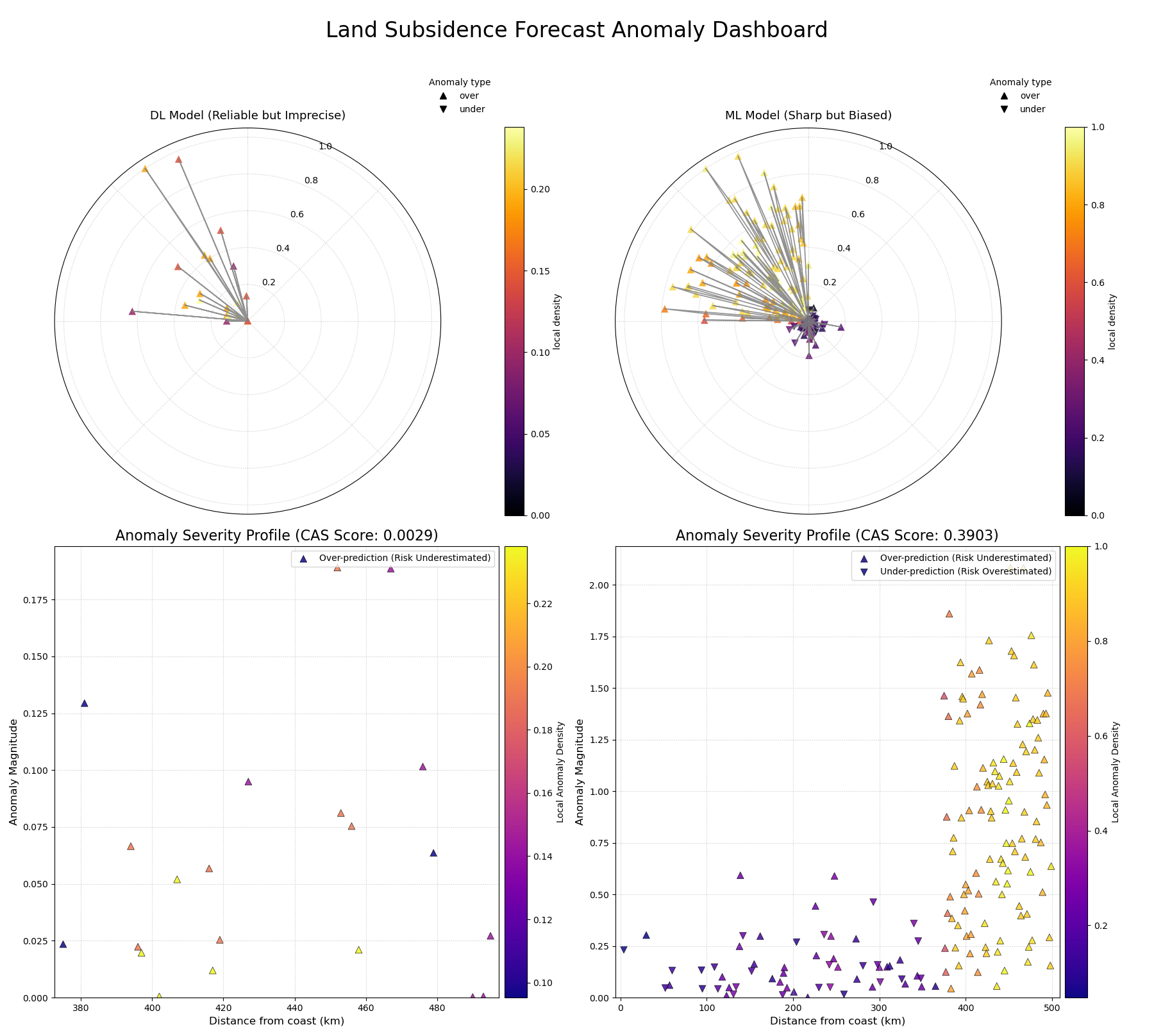
A comprehensive dashboard using polar glyphs and Cartesian profiles to diagnose the failure modes of two competing geohazard forecast models.
Best Practice
When evaluating probabilistic forecasts, never rely on a single metric. A model with high sharpness (narrow intervals) may seem appealing, but it is useless if it is not also well-calibrated. Always use a combination of diagnostics. The CAS score and its associated visualizations are designed to be used alongside standard metrics like coverage and PIT histograms to get a complete picture of a model’s performance.
For a deeper dive into the mathematical concepts behind the CAS score, please refer to the main User Guide Specialized Forecasting Metrics.