Taylor Diagrams
This gallery page focuses on Taylor Diagrams, which provide a concise visual summary of model performance. They compare key statistics like correlation, standard deviation, and Centered Root Mean Square Difference (CRMSD) between one or more models (or predictions) and a reference (observed) dataset.
A Taylor Diagram [1] conveys three key statistics on a 2D plot, allowing for a dense, quantitative comparison of model performance against a reference dataset (often called “observations”). This geometric relationship is not just an analogy; it is a direct consequence of the mathematical definitions of the statistics involved. The Law of Cosines provides the geometric framework to visualize a fundamental statistical identity.
Deriving the Relationship
Let’s start with the definition of the CRMSD. It is calculated on data where the means have been subtracted (denoted by primes: \(m'\) and \(r'\)).
The squared CRMSD is the mean of the squared differences:
(1)¶\[CRMSD^2 = \frac{1}{N}\sum_{k=1}^{N} (m'_k - r'_k)^2\]Expanding the squared term \((a-b)^2 = a^2 + b^2 - 2ab\) gives:
(2)¶\[CRMSD^2 = \frac{1}{N}\sum(m'_k)^2 + \frac{1}{N}\sum(r'_k)^2 - \frac{2}{N}\sum m'_k r'_k\]We can recognize each term in this expansion:
\(\frac{1}{N}\sum(m'_k)^2\) is the variance of the model (\(\sigma_{model}^2\)).
\(\frac{1}{N}\sum(r'_k)^2\) is the variance of the reference (\(\sigma_{ref}^2\)).
\(\frac{1}{N}\sum m'_k r'_k\) is the covariance between the model and reference.
Substituting these back, we get:
(3)¶\[CRMSD^2 = \sigma_{model}^2 + \sigma_{ref}^2 - 2 \cdot \text{cov}(m, r)\]Finally, we use the definition of the correlation coefficient, \(R = \frac{\text{cov}(m, r)}{\sigma_{model} \sigma_{ref}}\). Rearranging this gives \(\text{cov}(m, r) = R \cdot \sigma_{model} \sigma_{ref}\). Substituting this into our equation yields the final relationship:
(4)¶\[CRMSD^2 = \sigma_{model}^2 + \sigma_{ref}^2 - 2 \sigma_{model} \sigma_{ref} R\]
The Connection to the Law of Cosines
Now, compare this final equation to the Law of Cosines for a triangle with sides a, b, c, and an angle \(\gamma\) between sides a and b:
The two equations have the exact same form. By mapping the statistical terms to the geometric terms, we get:
Side a \(\rightarrow\) \(\sigma_{ref}\) (Standard deviation of reference)
Side b \(\rightarrow\) \(\sigma_{model}\) (Standard deviation of model)
Side c \(\rightarrow\) CRMSD
\(\cos(\gamma)\) \(\rightarrow\) R (Correlation Coefficient)
From Mathematics to Visualization
This remarkable equivalence is the conceptual foundation of the Taylor Diagram. It allows us to take an abstract statistical relationship and plot it in a simple, intuitive geometric space.
In the diagram, the standard deviations of the reference and the model are plotted as two sides of a triangle originating from the origin. The angle between them is set as \(\theta = \arccos(R)\). Because of the Law of Cosines, the length of the third side of the triangle—the line connecting the model point to the reference point—is guaranteed to be equal to the CRMSD.
This transforms a complex, multi-metric evaluation into a simple visual task: finding the point on the diagram that is closest to the reference. See the full details in the user guide section: Taylor Diagrams. Now, let’s break down the components of this diagram and its variants.
Plot Anatomy
Reference Point: A single point, typically plotted on the horizontal axis, that represents the “perfect” model. Its radial distance is the standard deviation of the reference data, and its correlation is, by definition, 1.0.
Azimuthal Angle (θ): The angle from the horizontal axis represents the Pearson Correlation Coefficient (R). A smaller angle indicates a higher correlation between the model and the reference. The axis is typically scaled with \(\arccos(R)\).
Radial Distance (r): The distance from the origin (the point (0,0)) represents the Standard Deviation (\(\sigma\)) of the model’s predictions. The plot often includes one or more circular arcs to show isocontours of standard deviation.
Distance from Reference: The distance between any model’s point and the reference point represents the Centered Root Mean Square Difference (CRMSD). This is a measure of the overall model skill; the closer a model’s point is to the reference point, the better its performance.
Model Points: Each colored marker on the plot corresponds to a different model or prediction set, allowing for simultaneous evaluation.
With these concepts in mind, let’s explore several practical applications and gallery examples.
Note
You need to run the code snippets locally to generate the plot
images referenced below (e.g., images/gallery_taylor_diagram_rwf.png).
Ensure the image paths in the .. image:: directives match where
you save the plots (likely an images subdirectory relative to
this file).
Taylor Diagram (Basic Plot)
The plot_taylor_diagram() is a basic
form. It is a more standard Taylor Diagram layout without
background shading, focusing purely on the positions of the model
points relative to the reference. Uses a half-circle layout (90
degrees, showing positive correlations only) with default West
orientation for Corr=1.
 1import kdiagram as kd
 2import numpy as np
 3import matplotlib.pyplot as plt
 4
 5# --- Data Generation (reusing from previous example) ---
 6np.random.seed(101)
 7n_points = 150
 8reference = np.random.normal(0, 1.0, n_points)
 9pred_a = reference * 0.8 + np.random.normal(0, 0.4, n_points)
10pred_b = reference * 0.5 + np.random.normal(0, 1.1, n_points)
11pred_c = reference * 0.95 + np.random.normal(0, 0.3, n_points)
12y_preds = [pred_a, pred_b, pred_c]
13names = ["Model A", "Model B", "Model C"]
14
15# --- Plotting ---
16kd.plot_taylor_diagram(
17    *y_preds,
18    reference=reference,
19    names=names,
20    acov='half_circle',      # Use 90-degree layout
21    zero_location='W',       # Place Corr=1 at the Left (West)
22    direction=-1,            # Clockwise angles
23    title='Gallery: Basic Taylor Diagram (Half Circle)',
24    # Save the plot (adjust path relative to this file)
25    savefig="images/gallery_taylor_diagram_basic.png"
26)
27plt.close()

Taylor Diagram (Flexible Input & Background)
The taylor_diagram() is a variant
of a series of Taylor diagrams implemented by k-diagram. It
shows its flexibility by accepting raw data arrays and adding a
background colormap based on the ‘rwf’ (Radial Weighting Function)
strategy, emphasizing points with good correlation and reference-like
standard deviation.
 1import kdiagram as kd
 2import numpy as np
 3import matplotlib.pyplot as plt
 4
 5# --- Data Generation ---
 6np.random.seed(101)
 7n_points = 150
 8reference = np.random.normal(0, 1.0, n_points) # Ref std dev approx 1.0
 9
10# Model A: High correlation, slightly lower std dev
11pred_a = reference * 0.8 + np.random.normal(0, 0.4, n_points)
12# Model B: Lower correlation, higher std dev
13pred_b = reference * 0.5 + np.random.normal(0, 1.1, n_points)
14# Model C: Good correlation, similar std dev
15pred_c = reference * 0.95 + np.random.normal(0, 0.3, n_points)
16
17y_preds = [pred_a, pred_b, pred_c]
18names = ["Model A", "Model B", "Model C"]
19
20# --- Plotting ---
21kd.taylor_diagram(
22    y_preds=y_preds,
23    reference=reference,
24    names=names,
25    cmap='Blues',             # Add background shading
26    radial_strategy='rwf',    # Use RWF strategy for background
27    norm_c=True,              # Normalize background colors
28    title='Gallery: Taylor Diagram (RWF Background)',
29    # Save the plot (adjust path relative to this file)
30    savefig="images/gallery_taylor_diagram_rwf.png"
31)
32plt.close()

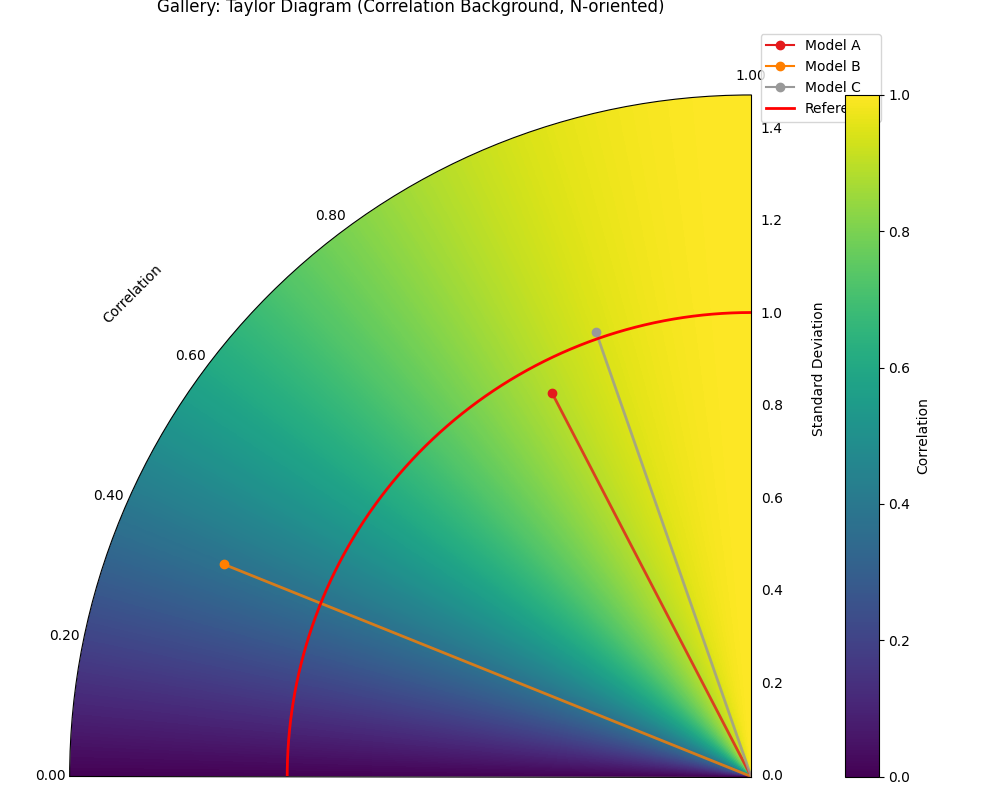
Taylor Diagram (Background Shading Focus)
The plot_taylor_diagram_in() is an alternative
plot with background shaing focus. It highlights the background colormap feature,
using the ‘convergence’ strategy where color intensity relates directly to the
correlation coefficient. It also demonstrates changing the plot
orientation (Corr=1 at North, angles increase counter-clockwise).
 1import kdiagram as kd
 2import numpy as np
 3import matplotlib.pyplot as plt
 4
 5# --- Data Generation (reusing from previous example) ---
 6np.random.seed(101)
 7n_points = 150
 8reference = np.random.normal(0, 1.0, n_points)
 9pred_a = reference * 0.8 + np.random.normal(0, 0.4, n_points)
10pred_b = reference * 0.5 + np.random.normal(0, 1.1, n_points)
11pred_c = reference * 0.95 + np.random.normal(0, 0.3, n_points)
12y_preds = [pred_a, pred_b, pred_c]
13names = ["Model A", "Model B", "Model C"]
14
15# --- Plotting ---
16kd.plot_taylor_diagram_in(
17    *y_preds,                     # Pass predictions as separate args
18    reference=reference,
19    names=names,
20    radial_strategy='convergence',# Background color shows correlation
21    cmap='viridis',
22    zero_location='N',            # Place Corr=1 at the Top (North)
23    direction=1,                  # Counter-clockwise angles
24    cbar=True,                    # Show colorbar for correlation
25    title='Gallery: Taylor Diagram (Correlation Background, N-oriented)',
26    # Save the plot (adjust path relative to this file)
27    savefig="images/gallery_taylor_diagram_in_conv.png"
28)
29plt.close()
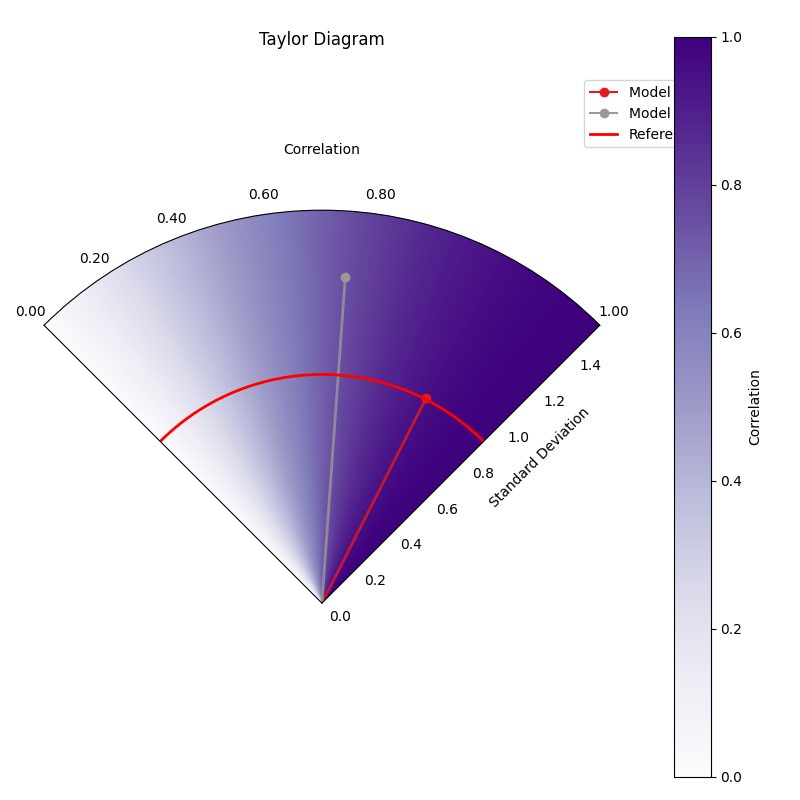
Taylor Diagram (NE Orientation, Convergence BG)
Another variant using plot_taylor_diagram_in(),
this time placing perfect correlation (1.0) in the North-East (‘NE’)
quadrant, with angles increasing counter-clockwise (direction=1).
The background uses the ‘convergence’ strategy with the ‘Purples’
colormap, where color intensity maps directly to the correlation
value, and includes a colorbar.
 1import kdiagram.plot.evaluation as kde
 2import numpy as np
 3import matplotlib.pyplot as plt
 4
 5# --- Data Generation (using same data as previous examples) ---
 6np.random.seed(42) # Use same seed for consistency if desired
 7reference = np.random.normal(0, 1, 100)
 8y_preds = [
 9    reference + np.random.normal(0, 0.3, 100), # Model A (close)
10    reference * 0.9 + np.random.normal(0, 0.8, 100) # Model B (worse corr/std)
11]
12names = ['Model A', 'Model B']
13
14# --- Plotting ---
15kde.plot_taylor_diagram_in(
16    *y_preds,
17    reference=reference,
18    names=names,
19    acov='half_circle', # 90 degree span
20    zero_location='NE', # Corr = 1.0 at North-East
21    direction=1,        # Angles increase counter-clockwise
22    fig_size=(8, 8),
23    cbar=True,          # Show colorbar for correlation
24    cmap='Purples',       # Use Purples colormap for background
25    radial_strategy='convergence', # Color based on correlation
26    title='Gallery: Taylor Diagram (NE, CCW, Convergence BG)',
27    # Save the plot (adjust path relative to this file)
28    savefig="images/gallery_taylor_diagram_in_ne_ccw_conv.png"
29)
30plt.close()
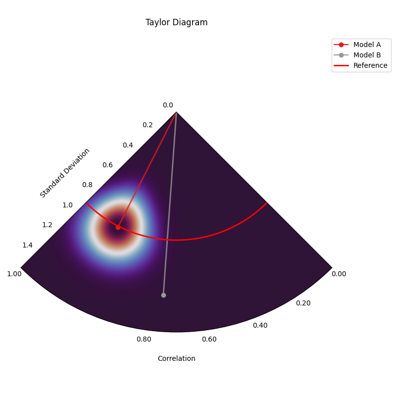
Taylor Diagram (SW Orientation, Performance BG)
This variant uses plot_taylor_diagram_in()
with perfect correlation (1.0) placed in the South-West (‘SW’)
quadrant, counter-clockwise angle increase (direction=1), and the
‘performance’ background strategy. The ‘performance’ strategy uses an
exponential decay centered on the best performing model in the input
(closest correlation and std dev to reference), highlighting the region
around it. Uses ‘gouraud’ shading for a smoother background and hides
the colorbar.
 1import kdiagram.plot.taylor_diagram as kde
 2import numpy as np
 3import matplotlib.pyplot as plt
 4
 5# --- Data Generation (using same data as previous examples) ---
 6np.random.seed(42) # Use same seed for consistency
 7reference = np.random.normal(0, 1, 100)
 8y_preds = [
 9    reference + np.random.normal(0, 0.3, 100), # Model A (close)
10    reference * 0.9 + np.random.normal(0, 0.8, 100) # Model B (worse corr/std)
11]
12names = ['Model A', 'Model B']
13
14# --- Plotting ---
15kde.plot_taylor_diagram_in(
16    *y_preds,
17    reference=reference,
18    names=names,
19    acov='half_circle',     # 90 degree span
20    zero_location='SW',     # Corr = 1.0 at South-West
21    direction=1,            # Angles increase counter-clockwise
22    fig_size=(8, 8),
23    cbar=False,             # Hide colorbar
24    cmap='twilight_shifted',# Use a cyclic map
25    shading='gouraud',      # Smoother shading
26    radial_strategy='performance', # Color based on best model proximity
27    title='Gallery: Taylor Diagram (SW, CCW, Performance BG)',
28    # Save the plot (adjust path relative to this file)
29    savefig="images/gallery_taylor_diagram_in_sw_ccw_perf.png"
30)
31plt.close()
Practical Application: Evaluating Climate Models
A primary and classic use of Taylor Diagrams is in climate science for evaluating the performance of Global Climate Models (GCMs). A research group might want to assess how well several competing GCMs reproduce the historical seasonal cycle of surface temperatures for a critical region, like the Amazon basin.
The diagram allows them to see, in a single glance, not just which model is “best,” but to diagnose the specific nature of each model’s errors. Does a model capture the timing of the seasons correctly (good correlation) but get the magnitude wrong (incorrect standard deviation)? Or does it have the right amount of variability but at the wrong times?
Let’s simulate this scenario with one set of observations and three different models.
Practical Example
A team of climatologists is faced with a critical task: validating a new generation of Global Climate Models (GCMs). Before these computationally expensive models can be trusted to project future climate scenarios, they must first prove their ability to accurately reproduce the known climate of the past. A simple error score is insufficient; the team needs to understand the nature of each model’s biases. The team chooses to focus on a critical and sensitive region: the Amazon basin. Their goal is to assess how well three competing GCMs simulate the historical seasonal cycle of monthly surface temperatures. The key scientific questions are:
Does the model correctly capture the timing of the seasons (the pattern, measured by correlation)?
Does the model correctly capture the intensity of the seasons (the magnitude of temperature swings, measured by standard deviation)?
Which model provides the best overall fidelity to the observed climate record?
A Taylor Diagram is the ideal tool for this multi-faceted evaluation, as it can represent all three statistics in a single, concise plot.
To perform this comparative analysis, the team’s workflow is simulated in the following code. First, a synthetic “observed” temperature record is created, representing the known seasonal cycle. Then, outputs from three different models are generated, each with a distinct performance profile: one that is well-calibrated, one that dampens the seasonal swings, and one that exaggerates them. Finally, these datasets are plotted on a Taylor Diagram.
 1import kdiagram as kd
 2import numpy as np
 3import matplotlib.pyplot as plt
 4
 5# --- 1. Simulate Climate Data ---
 6# Represents 20 years of monthly average temperatures
 7n_points = 20 * 12
 8time = np.linspace(0, 20 * 2 * np.pi, n_points)
 9
10# Observed Data: A clear seasonal cycle with some natural noise
11observed_temps = 25 + 5 * np.sin(time) + np.random.normal(0, 0.5, n_points)
12
13# Model A (Good): Captures the pattern and magnitude well
14model_a = 25 + 4.8 * np.sin(time) + np.random.normal(0, 0.6, n_points)
15
16# Model B (Dampened): Underestimates the seasonal swings
17model_b = 25 + 2.5 * np.sin(time) + np.random.normal(0, 0.8, n_points)
18
19# Model C (Exaggerated): Overestimates the seasonal swings
20model_c = 25 + 6.5 * np.sin(time) + np.random.normal(0, 0.7, n_points)
21
22y_preds = [model_a, model_b, model_c]
23names = ["Model A (Good)", "Model B (Dampened)", "Model C (Exaggerated)"]
24
25fig, axes = plt.subplots(
26    1, 2, figsize=(14, 6), subplot_kw={"projection": "polar"}
27)
28
29# --- 2. Plotting ---
30kd.plot_taylor_diagram(
31    *y_preds,
32    reference=observed_temps,
33    names=names,
34    acov='half_circle',
35    zero_location='E',
36    direction=-1,
37    ax=axes[0],        # <- draw on ax1
38    # title='Climate Model Evaluation: Amazon Seasonal Temperature Cycle',
39    savefig="images/gallery_taylor_diagram_climate.png"
40)
41# Right: shaded background + colorbar
42kd.plot_taylor_diagram_in(
43    *y_preds,
44    reference=obs,
45    names=names,
46    acov="half_circle",
47    zero_location="E",
48    direction=-1,
49    radial_strategy="performance",
50    cmap="magma",
51    norm_c=True,
52    cbar="on",
53    title="Taylor Diagram (Background Field)",
54    ax=axes[1],          # <- draw into right axes
55)
56# Global title with safe top margin
57fig.suptitle(
58    "Climate Model Evaluation: Amazon Seasonal Temperature Cycle",
59    y=1.0, fontsize=14
60)
61
62
63plt.close()
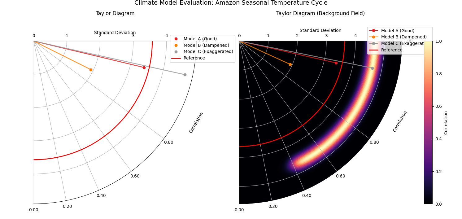
Taylor Diagram comparing the performance of three simulated climate models against observed seasonal temperature data for the Amazon.
For a deeper understanding of the statistical concepts behind these diagrams, please refer back to the main Taylor Diagrams section.
References