Visualizing Relationships
Understanding the relationship between observed (true) values and model predictions is fundamental to evaluation (see Murphy[1], Jolliffe and Stephenson[2]). While standard scatter plots are common, visualizing this relationship in a polar context can sometimes reveal different patterns or allow for comparing multiple prediction series against the true values in a compact format (see also the wider discussion on calibration and sharpness in probabilistic evaluation [3]).
k-diagram provides the plot_relationship function to explore these
connections using a flexible polar scatter plot where the angle is
derived from the true values and the radius from the predicted values
[4].
Summary of Relationship Functions
This section focuses on functions for visualizing the relationships between the core components of a forecast: true values, model predictions, and forecast errors.
Function |
Description |
|---|---|
Creates a polar scatter plot mapping true values to angle and (normalized) predicted values to radius. |
|
Visualizes how the full predicted distribution (quantile bands) changes as a function of the true value. |
|
Plots the forecast error against the true value to diagnose conditional biases. |
|
Plots the forecast error (residual) against the predicted value to diagnose issues like heteroscedasticity. |
Detailed Explanations
Let’s dive into the kdiagram.plot.relationship function.
True vs. Predicted Polar Relationship (plot_relationship())
Purpose: This function generates a polar scatter plot designed to visualize the relationship between a single set of true (observed) values and one or more sets of corresponding predicted values. It maps the true values to the angular position and the predicted values (normalized) to the radial position, allowing comparison of how different predictions behave across the range of true values [4] ( see foundational ideas on forecast evaluation and reliability [1][2]).
Mathematical Concept:
Angular Mapping ( \(\theta\) ): Let’s consider \(\upsilon\) as the
angular_angle. The angle \(\theta_i\) for each data point \(i\) is determined by its corresponding true value \(y_{\text{true}_i}\) based on thetheta_scaleparameter:'proportional'(Default): Linearly maps the range of y_true values to the specified angular coverage (acov).(1)¶\[\theta_i = \theta_{offset} + \upsilon \cdot \frac{y_{\text{true}_i} - \min(y_{\text{true}})} {\max(y_{\text{true}}) - \min(y_{\text{true}})}\]'uniform': Distributes points evenly across the angular range based on their index \(i\), ignoring the actual y_true value for positioning (useful if y_true isn’t strictly ordered or continuous).(2)¶\[\theta_i = \theta_{offset} + \upsilon \cdot \frac{i}{N-1}\]
Where \(\upsilon\) is determined by acov (e.g., \(2\pi\) for ‘default’, \(\pi\) for ‘half_circle’) and \(\theta_{offset}\) is an optional rotation.
Radial Mapping \(r\): For each prediction series y_pred, its values are independently normalized to the range [0, 1] using min-max scaling. This normalized value determines the radius \(r_i\) for that prediction series at angle \(\theta_i\).
(3)¶\[r_i = \frac{y_{\text{pred}_i} - \min(y_{\text{pred}})} {\max(y_{\text{pred}}) - \min(y_{\text{pred}})}\]Custom Angle Labels \(z_{values}\): If \(z_{values}\) are provided, the angular tick labels are replaced with these values (scaled to match the angular range), providing a way to label the angular axis with a variable other than the raw y_true values used for positioning.
Interpretation:
Angle: Represents the position within the range of y_true values (if theta_scale=’proportional’) or simply the sample index (if theta_scale=’uniform’). If z_values are used, the tick labels refer to that variable.
Radius: Represents the normalized predicted value for a specific model/series. A radius near 1 means the prediction was close to the maximum prediction made by that specific model. A radius near 0 means it was close to the minimum prediction made by that model.
Comparing Models: Look at points with similar angles (i.e., similar y_true values). Compare the radial positions of points from different models (different colors). Does one model consistently predict higher normalized values than another at certain y_true ranges (angles)?
Relationship Pattern: Observe the overall pattern. Does the radius (normalized prediction) tend to increase as the angle (y_true) increases? Is the relationship linear, cyclical, or scattered? How does the pattern differ between models?
Use Cases:
Comparing the relative response patterns of multiple models across the observed range of true values, especially when absolute scales differ.
Visualizing potential non-linear relationships between true values (angle) and normalized predictions (radius).
Exploring data using alternative angular representations by providing custom labels via z_values.
Displaying cyclical relationships if y_true represents a cyclical variable (e.g., day of year, hour of day) and acov=’default’.
Advantages (Polar Context):
Can effectively highlight cyclical patterns when y_true is mapped proportionally to a full circle (acov=’default’).
Allows overlaying multiple normalized prediction series against a common angular axis derived from the true values.
Flexible angular labeling using z_values provides context beyond the raw y_true mapping.
Normalization focuses the comparison on response patterns rather than absolute prediction magnitudes.
Understanding the direct relationship between a model’s predictions and the true values is a cornerstone of regression diagnostics. This polar scatter plot offers a unique perspective on this relationship, mapping true values to the angle and normalized predictions to the radius, which is especially useful for comparing the response patterns of multiple models.
Practical Example
An environmental agency uses two different scientific models to predict water temperature in a river based on air temperature. “Model A” is a simple linear model, while “Model B” is a more complex non-linear model. The agency needs to understand if and how their prediction patterns differ across the full range of observed water temperatures.
This plot will map the true water temperature to the angle on a circle and the models’ normalized predictions to the radius. This allows us to see if, for instance, one model systematically under-predicts at high temperatures.
>>> import numpy as np
>>> import kdiagram as kd
>>>
>>> # --- 1. Simulate water temperature data ---
>>> np.random.seed(1)
>>> # True water temperatures (e.g., in Celsius)
>>> y_true = np.linspace(5, 25, 150)
>>> # Model A: Simple linear response
>>> y_pred_A = y_true + np.random.normal(0, 1.5, 150)
>>> # Model B: A non-linear model that levels off at high temperatures
>>> y_pred_B = 25 - 20 * np.exp(-0.2 * y_true) + np.random.normal(0, 1.5, 150)
>>>
>>> # --- 2. Generate the plot ---
>>> ax = kd.plot_relationship(
...     y_true,
...     y_pred_A,
...     y_pred_B,
...     names=['Model A (Linear)', 'Model B (Non-Linear)'],
...     title='River Temperature Model Responses'
... )

A polar scatter plot comparing the response patterns of a linear and a non-linear model across the range of true values.
This plot visualizes the core stimulus-response behavior of each model. By tracing the points around the circle, we can diagnose how each model’s predictions change as the real-world value increases.
- Quick Interpretation:
This plot effectively contrasts the response patterns of the two models. “Model A (Linear)” produces points that form a tight, consistent spiral, visually confirming that its normalized predictions increase in a stable, linear fashion with the true water temperature. In contrast, the points for “Model B (Non-Linear)” are more scattered and follow a different pattern. Its normalized predictions appear to level off at higher temperatures (larger angles), clearly distinguishing its non-linear behavior from the simpler linear model.
This visualization technique is powerful for comparing the fundamental behaviors of different models. To see the full implementation, please explore the gallery example.
Example: See the gallery example and code: True vs. Predicted Relationship.
Conditional Quantile Bands (plot_conditional_quantiles())
Purpose: This function creates a Polar Conditional Quantile Plot to visualize how the entire predicted conditional distribution (represented by quantile bands) changes as a function of the true observed value. It is a powerful diagnostic tool for identifying heteroscedasticity—i.e., whether the forecast uncertainty is constant or changes with the magnitude of the target variable.
Mathematical Concept: This plot provides an intuitive view of the conditional predictive distribution, a novel visualization developed as part of the analytics framework:footcite:p:kouadiob2025.
Coordinate Mapping: The function first sorts the data based on the true values, \(y_{true}\), to ensure a continuous spiral. The sorted true values are then mapped to the angular coordinate, \(\theta\), in the range \([0, 2\pi]\).
(4)¶\[\theta_i \propto y_{true,i}^{\text{(sorted)}}\]The predicted quantiles, \(q_{i, \tau}\), for each observation \(i\) and quantile level \(\tau\) are mapped directly to the radial coordinate, \(r\).
Band Construction: For a given prediction interval (e.g., 80%), the corresponding lower (\(\tau=0.1\)) and upper (\(\tau=0.9\)) quantile forecasts are used to define the boundaries of a shaded band. The function can plot multiple, nested bands to give a more complete picture of the distribution’s shape. The median forecast (\(\tau=0.5\)) is drawn as a solid central line.
Interpretation: The plot reveals how the forecast distribution’s center and spread are related to the true value on the angular axis.
Central Line (Median Forecast): The position of this line shows the central tendency of the forecast. If it consistently deviates from a perfect spiral, it may indicate a conditional bias.
Shaded Bands (Prediction Intervals): The width of these bands is the most important feature.
If the band has a constant width as the angle increases, the model’s uncertainty is homoscedastic (constant).
If the band’s width changes (e.g., gets wider), the model’s uncertainty is heteroscedastic, meaning the forecast precision depends on the magnitude of the true value.
Use Cases:
To diagnose if a model’s uncertainty is constant or if it changes with the magnitude of the target variable.
To visually inspect the full predicted distribution, not just a point estimate, across the range of outcomes.
To identify if a model is consistently over- or under-confident for specific ranges of the true value by observing the band widths.
For probabilistic forecasts, it is not enough to know that a model’s uncertainty is well-calibrated on average; we must also check if that uncertainty changes depending on the outcome. This is the problem of heteroscedasticity, and the conditional quantile plot is the ideal tool for diagnosing it.
Practical Example
An insurance company has built a model to predict the final cost of a claim. For small, routine claims, the final cost is usually very predictable. However, for large, complex claims, the potential payout is much more uncertain. The company needs a model that reflects this reality by producing wider prediction intervals for higher-value claims.
This plot will visualize the model’s full predicted distribution (as quantile bands) as a function of the true claim cost. A good model should show the bands getting wider as the cost increases.
>>> import numpy as np
>>> import kdiagram as kd
>>>
>>> # --- 1. Simulate heteroscedastic insurance claim data ---
>>> np.random.seed(42)
>>> n_points = 250
>>> # True claim costs (low to high)
>>> y_true = np.linspace(100, 5000, n_points)
>>> # Uncertainty (noise) increases with the claim size
>>> error_std = y_true * 0.2
>>> quantiles = np.array([0.1, 0.25, 0.5, 0.75, 0.9])
>>> y_preds_quantiles = np.quantile(
...     y_true[:, np.newaxis] + np.random.normal(0, error_std[:, np.newaxis], (n_points, 500)),
...     q=quantiles,
...     axis=1
... ).T
>>>
>>> # --- 2. Generate the plot ---
>>> ax = kd.plot_conditional_quantiles(
...     y_true,
...     y_preds_quantiles,
...     quantiles=quantiles,
...     bands=[80, 50], # Show 80% and 50% prediction intervals
...     title='Claim Cost Forecast Uncertainty'
... )
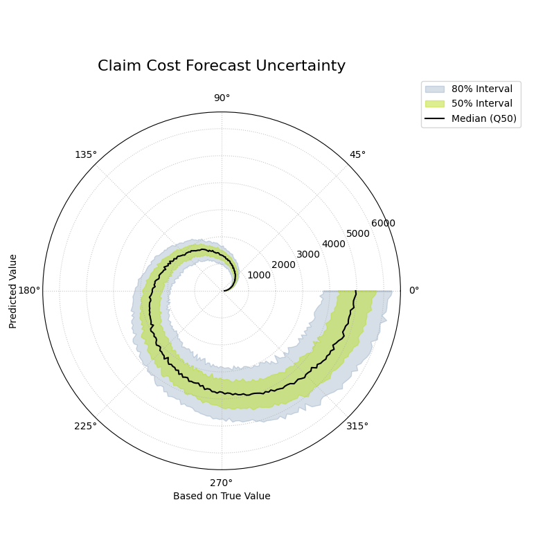
A polar plot where the angle represents the true value and the radius shows the predicted distribution, revealing how uncertainty changes with the outcome.
This plot provides an intuitive visualization of the model’s situational confidence. By observing the width of the shaded bands as they spiral outwards, we can assess if the model is correctly adjusting its uncertainty estimates.
- Quick Interpretation:
This plot provides a clear visualization of the model’s conditional uncertainty. The most critical insight is that the width of the shaded prediction intervals is not constant. The 50% (yellow-green) and 80% (light blue) intervals are very narrow for low-cost claims (near the center) and become progressively wider as the true claim cost increases (spiraling outwards). This demonstrates that the model has successfully learned to be heteroscedastic, correctly producing wider, less certain predictions for large, volatile claims and sharper, more confident predictions for smaller ones.
Diagnosing this kind of conditional behavior is key to building sophisticated and trustworthy forecasting models. To explore this example in more detail, please visit the gallery.
Example: See the gallery example and code: Conditional Quantile Bands.
Error vs. True Value Relationship (plot_error_relationship())
Purpose This function creates a Polar Error vs. True Value Plot, a powerful diagnostic tool for understanding if a model’s errors are correlated with the magnitude of the actual outcome. The angle is proportional to the true value, and the radius represents the forecast error. It is designed to reveal conditional biases and heteroscedasticity.
Mathematical Concept: This plot is a novel visualization developed as part of the analytics framework in [4]. It helps diagnose if the model’s error is independent of the true value, a key assumption in many statistical models.
Error (Residual) Calculation: For each observation \(i\), the error is the difference between the true and predicted value.
(5)¶\[e_i = y_{true,i} - y_{pred,i}\]Angular Mapping: The angle \(\theta_i\) is made proportional to the true value \(y_{true,i}\), after sorting, to create a continuous spiral.
(6)¶\[\theta_i \propto y_{true,i}^{\text{(sorted)}}\]Radial Mapping: The radius \(r_i\) represents the error \(e_i\). To handle negative error values on a polar plot, an offset is added to all radii so that the zero-error line becomes a reference circle.
Interpretation: The plot reveals how the error distribution changes as the true value increases.
Conditional Bias: A well-behaved model should have its error points scattered symmetrically around the “Zero Error” circle at all angles. If the center of the point cloud consistently drifts away from this circle at certain angles, it reveals a conditional bias (e.g., the model only under-predicts high values).
Heteroscedasticity: The vertical spread of the points (the width of the spiral) shows the error variance. If this spread changes as the angle increases, it indicates heteroscedasticity (i.e., the model is more or less certain for different true values).
Use Cases:
To check the fundamental assumption in many models that errors are independent of the true value.
To diagnose if a model has a conditional bias (e.g., it only performs poorly for high or low values).
To visually inspect for heteroscedasticity, where the variance of the error changes across the range of true values.
A fundamental assumption of many regression models is that the errors are independent of the value being predicted. A model is not truly reliable if it only performs well on a subset of the data. This plot is a crucial diagnostic for testing that assumption by visualizing the relationship between the forecast error and the true, observed value.
Practical Example
A real estate agency uses a machine learning model to predict house prices. For the model to be fair and useful, it must be accurate across the entire price range, from starter homes to luxury estates. A common failure mode is for models to systematically under-predict the prices of very expensive homes.
This plot maps the true house price to the angle and the prediction error to the radius. It will immediately reveal if the model’s errors are correlated with the actual value of the property.
>>> import numpy as np
>>> import kdiagram as kd
>>>
>>> # --- 1. Simulate a model with a conditional bias ---
>>> np.random.seed(0)
>>> n_points = 200
>>> # True house prices (skewed distribution)
>>> y_true = np.random.lognormal(mean=12.5, sigma=0.5, size=n_points)
>>> # Simulate a model that under-predicts expensive houses
>>> error = np.random.normal(0, 50000, n_points) - (y_true * 0.1)
>>> y_pred = y_true + error
>>>
>>> # --- 2. Generate the plot ---
>>> ax = kd.plot_error_relationship(
...     y_true,
...     y_pred,
...     title='Error vs. True House Price'
... )
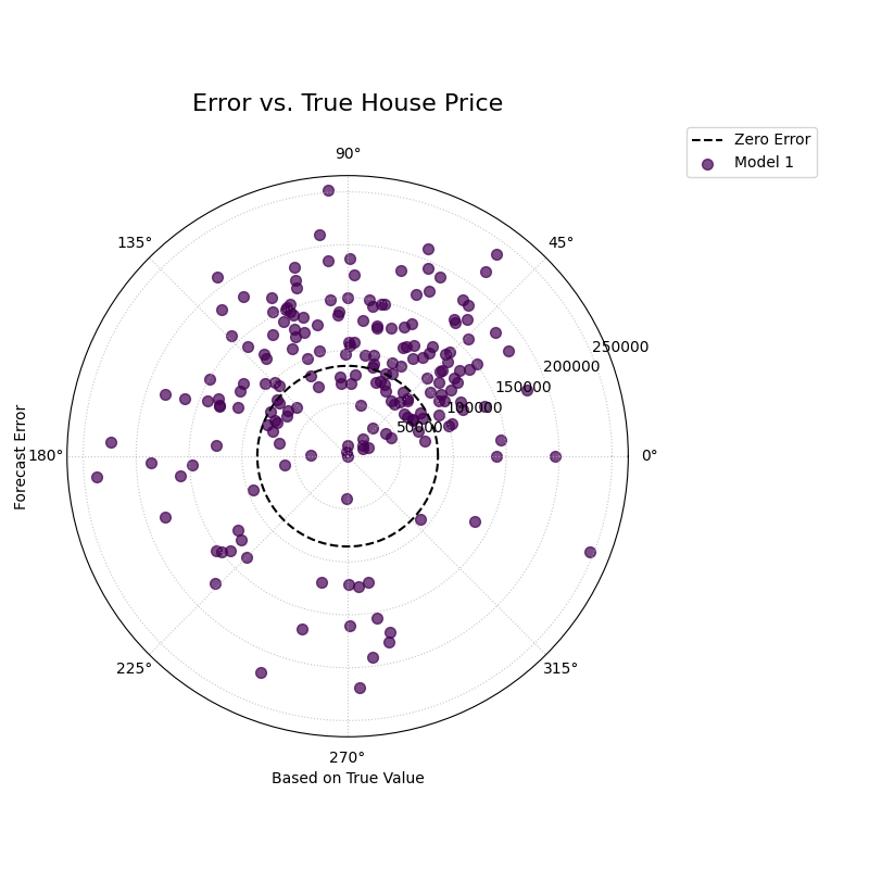
A polar scatter plot where the angle represents the true house price and the radius represents the prediction error, used to diagnose conditional bias.
This plot creates a spiral of error points. In a well-behaved model, this spiral should be centered on the “Zero Error” circle at all angles. Let’s see if our model exhibits any problematic drifts.
- Quick Interpretation:
In this diagnostic plot, a well-behaved model should have its error points scattered randomly and symmetrically around the dashed “Zero Error” circle across all angles. The visualization confirms this ideal behavior. The points are spread evenly around the reference circle throughout the entire range of true house prices. This provides strong evidence that the model does not suffer from conditional bias, meaning its accuracy is consistent regardless of whether it is predicting a low-price or high-price property.
Diagnosing conditional biases is a critical step toward building fair and robust regression models. To see the full implementation of this diagnostic check, please visit the gallery.
Example: See the gallery example and code: Error vs. True Value Relationship.
Residual vs. Predicted Relationship (plot_residual_relationship())
Purpose: This function creates a Polar Residual vs. Predicted Plot, a fundamental diagnostic for assessing model performance. The angle is proportional to the predicted value, and the radius represents the forecast error (residual). It is a powerful tool for identifying if a model’s errors are correlated with its own predictions, which can reveal issues like heteroscedasticity.
Key Distinction: Error vs. Residual Plots
This plot is a companion to
plot_error_relationship().
The key difference is the variable mapped to the angle:
Error vs. True Value Plot: Angle is based on
y_true. It answers: “Are my errors related to the actual outcome?”Residual vs. Predicted Plot: Angle is based on
y_pred. It answers: “Are my errors related to what my model is predicting?”
Both are crucial for a complete diagnosis.
Mathematical Concep:t This plot is a novel visualization developed as part of the analytics framework in [4].
Error (Residual) Calculation: For each observation \(i\), the error is the difference between the true and predicted value.
(7)¶\[e_i = y_{true,i} - y_{pred,i}\]Angular Mapping: The angle \(\theta_i\) is made proportional to the predicted value \(y_{pred,i}\), after sorting, to create a continuous spiral.
(8)¶\[\theta_i \propto y_{pred,i}^{\text{(sorted)}}\]Radial Mapping: The radius \(r_i\) represents the error \(e_i\). An offset is added to handle negative values, making the “Zero Error” line a reference circle.
Interpretation: The plot reveals how the error distribution changes as the model’s own prediction magnitude increases.
Heteroscedasticity: A well-behaved model should have a random scatter of points with a constant vertical spread (width of the spiral). If the spread of points forms a cone or fan shape, getting wider as the angle increases, it is a clear sign of heteroscedasticity. This means the model’s error variance grows as its predictions get larger.
Conditional Bias: If the center of the point cloud consistently drifts away from the “Zero Error” circle at certain angles, it reveals a bias dependent on the prediction’s magnitude (e.g., the model is only biased when it predicts high values).
Use Cases:
To check the assumption that the variance of the model’s errors is constant across the range of its predictions.
To diagnose if a model is becoming more or less confident in itself as its predictions change.
To identify non-linear patterns in the residuals that might suggest a missing feature or an incorrect model specification.
After checking for errors against the true value, a complementary and equally critical diagnostic is to plot the residuals against the predicted value. This is the classic test for heteroscedasticity, which answers the question: “Does my model’s error variance change as its predictions get larger?” A good model should have consistent error variance across its entire range of predictions.
Practical Example
Let’s continue with our house price prediction model. The real estate agency now wants to check if the model’s confidence is constant. Is it equally certain when predicting a \$200k house as it is when predicting a \$2M house? If the model’s errors become much larger for higher-priced predictions, its reliability is questionable.
This plot maps the predicted price to the angle and the error to the radius. A “fanning out” or cone shape in the points is a tell-tale sign of heteroscedasticity.
>>> import numpy as np
>>> import kdiagram as kd
>>>
>>> # --- 1. Simulate a model with heteroscedastic errors ---
>>> np.random.seed(42)
>>> n_points = 200
>>> # True house prices
>>> y_true_base = np.linspace(200000, 2000000, n_points)
>>> # Error magnitude is proportional to the price
>>> heteroscedastic_noise = np.random.normal(0, y_true_base * 0.1)
>>> y_true = y_true_base + np.random.normal(0, 50000)
>>> y_pred = y_true_base + heteroscedastic_noise
>>>
>>> # --- 2. Generate the plot ---
>>> ax = kd.plot_residual_relationship(
...     y_true,
...     y_pred,
...     title='Residual vs. Predicted House Price'
... )
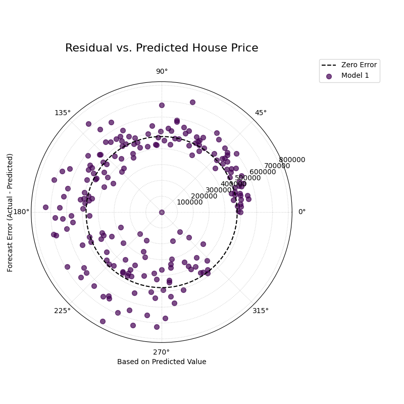
A polar scatter plot where the angle represents the predicted house price and the radius represents the prediction error, used to diagnose heteroscedasticity.
This plot should show a random scatter of points centered on the “Zero Error” circle. Any systematic patterns, such as a change in the spread of the points, indicate a problem with the model.
- Quick Interpretation:
This plot reveals a crucial characteristic of the model’s error structure. While the errors are centered on the “Zero Error” line, their spread is not constant. The points are tightly clustered for low predicted values (small angles) but fan out significantly as the predicted house price increases (larger angles). This distinct cone shape is the classic signature of heteroscedasticity. It indicates that the model’s error variance grows with the magnitude of its predictions; in other words, the model is much less certain and makes larger errors when it predicts high property values.
Checking for heteroscedasticity is fundamental to regression diagnostics. To explore this example in more detail, please visit the gallery.
Example: See the gallery example and code: Residual vs. Predicted Relationship.
References