Evaluating Probabilistic Forecasts
While prediction intervals provide a crucial view of uncertainty, a full probabilistic forecast offers a more complete picture by assigning a probability to all possible future outcomes. Evaluating these predictive distributions requires moving beyond simple interval checks to assess two fundamental and often competing qualities: calibration and sharpness [1].
Calibration (or reliability) refers to the statistical consistency between the probabilistic forecasts and the observed outcomes. A well-calibrated forecast is “honest” about its own uncertainty.
Sharpness refers to the concentration of the predictive distribution. A sharp forecast provides narrow, highly specific prediction intervals.
An ideal forecast is one that is both perfectly calibrated and maximally
sharp. The kdiagram.plot.probabilistic module provides a suite of
specialized polar plots to diagnose these two key properties.
From Theory to Practice: A Real-World Case Study
The visualization methods described in this guide were developed to solve practical challenges in interpreting complex, high-dimensional forecasts. For a detailed case study demonstrating how these plots are used to analyze the spatiotemporal uncertainty of a deep learning model for land subsidence forecasting, please refer to our research paper [2].
Summary of Probabilistic Diagnostic Functions
Function |
Description |
|---|---|
Assesses forecast calibration using a Polar Probability Integral Transform (PIT) histogram. |
|
Compares the sharpness (average interval width) of one or more models. |
|
Provides an overall performance score using the Continuous Ranked Probability Score (CRPS). |
|
Visualizes the direct trade-off between calibration and sharpness for multiple models. |
|
Visualizes how the forecast’s median and credibility bands change as a function of another feature. |
PIT Histogram (plot_pit_histogram())
Purpose: Creates a Polar Probability Integral Transform (PIT) histogram, a primary diagnostic for assessing the calibration (reliability) of a probabilistic forecast. It answers: Are the predicted probability distributions statistically consistent with the observed outcomes?
Mathematical Concept The Probability Integral Transform (PIT) is foundational in forecast verification [1]. For a continuous predictive distribution with CDF \(F\), the PIT value for an observation \(y\) is \(F(y)\). If forecasts are perfectly calibrated, PIT values across observations are i.i.d. uniform on \([0,1]\).
When only a finite set of \(M\) quantiles is available (common in ML workflows), the PIT for observation \(y_i\) can be approximated by the fraction of forecast quantiles less than or equal to \(y_i\):
where \(q_{i,j}\) is the \(j\)-th quantile forecast for observation \(i\), and \(\mathbf{1}\) is the indicator function. The histogram is then formed from the set of \(\mathrm{PIT}_i\) values.
Interpretation:
In the polar plot, PIT bins map to the angle; frequencies map to the radius.
Perfect calibration: A uniform PIT histogram. In polar form, bars lie on a perfect circle, matching the dashed “Uniform” reference.
Over-confidence (too narrow intervals): U-shaped histogram: large counts near 0 and 1, few in the middle.
Under-confidence (too wide intervals): Hump-shaped histogram: excess mass near the center.
Systemic bias: Sloped or skewed histogram indicating forecasts are consistently too high or too low.
Use Cases:
Visual assessment of probabilistic calibration.
Diagnose overconfidence, underconfidence, or bias.
Compare calibration across models before evaluating sharpness.
The first and most fundamental test of any probabilistic forecast is to assess its calibration. A forecast is considered calibrated if its predicted probability distributions are statistically consistent with the observed outcomes. In essence, it’s a test of the model’s statistical “honesty.” The Probability Integral Transform (PIT) histogram is the primary diagnostic tool for this task. Let’s go for a practical example for a better understanding.
Practical Example
Let say a energy company relies on a model to produce probabilistic forecasts of the power output from a wind farm. Before using these forecasts for operational planning, they must verify that the model is well-calibrated. If the forecast intervals are consistently too narrow (over-confident) or too wide (under-confident), any decisions based on them could be costly.
The polar PIT histogram will give us an immediate visual diagnosis of the forecast’s calibration by comparing the distribution of PIT values to a perfect uniform circle.
>>> import numpy as np
>>> import kdiagram as kd
>>>
>>> # --- 1. Simulate a probabilistic wind power forecast ---
>>> np.random.seed(0)
>>> # True power output often follows a skewed distribution
>>> y_true = np.random.weibull(a=2., size=1000) * 50
>>> quantiles = np.linspace(0.05, 0.95, 19)
>>> # Simulate an OVER-CONFIDENT model (predictive intervals are too narrow)
>>> noise = np.random.normal(0, 5, (1000, 500)) # Underestimate the real noise
>>> y_preds_quantiles = np.quantile(
...     y_true[:, np.newaxis] + noise, q=quantiles, axis=1
... ).T
>>>
>>> # --- 2. Generate the plot ---
>>> ax = kd.plot_pit_histogram(
...     y_true,
...     y_preds_quantiles,
...     quantiles=quantiles,
...     title='Calibration Check for Wind Power Forecast'
... )
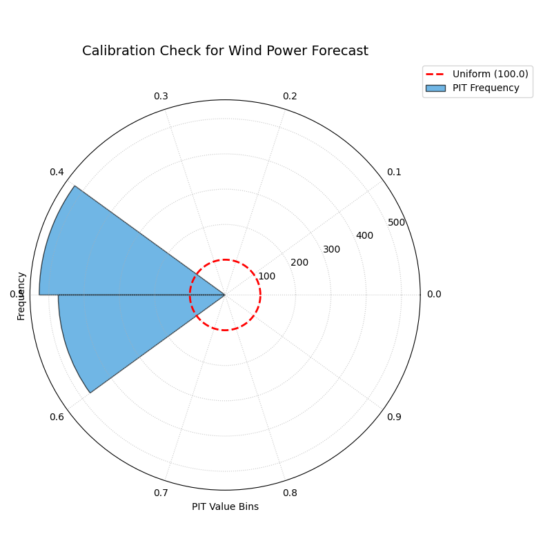
A polar PIT histogram used to diagnose the calibration of a probabilistic wind power forecast. Deviations from the dashed uniform circle indicate miscalibration.
This plot provides an instant diagnosis of the forecast’s statistical reliability. The shape of the histogram will tell us if the model is over-confident, under-confident, or biased.
- Quick Interpretation:
For a perfectly calibrated forecast, the blue histogram bars should form a complete circle matching the dashed red “Uniform” reference line. This plot, however, shows a distinct U-shape, with high frequencies concentrated at the extreme low and high ends of the PIT value range and a significant dip in the middle. This is the classic signature of an over-confident forecast, indicating that the model’s prediction intervals are systematically too narrow and that the true outcomes fall outside of the predicted range more often than expected.
Diagnosing miscalibration is the essential first step in evaluating a probabilistic model. To see the full implementation and explore other common patterns, please visit the gallery.
Example: See the gallery example and code at PIT Histogram (Calibration).
Polar Sharpness Diagram (plot_polar_sharpness())
Purpose This function creates a Polar Sharpness Diagram to visually compare the sharpness (or precision) of one or more probabilistic forecasts. While calibration assesses a forecast’s reliability, sharpness measures the concentration of its predictive distribution. An ideal forecast is not only calibrated but also as sharp as possible. This plot directly answers the question: “Which model provides the most precise (narrowest) forecast intervals?”
Mathematical Concept Sharpness is a property of the forecast alone and does not depend on the observed outcomes [1]. It is typically quantified by the average width of the prediction intervals.
Interval Width: For each model and each observation \(i\), the width of the central prediction interval is calculated using the lowest (\(q_{min}\)) and highest (\(q_{max}\)) provided quantiles.
(2)¶\[w_i = y_{i, q_{max}} - y_{i, q_{min}}\]Sharpness Score: The sharpness score \(S\) for each model is the average of these interval widths over all \(N\) observations. This score is used as the radial coordinate in the polar plot. A lower score is better, indicating a sharper, more concentrated forecast.
(3)¶\[S = \frac{1}{N} \sum_{i=1}^{N} w_i\]
Interpretation The plot assigns each model its own angular sector for clear separation, with the radial distance from the center representing its sharpness.
Radius: The distance from the center directly corresponds to the average prediction interval width. Points closer to the center represent sharper, more desirable forecasts.
Comparison: The plot allows for an immediate visual comparison of the relative sharpness of different models.
Use Cases:
To directly compare the precision (average interval width) of multiple forecasting models.
To use in conjunction with a calibration plot (like the PIT Histogram) to understand the crucial trade-off between a model’s reliability and its sharpness. A model might be very sharp but poorly calibrated, or vice-versa.
To select a model that provides the best balance of sharpness and calibration for a specific application.
Once a forecast is deemed well-calibrated, the next crucial property to evaluate is its sharpness. A calibrated forecast that is too wide (e.g., “wind power will be between 0 and 100 MW”) is reliable but not very useful. Sharpness measures the concentration of the predictive distribution, rewarding forecasts that are more precise.
Practical Example
Continuing with our wind power scenario, the energy company has two competing probabilistic models, “Model A” and “Model B”. Initial checks have shown that both are reasonably well-calibrated. The company now needs to determine which model provides a more precise and therefore more economically valuable forecast.
The polar sharpness diagram will provide a direct visual comparison of the models’ average prediction interval widths. The model closer to the center of the plot is the sharper, more decisive one.
>>> import numpy as np
>>> import kdiagram as kd
>>>
>>> # --- 1. Simulate two calibrated forecasts with different sharpness ---
>>> np.random.seed(42)
>>> quantiles = np.linspace(0.05, 0.95, 19)
>>> y_true = np.random.weibull(a=2., size=1000) * 50
>>> # Model A: A reasonably sharp forecast
>>> noise_A = np.random.normal(0, 15, (1000, 500))
>>> y_preds_A = np.quantile(
...     y_true[:, np.newaxis] + noise_A, q=quantiles, axis=1
... ).T
>>> # Model B: A sharper (more precise) forecast
>>> noise_B = np.random.normal(0, 10, (1000, 500))
>>> y_preds_B = np.quantile(
...     y_true[:, np.newaxis] + noise_B, q=quantiles, axis=1
... ).T
>>>
>>> # --- 2. Generate the plot ---
>>> ax = kd.plot_polar_sharpness(
...     y_preds_A,
...     y_preds_B,
...     quantiles=quantiles,
...     names=['Model A', 'Model B (Sharper)'],
...     title='Sharpness Comparison for Wind Power Models'
... )
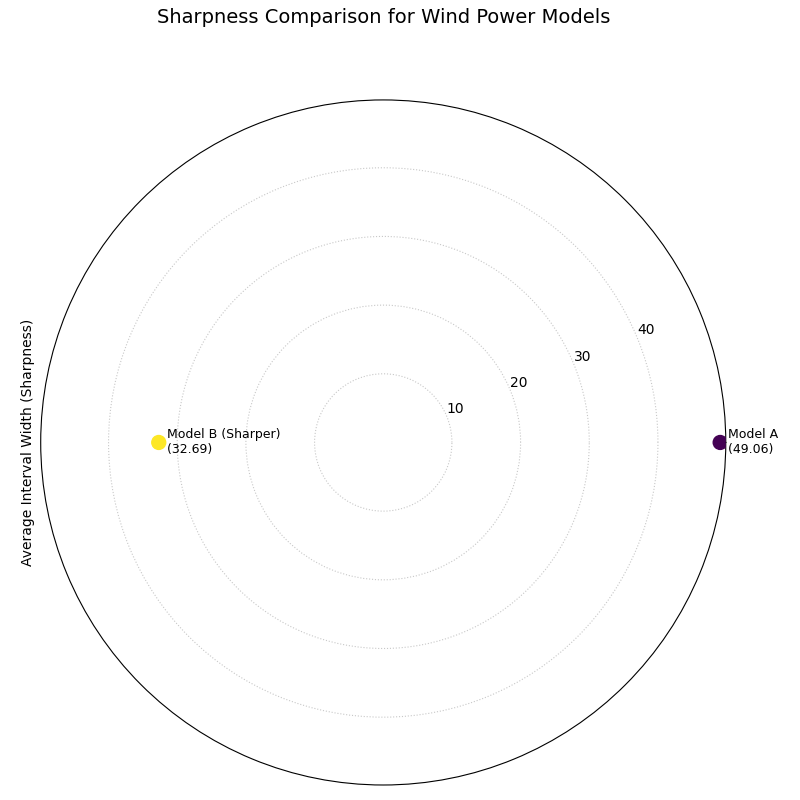
A polar plot where the radial distance from the center represents the average prediction interval width for two competing models.
This plot provides a clear and simple answer to the question of which model is more precise. The point closer to the center of the plot represents the sharper, and therefore more desirable, forecast.
- Quick Interpretation:
The plot provides a direct comparison of the models’ precision, where points closer to the center represent sharper and more desirable forecasts. The visualization clearly shows that “Model B” is demonstrably sharper than “Model A”. This is confirmed by their respective average interval widths, with Model B’s forecast being significantly more concentrated (a width of 32.69) compared to Model A’s (49.06). Based solely on sharpness, Model B provides a more decisive and economically useful forecast.
An ideal forecast is both calibrated and sharp. To learn more about this crucial trade-off and see the full code, explore the example in our gallery.
Example See the gallery example and code: Polar Sharpness Diagram.
CRPS Comparison (plot_crps_comparison())
Purpose: This function creates a Polar CRPS Comparison Diagram to provide a high-level summary of a model’s overall probabilistic skill. It uses the Continuous Ranked Probability Score (CRPS), a proper scoring rule that assesses both calibration and sharpness simultaneously. This plot answers the question: “Which model performs best overall when considering both reliability and precision?”
Mathematical Concept: The Continuous Ranked Probability Score (CRPS) is a widely used metric for evaluating probabilistic forecasts that generalizes the Mean Absolute Error [1]. For a single observation \(y\) and a predictive CDF \(F\), it is defined as:
where \(\mathbf{1}\) is the Heaviside step function. A lower CRPS value indicates a better forecast.
When the forecast is given as a set of \(M\) quantiles \(\{q_1, ..., q_M\}\), the CRPS can be approximated by averaging the pinball loss \(\mathcal{L}_{\tau}\) over the quantile levels \(\tau \in \{ \tau_1, ..., \tau_M \}\). The pinball loss for a single quantile forecast \(q\) at level \(\tau\) is:
This function calculates the average CRPS over all observations for each model and plots this final score as the radial coordinate.
Interpretation: The plot assigns each model its own angular sector, with the radial distance from the center representing its overall performance.
Radius: The distance from the center directly corresponds to the average CRPS. Points closer to the center represent better-performing models.
Comparison: The plot provides an immediate visual summary of the relative performance of different models. It is a “bottom-line” metric but does not explain why one model is better (i.e., whether due to superior calibration or superior sharpness).
Use Cases
To get a quick, high-level summary of which model performs best overall when considering both calibration and sharpness.
To use as a final comparison plot after using the PIT histogram and sharpness diagram to understand the components of the CRPS score.
For model selection when a single, proper scoring rule is the primary decision criterion.
After assessing calibration and sharpness separately, it is often useful to have a single, overall score that summarizes a probabilistic forecast’s quality. The Continuous Ranked Probability Score (CRPS) is the industry standard for this, as it simultaneously rewards both calibration and sharpness. A lower CRPS indicates a better overall forecast.
Practical Example
To conclude our wind power model evaluation, the energy company needs to make a final decision between “Model A” and “Model B”. They have analyzed the models’ calibration and sharpness, but now they need a definitive “bottom-line” metric to formally select the winner for deployment.
The polar CRPS comparison plot provides this final verdict. It computes the average CRPS for each model and plots the scores, allowing for a quick, high-level summary of which model performs best overall.
>>> import numpy as np
>>> import kdiagram as kd
>>>
>>> # --- 1. Use the same data from the sharpness example ---
>>> np.random.seed(42)
>>> quantiles = np.linspace(0.05, 0.95, 19)
>>> y_true = np.random.weibull(a=2., size=1000) * 50
>>> noise_A = np.random.normal(0, 15, (1000, 500)) # Model A
>>> y_preds_A = np.quantile(
...     y_true[:, np.newaxis] + noise_A, q=quantiles, axis=1
... ).T
>>> noise_B = np.random.normal(0, 10, (1000, 500)) # Model B
>>> y_preds_B = np.quantile(
...     y_true[:, np.newaxis] + noise_B, q=quantiles, axis=1
... ).T
>>>
>>> # --- 2. Generate the plot ---
>>> ax = kd.plot_crps_comparison(
...     y_true,
...     y_preds_A,
...     y_preds_B,
...     quantiles=quantiles,
...     names=['Model A', 'Model B'],
...     title='Overall Performance (CRPS) for Wind Power Models'
... )
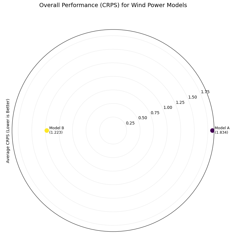
A polar plot where the radial distance from the center represents the overall CRPS score (lower is better) for two competing models.
This plot provides the final verdict in our evaluation workflow. The model with the score closer to the center is the overall winner, achieving the best combined performance in both reliability and precision.
- Quick Interpretation:
This plot gives a final verdict on overall performance, as the CRPS score rewards both calibration and sharpness, with lower scores being better. The chart clearly indicates that “Model B” is the superior model overall. Its position is substantially closer to the center, which is quantitatively supported by its much lower average CRPS of 1.223 compared to Model A’s score of 1.834. This demonstrates that Model B achieves the best combined balance of reliability and precision.
The CRPS is a powerful metric for summarizing forecast quality. To see the full implementation and learn more about its components, please refer to the gallery example.
Example See the gallery example and code here: CRPS Comparison (Overall Score).
Calibration-Sharpness Diagram (plot_calibration_sharpness())
Purpose: This function creates a Polar Calibration-Sharpness Diagram, a powerful summary visualization that plots the fundamental trade-off between a forecast’s calibration (reliability) and its sharpness (precision). Each model is represented by a single point, allowing for an immediate and intuitive comparison of overall probabilistic performance. The ideal forecast is located at the center of the plot.
Mathematical Concept: This plot synthesizes two key aspects of a probabilistic forecast into a single point for each model. It is a novel visualization developed as part of the analytics framework [2].
Sharpness (Radius): The radial coordinate represents the forecast’s sharpness, calculated as the average width of the prediction interval between the lowest and highest provided quantiles. A smaller radius is better (sharper).
(6)¶\[S = \frac{1}{N} \sum_{i=1}^{N} (y_{i, q_{max}} - y_{i, q_{min}})\]Calibration Error (Angle): The angular coordinate represents the forecast’s calibration error. This is quantified by first calculating the Probability Integral Transform (PIT) values for each observation. The Kolmogorov-Smirnov (KS) statistic is then used to measure the maximum distance between the empirical CDF of these PIT values and the CDF of a perfect uniform distribution.
(7)¶\[E_{calib} = \sup_{x} | F_{PIT}(x) - U(x) |\]An error of 0 indicates perfect calibration. The angle is mapped such that \(\theta = E_{calib} \cdot \frac{\pi}{2}\), so 0° is perfect and 90° is the worst possible calibration.
Interpretation: The plot provides a high-level summary of probabilistic forecast quality, with the ideal model located at the center (origin).
Radius (Sharpness): The distance from the center. Models closer to the center are sharper (more precise).
Angle (Calibration Error): The angle from the 0° axis. Models with a smaller angle are better calibrated.
Overall Performance: The best model is the one closest to the origin, as it represents the optimal balance of both low calibration error and high sharpness.
Use Cases:
To quickly compare the overall quality of multiple probabilistic models in a single, decision-oriented view.
To visualize the trade-off between a model’s reliability and its precision. For example, one model might be very sharp but poorly calibrated, while another is well-calibrated but not very sharp.
For model selection when a balanced performance between calibration and sharpness is the primary goal.
We have seen how to evaluate a forecast’s calibration (reliability) and its sharpness (precision) as separate concepts. This final visualization brings them together. The calibration-sharpness diagram distills the entire probabilistic performance of a model into a single point, allowing for an immediate and decisive comparison of the crucial trade-off between these two competing qualities.
Practical Example
Let’s summarize our wind power forecasting evaluation. The energy company has three candidate models: Model A (Under-Confident): Known to be well-calibrated but produces very wide, imprecise forecast intervals. Model B (Over-Confident): Produces very sharp, narrow intervals but is poorly calibrated. Model C (Balanced): A newer model that aims to provide a good compromise between reliability and precision.
The calibration-sharpness diagram will plot each model as a single point. The goal is to find the model closest to the center of the plot, as this represents the optimal balance of perfect calibration (zero angle) and perfect sharpness (zero radius).
>>> import numpy as np
>>> import kdiagram as kd
>>>
>>> # --- 1. Simulate three models with different trade-offs ---
>>> np.random.seed(42)
>>> y_true = np.random.weibull(a=2., size=1000) * 50
>>> quantiles = np.linspace(0.05, 0.95, 19)
>>> # Model A (Under-Confident -> wide intervals)
>>> noise_A = np.random.normal(0, 25, (1000, 500))
>>> y_preds_A = np.quantile(
...     y_true[:, np.newaxis] + noise_A, q=quantiles, axis=1
... ).T
>>> # Model B (Over-Confident -> narrow intervals)
>>> noise_B = np.random.normal(0, 5, (1000, 500))
>>> y_preds_B = np.quantile(
...     y_true[:, np.newaxis] + noise_B, q=quantiles, axis=1
... ).T
>>> # Model C (Balanced)
>>> noise_C = np.random.normal(0, 15, (1000, 500))
>>> y_preds_C = np.quantile(
...     y_true[:, np.newaxis] + noise_C, q=quantiles, axis=1
... ).T
>>>
>>> # --- 2. Generate the plot ---
>>> ax = kd.plot_calibration_sharpness(
...     y_true,
...     y_preds_A,
...     y_preds_B,
...     y_preds_C,
...     quantiles=quantiles,
...     names=['A (Under-Confident)', 'B (Over-Confident)', 'C (Balanced)'],
...     title='Model Selection: Calibration vs. Sharpness'
... )
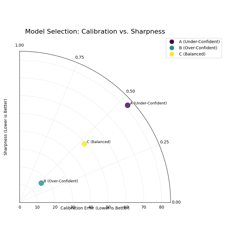
A polar plot where each point represents a model. The angle shows calibration error, and the radius shows sharpness. The ideal model is at the center (0,0).
This plot provides the ultimate summary for probabilistic model selection. A single glance reveals which model achieves the best compromise between being right and being useful.
- Quick Interpretation:
This plot provides a powerful summary for model selection, where the ideal model is closest to the center (the origin). The plot visualizes a classic trade-off: Model A is well-calibrated (small angle) but not very sharp (large radius), a sign of under-confidence. In contrast, Model B is very sharp (small radius) but less well-calibrated (larger angle), which is characteristic of over-confidence. Model C (Balanced) emerges as the clear winner, as its position closest to the origin demonstrates that it achieves the best overall compromise between statistical reliability and predictive precision.
This decision-oriented plot is the ideal final step in a thorough probabilistic forecast evaluation. To see the full implementation, please visit the gallery example.
See the gallery example and code: Calibration-Sharpness Diagram.
Polar Credibility Bands (plot_credibility_bands())
Purpose: This function creates a Polar Credibility Bands plot to visualize the structure of a model’s forecast distribution as a function of another variable. It is a descriptive tool that answers the question: “How do my model’s median prediction and its uncertainty (interval width) change depending on a specific feature?”
Mathematical Concept: This plot visualizes the conditional expectation of the forecast quantiles. It is a novel visualization developed as part of the analytics framework in [2].
Binning: The data is first partitioned into \(K\) bins, \(B_k\), based on the values in
theta_col.Conditional Means: For each bin \(B_k\), the mean of the lower quantile (\(\bar{q}_{low,k}\)), median quantile (\(\bar{q}_{med,k}\)), and upper quantile (\(\bar{q}_{up,k}\)) are calculated.
(8)¶\[\bar{q}_{j,k} = \frac{1}{|B_k|} \sum_{i \in B_k} q_{j,i}\]where \(j \in \{\text{low, med, up}\}\).
Visualization: The plot displays:
A central line representing the mean median forecast (\(\bar{q}_{med,k}\)).
A shaded band between the mean lower and upper bounds (\(\bar{q}_{low,k}\) and \(\bar{q}_{up,k}\)). The width of this band represents the average forecast sharpness for that bin.
Interpretation: The plot reveals how the forecast distribution’s center and spread are related to the feature on the angular axis.
Central Line (Mean Median): The position of this line shows the average central tendency of the forecast for each bin. Trends in this line reveal if the model’s predictions are correlated with the binned feature.
Shaded Band (Credibility Band): The width of this band visualizes the average forecast sharpness. If the band’s width changes at different angles, it is a clear sign of heteroscedasticity—meaning the model’s uncertainty is not constant but depends on the binned feature.
Use Cases:
To diagnose if a model’s uncertainty changes predictably with another feature (e.g., time, or the magnitude of the forecast itself).
To visually inspect the conditional mean of a forecast.
To communicate how the forecast distribution is expected to behave under different conditions.
Beyond checking for overall calibration, a deeper analysis involves understanding if a model’s uncertainty is itself predictable. Does the forecast’s precision change depending on other factors? This is the question of heteroscedasticity, and the credibility bands plot is designed to diagnose this exact behavior.
Practical Example
Consider a retail business forecasting its daily sales. The sales patterns, and therefore the forecast uncertainty, are likely not the same every day. For instance, sales might be much more volatile and harder to predict on a busy Saturday than on a quiet Tuesday.
This plot allows us to visualize how the model’s median forecast and its uncertainty (the width of its credibility band) change for each day of the week, helping us to trust and understand the forecast’s situational performance.
>>> import numpy as np
>>> import pandas as pd
>>> import kdiagram as kd
>>>
>>> # --- 1. Simulate forecasts with day-of-week dependent uncertainty ---
>>> np.random.seed(1)
>>> n_points = 700
>>> day_of_week = np.arange(n_points) % 7 # 0=Mon, ..., 6=Sun
>>> # Sales are higher and more volatile on weekends
>>> weekday_effect = np.array([100, 100, 110, 120, 180, 250, 200])
>>> volatility = np.array([10, 10, 15, 15, 30, 40, 35])
>>>
>>> median_forecast = weekday_effect[day_of_week] + np.random.randn(n_points) * 5
>>> interval_width = volatility[day_of_week]
>>>
>>> df = pd.DataFrame({
...     'day_of_week': day_of_week,
...     'q50_sales': median_forecast,
...     'q10_sales': median_forecast - interval_width,
...     'q90_sales': median_forecast + interval_width
... })
>>>
>>> # --- 2. Generate the plot ---
>>> ax = plot_credibility_bands(
...    df,
...    q_cols=('q10_sales','q50_sales','q90_sales'),
...    theta_col='day_of_week',
...    theta_period=7,
...    theta_bins=7,
...    theta_ticklabels=['Mon','Tue','Wed','Thu','Fri','Sat','Sun'],
...    zero_at='E',        # put Monday at 0° on the right (optional)
...    clockwise=True,     # or False, depending on preference
...    title='Daily Sales Forecast Uncertainty by Day of Week',
... )
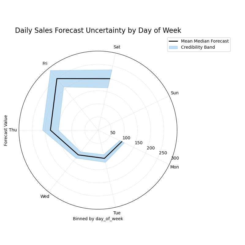
A polar plot where each angular sector represents a day of the week, visualizing how the median forecast and its 80% credibility band change.
This plot reveals how the center and spread of the forecast distribution relate to the day of the week. Let’s examine the trends in the central line and the width of the shaded band.
- Quick Interpretation:
This plot reveals how the forecast’s central tendency and uncertainty change throughout the week. The “Mean Median Forecast” (black line) varies in radius, showing that the model correctly predicts higher sales on some days versus others. More importantly, the width of the blue credibility band is not uniform. It is noticeably wider for the days on the left and bottom of the plot, indicating that the model’s forecast is much less certain and more volatile on these days (likely corresponding to weekends), a clear sign of heteroscedasticity.
Diagnosing this kind of conditional behavior is key to building more sophisticated and trustworthy forecasting models. To explore this example in more detail, please visit the gallery.
Example: See the gallery example and code: Polar Credibility Bands.
References