Visualizing Forecast Errors
A crucial part of model evaluation is the direct analysis of its errors. While uncertainty visualizations focus on the predicted range, error visualizations focus on the discrepancy between the point forecast and the actual outcome (\(e = y_{true} - \hat{y}_{pred}\)). A thorough error analysis can reveal systemic biases, inconsistencies, and opportunities for model improvement.
The kdiagram.plot.errors module provides specialized polar plots
to diagnose and compare model errors in an intuitive, visual manner.
Summary of Error Visualization Functions
Function |
Description |
|---|---|
Visualizes mean error (bias) and error variance as a function of a cyclical or ordered feature. |
|
Compares the full error distributions of multiple models on a single polar plot. |
|
Displays two-dimensional uncertainty using error ellipses, ideal for spatial or positional errors. |
Detailed Explanations
Let’s explore these functions in detail.
Systemic vs. Random Error (plot_error_bands())
Purpose: This plot is designed to decompose a model’s error into two components: systemic error (bias) and random error (variance). It achieves this by aggregating errors across bins of an angular variable (like the month of the year or hour of the day) and displaying the mean and standard deviation of the errors in each bin [1].
Mathematical Concept:
The function first partitions the dataset into \(K\) bins,
\(B_k\), based on the theta_col values.
Mean Error (Bias): For each bin \(B_k\), the mean error \(\mu_{e,k}\) is calculated. This represents the average bias of the model under the conditions of that bin.
(1)¶\[\mu_{e,k} = \frac{1}{|B_k|} \sum_{i \in B_k} e_i\]where \(e_i\) is the error of sample \(i\). This is plotted as the central black line.
Error Variance: The standard deviation of the error, \(\sigma_{e,k}\), is calculated for each bin. This measures the consistency or random scatter of the errors.
(2)¶\[\sigma_{e,k} = \sqrt{\frac{1}{|B_k|-1} \sum_{i \in B_k} (e_i - \mu_{e,k})^2}\]Error Band: A shaded band is drawn around the mean error line, with its boundaries defined as:
(3)¶\[\text{Bounds}_k = \mu_{e,k} \pm n_{std} \cdot \sigma_{e,k}\]The width of this band is a direct visualization of the model’s random error.
Interpretation:
Mean Error Line (Bias): If this line deviates from the “Zero Error” reference circle, the model has a systemic bias in that angular region. An outward deviation means over-prediction on average; an inward deviation means under-prediction.
Shaded Band (Variance): A wide band indicates high variance, meaning the model’s predictions are inconsistent and unreliable in that region. A narrow band indicates consistent, low-variance errors.
Use Cases:
Diagnosing if a model’s bias is dependent on a cyclical feature like seasonality or time of day.
Identifying conditions under which a model’s performance becomes unstable or inconsistent.
Separating reducible systemic errors (bias) from irreducible random errors (variance) to guide model improvement efforts.
You’ve just seen the theory behind decomposing errors into bias and variance. Now, let’s put this powerful diagnostic tool to work. The following example simulates a common forecasting challenge where a model’s performance is not constant, illustrating where this plot truly shines.
Practical Example
An energy company uses a model to forecast electricity demand for the next day. They suspect the model’s accuracy changes depending on the time of day—performing well overnight but struggling during the peak demand hours of the late afternoon.
An error band plot is the perfect diagnostic tool for this. It can show the mean error (bias) and error variance (consistency) for each hour, wrapped around a 24-hour circle, to instantly reveal time-dependent patterns in the model’s performance.
>>> import numpy as np
>>> import pandas as pd
>>> import kdiagram as kd
>>>
>>> # --- 1. Simulate errors with a time-of-day pattern ---
>>> np.random.seed(42)
>>> n_points = 5000
>>> hour_of_day = np.random.randint(0, 24, n_points)
>>> # Create a bias (under-prediction) and more noise during peak hours (4-7 PM)
>>> peak_hours = (hour_of_day >= 16) & (hour_of_day <= 19)
>>> bias = np.where(peak_hours, -15, 2) # Negative error = under-prediction
>>> noise = np.where(peak_hours, 25, 10)
>>> errors = bias + np.random.normal(0, noise, n_points)
>>>
>>> df_hourly = pd.DataFrame({'hour': hour_of_day, 'demand_error': errors})
>>>
>>> # --- 2. Generate the plot ---
>>> ax = kd.plot_error_bands(
...     df=df_hourly,
...     error_col='demand_error',
...     theta_col='hour',
...     theta_period=24,
...     theta_bins=24,
...     n_std=1.5,
...     title='Forecast Error Analysis by Hour of Day'
... )
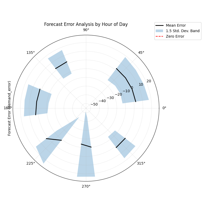
Polar error bands revealing how a forecast’s mean error (bias) and variance change depending on the hour of the day.
This visualization wraps the entire 24-hour error cycle into a single view. By examining the central line’s distance from the “Zero Error” circle and the width of the shaded band, we can pinpoint exactly when our forecast is least reliable.
- Quick Interpretation:
The plot immediately reveals that the model’s performance is not constant, but rather exhibits a strong time-dependent pattern. An analysis of the mean error (the black line) shows a systemic bias that shifts throughout the day; for instance, the model tends to under-predict in the early morning hours, while it consistently over-predicts in the afternoon. In addition to this changing bias, the model’s consistency also varies significantly. The width of the shaded variance band is much larger during the evening and night, indicating that the model’s predictions are highly inconsistent and unreliable during these periods.
This plot effectively diagnoses that the model has a time-dependent bias and is far less consistent at certain times of the day. To reproduce this diagnostic plot, explore the full example in the gallery.
Example: See the gallery Polar Error Bands for code and plot examples.
Comparing Error Distributions (plot_error_violins())
Purpose: This function provides a direct visual comparison of the full error distributions for multiple models on a single polar plot. It adapts the traditional violin plot (Hintze and Nelson[2]) to a polar coordinate system, to show the shape, bias, and variance of each model’s errors, making it an excellent tool for model selection.
Mathematical Concept: For each model’s error data, a Kernel Density Estimate (KDE) is computed to create a smooth representation of its probability density function, \(\hat{f}_h(x)\).
This density curve is then plotted symmetrically around a radial axis to form the “violin” shape. The width of the violin at any error value \(x\) is proportional to the probability density \(\hat{f}_h(x)\). Each model is assigned its own angular sector on the polar plot.
Interpretation:
Bias (Centering): The location of the widest part of the violin relative to the “Zero Error” circle reveals the model’s bias. A violin centered on the circle is unbiased. A violin shifted outward indicates a positive bias (over-prediction), while a shift inward indicates a negative bias (under-prediction).
Variance (Width/Height): A short, wide violin signifies a high-variance model with inconsistent errors. A tall, narrow violin signifies a low-variance model with consistent performance.
Shape: The shape of the violin reveals further details. An asymmetric shape indicates skewed errors. Multiple wide sections (bimodality) suggest the model makes two or more common types of errors.
Use Cases:
Directly comparing the overall performance of multiple candidate models.
Selecting a model based on a holistic view of its error profile (e.g., choosing a slightly biased but highly consistent model over an unbiased but inconsistent one).
Presenting a summary of comparative model performance to stakeholders.
Now that you understand the mathematical concept behind polar violins, let’s see them in action. This practical example will show you how to turn abstract error data from competing models into a clear, comparative visualization, making model selection much more intuitive.
Practical Example
Imagine a financial firm has built three different models (A, B, and C) to predict a client’s credit score. To choose the best one, they need to compare the entire distribution of prediction errors. A model that is unbiased on average but makes occasional huge errors could be very risky.
A polar violin plot allows for a direct, side-by-side comparison of the shape, bias, and variance of each model’s errors on a single, intuitive chart.
>>> import numpy as np
>>> import pandas as pd
>>> import kdiagram as kd
>>>
>>> # --- 1. Simulate errors from three different models ---
>>> np.random.seed(0)
>>> n_points = 1000
>>> df_errors = pd.DataFrame({
...     'Model A (Good)': np.random.normal(loc=0.5, scale=1.5, size=n_points),
...     'Model B (Biased)': np.random.normal(loc=-4.0, scale=1.5, size=n_points),
...     'Model C (Inconsistent)': np.random.normal(loc=0, scale=4.0, size=n_points),
... })
>>>
>>> # --- 2. Generate the plot ---
>>> ax = kd.plot_error_violins(
...     df_errors,
...     'Model A (Good)',
...     'Model B (Biased)',
...     'Model C (Inconsistent)',
...     title='Comparison of Credit Score Model Errors'
... )
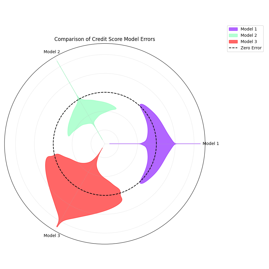
A polar violin plot comparing the error distributions of three competing models, revealing differences in their bias and variance.
The resulting plot arranges the error profile of each model into a clear, comparative layout. Let’s dissect these violin shapes to see which model is truly the most reliable.
- Quick Interpretation:
This plot provides a rich, comparative view of the three distinct error profiles. Model 2 (Green) clearly emerges as the best performer, as its violin is both tall, narrow, and centered on the “Zero Error” line, indicating an ideal combination of low bias and low variance. In contrast, Model 1 (Purple) presents a trade-off; while its narrow shape demonstrates high consistency (low variance), its outward shift reveals a systemic positive bias. Model 3 (Red) showcases the opposite problem. Although it appears unbiased on average with its center near zero, its extremely wide shape and long tail signify dangerously high variance, making it unreliable and prone to large, unpredictable errors.
This direct visual comparison makes model selection much clearer than relying on single-score metrics. To see the full implementation, please refer to the gallery example.
Example: See the gallery Polar Error Violins for code and plot examples.
Visualizing 2D Uncertainty (plot_error_ellipses())
Purpose: This function is designed for visualizing two-dimensional uncertainty, a concept explored in Kouadio[1], which is common in spatial or positional forecasting. It draws an ellipse for each data point, where the ellipse’s size and orientation represent the uncertainty in both the radial and angular directions.
Mathematical Concept: For each data point \(i\), we have a mean position \((\mu_{r,i}, \mu_{\theta,i})\) and the standard deviations of the errors in those directions, \(\sigma_{r,i}\) and \(\sigma_{\theta,i}\).
The ellipse is defined by its half-width (in the radial direction) and half-height (in the tangential direction):
The ellipse is then rotated by the angle \(\mu_{\theta,i}\) and translated to its mean position on the polar plot. The area of the ellipse represents the confidence region (e.g., \(n_{std}=2\) approximates a 95% confidence region).
Interpretation:
Ellipse Position: The center of the ellipse marks the mean predicted location.
Ellipse Size: A larger ellipse indicates greater overall positional uncertainty.
Ellipse Shape (Eccentricity): The shape reveals the nature of the uncertainty. A circular ellipse means the error is similar in all directions. An elongated ellipse indicates that the error is much larger in one direction (e.g., radial) than the other (e.g., angular).
Use Cases:
Visualizing the uncertainty in tracking applications (e.g., predicting the future position of a vehicle or storm).
Understanding the directionality of spatial forecast errors.
Assessing the positional accuracy of simulation models.
The concept of two-dimensional positional uncertainty can seem abstract. Let’s ground it in a tangible, high-stakes application. This example will demonstrate how to use error ellipses to visualize the uncertainty in hurricane track forecasting, making complex data much more intuitive.
Practical Example
A meteorological agency tracks hurricanes. Their models predict a storm’s future position in terms of distance and direction from a reference point, along with the uncertainty (standard deviation) for both of these measurements. Visualizing this two-dimensional uncertainty is critical for issuing effective public warnings.
A polar error ellipse plot is the ideal way to visualize this 2D positional uncertainty. Each ellipse can represent the confidence region for a tracked storm’s predicted location, with its color indicating the storm’s intensity.
>>> import numpy as np
>>> import pandas as pd
>>> import kdiagram as kd
>>>
>>> # --- 1. Simulate tracking data for multiple hurricanes ---
>>> np.random.seed(1)
>>> n_points = 15
>>> df_tracking = pd.DataFrame({
...     'direction_deg': np.linspace(0, 330, n_points),
...     'distance_km': np.random.uniform(200, 800, n_points),
...     'distance_std': np.random.uniform(20, 70, n_points),
...     'direction_std_deg': np.random.uniform(5, 15, n_points),
...     'storm_category': np.random.randint(1, 6, n_points)
... })
>>>
>>> # --- 2. Generate the plot ---
>>> ax = kd.plot_error_ellipses(
...     df=df_tracking,
...     r_col='distance_km',
...     theta_col='direction_deg',
...     r_std_col='distance_std',
...     theta_std_col='direction_std_deg',
...     color_col='storm_category',
...     n_std=2.0, # for a 95% confidence ellipse
...     title='95% Confidence Ellipses for Hurricane Track Forecasts'
... )
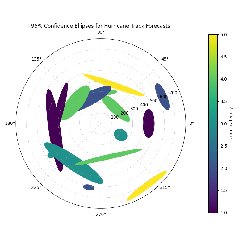
95% confidence ellipses visualizing the two-dimensional positional uncertainty for multiple hurricane track forecasts, colored by storm intensity.
Each ellipse on this plot represents a 95% confidence region for a hurricane’s predicted position. The size, shape, and color of these ellipses tell a rich story about the forecast’s reliability. Let’s analyze them in detail.
- Quick Interpretation:
This plot offers a multi-faceted view of the two-dimensional positional uncertainty in the forecasts. The magnitude of this uncertainty is directly conveyed by the size of the ellipses, which vary dramatically from small, confident predictions (purple) to large regions of uncertainty (yellow). Moreover, the shape of the ellipses reveals the nature of the error; nearly circular ellipses indicate uniform uncertainty, whereas elongated ones show that the error is much greater in one direction (e.g., distance) than the other (e.g., direction). Finally, the color provides a key physical insight, showing a clear correlation between storm intensity and forecast uncertainty, as the higher-category storms (yellow) correspond to the largest ellipses.
This visualization communicates complex, two-dimensional error data. For a complete, step-by-step example, please see the full implementation in the gallery.
Example: See the gallery Polar Error Ellipses for code and plot examples.
References