Spatial Diagnostic Plots
Forecasting models are increasingly applied to problems where observations are tied to geographic or projected coordinates — ground-subsidence monitoring wells, meteorological stations, river gauges, or any network of sensors distributed across a 2-D domain. Evaluating such models requires not only the standard temporal diagnostics but also the ability to ask: where does the model fail? Which locations have under-covered prediction intervals? Does the uncertainty correlate with geography?
The kdiagram.plot.spatial module provides a suite of
Cartesian (non-polar) diagnostic functions that map prediction
metrics, interval uncertainty, and multi-model comparisons onto any
(x, y) or (longitude, latitude) coordinate space, together
with a family of polar-from-spatial functions that implement the
spatial-polar diagnostic paradigm introduced in
Kouadio et al.[1]. No basemap dependency is
required; all plots are pure Matplotlib and follow the same
consistent, DataFrame-centric API as the rest of k-diagram.
Note
An optional add_basemap=True parameter is accepted by all
functions. It overlays a web tile basemap using
contextily when that
package is installed (pip install contextily). If
contextily is not available the parameter is silently
ignored and the plot renders without a basemap.
Summary of Spatial Plotting Functions
Function |
Description |
|---|---|
|
Color-coded scatter plot of any numeric metric (e.g. CAS, CRPS, interval width) at arbitrary spatial locations. An optional second column controls bubble size. |
|
Interpolates scattered point data onto a regular grid with
|
|
Bubble map where marker size encodes the mean prediction- interval width per location and marker color encodes the deviation of the empirical coverage from the nominal level. |
|
Scatter map of pre-computed coverage rates using a diverging colormap centered on the nominal level. Optionally flags stations that exceed a tolerance threshold with a star. |
|
Multi-panel grid that plots the same metric for \(N\) models or conditions side-by-side on a shared color scale. |
|
Geographic scatter map color-coded by site order index, with optional arrows showing the traversal path. The companion key to the polar hedgehog diagrams. |
|
Core polar diagnostic: angle = spatially-ordered site rank, radius = metric value. Supports single-horizon (colored spikes) and multi-horizon ring encoding (concentric rings per horizon). |
|
Two-panel composite: geographic scatter map (left) paired with polar hedgehog diagnostic (right), sharing colormap and scale. Reproduces the paired panel layout of the k-diagram paper. |
Common Spatial Parameters
All functions share a consistent set of parameters.
Parameter |
Description |
|---|---|
|
The input |
|
Column names for the horizontal and vertical coordinates. Any coordinate system (projected meters, decimal degrees, arbitrary units) is accepted. |
|
Strings for the plot title and axis labels. Column names are used as defaults when not provided. |
|
Matplotlib colormap name. |
|
Marker or image transparency (0–1). |
|
Whether to draw a colorbar (default |
|
Label for the colorbar axis. |
|
Grid visibility and styling forwarded to
|
|
Figure size in inches as |
|
Figure resolution when saving. |
|
An existing |
|
File path for saving. Interactive display when |
|
Overlay a web tile basemap via |
Metric Scatter Map (plot_spatial_scatter())
Purpose
This is the primary spatial diagnostic function. It creates a
color-coded scatter plot where each row in df is rendered as a
marker positioned at (x_col, y_col) and colored by the value
of metric_col. An optional size_col encodes a second
numeric dimension as the marker area (bubble chart), making it
possible to visualize two independent metrics simultaneously —
for example, the CAS score as color and the prediction-interval
width as bubble size.
Key Parameters
In addition to the shared spatial parameters, this function uses:
``metric_col``: The column whose values drive the point color. Any numeric metric is accepted: CAS, CRPS, interval width, coverage rate, model rank, etc.
``size_col``: Optional column to control marker size. Values are linearly rescaled to
size_range.``s``: Fixed marker size in points² when
size_colisNone(default80).``size_range``:
(min, max)marker area in points² whensize_colis given.``vmin`` / ``vmax``: Color scale limits. Inferred from the data when not provided.
``annotate``: If
True, annotates every point with the value inannotation_col(or the metric value if that parameter is omitted).``edgecolor`` / ``linewidths``: Marker border color and line width.
``marker``: Marker symbol (default
'o').
Conceptual Basis
Let \(\mathcal{S} = \{(x_i, y_i, m_i)\}_{i=1}^{N}\) be a set of \(N\) spatial observations where \((x_i, y_i)\) are the coordinates and \(m_i\) is the metric value for location \(i\). The function renders each observation as a point:
where \(\mathcal{C}\) is the chosen colormap normalised over \([v_{\min}, v_{\max}]\).
When a size_col \(w_i\) is provided the marker area is
linearly rescaled to size_range \([s_{\min}, s_{\max}]\):
Interpretation
Color clusters: Spatial regions of similar color indicate consistent model behavior across nearby stations. An isolated bright spot in a sea of cool colors flags a single problematic location.
Color gradients: A smooth gradient often reflects a physical driver — e.g. increasing CAS towards the coast or along a fault line.
Bubble size (when ``size_col`` is used): Larger bubbles simultaneously encode a second dimension. Wide intervals with high CAS (large and bright) identify stations where the model is both uncertain and poorly calibrated.
Use Cases
Quickly mapping any per-station metric (CAS, CRPS, MAE, …) to reveal geographic patterns.
Comparing model errors across monitoring networks.
Identifying spatial hotspots of high uncertainty or low coverage that require targeted investigation.
Practical Example
A network of 35 ground-subsidence monitoring wells is spread across an urban area. Each well has been assigned a CAS score (higher = more clustered violations) and a mean prediction- interval width. We plot both simultaneously: color encodes CAS and bubble size encodes interval width.
>>> import numpy as np
>>> import pandas as pd
>>> import kdiagram as kd
>>>
>>> # --- 1. Build a dataset of 35 monitoring stations ---
>>> rng = np.random.default_rng(2025)
>>> N = 35
>>> lons = rng.uniform(113.15, 113.45, N)
>>> lats = rng.uniform(22.38,  22.68,  N)
>>>
>>> # CAS highest near the south-east hot-spot
>>> dx, dy = lons - 113.38, lats - 22.45
>>> cas = np.clip(
...     0.15 + 0.70 * np.exp(-(dx**2 + dy**2) / 0.008)
...     + rng.uniform(0, 0.12, N), 0, 1
... )
>>> width = 0.4 + 1.4 * np.exp(-(dx**2 + dy**2) / 0.015)
>>>
>>> df = pd.DataFrame({
...     "lon": lons, "lat": lats,
...     "cas": cas, "interval_width": width,
... })
>>>
>>> # --- 2. Generate the plot ---
>>> ax = kd.plot_spatial_scatter(
...     df, "lon", "lat", "cas",
...     size_col="interval_width",
...     size_range=(30, 320),
...     cmap="plasma",
...     alpha=0.88,
...     edgecolor="white",
...     linewidths=0.6,
...     title="CAS Score per Monitoring Station (QAR)",
...     xlabel="Longitude (E)",
...     ylabel="Latitude (N)",
...     colorbar_label="CAS",
... )
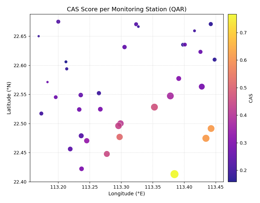
CAS scores for 35 ground-subsidence monitoring wells, color- coded by severity and scaled in size by prediction-interval width. A spatial cluster of high-CAS, wide-interval stations is visible in the south-east of the domain.
- Quick Interpretation:
The plot reveals an immediate spatial pattern: the brightest, largest bubbles are concentrated in the south-east corner, identifying a geographic cluster where the model produces both wide intervals and highly clustered violations. This kind of spatial cluster is missed entirely by aggregate CAS scores averaged over all stations.
Example: See the gallery: Spatial Scatter Plot.
Interpolated Spatial Heatmap (plot_spatial_heatmap())
Purpose
This function converts scattered (x, y, metric) data into a
continuous 2-D color surface by interpolating the values onto a
regular grid. The result is a smooth heatmap that is easier to
read than a scatter of isolated dots when the domain is densely
sampled or when the spatial pattern is the primary interest.
Optional iso-contour lines and an original-data overlay are
supported.
Key Parameters
In addition to the shared spatial parameters:
``method``: Interpolation algorithm forwarded to
scipy.interpolate.griddata(). Options are'linear'(default),'cubic'(smoother, can overshoot), and'nearest'(blocky but robust).``resolution``: Number of grid points per axis (default
200). Higher values give finer surfaces at a slight speed cost.``contour``: Draw iso-lines on top of the surface (default
False).``contour_levels``: Number of contour levels.
``scatter_overlay``: Overlay the original data points on top of the heatmap (default
True).``scatter_s`` / ``scatter_color`` / ``scatter_alpha``: Appearance of the overlay markers.
``vmin`` / ``vmax``: Color scale limits.
Mathematical Concept
Given \(N\) scattered observations \(\{(x_i, y_i, z_i)\}_{i=1}^{N}\), the function builds a regular \(M \times M\) grid \(\{(x_j^*, y_k^*)\}_{j,k=1}^{M}\) over the bounding box of the data and evaluates
where \(\mathcal{I}\) is the chosen interpolation operator
(piecewise linear, natural cubic, or nearest-neighbor).
Grid cells that fall outside the convex hull of the observation
points are automatically masked (NaN), so the heatmap never
extrapolates beyond the data boundary.
The \(M\) grid points per axis are spaced uniformly:
Interpretation
Hot regions: High values of the interpolated surface identify areas of elevated metric (e.g. high CAS or CRPS).
Iso-contours: Lines of equal value make it easy to quantify “how far” a region extends beyond a threshold.
Data overlay: The original station points (white dots by default) show where the interpolation is well-supported by data and where it is extrapolating between sparse observations.
Method choice: Use
cubicfor smooth surfaces when stations are dense; usenearestwhen the spatial pattern is expected to be discontinuous or stations are very sparse.
Use Cases
Producing publication-quality maps of per-station metrics.
Identifying spatial gradients or hotspots that are not visible from a scatter of dots.
Supporting decisions about where to add new monitoring stations (gaps in the surface with few supporting points).
Practical Example
Using the same 35-station dataset, we now produce a smooth surface to reveal the spatial gradient in CAS more clearly. Cubic interpolation and iso-contour lines highlight the concentration of high CAS in the south-east.
>>> ax = kd.plot_spatial_heatmap(
...     df, "lon", "lat", "cas",
...     method="cubic",
...     resolution=150,
...     contour=True,
...     contour_levels=6,
...     contour_color="white",
...     scatter_overlay=True,
...     scatter_s=18,
...     scatter_color="white",
...     cmap="YlOrRd",
...     colorbar_label="CAS (QAR)",
...     title="CAS Spatial Distribution - Interpolated Surface",
... )
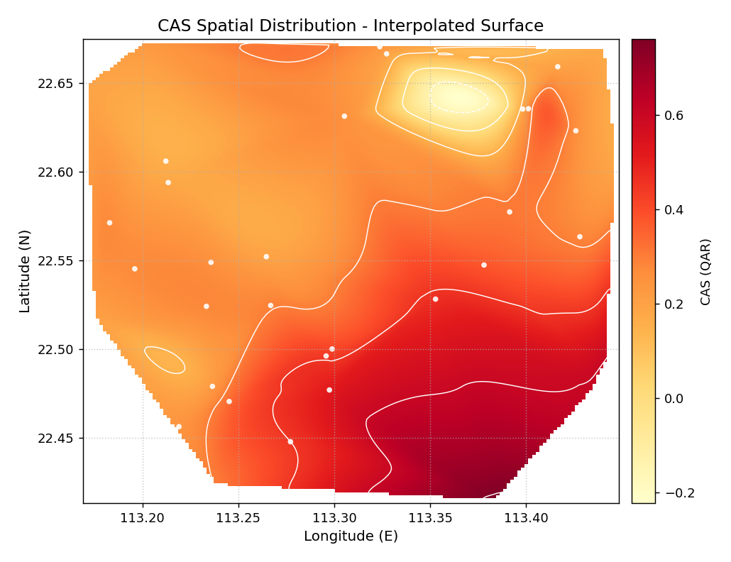
Cubic-interpolated CAS surface for the subsidence monitoring network. White iso-contour lines and station markers are overlaid. The south-east hot-spot emerges clearly as a well-defined peak surrounded by lower-severity regions.
- Quick Interpretation:
The smooth surface makes the spatial gradient immediately legible: CAS increases from roughly 0.2 in the north-west to over 0.7 near the south-east hot-spot. The iso-contour lines show that the high-severity region covers roughly a quarter of the monitoring domain — a finding that aggregate CAS statistics cannot convey.
Example: See the gallery: Spatial Heatmap.
Uncertainty Bubble Map (plot_spatial_uncertainty())
Purpose
This function provides a simultaneous view of two interval diagnostics per spatial location: the mean prediction-interval width (encoded as marker size) and the deviation of the empirical coverage from the nominal level (encoded as color). It directly answers the questions: “Which stations have excessively wide or narrow intervals?” and “Which stations are chronically under- or over-covered?” — both mapped to space in one compact diagram.
When the input DataFrame contains multiple rows per location
(e.g. one row per time step or forecast horizon), the function
aggregates automatically by (x_col, y_col).
Key Parameters
In addition to the shared spatial parameters:
``actual_col``: Observed values.
``q_low_col`` / ``q_up_col``: Lower and upper bounds of the prediction interval.
``nominal``: Target coverage level, e.g.
0.9for a 90 % PI (default0.9).``size_range``:
(min, max)bubble area in points² across all locations.``legend``: Display a size legend for the interval-width scale (default
True).
Mathematical Concept
For each observation \(i\) at location \(s\), the function computes:
After grouping by location \(s\), the per-station statistics are:
The coverage deviation from the nominal level \(\alpha\) is:
A diverging colormap is centered at \(\delta_s = 0\) so that stations on-target appear neutral, under-covered stations (\(\delta_s < 0\)) appear red, and over-covered stations (\(\delta_s > 0\)) appear blue. Marker area is linearly proportional to \(\bar{w}_s\).
Interpretation
Large, red bubbles: Wide intervals and under-coverage — the worst outcome: the model’s interval is not only wide but still fails to contain the observations.
Small, red bubbles: Narrow intervals and under-coverage — over-confident predictions that consistently miss.
Large, blue bubbles: Wide intervals and over-coverage — conservative (too wide) intervals that cover more than needed.
Small, neutral bubbles: Narrow, well-calibrated intervals — the ideal.
Size legend: The legend shows example bubble sizes corresponding to the minimum, median, and maximum interval widths across all stations.
Use Cases
Identifying which monitoring stations have calibration problems vs. which are merely uncertain.
Diagnosing whether model failure is due to interval width or interval placement.
Targeting stations for model refinement or for additional physical data collection.
Practical Example
We simulate 20 time steps of forecast data for each of the 35 monitoring wells. The south-east hot-spot cluster is made slightly under-covered to mirror a realistic calibration issue.
>>> # --- 1. Build a multi-row dataset (35 stations x 20 steps) ---
>>> N_STEPS = 20
>>> lons_r = np.repeat(lons, N_STEPS)
>>> lats_r = np.repeat(lats, N_STEPS)
>>> y_obs  = rng.normal(0, 1, N * N_STEPS)
>>> iw_r   = np.repeat(width, N_STEPS) * rng.uniform(0.8, 1.2, N*N_STEPS)
>>> q10 = y_obs - iw_r / 2
>>> q90 = y_obs + iw_r / 2
>>> # Slightly inflate observations in the hot-spot -> under-coverage
>>> hspot = np.repeat(np.exp(-(dx**2+dy**2)/0.008), N_STEPS) > 0.5
>>> y_obs[hspot] += rng.uniform(0.3, 0.7, hspot.sum())
>>>
>>> df_unc = pd.DataFrame({
...     "lon": lons_r, "lat": lats_r,
...     "y": y_obs, "q10": q10, "q90": q90,
... })
>>>
>>> # --- 2. Generate the plot ---
>>> ax = kd.plot_spatial_uncertainty(
...     df_unc, "lon", "lat", "y", "q10", "q90",
...     nominal=0.90,
...     size_range=(25, 420),
...     cmap="RdBu_r",
...     title="Interval Width and Coverage Deviation per Station",
... )
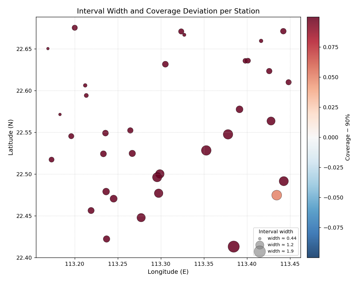
Bubble map for 35 monitoring wells. Bubble area is proportional to the mean 90 % PI width; color encodes coverage deviation from the 90 % nominal level (red = under-covered, blue = over-covered).
- Quick Interpretation:
The south-east cluster of large, reddish bubbles shows exactly the expected pattern: those stations have the widest prediction intervals yet are still under-covered relative to the 90 % nominal level. The north-west stations (smaller, neutral or slightly blue) are better calibrated and have narrower intervals. This combined view is impossible to obtain from a single tabular metric.
Example: See the gallery: Spatial Uncertainty Map.
Coverage Deviation Map (plot_spatial_coverage())
Purpose
This function produces a spatial scatter plot of pre-computed
empirical coverage rates using a diverging colormap centered on
the nominal level \(\alpha\). It is complementary to
plot_spatial_uncertainty(): where
that function accepts raw forecasts and computes coverage
internally, this function accepts a column of already-aggregated
coverage rates — suitable when coverage has been calculated
externally, stored in a metrics table, or averaged over a specific
subset of horizons.
An optional tol threshold flags stations whose deviation
exceeds the tolerance with a star marker ★, providing an
immediate visual audit of which locations need attention.
Key Parameters
In addition to the shared spatial parameters:
``coverage_col``: Column with empirical coverage rates (values in [0, 1]).
``nominal``: Nominal target coverage (default
0.9).``tol``: If given, stations where \(|\hat{c}_s - \alpha| > \text{tol}\) are annotated with a star.
``annotate``: If
True, print the coverage value next to each point.``fmt``: Format string for annotation values (default
'.2f').
Mathematical Concept
The color of each point encodes:
A TwoSlopeNorm is constructed with
vmin = -|\delta|_{\max}, vcenter = 0, and
vmax = +|\delta|_{\max} so that the neutral color always
corresponds exactly to \(\delta_s = 0\) regardless of the
data range.
The star flag is added for any station \(s\) where:
Flagged under-covered stations (\(\delta_s < 0\)) are annotated in crimson; over-covered stations in steel-blue.
Interpretation
Blue points: Coverage above nominal — intervals are conservative (too wide for the required coverage level).
Red points: Coverage below nominal — the prediction interval fails to contain the observation at the required rate.
Deep red: Serious under-coverage; the model is over-confident at this location.
Star ``★`` flags: Stations that exceed the
tolthreshold and warrant immediate investigation.Uniform neutral: If all points are the same neutral color the model is well-calibrated everywhere.
Use Cases
Quality-control audit of a forecast model across all monitoring locations.
Spatial reporting of coverage metrics in a paper or dashboard.
Identifying geographic clusters of calibration failure (contiguous red regions).
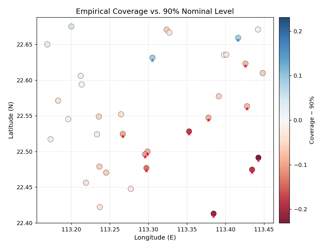
Practical Example
We use the per-station coverage rates already attached to
df_stations. A tol=0.08 flag identifies stations
that deviate from 90 % by more than 8 percentage points.
>>> df_stations["coverage"] = np.clip(
...     0.90 - 0.25 * np.exp(-(dx**2 + dy**2) / 0.010)
...     + rng.normal(0, 0.04, N), 0.55, 0.99
... )
>>>
>>> ax = kd.plot_spatial_coverage(
...     df_stations, "lon", "lat", "coverage",
...     nominal=0.90,
...     tol=0.08,
...     cmap="RdBu",
...     s=95,
...     title="Empirical Coverage vs. 90% Nominal Level",
...     xlabel="Longitude (E)",
...     ylabel="Latitude (N)",
... )
Per-station empirical coverage rates for a 35-well network. Colors diverge from the 90 % nominal level (neutral = on- target, red = under-covered, blue = over-covered). Star markers flag stations whose deviation exceeds 8 percentage points.
- Quick Interpretation:
The south-east corner shows a cluster of red points, confirming that those stations consistently fall below the 90 % coverage target. Several of these are flagged with a star
★, indicating deviations larger than 8 percentage points. The north-west stations are largely neutral or slightly blue, meaning the model is well-calibrated or slightly conservative there.
Example: See the gallery: Spatial Coverage Map.
Multi-Model Spatial Comparison (plot_spatial_comparison())
Purpose
This function generates an \(N\)-panel grid that plots the
same spatial metric for \(N\) different models, conditions,
or forecast horizons side-by-side. When shared_scale=True
(the default), all panels use a single, synchronized colormap
range, making direct visual comparison across panels meaningful
and reliable.
This is the spatial equivalent of a multi-column comparison table: instead of rows of numbers, each “cell” is a full spatial scatter map.
Key Parameters
In addition to the shared spatial parameters:
``metric_cols``: List of column names — one column per panel. Also accepts a comma-separated string (e.g.
"cas_qar,cas_qgbm").``names``: Panel subtitles. Defaults to the column names.
``ncols``: Number of columns in the panel grid (default
2). Rows are added automatically.``shared_scale``: Synchronize the colormap range across all panels (default
True).``vmin`` / ``vmax``: Override the shared scale limits.
Mathematical Concept
When shared_scale=True the global range is computed across
all panels before any plotting occurs:
Every scatter in panel \(k\) uses the same normalization:
This guarantees that identical colors across panels correspond to identical metric values, enabling direct, pixel-level comparison between models.
When shared_scale=False each panel is normalized
independently, which is useful when comparing metrics with very
different ranges (e.g. CAS of a weak model vs. CAS of a strong
model where the strong model’s variation would be invisible on
the weak model’s scale).
Interpretation
Shared scale (recommended for ranking): A panel that is uniformly lighter than the others contains lower metric values everywhere — indicating a better (or worse, depending on the metric) model across the entire domain.
Residual patterns: Look for panels that share the same hot-spot geography vs. panels where the hot-spot moves or disappears — this reveals which spatial failure modes are model-specific vs. data-driven.
Single shared colorbar: The right-side colorbar applies to all panels, so any given color has the same numeric meaning throughout the figure.
Use Cases
Side-by-side comparison of CAS, CRPS, or coverage for multiple competing models.
Comparing the same model across different forecast horizons.
Generating a single, journal-ready figure that replaces multiple individual maps.
Practical Example
Three quantile-regression models — QAR, QGBM, and XTFT — have been evaluated on the same 35-station network. Their CAS scores are stored as separate columns. We compare them in a single 1×3 figure.
>>> df_stations["cas_qar"]  = cas_qar    # from earlier
>>> df_stations["cas_qgbm"] = cas_qgbm
>>> df_stations["cas_xtft"] = cas_xtft
>>>
>>> axes = kd.plot_spatial_comparison(
...     df_stations, "lon", "lat",
...     ["cas_qar", "cas_qgbm", "cas_xtft"],
...     names=["QAR", "QGBM", "XTFT"],
...     ncols=3,
...     shared_scale=True,
...     cmap="plasma",
...     colorbar_label="CAS",
...     figsize=(14, 4.5),
... )
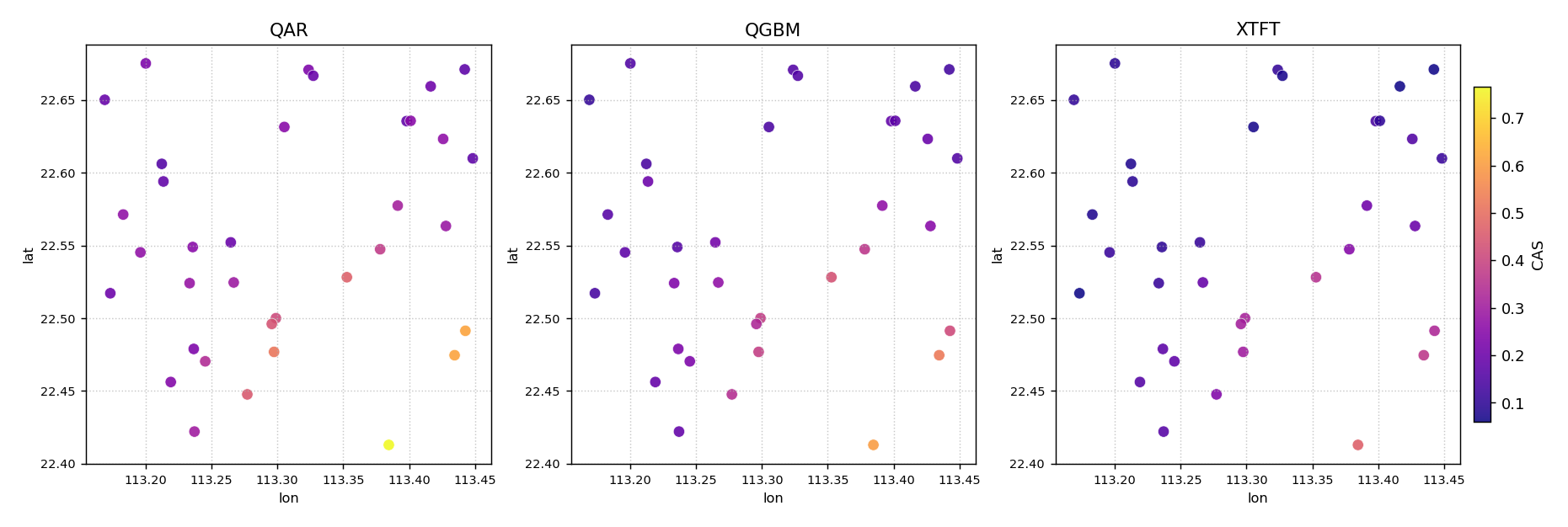
Side-by-side CAS maps for three quantile-regression models evaluated on the same 35-well network. All three panels share a single color scale, making direct comparisons valid. The south-east hot-spot persists across all models but is most severe for QAR.
- Quick Interpretation:
All three panels share the same spatial pattern — the south- east cluster — confirming that the hot-spot is driven by data characteristics rather than a specific model’s behavior. However, the QAR panel (leftmost) is clearly brighter in the hot-spot region than QGBM and XTFT, indicating that QAR produces the most severe clustered violations there. XTFT (rightmost) is the lightest overall, suggesting the best spatial calibration across the network.
Example: See the gallery: Multi-Model Spatial Comparison.
plot_spatial_ordering — Geographic ordering map
Purpose
plot_spatial_ordering() renders a
geographic scatter map in which each site is color-coded by its
position in the ordering sequence — the rank used to define polar
angle in the hedgehog diagnostic plots. Optional arrows connect
consecutive sites to make the traversal path legible.
This plot is the essential key to reading
plot_polar_from_spatial(): it answers
the question “which geographic location corresponds to which polar
angle?”
Key Parameters
Parameter |
Purpose |
|---|---|
|
|
|
Pre-computed ordering column (overrides |
|
Draw directional arrows between consecutive sites. |
|
Draw one arrow every k sites (default N//15). |
|
List of 0-based indices to annotate with a 1-based site number. |
Mathematical Concept
The ordering criterion maps the 2-D coordinate of each site to a scalar rank \(i \in \{0, 1, \ldots, N-1\}\). This rank is later mapped linearly to polar angle:
The geographic ordering map shows the spatial layout of that mapping so the reader can trace any spike in the polar hedgehog back to its physical location.
Interpretation
Sites near the bottom of the colorbar (dark) appear near polar angle 0 (top of the circle); sites near the top appear near 2π (full circle).
A smooth color gradient means the ordering traverses the domain monotonically — any abrupt color jumps indicate sites that are spatially isolated from their numerical neighbors.
Example
>>> import numpy as np, pandas as pd
>>> from kdiagram.plot.spatial import plot_spatial_ordering
>>> rng = np.random.default_rng(42)
>>> n = 80
>>> df = pd.DataFrame({
...     "lon": rng.uniform(113.1, 113.6, n),
...     "lat": rng.uniform(22.3, 22.8, n),
... })
>>> ax = plot_spatial_ordering(
...     df, "lon", "lat",
...     order_by="lat",
...     show_arrows=True,
...     label_sites=[0, 19, 39, 59, 79],
...     title="Geographic domain and site ordering (south to north)",
... )
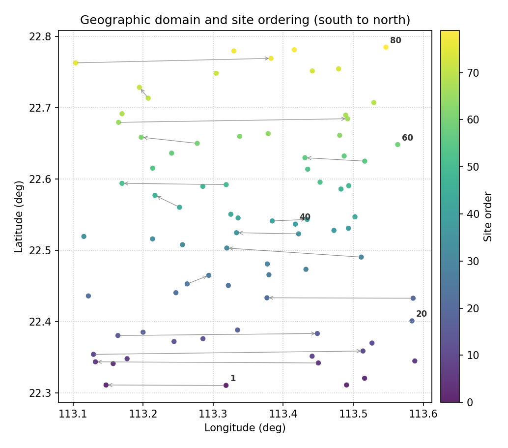
Color encodes site order (0 = first, N−1 = last). Arrows show the south-to-north traversal path; labeled ticks mark key waypoints that map to specific polar angles.
Quick Interpretation
Sites are ordered south-to-north (low latitude → high latitude). The smooth color gradient confirms a monotonic traversal of the domain. Site 1 (rank 0) maps to polar angle 0 (North pole of the circle); site 80 (rank 79) maps to ≈ 2π.
plot_polar_from_spatial — Core polar hedgehog diagnostic
Purpose
plot_polar_from_spatial() is the central
visualization of the k-diagram spatial-polar framework
[1]. It converts
a spatially ordered set of sites into a hedgehog polar diagram where:
Angle (\(\theta\)) encodes the geographic ordering rank of the site — sites are distributed uniformly around the full circle.
Radius (r) encodes the metric value at that site (interval width, CAS score, CRPS, coverage deviation, etc.).
A thin radial spike — or needle — is drawn for each site. Clusters of long spikes reveal geographic clusters of high metric values; clusters of short spikes reveal well-calibrated or low-error regions.
The function also supports a ring (multi-horizon) mode: when
horizon_cols is given, concentric rings are stacked outward, one
ring per forecast horizon (or any discrete grouping), so the evolution
of the metric across horizons can be read at every site simultaneously.
Key Parameters
Parameter |
Purpose |
|---|---|
|
Column whose values become the spike radius. |
|
Additional columns for multi-horizon rings. |
|
Label for each ring (e.g. |
|
Column that drives spike color (single-horizon mode only).
Defaults to |
|
Spatial ordering criterion ( |
|
Where rank 0 appears on the circle: |
|
If |
|
Number of angular site-index labels. |
Mathematical Concept
Let sites be ordered by latitude, yielding ranks \(i = 0, 1, \ldots, N-1\). The polar coordinates of site i are:
where \(v_i\) is the metric value at site i (e.g. interval width). The spike for site i is the segment from the origin to \((r_i, \theta_i)\).
In ring mode with K horizons, the \(k\)-th ring spans radii:
where \(\Delta = v_{\max} / K\) normalises all rings to the same radial budget.
Interpretation
Long spikes → high metric value (e.g. wide prediction interval, high error) at that geographic location.
Symmetric hedgehog → metric is roughly uniform across the domain.
Asymmetric hedgehog → metric concentrates in one arc, revealing a geographic cluster of difficult-to-predict sites.
In ring mode: rings that grow outward toward larger radii indicate the metric worsens at longer horizons; rings of similar height indicate horizon-robust calibration.
Example — single horizon
>>> import numpy as np, pandas as pd
>>> from kdiagram.plot.spatial import plot_polar_from_spatial
>>> rng = np.random.default_rng(42)
>>> n = 80
>>> df = pd.DataFrame({
...     "lon": rng.uniform(113.1, 113.6, n),
...     "lat": rng.uniform(22.3, 22.8, n),
...     "width_h1": rng.uniform(0.3, 3.0, n),
... })
>>> ax = plot_polar_from_spatial(
...     df, "lon", "lat", "width_h1",
...     order_by="lat",
...     cmap="plasma",
...     colorbar_label="Interval width H1 (m)",
... )
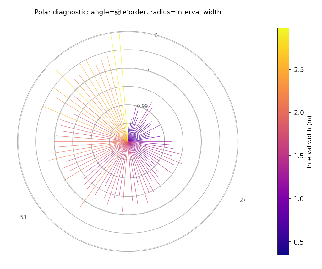
Single-horizon hedgehog. Angle = latitude-ordered site rank; radius = interval width. Spikes are colored by width value (plasma colormap). Concentric reference circles aid reading.
Example — multi-horizon rings
>>> df["width_h3"] = df["width_h1"] * 1.35
>>> df["width_h7"] = df["width_h1"] * 1.85
>>> ax = plot_polar_from_spatial(
...     df, "lon", "lat", "width_h1",
...     horizon_cols=["width_h3", "width_h7"],
...     horizon_labels=["H1", "H3", "H7"],
...     order_by="lat",
... )
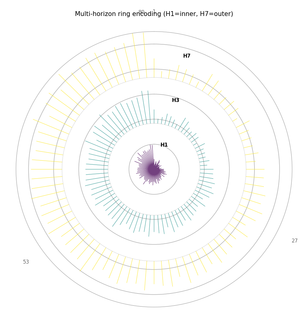
Ring mode with three forecast horizons (H1 inner, H7 outer). At every polar angle (site), the three spikes show how uncertainty grows with horizon. Sites where the H7 spike is much longer than the H1 spike have strongly horizon-dependent calibration.
Quick Interpretation
The example shows a gradient from shorter spikes at small polar angles (southern sites, moderate uncertainty) to longer spikes at large polar angles (northern sites, higher uncertainty). The multi-horizon plot reveals that the uncertainty growth is consistent across all sites — the rings scale uniformly outward.
plot_paired_spatial_polar — Paired map + polar diagnostic
Purpose
plot_paired_spatial_polar() combines the
geographic scatter map and the polar hedgehog into a single side-by-side
figure that directly reproduces the paired panel layouts of the k-diagram
paper [1] (figures 2 and 5:
panels (a)+(b), (c)+(d), etc.).
The left panel is a geographic scatter map colored by the metric. The right panel is the polar hedgehog diagnostic. Both panels share the same colormap and, optionally, the same color scale, making the correspondence between geographic location and polar angle immediately readable without switching between separate figures.
Key Parameters
Parameter |
Purpose |
|---|---|
|
Dict |
|
Draw direction arrows on the map to visualize the traversal path. |
|
Enables multi-ring mode in the polar panel. |
|
Individual panel titles (override defaults). |
|
Super-title for the full figure. |
Interpretation
Read both panels in tandem:
Find a site in the left map (e.g. a cluster of large dots in a specific geographic corner).
Identify that site’s latitude rank to determine its polar angle.
Locate the corresponding spike in the right hedgehog to read the exact metric value.
The pattern of long spikes in the hedgehog directly maps back to a spatial cluster of high-metric sites in the map.
This paired reading makes it possible to communicate both the spatial pattern and the magnitude distribution of any forecast metric in a single compact figure.
Example
>>> import numpy as np, pandas as pd
>>> from kdiagram.plot.spatial import plot_paired_spatial_polar
>>> rng = np.random.default_rng(42)
>>> n = 80
>>> df = pd.DataFrame({
...     "lon": rng.uniform(113.1, 113.6, n),
...     "lat": rng.uniform(22.3, 22.8, n),
...     "width_h1": rng.uniform(0.3, 3.0, n),
...     "width_h3": rng.uniform(0.3, 3.0, n) * 1.35,
...     "width_h7": rng.uniform(0.3, 3.0, n) * 1.85,
... })
>>> axes = plot_paired_spatial_polar(
...     df, "lon", "lat", "width_h1",
...     order_by="lat",
...     cmap="YlOrRd",
...     colorbar_label="Interval width H1 (m)",
...     map_label_sites={0: "S1", 39: "S2", 79: "S3"},
...     title="Paired map and polar diagnostic (H1)",
... )
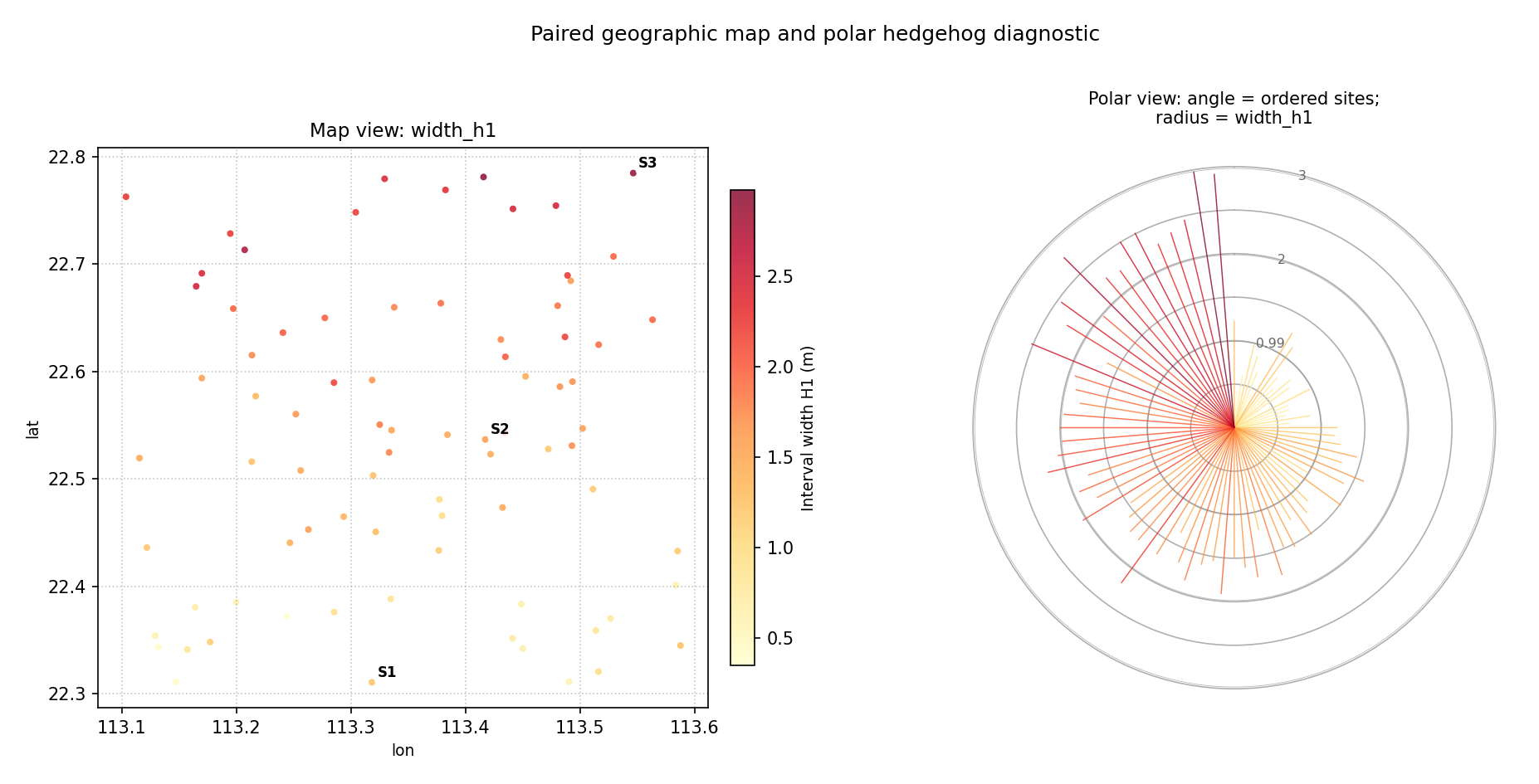
Single-horizon paired layout. Left: geographic scatter colored by interval width. Right: polar hedgehog with angle = latitude order. Sites S1, S2, S3 are annotated on the map; they appear at the corresponding polar angles 0°, 180°, and ~360° in the hedgehog.
Example — multi-horizon paired
>>> axes = plot_paired_spatial_polar(
...     df, "lon", "lat", "width_h1",
...     horizon_cols=["width_h3", "width_h7"],
...     horizon_labels=["H1", "H3", "H7"],
...     order_by="lat",
...     cmap="plasma",
...     title="Paired maps: multi-horizon ring encoding",
... )
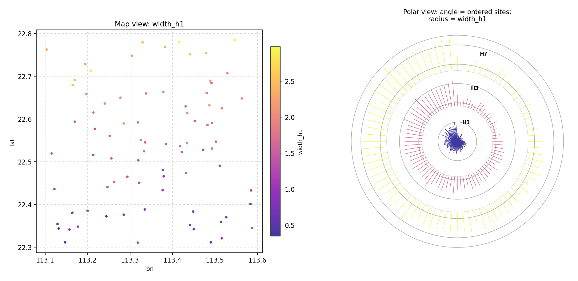
Multi-horizon paired layout. The polar panel now shows three concentric rings (H1 inner, H7 outer) at every site angle. Sites with strongly growing rings have rapidly increasing uncertainty with forecast horizon.
Quick Interpretation
The map (left) shows a mild south-to-north gradient in interval width. The hedgehog (right) confirms this: spikes near angle 0 (southern sites) are shorter than spikes near angle 2π (northern sites). The multi-horizon version further reveals that this geographic gradient is amplified at longer horizons — the H7 ring is noticeably longer than H1 for northern sites.
References