Contextual Diagnostic Plots
While the core of k-diagram is its specialized polar visualizations,
a complete forecast evaluation often benefits from standard, familiar
plots that provide essential context. This gallery showcases the
functions in the kdiagram.plot.context module, which are
designed to be companions to the main polar diagnostics.
These plots cover fundamental diagnostics such as time series comparisons, scatter plots, and error distribution analysis, all following the consistent, DataFrame-centric API of the k-diagram package.
Note
You need to run the code snippets locally to generate the plot
images referenced below. Ensure the image paths in the
.. image:: directives match where you save the plots.
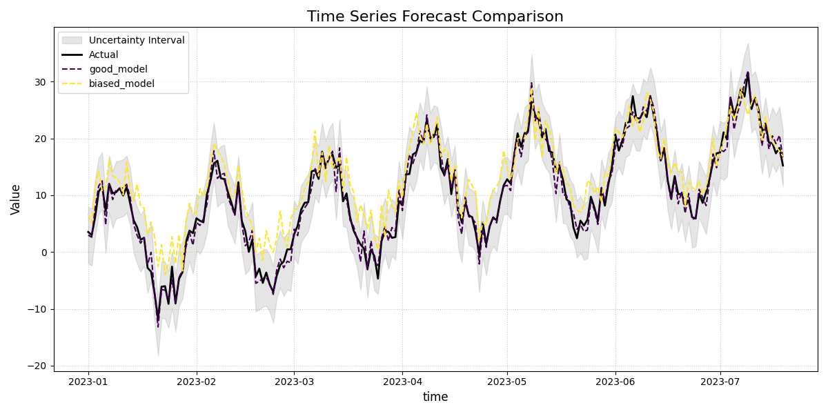
Time Series Plot
This is the most fundamental contextual plot, providing a direct visualization of the actual and predicted values over time. It is an essential first step for understanding a model’s performance, showing how well it tracks the overall trend, seasonality, and anomalies in the data.
 1import kdiagram.plot.context as kdc
 2import pandas as pd
 3import numpy as np
 4import matplotlib.pyplot as plt
 5
 6# --- Data Generation ---
 7np.random.seed(0)
 8n_samples = 200
 9time_index = pd.date_range("2023-01-01", periods=n_samples, freq='D')
10
11# A true signal with a trend and seasonality
12y_true = (np.linspace(0, 20, n_samples) +
13          10 * np.sin(np.arange(n_samples) * 2 * np.pi / 30) +
14          np.random.normal(0, 2, n_samples))
15
16# Model 1: A good forecast that tracks the signal well
17y_pred_good = y_true + np.random.normal(0, 1.5, n_samples)
18
19# Model 2: A biased forecast that misses the trend
20y_pred_biased = y_true * 0.8 + 5 + np.random.normal(0, 2, n_samples)
21
22df = pd.DataFrame({
23    'time': time_index,
24    'actual': y_true,
25    'good_model': y_pred_good,
26    'biased_model': y_pred_biased,
27    'q10': y_pred_good - 5, # Uncertainty band for the good model
28    'q90': y_pred_good + 5,
29})
30
31# --- Plotting ---
32kdc.plot_time_series(
33    df,
34    x_col='time',
35    actual_col='actual',
36    pred_cols=['good_model', 'biased_model'],
37    q_lower_col='q10',
38    q_upper_col='q90',
39    title="Time Series Forecast Comparison",
40    savefig="gallery/images/gallery_plot_context_time_series_plot.png"
41)
42plt.close()
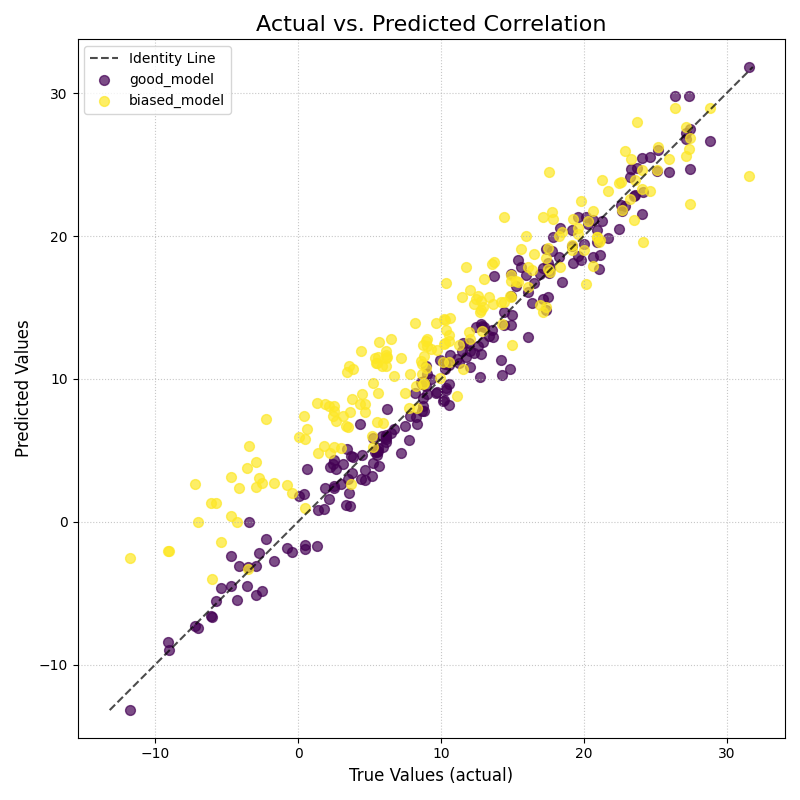
Scatter Correlation Plot
This function creates a classic Cartesian scatter plot to visualize the relationship between true observed values and model predictions. It is an essential tool for assessing linear correlation, identifying systemic bias, and spotting outliers.
 1import kdiagram.plot.context as kdc
 2import pandas as pd
 3import numpy as np
 4import matplotlib.pyplot as plt
 5
 6# --- Data Generation (using the same data as before) ---
 7np.random.seed(0)
 8n_samples = 200
 9time_index = pd.date_range("2023-01-01", periods=n_samples, freq='D')
10y_true = (np.linspace(0, 20, n_samples) +
11          10 * np.sin(np.arange(n_samples) * 2 * np.pi / 30) +
12          np.random.normal(0, 2, n_samples))
13y_pred_good = y_true + np.random.normal(0, 1.5, n_samples)
14y_pred_biased = y_true * 0.8 + 5 + np.random.normal(0, 2, n_samples)
15
16df = pd.DataFrame({
17    'time': time_index,
18    'actual': y_true,
19    'good_model': y_pred_good,
20    'biased_model': y_pred_biased,
21})
22
23# --- Plotting ---
24kdc.plot_scatter_correlation(
25    df,
26    actual_col='actual',
27    pred_cols=['good_model', 'biased_model'],
28    title="Actual vs. Predicted Correlation",
29    savefig="gallery/images/gallery_plot_context_time_scatter_corr.png"
30)
31plt.close()
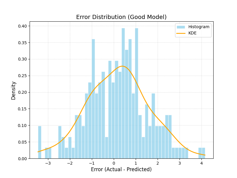
Error Distribution Plot
This function creates a histogram and a Kernel Density Estimate (KDE) plot of the forecast errors. It is a fundamental diagnostic for checking if a model’s errors are unbiased (centered at zero) and normally distributed, which are key assumptions for many statistical methods.
 1import kdiagram.plot.context as kdc
 2import pandas as pd
 3import numpy as np
 4import matplotlib.pyplot as plt
 5
 6# --- Data Generation (using the same data as before) ---
 7np.random.seed(0)
 8n_samples = 200
 9y_true = (np.linspace(0, 20, n_samples) +
10          10 * np.sin(np.arange(n_samples) * 2 * np.pi / 30) +
11          np.random.normal(0, 2, n_samples))
12y_pred_good = y_true + np.random.normal(0, 1.5, n_samples)
13
14df = pd.DataFrame({
15    'actual': y_true,
16    'good_model': y_pred_good,
17})
18
19# --- Plotting ---
20kdc.plot_error_distribution(
21    df,
22    actual_col='actual',
23    pred_col='good_model',
24    title="Error Distribution (Good Model)",
25    savefig="gallery/images/gallery_plot_context_error_dist.png"
26)
27plt.close()
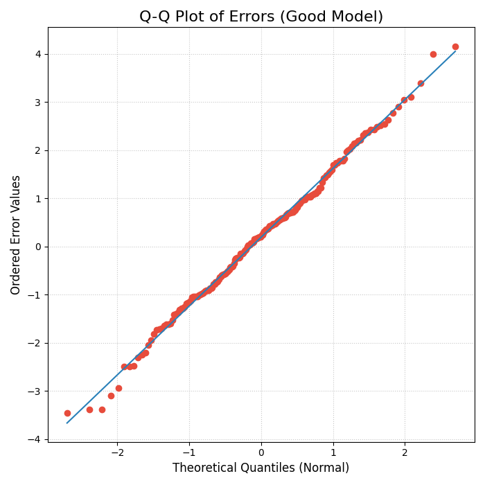
Q-Q Plot for Error Normality
This function generates a Quantile-Quantile (Q-Q) plot, a standard graphical method for comparing a dataset’s distribution to a theoretical distribution (in this case, the normal distribution). It is an essential tool for visually checking if the forecast errors are normally distributed.
 1import kdiagram.plot.context as kdc
 2import pandas as pd
 3import numpy as np
 4import matplotlib.pyplot as plt
 5
 6# --- Data Generation (using the same data as before) ---
 7np.random.seed(0)
 8n_samples = 200
 9y_true = (np.linspace(0, 20, n_samples) +
10          10 * np.sin(np.arange(n_samples) * 2 * np.pi / 30) +
11          np.random.normal(0, 2, n_samples))
12y_pred_good = y_true + np.random.normal(0, 1.5, n_samples)
13
14df = pd.DataFrame({
15    'actual': y_true,
16    'good_model': y_pred_good,
17})
18
19# --- Plotting ---
20kdc.plot_qq(
21    df,
22    actual_col='actual',
23    pred_col='good_model',
24    title="Q-Q Plot of Errors (Good Model)",
25    savefig="gallery/images/gallery_plot_context_qq_plot.png"
26)
27plt.close()
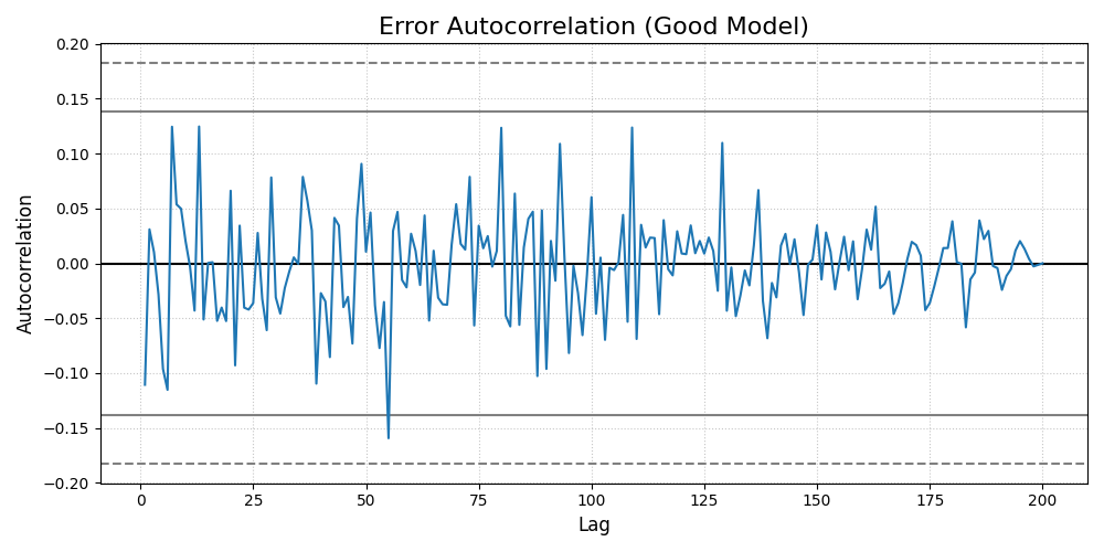
Error Autocorrelation (ACF) Plot
This function creates an Autocorrelation Function (ACF) plot of the forecast errors. It is a critical diagnostic for time series models, used to check if there is any remaining temporal structure (i.e., patterns) in the residuals.
 1import kdiagram.plot.context as kdc
 2import pandas as pd
 3import numpy as np
 4import matplotlib.pyplot as plt
 5
 6# --- Data Generation (using the same data as before) ---
 7np.random.seed(0)
 8n_samples = 200
 9y_true = (np.linspace(0, 20, n_samples) +
10          10 * np.sin(np.arange(n_samples) * 2 * np.pi / 30) +
11          np.random.normal(0, 2, n_samples))
12y_pred_good = y_true + np.random.normal(0, 1.5, n_samples)
13
14df = pd.DataFrame({
15    'actual': y_true,
16    'good_model': y_pred_good,
17})
18
19# --- Plotting ---
20kdc.plot_error_autocorrelation(
21    df,
22    actual_col='actual',
23    pred_col='good_model',
24    title="Error Autocorrelation (Good Model)",
25    savefig="gallery/images/gallery_plot_context_error_autocorr_acf.png"
26)
27plt.close()
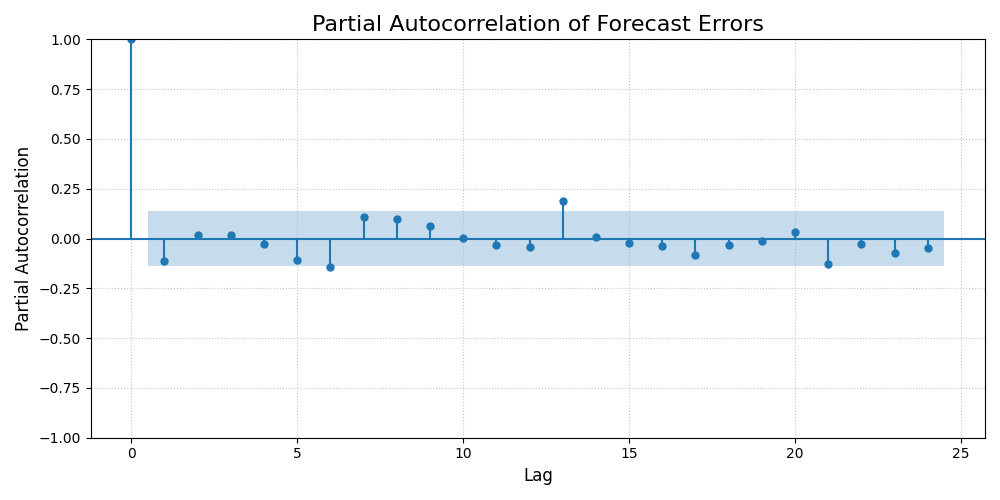
Error Partial Autocorrelation (PACF) Plot
This function creates a Partial Autocorrelation Function (PACF) plot of the forecast errors. It is a critical companion to the ACF plot, used to identify the direct relationship between an error and its past values, after removing the effects of intervening lags.
 1import kdiagram.plot.context as kdc
 2import pandas as pd
 3import numpy as np
 4import matplotlib.pyplot as plt
 5
 6# --- Data Generation (using the same data as before) ---
 7np.random.seed(0)
 8n_samples = 200
 9y_true = (np.linspace(0, 20, n_samples) +
10          10 * np.sin(np.arange(n_samples) * 2 * np.pi / 30) +
11          np.random.normal(0, 2, n_samples))
12y_pred_good = y_true + np.random.normal(0, 1.5, n_samples)
13
14df = pd.DataFrame({
15    'actual': y_true,
16    'good_model': y_pred_good,
17})
18
19# --- Plotting ---
20# Note: Requires the 'statsmodels' package to be installed.
21try:
22    kdc.plot_error_pacf(
23        df,
24        actual_col='actual',
25        pred_col='good_model',
26        title="Partial Autocorrelation of Forecast Errors",
27        savefig="gallery/images/gallery_plot_context_error_partial_autocorr_pacf.png"
28    )
29except ImportError:
30    print("Skipping PACF plot: statsmodels is not installed.")
31finally:
32    plt.close()