Probabilistic Diagnostics Gallery
This gallery page showcases plots from k-diagram designed for the
comprehensive evaluation of probabilistic forecasts. These visualizations
move beyond simple interval checks to assess the two key qualities of a
probabilistic forecast: calibration (is the forecast reliable?) and
sharpness (is the forecast precise?).
The plots provide intuitive diagnostics for PIT histograms, forecast sharpness, overall performance (CRPS), and conditional uncertainty, allowing for a deeper understanding of a model’s predictive distributions.
Note
You need to run the code snippets locally to generate the plot
images referenced below. Ensure the image paths in the
.. image:: directives match where you save the plots.
PIT Histogram (Calibration)
The plot_pit_histogram() function is
the primary diagnostic tool for assessing the statistical calibration
of a probabilistic forecast. It visualizes the Probability Integral
Transform (PIT) distribution, which for a perfectly calibrated model,
should be uniform. This polar version transforms that ideal uniform
histogram into a perfect circle, making deviations—and thus specific
types of miscalibration—immediately obvious.
First, let’s break down the components of this core diagnostic plot.
Plot Anatomy
Angle (θ): The angular axis is divided into bins representing the PIT value, spanning from 0 to 1. Each sector corresponds to a range of PIT values (e.g., 0.0 to 0.1).
Radius (r): The radius of each bar shows the frequency or count of PIT values that fall into that angular bin. Since the radial axis represents a simple count, its tick labels can optionally be hidden with
mask_radius=Trueto simplify the visual.Reference Line: The dashed red circle shows the expected frequency for a perfectly uniform (calibrated) distribution. The goal is for the blue bars to align with this circle.
With this framework, let’s explore how to use this plot to diagnose different, common types of forecast miscalibration.
Use Case 1: The Ideal Case - A Well-Calibrated Forecast
The first and most important use case is to identify a well-calibrated forecast. This serves as the benchmark against which all other models are compared.
Let’s simulate a probabilistic forecast for daily temperatures where the model’s predicted uncertainty perfectly matches the true, underlying stochasticity of the weather.
 1import kdiagram as kd
 2import numpy as np
 3from scipy.stats import norm
 4import matplotlib.pyplot as plt
 5
 6# --- 1. Data Generation (Shared for all use cases) ---
 7np.random.seed(42)
 8n_samples = 2000
 9true_mean = 15
10true_scale = 5.0 # The "true" uncertainty
11y_true = np.random.normal(loc=true_mean, scale=true_scale, size=n_samples)
12quantiles = np.linspace(0.05, 0.95, 19) # 19 quantiles from 5% to 95%
13
14# --- 2. Create a Well-Calibrated Forecast ---
15# The model's predicted scale matches the true scale
16calibrated_preds = norm.ppf(quantiles, loc=true_mean, scale=true_scale)
17# We need to broadcast it to match the shape of y_true
18calibrated_preds = np.tile(calibrated_preds, (n_samples, 1))
19
20# --- 3. Plotting ---
21kd.plot_pit_histogram(
22    y_true, calibrated_preds, quantiles,
23    title="Use Case 1: A Well-Calibrated Forecast",
24    savefig="gallery/images/gallery_pit_histogram_calibrated.png",
25)
26plt.close()
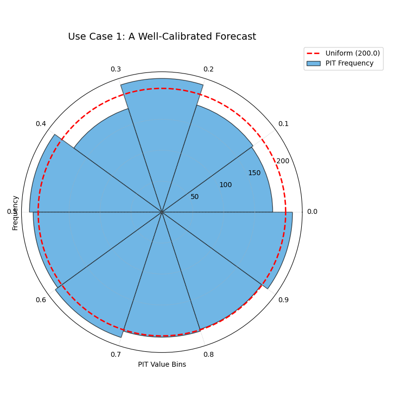
The blue bars of the histogram align almost perfectly with the dashed red reference circle, indicating a uniform PIT distribution.
Use Case 2: Diagnosing an Overconfident Forecast
A very common failure mode for modern machine learning models is overconfidence. The model produces prediction intervals that are systematically too narrow, failing to account for the true level of uncertainty. The PIT histogram has a classic “tell” for this condition.
Let’s simulate a model that underestimates the true volatility of the weather, producing overly sharp forecasts.
 1# --- 1. Data Generation (uses y_true and quantiles from previous step) ---
 2# --- 2. Create an Overconfident Forecast ---
 3# The model's predicted scale is smaller than the true scale
 4overconfident_scale = 2.5 # Half of the true scale
 5overconfident_preds = norm.ppf(quantiles, loc=true_mean, scale=overconfident_scale)
 6overconfident_preds = np.tile(overconfident_preds, (n_samples, 1))
 7
 8# --- 3. Plotting ---
 9kd.plot_pit_histogram(
10    y_true, overconfident_preds, quantiles,
11    title="Use Case 2: An Overconfident Forecast",
12    color="#E74C3C", # Use red to indicate a problem
13    savefig="gallery/images/gallery_pit_histogram_overconfident.png",
14)
15plt.close()
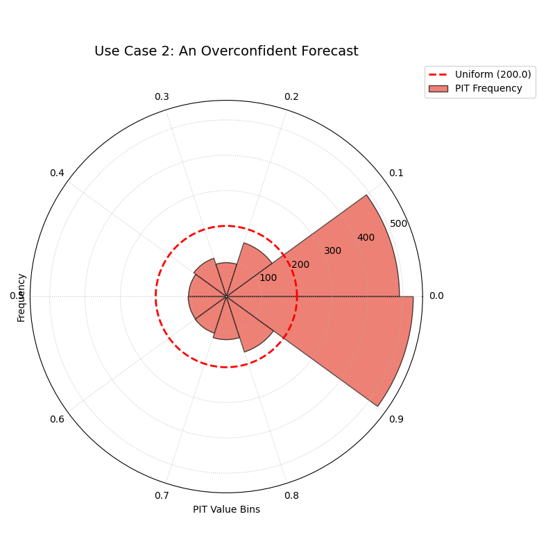
The histogram bars are very high at the extremes (0.0 and 0.9 bins) and very low in the middle, forming a distinct U-shape.
Use Case 3: Diagnosing an Underconfident or Biased Forecast
The opposite problem is underconfidence, where a model’s prediction intervals are systematically too wide. We can also use the PIT histogram to diagnose a simple bias, where the model’s central tendency is consistently wrong.
Let’s create side-by-side plots: one for an underconfident model and one for a biased model, to see their distinct signatures.
 1# --- 1. Data Generation (uses y_true and quantiles from previous steps) ---
 2# --- 2. Create Underconfident and Biased Forecasts ---
 3# Underconfident model: predicted scale is larger than true scale
 4underconfident_scale = 10.0 # Double the true scale
 5underconfident_preds = norm.ppf(quantiles, loc=true_mean, scale=underconfident_scale)
 6underconfident_preds = np.tile(underconfident_preds, (n_samples, 1))
 7# Biased model: central tendency is wrong
 8biased_loc = 12.0 # True mean is 15
 9biased_preds = norm.ppf(quantiles, loc=biased_loc, scale=true_scale)
10biased_preds = np.tile(biased_preds, (n_samples, 1))
11
12# --- 3. Create a figure with two polar subplots ---
13fig, (ax1, ax2) = plt.subplots(1, 2, figsize=(16, 8), subplot_kw={'projection': 'polar'})
14
15# --- 4. Plot each diagnostic on its dedicated axis ---
16kd.plot_pit_histogram(
17    y_true, underconfident_preds, quantiles, ax=ax1,
18    title="Underconfident Forecast", color="#F1C40F" # Yellow
19)
20kd.plot_pit_histogram(
21    y_true, biased_preds, quantiles, ax=ax2,
22    title="Biased Forecast", color="#9B59B6" # Purple
23)
24
25fig.suptitle('Use Case 3: Diagnosing Other Miscalibrations', fontsize=16)
26fig.tight_layout(rect=[0, 0, 1, 0.95])
27fig.savefig("gallery/images/gallery_pit_histogram_other.png")
28plt.close(fig)
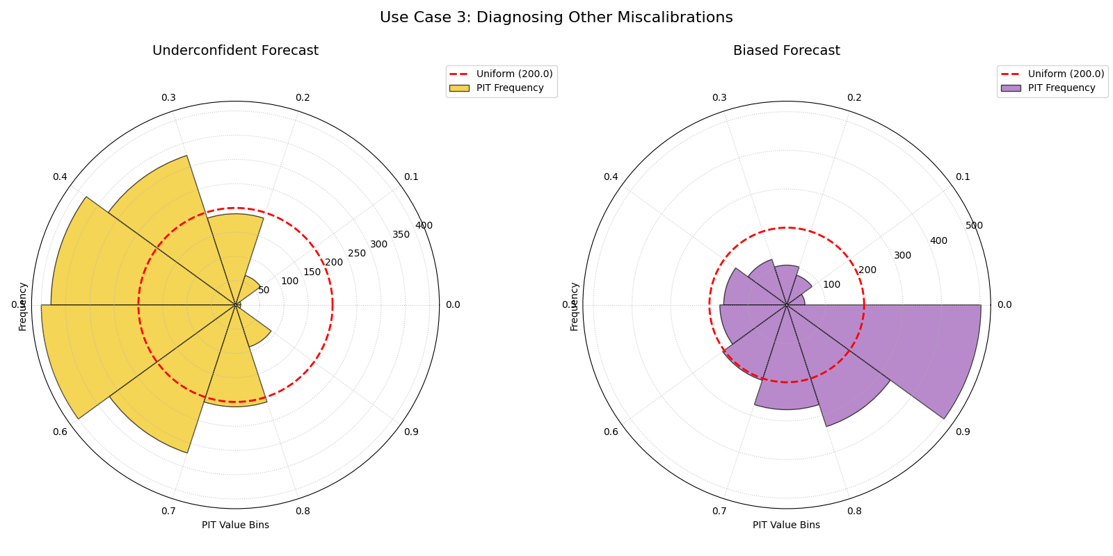
The left plot shows a hump-shaped histogram (underconfidence). The right plot shows a sloped histogram (bias).
Best Practice
The PIT histogram should be your first diagnostic for any probabilistic forecast. A model that is not well-calibrated (i.e., does not produce a uniform PIT histogram) cannot be trusted, even if it appears to be sharp or has a good overall score on other metrics. Always check for calibration first.
For a deeper understanding of the statistical theory behind the Probability Integral Transform, please refer back to the main PIT Histogram (plot_pit_histogram()) section.
Polar Sharpness Diagram
While the PIT histogram assesses a forecast’s reliability, the
plot_polar_sharpness() function
evaluates its sharpness, or precision. A calibrated forecast that is
too wide (e.g., “tomorrow’s temperature will be between -10°C and
40°C”) is reliable but not very useful. This plot directly compares the
average width of prediction intervals from one or more models, helping
to identify which forecast is the most decisive.
Let’s begin by understanding the components of this comparative plot.
Plot Anatomy
Angle (θ): Each angular sector is assigned to a different model or prediction set. This is purely for visual separation; the angle itself has no numerical meaning. The angular tick labels are therefore hidden by default.
Radius (r): Directly corresponds to the average prediction interval width, which serves as the sharpness score. A smaller radius is better, as it indicates a sharper, more precise, and more useful forecast.
Azimuth: The azimuth, or the circular path, represents a line of constant sharpness. The plot’s grid lines are drawn at specific sharpness levels to serve as a reference for comparing the models.
Now, let’s apply this plot to a real-world model selection problem.
Use Case: The Sharpness-Calibration Trade-off
The most important use of the sharpness diagram is in conjunction with a calibration plot like the PIT histogram. A model can easily achieve high sharpness by being overconfident, so we must evaluate both properties together.
Let’s continue our weather forecasting scenario. We have three models: one is well-calibrated, one is overconfident (too sharp), and one is underconfident (not sharp). This plot will quantify their precision.
 1import kdiagram as kd
 2import numpy as np
 3from scipy.stats import norm
 4import matplotlib.pyplot as plt
 5
 6# --- 1. Data Generation: Three models with different properties ---
 7np.random.seed(42)
 8n_samples = 2000
 9true_mean = 15
10true_scale = 5.0
11y_true = np.random.normal(loc=true_mean, scale=true_scale, size=n_samples)
12quantiles = np.linspace(0.05, 0.95, 19)
13
14# Model A: Well-calibrated
15calibrated_preds = norm.ppf(quantiles, loc=true_mean, scale=true_scale)
16calibrated_preds = np.tile(calibrated_preds, (n_samples, 1))
17
18# Model B: Overconfident (too sharp)
19overconfident_preds = norm.ppf(quantiles, loc=true_mean, scale=2.5)
20overconfident_preds = np.tile(overconfident_preds, (n_samples, 1))
21
22# Model C: Underconfident (not sharp)
23underconfident_preds = norm.ppf(quantiles, loc=true_mean, scale=10.0)
24underconfident_preds = np.tile(underconfident_preds, (n_samples, 1))
25
26# --- 2. Plotting ---
27kd.plot_polar_sharpness(
28    calibrated_preds,
29    overconfident_preds,
30    underconfident_preds,
31    quantiles=quantiles,
32    names=['A (Calibrated)', 'B (Overconfident)', 'C (Underconfident)'],
33    title="Use Case: The Sharpness-Calibration Trade-off",
34    savefig="gallery/images/gallery_polar_sharpness_basic.png",
35)
36plt.close()
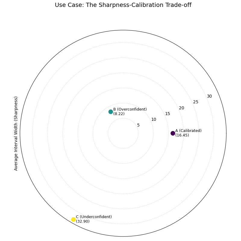
A polar plot with three points, each representing a model. The overconfident model is closest to the center (sharpest), while the underconfident model is farthest away.
Best Practice
Never evaluate sharpness in isolation. A model can always appear
sharper by becoming more overconfident. Always use this plot in
conjunction with the plot_pit_histogram()
to ensure you are selecting a model that is both sharp and reliable.
See Also
The plot_crps_comparison() function
and/or plot_calibration_sharpness() is
designed to combine both calibration and sharpness into a single,
overall score, making it a great final step after analyzing the two
properties separately.
For a deeper understanding of the statistical concepts behind sharpness and proper scoring rules, please refer back to the main Polar Sharpness Diagram (plot_polar_sharpness()) section.
CRPS Comparison (Overall Score)
After analyzing a forecast’s reliability (calibration) and precision
(sharpness) separately, we often need a single, overall score to make a
final decision. The plot_crps_comparison()
function provides this summary. It uses the Continuous Ranked Probability
Score (CRPS), a proper scoring rule that simultaneously rewards both
calibration and sharpness, to give a final verdict on which model
performs best.
Let’s begin by understanding the components of this summary plot.
Plot Anatomy
Angle (θ): Each angular sector is assigned to a different model or prediction set. This is purely for visual separation; the angle itself has no numerical meaning.
Radius (r): Directly corresponds to the average CRPS for that model. The CRPS is an error metric, so a smaller radius is better, indicating a more skillful probabilistic forecast.
Azimuth: The azimuth, or the circular path, represents a line of constant CRPS. The plot’s grid lines serve as a reference for comparing the models’ scores. Since the radius is the key metric, its labels are important, but can be hidden with
mask_radius=Truefor a cleaner look.
With this in mind, let’s conclude our wind power forecasting case study by using the CRPS to select the winning model.
Use Case: The Final Verdict in Model Selection
The most powerful use of this plot is as the final step in a probabilistic forecast evaluation. It synthesizes the complex trade-offs between calibration and sharpness into a single, easy-to-interpret score.
Let’s revisit our three wind power forecasting models: one well-calibrated, one overconfident (too sharp), and one underconfident (not sharp). The CRPS will penalize the miscalibrated models and reward the one that achieves the best balance.
 1import kdiagram as kd
 2import numpy as np
 3from scipy.stats import norm
 4import matplotlib.pyplot as plt
 5
 6# --- 1. Data Generation (consistent with previous examples) ---
 7np.random.seed(42)
 8n_samples = 2000
 9true_mean = 15
10true_scale = 5.0
11y_true = np.random.normal(loc=true_mean, scale=true_scale, size=n_samples)
12quantiles = np.linspace(0.05, 0.95, 19)
13
14# Model A: Well-calibrated
15calibrated_preds = norm.ppf(quantiles, loc=true_mean, scale=true_scale)
16calibrated_preds = np.tile(calibrated_preds, (n_samples, 1))
17
18# Model B: Overconfident (too sharp)
19overconfident_preds = norm.ppf(quantiles, loc=true_mean, scale=2.5)
20overconfident_preds = np.tile(overconfident_preds, (n_samples, 1))
21
22# Model C: Underconfident (not sharp)
23underconfident_preds = norm.ppf(quantiles, loc=true_mean, scale=10.0)
24underconfident_preds = np.tile(underconfident_preds, (n_samples, 1))
25
26# --- 2. Plotting ---
27kd.plot_crps_comparison(
28    y_true,
29    calibrated_preds,
30    overconfident_preds,
31    underconfident_preds,
32    quantiles=quantiles,
33    names=['A (Calibrated)', 'B (Overconfident)', 'C (Underconfident)'],
34    title="Final Verdict: Overall Forecast Performance (CRPS)",
35    savefig="gallery/images/gallery_crps_comparison.png",
36)
37plt.close()
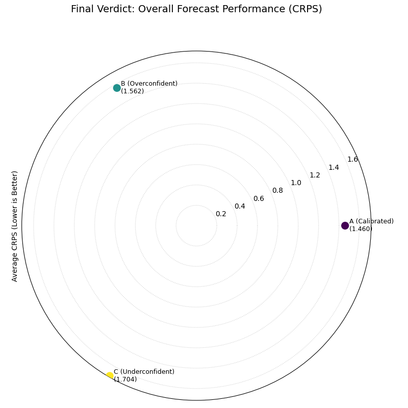
A polar plot with three points representing the final CRPS score for each model. The well-calibrated model is closest to the center, indicating the best overall performance.
Best Practice
The CRPS is an excellent “bottom-line” metric, but it should be used
as the final step of an analysis, not the only step. Always use
the plot_pit_histogram() and
plot_polar_sharpness() plots
first to understand why one model has a better CRPS than another.
This allows you to diagnose if the improvement comes from better
calibration, better sharpness, or both.
See Also
The plot_calibration_sharpness()
diagram provides an alternative summary view. While this plot gives a
single overall score (radius), the calibration-sharpness diagram
plots the two components (calibration error on the angle, sharpness
on the radius) separately, which can be useful for visualizing the
trade-off more explicitly.
For a deeper understanding of the statistical theory behind the Continuous Ranked Probability Score, please refer back to the main CRPS Comparison (plot_crps_comparison()) section.
Calibration-Sharpness Diagram
The plot_calibration_sharpness()
function provides the ultimate summary for probabilistic model
selection. It distills the two most important, and often competing,
qualities of a forecast—calibration (reliability) and sharpness
(precision)—into a single, decision-oriented visualization. Each model
is represented by a single point, making it immediately clear which one
achieves the best overall balance.
Let’s begin by understanding the components of this powerful summary plot.
Plot Anatomy
Angle (θ): Represents the calibration error of the forecast, calculated using the Kolmogorov-Smirnov statistic on the PIT values. An angle of 0° is perfect calibration, and the error increases as the angle approaches 90°.
Radius (r): Represents the sharpness of the forecast, measured as the average width of the prediction interval. A smaller radius is better, indicating a sharper, more precise forecast.
Ideal Point: The ideal forecast is located at the center of the plot (the origin), as this represents the perfect combination of zero calibration error and zero interval width (perfect sharpness). The best real-world model is the one closest to this point.
With this framework, let’s apply the plot to a final model selection problem, showing how it can guide us to the best choice.
Use Case: The Three-Model Trade-off
The most common use of this plot is to visualize the classic trade-offs between different types of probabilistic models and select the most balanced performer.
Let’s return to our weather forecasting scenario. An agency has three competing models for predicting temperature:
Model A (Balanced): A well-regarded model that aims for a good compromise.
Model B (Sharp & Biased): A newer, aggressive model that produces very tight predictions but is suspected of being poorly calibrated.
Model C (Calibrated & Wide): An older, conservative model that is reliable but often produces impractically wide prediction intervals.
 1import kdiagram as kd
 2import numpy as np
 3from scipy.stats import norm
 4import matplotlib.pyplot as plt
 5
 6# --- 1. Data Generation: Three models with different trade-offs ---
 7np.random.seed(42)
 8n_samples = 2000
 9y_true = np.random.normal(loc=15, scale=5, size=n_samples)
10quantiles = np.linspace(0.05, 0.95, 19)
11
12# Model A (Balanced)
13model_A = norm.ppf(quantiles, loc=y_true[:, np.newaxis], scale=5)
14# Model B (Sharp but biased/overconfident)
15model_B = norm.ppf(quantiles, loc=y_true[:, np.newaxis] - 1, scale=3)
16# Model C (Calibrated but wide/underconfident)
17model_C = norm.ppf(quantiles, loc=y_true[:, np.newaxis], scale=8)
18
19model_names = ["A (Balanced)", "B (Sharp/Biased)", "C (Calibrated/Wide)"]
20
21# --- 2. Plotting ---
22kd.plot_calibration_sharpness(
23    y_true,
24    model_A, model_B, model_C,
25    quantiles=quantiles,
26    names=model_names,
27    cmap='plasma',
28    title='Use Case: Model Selection Trade-off',
29    savefig="gallery/images/gallery_calibration_sharpness_basic.png",
30)
31plt.close()
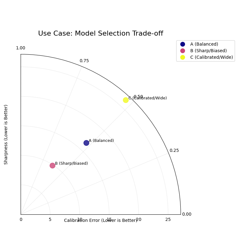
A polar plot showing three points, with the “Balanced” model being closest to the ideal point at the center of the plot.
See Also
This diagram is the culminating plot of a probabilistic forecast
evaluation. It synthesizes the information from the
plot_pit_histogram() (which
measures calibration) and the
plot_polar_sharpness() plot
into a single, decision-oriented graphic.
For a deeper understanding of the statistical theory behind calibration, sharpness, and proper scoring rules, please refer back to the main Calibration-Sharpness Diagram (plot_calibration_sharpness()) section.
Polar Credibility Bands
The plot_credibility_bands() function
is a descriptive tool for understanding the conditional
behavior of a probabilistic forecast. It answers the question: “How do
my model’s median prediction and its uncertainty change depending on a
specific feature, like the time of year or a categorical input?” By
binning the data based on this feature, it creates a clear picture of
the forecast’s structure.
Let’s begin by understanding the components of this diagnostic plot.
Plot Anatomy
Angle (θ): Represents the binned values of the feature specified by
theta_col. If the feature is cyclical (e.g., month of the year), the plot wraps around seamlessly to show the full cycle.Radius (r): Represents the magnitude of the forecast value.
Central Line: This solid black line shows the average of the median (Q50) forecast for each angular bin. Its position reveals the forecast’s central tendency under each condition.
Shaded Band: The area between the average of the lower and upper quantiles. The width of this band directly visualizes the average forecast sharpness for each bin, making it an excellent tool for diagnosing heteroscedasticity.
Now, let’s apply this plot to a real-world forecasting problem to see how it uncovers conditional patterns.
Use Case 1: Diagnosing Seasonal Uncertainty
A primary use case for this plot is to analyze how a forecast’s central tendency and uncertainty evolve over a seasonal or cyclical period.
Let’s simulate a forecast for monthly product sales. We expect both the sales volume and the forecast uncertainty to follow a strong seasonal pattern, with higher and more volatile sales during the holiday season.
 1import kdiagram as kd
 2import pandas as pd
 3import numpy as np
 4import matplotlib.pyplot as plt
 5
 6# --- 1. Data Generation: Seasonal Sales Forecast ---
 7np.random.seed(0)
 8n_points = 1000
 9# Simulate a cyclical feature (month of the year)
10month = np.random.randint(1, 13, n_points)
11# Forecast median follows a seasonal pattern (peaks in summer/winter)
12median_forecast = 50 + 25 * np.sin((month - 3) * np.pi / 6)
13# Uncertainty (interval width) is also seasonal (widest in winter)
14interval_width = 15 + 10 * np.cos(month * np.pi / 3)**2
15
16df_seasonal = pd.DataFrame({
17    'month': month,
18    'q50_sales': median_forecast + np.random.randn(n_points) * 3,
19    'q10_sales': median_forecast - interval_width,
20    'q90_sales': median_forecast + interval_width,
21})
22
23# --- 2. Plotting ---
24kd.plot_credibility_bands(
25    df=df_seasonal,
26    q_cols=('q10_sales', 'q50_sales', 'q90_sales'),
27    theta_col='month',
28    theta_period=12, # A 12-month cycle
29    theta_bins=12,
30    title="Use Case 1: Seasonal Sales Forecast Uncertainty",
31    color="#8E44AD", # A nice purple
32    savefig="gallery/images/gallery_credibility_bands_seasonal.png",
33)
34plt.close()
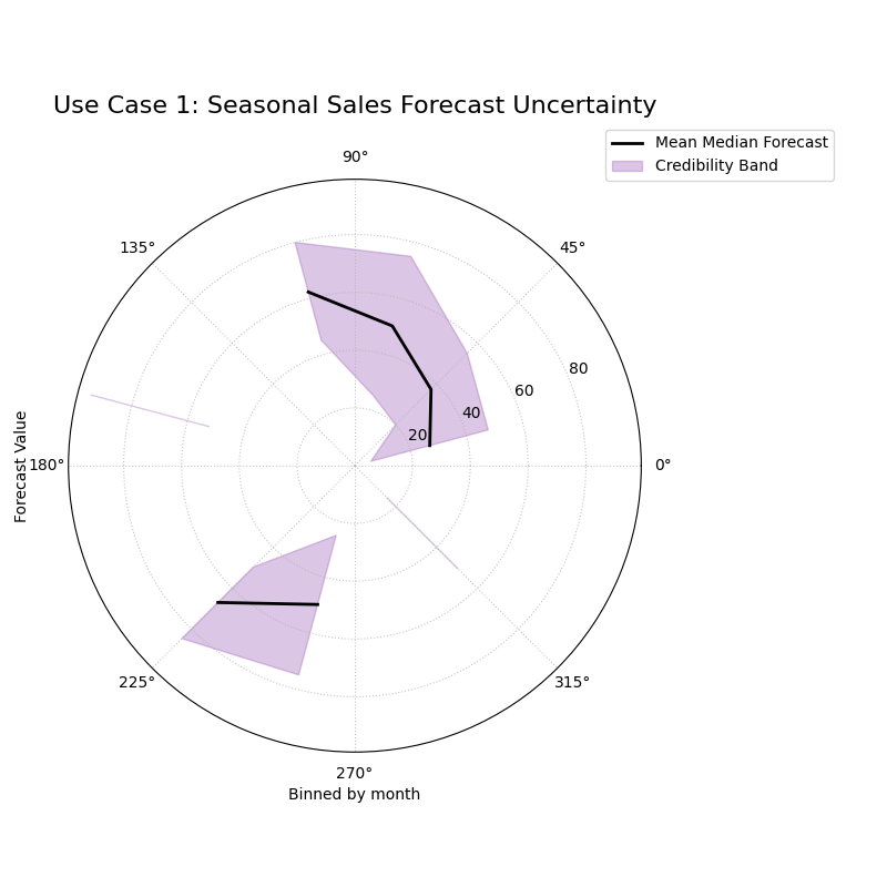
The central line (median) and the width of the shaded band both show a clear cyclical pattern as the angle (month) changes.
Use Case 2: Comparing Uncertainty Across Categories
This plot is not limited to time-based features. It is an ideal tool for comparing the forecast distribution across any set of discrete categories.
Let’s analyze a model that predicts shipping costs. We want to see if the model’s uncertainty is different for three distinct shipping methods: “Air”, “Sea”, and “Ground”.
 1# --- 1. Data Generation: Shipping Cost by Method ---
 2np.random.seed(42)
 3n_points = 900
 4# Assign each sample to a shipping method
 5method_map = {0: 'Air', 1: 'Sea', 2: 'Ground'}
 6shipping_method_code = np.random.randint(0, 3, n_points)
 7shipping_method_name = [method_map[c] for c in shipping_method_code]
 8
 9# Define different uncertainty profiles for each method
10median_forecast = np.zeros(n_points)
11interval_width = np.zeros(n_points)
12median_forecast[shipping_method_code == 0] = 150 # Air is expensive
13median_forecast[shipping_method_code == 1] = 70  # Sea is mid-range
14median_forecast[shipping_method_code == 2] = 40  # Ground is cheap
15interval_width[shipping_method_code == 0] = 30 # Air is predictable
16interval_width[shipping_method_code == 1] = 50 # Sea is highly unpredictable
17interval_width[shipping_method_code == 2] = 10 # Ground is very predictable
18
19df_shipping = pd.DataFrame({
20    'method_code': shipping_method_code,
21    'q50_cost': median_forecast + np.random.randn(n_points),
22    'q10_cost': median_forecast - interval_width,
23    'q90_cost': median_forecast + interval_width,
24})
25
26# --- 2. Plotting ---
27# Note: Since theta_col is categorical, we don't set theta_period.
28# The plot will map the unique categories to the angular space.
29kd.plot_credibility_bands(
30    df=df_shipping,
31    q_cols=('q10_cost', 'q50_cost', 'q90_cost'),
32    theta_col='method_code', # Bin by the numerical code
33    theta_bins=3, # We have 3 categories
34    title="Use Case 2: Shipping Cost Uncertainty by Method",
35    savefig="gallery/images/gallery_credibility_bands_categorical.png",
36)
37plt.close()
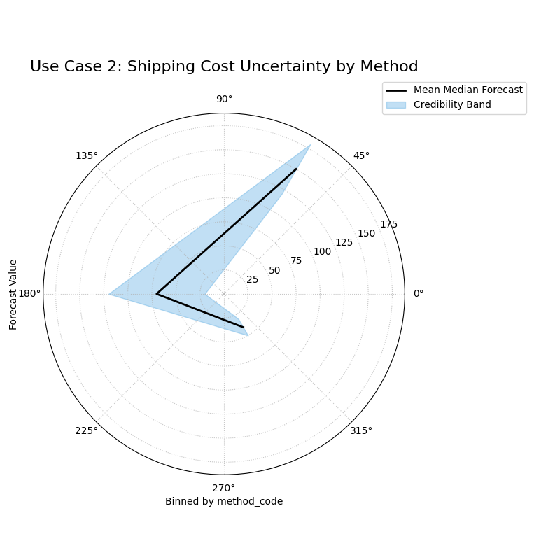
The plot is divided into three distinct angular sectors, one for each shipping method, each showing a different median value and interval width.
Use Case 3: Side-by-Side Comparison of Conditional Uncertainty
A truly powerful application of this plot is to compare the conditional uncertainty structures of two competing models. Does a newer, more complex model produce more realistic uncertainty estimates under different conditions than an older, simpler one? A side-by-side comparison provides a clear and decisive answer.
Best Practice
To compare two models, create a multi-panel figure using
matplotlib.pyplot.subplots and then pass each ax object to
plot_credibility_bands. This is the recommended workflow for a
direct, visual comparison of model behavior.
Let’s tackle a common problem in energy forecasting: predicting solar power output, where uncertainty is highly dependent on cloud cover.
Practical Example
A renewable energy company is evaluating a new AI-based model for forecasting solar power output against their older “Baseline Model”. The baseline model has a known weakness: it assumes a constant level of uncertainty regardless of the weather. The new AI model is supposed to have learned that forecasts are much less certain on heavily overcast days.
We will create a side-by-side credibility band plot, with both plots binned by cloud cover. The left panel will show the Baseline Model’s naive uncertainty, and the right panel will show the AI Model’s more sophisticated, condition-dependent uncertainty.
 1import kdiagram as kd
 2import pandas as pd
 3import numpy as np
 4import matplotlib.pyplot as plt
 5
 6# --- 1. Data Generation: Solar Power Forecast ---
 7np.random.seed(1)
 8n_points = 2000
 9# Cloud cover from 0% to 100%
10cloud_cover = np.random.uniform(0, 100, n_points)
11# Median forecast decreases with more clouds
12median_forecast = 150 * np.exp(-cloud_cover / 50) + np.random.normal(0, 5, n_points)
13
14df_solar = pd.DataFrame({'cloud_cover': cloud_cover, 'q50_ai': median_forecast, 'q50_baseline': median_forecast})
15
16# --- 2. Generate Predictions for Two Models ---
17# Baseline Model: constant, naive uncertainty
18width_baseline = np.ones(n_points) * 30
19df_solar['q10_baseline'] = df_solar['q50_baseline'] - width_baseline
20df_solar['q90_baseline'] = df_solar['q50_baseline'] + width_baseline
21
22# AI Model: uncertainty correctly grows with cloud cover
23width_ai = 10 + (df_solar['cloud_cover'] / 100) * 50
24df_solar['q10_ai'] = df_solar['q50_ai'] - width_ai
25df_solar['q90_ai'] = df_solar['q50_ai'] + width_ai
26
27# --- 3. Create a figure with two polar subplots ---
28fig, (ax1, ax2) = plt.subplots(1, 2, figsize=(16, 8),
29                             subplot_kw={'projection': 'polar'})
30
31# --- 4. Plot each model's diagnostic on its dedicated axis ---
32kd.plot_credibility_bands(
33    df=df_solar, ax=ax1,
34    q_cols=('q10_baseline', 'q50_baseline', 'q90_baseline'),
35    theta_col='cloud_cover',
36    theta_bins=10, # Bin cloud cover into 10 groups
37    title='Baseline Model (Naive Uncertainty)',
38    color='crimson'
39)
40kd.plot_credibility_bands(
41    df=df_solar, ax=ax2,
42    q_cols=('q10_ai', 'q50_ai', 'q90_ai'),
43    theta_col='cloud_cover',
44    theta_bins=10,
45    title='AI Model (Conditional Uncertainty)',
46    color='teal'
47)
48
49fig.suptitle('Use Case 3: Comparing Conditional Uncertainty Structures', fontsize=16)
50fig.tight_layout(rect=[0, 0.03, 1, 0.95])
51fig.savefig("gallery/images/gallery_credibility_bands_side_by_side.png")
52plt.close(fig)
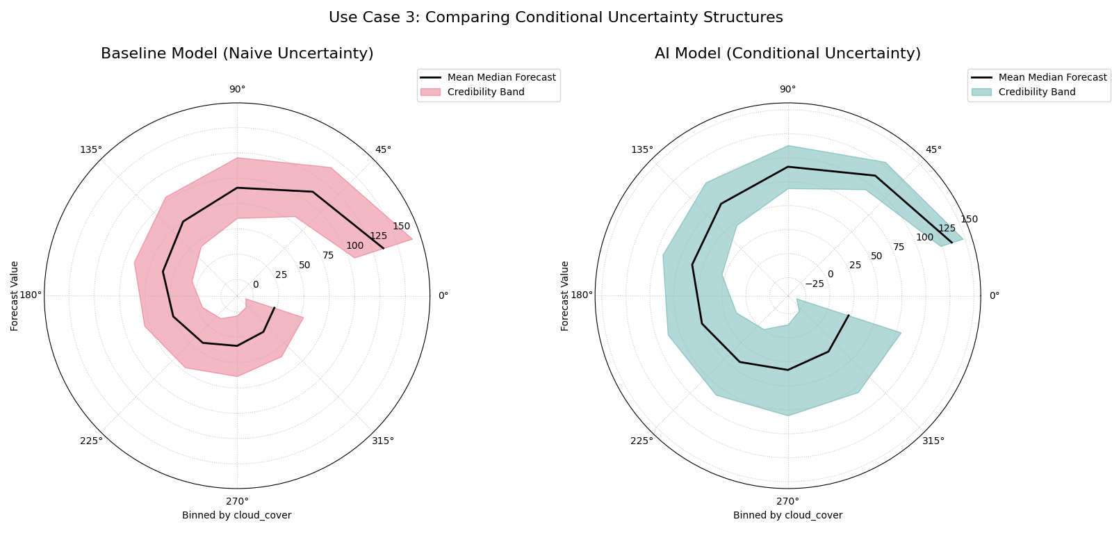
A two-panel figure. The left plot (Baseline Model) shows a credibility band with a constant width. The right plot (AI Model) shows a band that is narrow for low cloud cover and wide for high cloud cover.
For a deeper understanding of the statistical concepts behind conditional distributions and heteroscedasticity, please refer back to the main Polar Credibility Bands (plot_credibility_bands()) section.