Feature-Based Visualization Gallery
This gallery page showcases plots from k-diagram focused on understanding feature influence and importance. Currently, it features the Feature Importance Fingerprint plot.
Note
You need to run the code snippets locally to generate the plot
images referenced below (e.g., images/gallery_feature_fingerprint.png).
Ensure the image paths in the .. image:: directives match where
you save the plots (likely an images subdirectory relative to
this file).
Feature Importance Fingerprint
The plot_feature_fingerprint()
function is a tool for model interpretation. It creates a polar
radar chart to visualize and compare the importance profiles of multiple
features across different contexts (e.g., different models or time
periods). Each context is represented by a unique “fingerprint,”
allowing for an immediate visual comparison of what drives the model’s
decisions.
First, let’s break down the components of this comparative plot.
Plot Anatomy
Angle (θ): Each angular axis is assigned to a specific input feature (e.g., ‘Rainfall’, ‘Temperature’).
Radius (r): Corresponds to the importance score of that feature for a given layer. This can be the raw score or, more commonly, a normalized score (
normalize=True) where 1.0 is the most important feature within that layer.Polygon (Layer): Each colored polygon represents a different layer or context, such as a different model, a different time period, or a different customer segment. The polygon’s shape is the “fingerprint” of feature influence for that layer.
With this framework, let’s apply the plot to a real-world problem, starting with a classic model comparison and then moving to a more advanced analysis of concept drift.
Use Case 1: Comparing Different Models’ “Logic”
A primary use of this plot is to compare the internal “logic” of two or more competing models. Do they rely on the same features to make decisions, or do they have fundamentally different approaches to solving the problem?
Let’s imagine a telecommunications company has trained a simple Logistic Regression model and a complex Gradient Boosting model to predict customer churn. They need to understand what each model has learned before deploying it.
 1import kdiagram as kd
 2import numpy as np
 3import matplotlib.pyplot as plt
 4
 5# --- 1. Data Generation: Feature Importances for Two Models ---
 6features = [
 7    'Tenure', 'Monthly Charges', 'Total Charges',
 8    'Data Usage', 'Support Calls', 'Contract Type'
 9]
10labels = ['Logistic Regression', 'Gradient Boosting']
11
12# A simple model might rely heavily on a few key features
13logreg_importances = [0.9, 0.8, 0.7, 0.1, 0.2, 0.6]
14# A more complex model might learn from a wider array of signals
15boosting_importances = [0.5, 0.6, 0.6, 0.9, 0.8, 0.4]
16
17importances = np.array([logreg_importances, boosting_importances])
18
19# --- 2. Plotting ---
20kd.plot_feature_fingerprint(
21    importances=importances,
22    features=features,
23    labels=labels,
24    normalize=True, # Focus on the relative pattern of importance
25    title="Use Case 1: Churn Model Feature Importance Fingerprints",
26    acov="full", # use full circle.
27    savefig="gallery/images/gallery_feature_fingerprint_models.png"
28)
29plt.close()
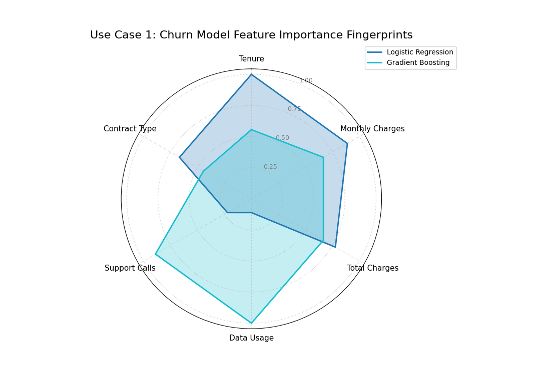
The “fingerprints” of two models, showing that the Logistic Regression (blue) relies on tenure and charges, while the Gradient Boosting model (orange) relies more on usage and support calls.
Use Case 2: Diagnosing Feature Importance Drift Over Time
A model’s logic may not be static. The factors that predict an outcome one year might be different the next, a phenomenon known as concept drift. This plot is an excellent tool for diagnosing this drift by comparing a model’s feature importance fingerprints calculated from different time periods.
Let’s analyze a model that predicts crop yield. We’ll simulate how the importance of different environmental factors might change over three consecutive years due to changing climate patterns.
 1# --- 1. Data Generation: Feature Importances for Three Years ---
 2features = ['Rainfall', 'Temperature', 'Wind Speed',
 3            'Soil Moisture', 'Solar Radiation', 'Topography']
 4years = ['2022 (Wet Year)', '2023 (Dry Year)', '2024 (Hot Year)']
 5
 6# Simulate importance scores that change each year
 7importances_yearly = np.array([
 8    # 2022: A wet year, so rainfall and topography are key
 9    [0.9, 0.3, 0.2, 0.5, 0.4, 0.6],
10    # 2023: A dry year, so soil moisture becomes critical
11    [0.4, 0.5, 0.1, 0.9, 0.6, 0.3],
12    # 2024: A hot year, so temperature and solar radiation dominate
13    [0.2, 0.9, 0.3, 0.4, 0.8, 0.1]
14])
15
16# --- 2. Plotting ---
17kd.plot_feature_fingerprint(
18    importances=importances_yearly,
19    features=features,
20    labels=years,
21    normalize=True,
22    title="Use Case 2: Yearly Drift in Crop Yield Feature Importance",
23    cmap='Set2',
24    savefig="gallery/images/gallery_feature_fingerprint_drift.png"
25)
26plt.close()
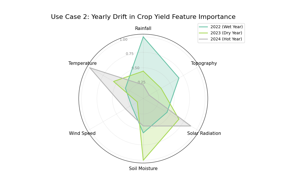
Three overlapping polygons, each with a different shape, showing that the most important feature for the model changes each year.
For a deeper understanding of the statistical concepts behind feature importance and model interpretation, please refer back to the main Feature Importance Fingerprint (plot_feature_fingerprint()) section.
Feature Fingerprint (Dynamic)
The plot_fingerprint() function is a
versatile tool for model and data interpretation. As a next-generation
evolution of the feature fingerprint plot, it not only visualizes
pre-computed importance scores but can also dynamically calculate
them from raw data. This allows for rapid, code-efficient exploration
of feature significance across different groups or contexts.
It can operate in two primary modes:
Unsupervised: To find the most variable or dispersed features within different data segments (e.g., using standard deviation).
Supervised: To find features most correlated with a target variable.
First, let’s review the plot’s structure.
Plot Anatomy
Angle (θ): Each angular axis is assigned to a specific input feature (e.g., ‘Alcohol’, ‘Flavanoids’).
Radius (r): Corresponds to the importance score of that feature. When calculated dynamically, this could be a standard deviation, variance, or correlation value. Normalizing this score (
normalize=True) is common to compare the relative patterns.Polygon (Layer): Each colored polygon represents a different layer or context. This function can automatically generate these layers by splitting the data using a
group_col.
Use Case 1: Unsupervised Fingerprint for Variability Analysis
An ideal use of this function is to understand the intrinsic properties of a dataset. Let’s imagine we have a dataset of different wine cultivars and want to identify which chemical properties are the most variable for each type. This can reveal the defining, or most inconsistent, characteristics of each group without respect to a target.
Here, we’ll use method='std' to compute the standard deviation for
each feature, grouped by wine type.
 1import numpy as np
 2import pandas as pd
 3import matplotlib.pyplot as plt
 4from sklearn.datasets import load_wine
 5import kdiagram as kd
 6
 7# --- 1) Load and tidy
 8wine = load_wine()
 9df = pd.DataFrame(wine.data, columns=wine.feature_names)
10df["wine_type"] = pd.Series(wine.target).map(
11    {0: "Cultivar A", 1: "Cultivar B", 2: "Cultivar C"}
12)
13
14# --- 2) Standardize features globally (z-score) to remove scale effects
15X = df.drop(columns=["wine_type"])
16Z = (X - X.mean()) / X.std(ddof=0)
17
18# --- 3) Per-cultivar variability on standardized features
19std_by_type = (
20    pd.concat([Z, df["wine_type"]], axis=1)
21      .groupby("wine_type")
22      .std(ddof=0)
23)
24
25# --- 4) Keep a compact, readable set of axes
26# Pick the top-8 features by average variability across cultivars
27features_top8 = (
28    std_by_type.mean(axis=0)
29    .sort_values(ascending=False)
30    .head(8)
31    .index
32    .tolist()
33)
34
35# --- 5) Plot: pass precomputed matrix (layers x features)
36kd.plot_fingerprint(
37    std_by_type[features_top8],   # precomputed importances (DataFrame)
38    precomputed=True,
39    labels=std_by_type.index.tolist(),
40    features=features_top8,
41    normalize=True,               # compare shapes per cultivar
42    title="Chemical Variability Fingerprint by Wine Cultivar",
43    acov="half_circle",           # cleaner labels
44    # savefig="gallery/images/plot_fingerprint_variability.png",
45)
46plt.close()
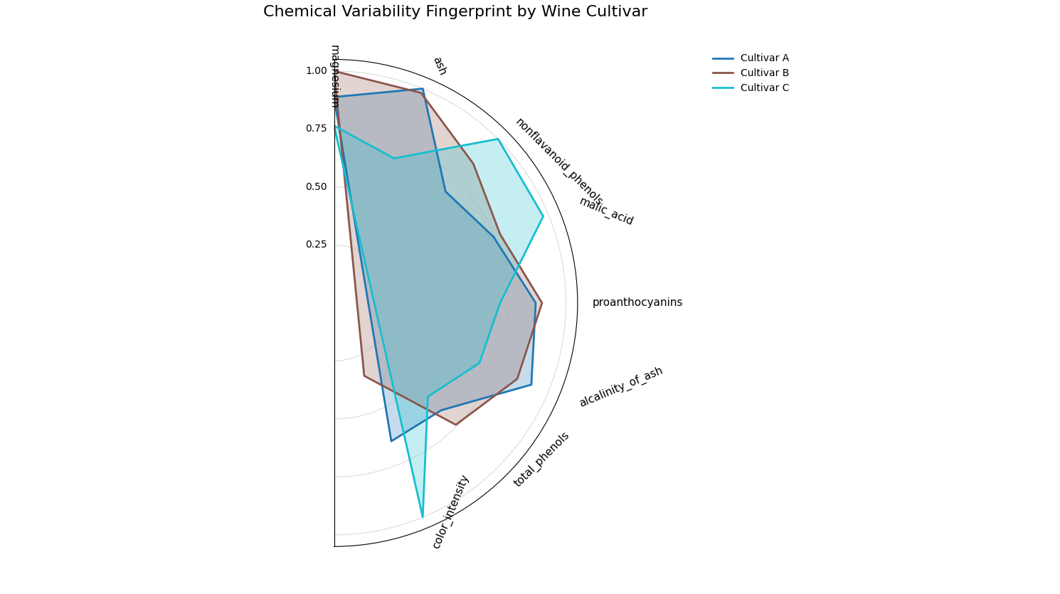
The “fingerprints” show that ‘Cultivar A’ is most variable in its ‘flavanoids’, while ‘Cultivar C’ is most variable in ‘proline’.
Use Case 2: Supervised Fingerprint for Correlation Analysis
Now, let’s switch to a supervised problem. We want to understand what drives the quality of a wine. We can use the function to compute the absolute correlation of each feature with a target variable (y_col).
Let’s simulate a scenario where the factors driving quality differ between two vineyards. This is a common real-world problem where the context (the vineyard) changes the feature importance landscape.
 1# --- 1. Generate Synthetic Quality Data ---
 2import numpy as np
 3import pandas as pd
 4import matplotlib.pyplot as plt
 5import kdiagram as kd
 6
 7# Reuse df from Use Case 1 (already has features + wine_type)
 8# If running standalone, rebuild df with load_wine() as above.
 9
10np.random.seed(42)
11
12# --- 1) Create vineyard context
13df["vineyard"] = np.random.choice(["Hillside", "Valley"], size=len(df), p=[0.5, 0.5])
14hillside = df["vineyard"] == "Hillside"
15valley   = ~hillside
16
17# --- 2) Build a full-length, index-aligned quality Series
18quality = pd.Series(0.0, index=df.index)
19
20# Hillside: alcohol & flavanoids drive quality
21quality.loc[hillside] += (
22    1.2 * df.loc[hillside, "alcohol"]
23    + 2.0 * df.loc[hillside, "flavanoids"]
24)
25
26# Valley: proline & color_intensity drive quality
27quality.loc[valley] += (
28    0.005 * df.loc[valley, "proline"]      # rescale proline so it isn’t dominating
29    + 1.5   * df.loc[valley, "color_intensity"]
30)
31
32# Add modest noise everywhere
33quality += np.random.normal(0, 0.5, size=len(df))
34
35df["quality_score"] = quality
36
37# --- 3) Choose a compact, interpretable feature set
38drivers = ["alcohol", "flavanoids", "proline", "color_intensity"]
39# Add a few supporting axes with high overall variance to improve context
40extra = (
41    df.drop(columns=["wine_type", "vineyard", "quality_score"])
42      .std()
43      .sort_values(ascending=False)
44      .index.difference(drivers)
45      .tolist()[:4]
46)
47features_to_show = drivers + extra   # 8 axes total
48
49# --- 4) Plot absolute correlation per vineyard
50kd.plot_fingerprint(
51    df,
52    precomputed=False,
53    y_col="quality_score",
54    group_col="vineyard",
55    method="abs_corr",                 # |corr(y, x)| per group
56    features=features_to_show,
57    normalize=True,
58    acov="full",                       # full-circle works nicely here
59    title="Quality Driver Fingerprints by Vineyard",
60    # savefig="gallery/images/plot_fingerprint_correlation.png",
61)
62plt.close()
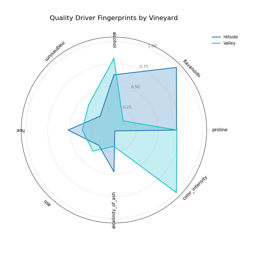
The plot shows that for the ‘Hillside’ vineyard, ‘flavanoids’ and ‘alcohol’ are most correlated with quality, while for the ‘Valley’ vineyard, it’s ‘proline’ and ‘color_intensity’.
Best Practice
Method Selection: Use unsupervised methods (
'std','var') for data characterization and supervised methods ('abs_corr') when you have a clear prediction target.Normalization: Keep
normalize=True(the default) when you care about the relative pattern of importances within each group. This answers: “What is the most important feature for this group?”Angular Coverage: The default
acov="half_circle"is often excellent for readability, especially with many features, as it prevents labels from overlapping at the top and bottom. Use"full"when a circular metaphor is more intuitive.
For more details on the statistical calculations, please see the main User Guide section on Dynamic Feature Fingerprint (plot_fingerprint()).
Polar Feature Interaction
The plot_feature_interaction()
function is a powerful diagnostic tool for visualizing the joint effect
of two features on a target variable. By mapping these interactions
onto a polar heatmap, it excels at revealing complex, non-linear
relationships and conditional patterns that are often missed by
traditional 1D or 2D Cartesian plots.
First, let’s break down the components of this insightful plot.
Plot Anatomy
Angle (θ): Represents the first independent feature. This axis is ideal for cyclical data (e.g., ‘hour of day’, ‘month of year’), where the start and end points connect seamlessly.
Radius (r): Represents the second independent feature, plotted concentrically. The lowest value is at the center, and the highest is at the periphery.
Color: Represents the aggregated value of the dependent (target) variable for all data points falling within a specific angle-radius bin. The aggregation statistic (e.g., ‘mean’ or ‘std’) can be specified.
With this framework, we can explore how seemingly independent features can conspire to influence an outcome.
Use Case 1: Comparing Modes — Basic (Heatmap) vs. Annular (Wedges)
A classic application is modeling solar panel energy output. The output
is not determined by the hour or cloud cover alone, but by their strong
interaction. High output is only possible during daylight hours and when
cloud cover is low. These plots make that relationship immediately obvious.
We can visualize this comparison using two different modes:
the default heatmap (mode='basic') and the discrete wedge view
(mode='annular').
The plot_feature_interaction()
function integrates directly with Matplotlib, allowing us to pass an
ax object to place them side-by-side on a subplot.
 1import kdiagram as kd
 2import pandas as pd
 3import numpy as np
 4import matplotlib.pyplot as plt
 5
 6# --- Data Generation ---
 7np.random.seed(0)
 8n_points = 5000
 9hour_of_day = np.random.uniform(0, 24, n_points)
10cloud_cover = np.random.rand(n_points)
11
12# Target depends on the interaction between daylight and cloud cover
13daylight = np.sin(hour_of_day * np.pi / 24) ** 2
14cloud_factor = (1 - cloud_cover ** 0.5)
15output = 100 * daylight * cloud_factor + np.random.rand(n_points) * 5
16output[(hour_of_day < 6) | (hour_of_day > 18)] = 0 # No output at night
17
18df_solar = pd.DataFrame({
19    'hour': hour_of_day,
20    'cloud_cover': cloud_cover,
21    'panel_output': output,
22})
23
24# --- Create a 1x2 Subplot Figure ---
25# Note: We must use subplot_kw to create polar axes
26fig, (ax1, ax2) = plt.subplots(
27    1, 2,
28    figsize=(16, 8),
29    subplot_kw={'projection': 'polar'}
30)
31fig.suptitle('Solar Panel Output: Basic vs. Annular Mode', fontsize=18, y=1.05)
32
33# --- Plot 1: Basic (default heatmap) ---
34kd.plot_feature_interaction(
35    df=df_solar,
36    theta_col='hour',
37    r_col='cloud_cover',
38    color_col='panel_output',
39    theta_period=24,
40    theta_bins=24,
41    r_bins=8,
42    cmap='inferno',
43    title='(a) Basic Mode (Heatmap)',
44    ax=ax1  # Pass the first axis
45)
46
47# --- Plot 2: Annular (wedges) with Custom Ticks ---
48kd.plot_feature_interaction(
49    df=df_solar,
50    theta_col='hour',
51    r_col='cloud_cover',
52    color_col='panel_output',
53    theta_period=24,
54    theta_bins=24,
55    r_bins=8,
56    cmap='inferno',
57    mode="annular",  # Use curved wedges
58    title='(b) Annular Mode (Wedges)',
59    # --- Custom, human-readable ticks ---
60    theta_ticks=[0, 6, 12, 18],
61    theta_ticklabels={0: "Midnight", 6: "6 AM", 12: "Noon", 18: "6 PM"},
62    r_ticks=[0, 0.5, 1.0],
63    r_ticklabels={0: "Clear Sky", 0.5: "Partial", 1.0: "Overcast"},
64    ax=ax2  # Pass the second axis
65)
66
67# --- Save the combined figure ---
68#plt.tight_layout(pad=3.0)
69kd.savefig('gallery/images/plot_feature_interaction_solar_comparison.png')
70plt.close(fig)
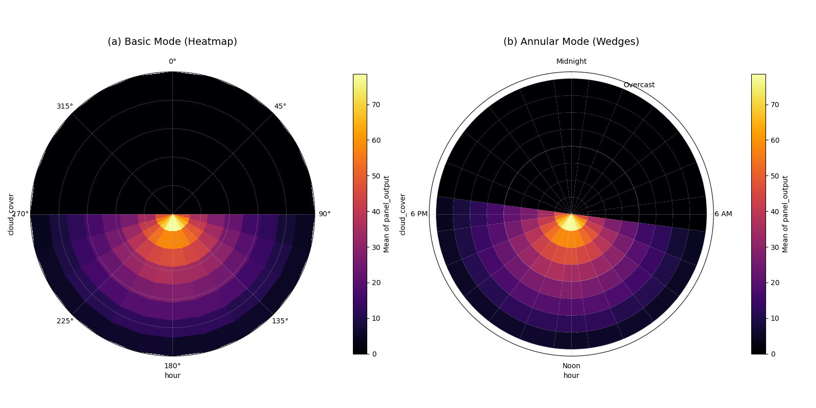
A comparison of the (a) basic heatmap and (b) annular wedge plot for the same solar panel data.
Use Case 2: Identifying Market Volatility
Beyond simple averages, this plot can visualize higher-order moments
like standard deviation to uncover volatility. Consider a financial
dataset where we want to understand stock price volatility based on the
time of day and a real-time market sentiment score. Here, we set
statistic='std' to find combinations of time and sentiment that
lead to the most unpredictable pricing.
 1# --- Data Generation for Market Volatility ---
 2np.random.seed(42)
 3n_trades = 10000
 4trade_hour = np.random.uniform(9.5, 16, n_trades) # Trading hours
 5sentiment = np.random.uniform(-1, 1, n_trades)   # Sentiment score
 6
 7# Volatility is highest at market open/close and during high sentiment
 8time_vol = 1 / ((trade_hour - 12.75)**2 + 0.5)
 9senti_vol = (sentiment + 1.1)**2
10price_change = np.random.randn(n_trades) * time_vol * senti_vol
11
12df_market = pd.DataFrame({
13    'hour': trade_hour,
14    'sentiment_score': sentiment,
15    'price_change_abs': np.abs(price_change)
16})
17
18# --- Plotting Volatility ---
19kd.plot_feature_interaction(
20    df=df_market,
21    theta_col='hour',
22    r_col='sentiment_score',
23    color_col='price_change_abs',
24    statistic='std', # Visualize standard deviation
25    theta_period=24,
26    theta_bins=16,
27    r_bins=10,
28    cmap='plasma',
29    title='Market Price Volatility by Hour and Sentiment',
30    savefig='gallery/images/plot_feature_interaction_volatility.png',
31)
32plt.close()

Volatility (bright colors) is highest at market open/close and when sentiment is most positive (outermost ring).
Use Case 3: Annular Mode & Custom Domain Ticks
The “annular” mode renders each bin as a
distinct curved wedge, which can be visually clearer than the default
heatmap. More importantly, we use theta_ticks,
theta_ticklabels, r_ticks, and r_ticklabels to map the raw
data values (like hour=9.5 or sentiment=-1.0) to
human-readable, domain-specific labels (like “Open 9:30” or
“Bearish”). This makes the plot self-explanatory.
 1import kdiagram as kd
 2import pandas as pd
 3import numpy as np
 4import matplotlib.pyplot as plt
 5
 6# --- Data Generation for Market Volatility ---
 7np.random.seed(42)
 8n_trades = 10000
 9trade_hour = np.random.uniform(9.5, 16, n_trades) # Trading hours
10sentiment = np.random.uniform(-1, 1, n_trades)   # Sentiment score
11
12# Volatility is highest at market open/close and during high sentiment
13time_vol = 1 / ((trade_hour - 12.75)**2 + 0.5)
14senti_vol = (sentiment + 1.1)**2
15price_change = np.random.randn(n_trades) * time_vol * senti_vol
16
17df_market = pd.DataFrame({
18    'hour': trade_hour,
19    'sentiment_score': sentiment,
20    'price_change_abs': np.abs(price_change)
21})
22
23# --- Plotting Volatility with Annular Mode & Custom Ticks ---
24kd.plot_feature_interaction(
25    df=df_market,
26    theta_col='hour',
27    r_col='sentiment_score',
28    color_col='price_change_abs',
29    statistic='std', # Visualize standard deviation
30    theta_period=24, # Use 24 to scale hours correctly
31    theta_bins=16,
32    r_bins=10,
33    acov='half_circle', # Focus on the trading day
34    cmap='plasma',
35    title='Market Price Volatility by Hour and Sentiment',
36    mode="annular",  # Use curved wedges
37    theta_ticks=[9.5, 12.0, 16.0],
38    theta_ticklabels={9.5: "Open 9:30", 12.0: "Noon", 16.0: "Close 16:00"},
39    theta_tick_step=1.0, # 1 unit in your theta data space
40    r_ticks=[-1, -0.5, 0, 0.5, 1],
41    r_ticklabels={-1:"Bearish", 0:"Neutral", 1:"Bullish"},
42    savefig='gallery/images/plot_feature_interaction_volatility_mode_annular.png',
43)
44plt.close()
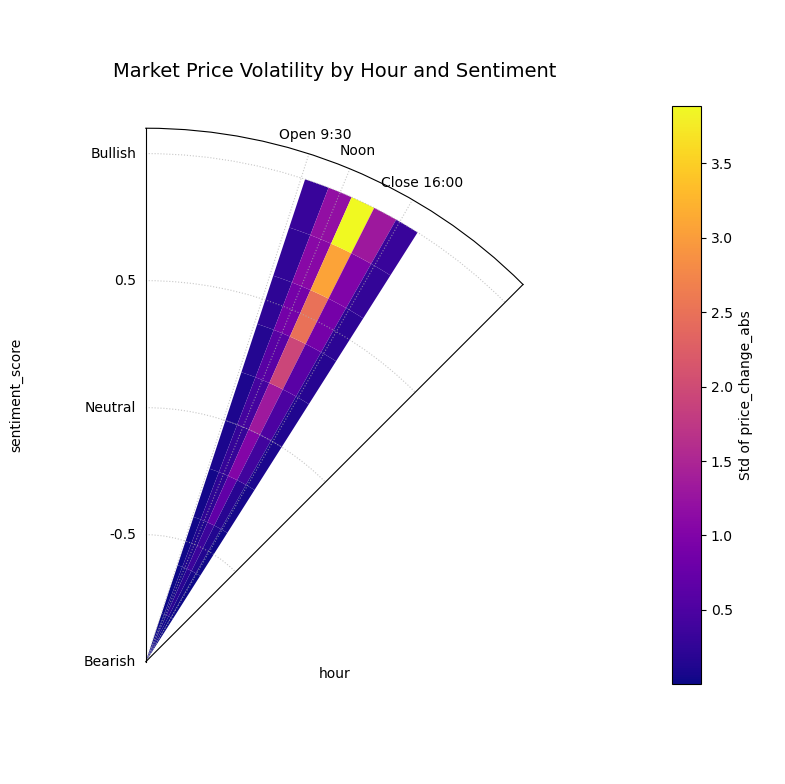
The plot uses mode=”annular” for clear bins and custom tick labels like “Open 9:30”, “Noon”, “Bearish”, and “Bullish” for readability.
Use Case 4: Focused Analysis in Manufacturing
Sometimes, a full 360° view is not necessary, especially when one
feature is not cyclical. We can use the acov (angular coverage)
parameter to create a sector plot for a more focused analysis.
Imagine a process where product defects are related to machine speed
and lubricant viscosity. We can map the linear viscosity scale to a
180° arc using acov='half_circle'.
 1# --- Data Generation for Manufacturing Defects ---
 2np.random.seed(123)
 3n_samples = 8000
 4speed = np.random.uniform(100, 500, n_samples)      # Speed in RPM
 5viscosity = np.random.uniform(20, 80, n_samples) # Viscosity in cSt
 6
 7# Defects occur primarily at high speeds with low viscosity
 8defect_prob = 1 / (1 + np.exp(
 9    -0.02 * ((speed - 400) - (viscosity - 50) * 5)
10))
11defects = np.random.binomial(1, defect_prob)
12
13df_qc = pd.DataFrame({
14    'speed_rpm': speed, 'viscosity_cst': viscosity, 'is_defect': defects
15})
16
17# --- Plotting with Angular Coverage Control ---
18kd.plot_feature_interaction(
19    df=df_qc,
20    theta_col='viscosity_cst', # Non-cyclical feature
21    r_col='speed_rpm',
22    color_col='is_defect',
23    statistic='mean',     # Mean of binary = defect rate
24    acov='half_circle',   # Use a 180-degree view
25    theta_bins=15,
26    r_bins=10,
27    cmap='cividis',
28    title='Product Defect Rate by Speed and Viscosity',
29    savefig='gallery/images/plot_feature_interaction_defects.png',
30)
31plt.close()
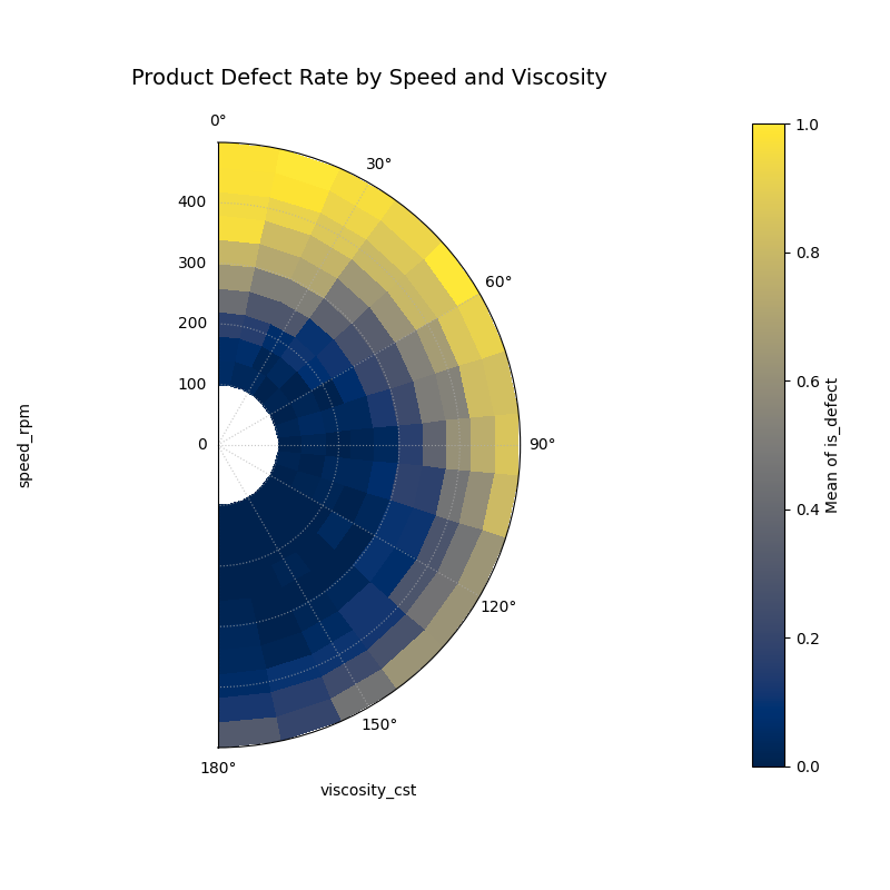
The focused semi-circle plot pinpoints the highest defect rate (bright yellow) at high speeds and low-to-mid viscosity.
For a deeper dive into the underlying mathematics of polar mapping and binning, please refer to the main User Guide section on Feature Interaction Plot (plot_feature_interaction()).