Evaluating Classification Models
Evaluating the performance of classification models is a crucial step in the machine learning workflow. Beyond a single accuracy score, a thorough evaluation requires understanding a model’s ability to distinguish between classes, its performance on imbalanced data, and its specific types of errors.
The kdiagram.plot.evaluation module provides a suite of
visualizations for this purpose, featuring novel polar adaptations
of standard, powerful diagnostic tools like the ROC curve, the
Precision-Recall curve, and the confusion matrix. These plots
provide an intuitive and aesthetically engaging way to compare
the performance of multiple models and diagnose their strengths
and weaknesses.
Note
Many evaluation plots accept kind={'polar','cartesian'}
(default is 'polar' unless stated otherwise). When
kind='cartesian', the function delegates to a Cartesian
renderer while preserving common styling (figsize, colors,
show_grid). Polar-only options (e.g., acov, zero_at,
clockwise) are ignored in Cartesian mode. The return value is
always the actual Axes used. Use Cartesian when you want the
conventional reading for ROC/PR and classification plots (FPR/TPR on x/y,
Precision/Recall on y/x, grouped bars). Use Polar when you want
compact overviews, periodic angles, or comparative radial layouts.
For ROC/PR in polar, a quarter-circle is used for readability. In the following
examples, we use the default behavior ( i.e kind="polar").
Summary of Evaluation Functions
Function |
Description |
|---|---|
Draws a Polar Receiver Operating Characteristic (ROC) curve to assess a model’s discriminative ability. |
|
Draws a Polar Precision-Recall (PR) curve, ideal for evaluating models on imbalanced datasets. |
|
Visualizes the four components of a binary confusion matrix as a polar bar chart. |
|
Visualizes a multiclass confusion matrix using a grouped polar bar chart to show per-class predictions. |
|
Displays a detailed per-class report of Precision, Recall, and F1-Score on a polar plot. |
|
Visualizes the Pinball Loss for each quantile of a probabilistic forecast. |
|
Visualizes the performance of multiple regression models through grouped polar bar chart. |
Polar ROC Curve (plot_polar_roc())
Purpose: This function creates a Polar Receiver Operating Characteristic (ROC) Curve, a novel visualization for evaluating the performance of binary classification models. It adapts the standard ROC curve, a fundamental tool in machine learning, to a more intuitive and aesthetically engaging polar format [1].
Mathematical Concept: A Receiver Operating Characteristic (ROC) curve is a standard tool for evaluating binary classifiers [2]. It is created by plotting the True Positive Rate (TPR) against the False Positive Rate (FPR) at various threshold settings.
The novelty of this plot, developed as part of the analytics framework in [3], lies in its transformation of these Cartesian coordinates into a polar system. The mapping is defined as:
This transformation maps the standard ROC space onto a 90-degree polar quadrant:
The angle (θ) is mapped to the False Positive Rate, spanning from 0 at 0° to 1 at 90°.
The radius (r) is mapped to the True Positive Rate, spanning from 0 at the center to 1 at the edge.
Under this transformation, the standard y=x “no-skill” line becomes a perfect Archimedean spiral.
Interpretation: The plot provides an intuitive visual assessment of a classifier’s discriminative power.
No-Skill Spiral (Dashed Line): This is the polar equivalent of the y=x diagonal in a standard ROC plot. A model with no discriminative power would lie on this line.
Model Curve: Each colored line represents a model. A better model will have a curve that bows outwards, away from the no-skill spiral, maximizing the area under the curve (AUC).
Performance: A model is superior if its curve achieves a high True Positive Rate (large radius) for a low False Positive Rate (small angle).
Use Cases:
To evaluate and compare the overall discriminative power of binary classification models.
To select an optimal classification threshold based on the desired balance between the True Positive Rate and False Positive Rate.
To create a more visually engaging and compact representation of ROC performance for reports and presentations.
The Receiver Operating Characteristic (ROC) curve is a cornerstone of classifier evaluation. While the traditional Cartesian plot is widely used, this novel polar version offers a more compact and visually engaging way to compare the discriminative power of different models. Let’s apply it to a critical real-world problem.
Practical Example
Imagine a healthcare provider has developed two machine learning models to predict whether a patient has a certain disease based on their test results. “Model Alpha” is a well-established algorithm, while “Model Beta” is a new, experimental one. It’s crucial to evaluate which model is better at distinguishing between sick and healthy patients.
The polar ROC curve visualizes this trade-off between correctly identifying sick patients (True Positive Rate) and incorrectly flagging healthy patients (False Positive Rate).
>>> import numpy as np
>>> import kdiagram as kd
>>> from sklearn.metrics import roc_curve
>>>
>>> # --- 1. Simulate model prediction scores ---
>>> np.random.seed(0)
>>> y_true = np.array([0] * 500 + [1] * 500) # Balanced classes
>>> # Model Alpha: Good, but not perfect
>>> y_pred_alpha = np.clip(y_true + np.random.normal(0.5, 0.4, 1000), 0, 1)
>>> # Model Beta: A superior model
>>> y_pred_beta = np.clip(y_true + np.random.normal(0.5, 0.3, 1000), 0, 1)
>>>
>>> # --- 2. Generate the plot ---
>>> ax = kd.plot_polar_roc(
...     y_true,
...     y_pred_alpha,
...     y_pred_beta,
...     names=['Model Alpha', 'Model Beta'],
...     title='Polar ROC Comparison for Disease Prediction'
... )
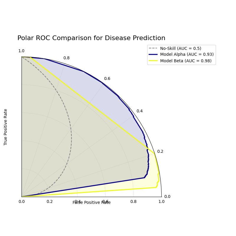
A polar ROC plot comparing the performance of “Model Alpha” and “Model Beta”. A superior model will have a curve that bows further outwards from the “no-skill” spiral.
This plot maps the classic ROC analysis onto an intuitive spiral. Let’s interpret the curves to determine which model offers better diagnostic performance.
- Quick Interpretation:
The plot indicates that both models are highly effective, as their curves bow significantly outwards from the dashed “No-Skill” spiral. However, a direct comparison reveals that “Model Beta” (yellow) is the superior classifier. Its curve consistently sits outside of “Model Alpha’s” curve, demonstrating its ability to achieve a higher True Positive Rate (radius) for any given False Positive Rate (angle). This visual conclusion is quantitatively confirmed by Model Beta’s higher Area Under the Curve (AUC) score of 0.98, compared to 0.93 for Model Alpha.
This visualization provides a clear verdict on which model has better discriminative ability. To see the full implementation and dive deeper into the analysis, please explore the complete example in our gallery.
Example: See the gallery example and code: Polar Receiver Operating Characteristic (ROC) Curve.
Polar Precision-Recall Curve (plot_polar_pr_curve())
Purpose: This function creates a Polar Precision-Recall (PR) Curve, a novel visualization for evaluating binary classification models. It is particularly useful for tasks with imbalanced classes (e.g., fraud detection, medical diagnosis), where ROC curves can sometimes provide an overly optimistic view of performance.
Mathematical Concept: A Precision-Recall curve is a standard tool for evaluating binary classifiers [2]. It is created by plotting Precision against Recall at various threshold settings.
The novelty of this plot, developed as part of the analytics framework in [3], lies in its transformation of these Cartesian coordinates into a polar system. The mapping is defined as:
This transformation maps the standard PR space onto a 90-degree polar quadrant:
The angle (θ) is mapped to Recall, spanning from 0 at 0° to 1 at 90°.
The radius (r) is mapped to Precision, spanning from 0 at the center to 1 at the edge.
A “no-skill” classifier is represented by a circle at a radius equal to the proportion of positive samples in the dataset.
Interpretation: The plot provides an intuitive visual assessment of a classifier’s performance on the positive class.
No-Skill Circle (Dashed Line): Represents a random classifier. A good model’s curve should be far outside this circle.
Model Curve: Each colored line represents a model. A better model will have a curve that bows outwards towards the top-right of the plot, maximizing the area under the curve (Average Precision).
Performance: A model is superior if it maintains a high Precision (large radius) as it achieves a high Recall (wide angular sweep).
Use Cases:
To evaluate and compare binary classifiers on imbalanced datasets where the number of negative samples far outweighs the positive samples.
To understand the trade-off between a model’s ability to correctly identify positive cases (Recall) and its ability to avoid false alarms (Precision).
To compare models based on their Average Precision (AP) score, which is summarized by the area under the PR curve.
While ROC curves are excellent, they can be misleading on imbalanced datasets. For problems like fraud detection, where the event of interest is rare, the Precision-Recall (PR) curve is the industry standard. This polar version makes comparing models on these tricky datasets even more intuitive.
Practical Example
Consider a credit card company building a model to detect fraudulent transactions. This is a classic imbalanced data problem: over 99% of transactions are legitimate. A model that simply predicts “not fraud” every time would have high accuracy but would be completely useless.
The polar Precision-Recall curve is the ideal tool here. It evaluates a model’s ability to find the few fraudulent cases (Recall) while minimizing false alarms that would inconvenience customers (Precision).
>>> import numpy as np
>>> import kdiagram as kd
>>>
>>> # --- 1. Simulate imbalanced fraud data ---
>>> np.random.seed(42)
>>> # Only 2% of transactions are fraudulent
>>> y_true = np.array([0] * 4900 + [1] * 100)
>>> # A decent model
>>> y_pred_A = np.clip(y_true * 0.5 + np.random.power(2, 5000) * 0.4, 0.01, 0.99)
>>> # A better model that handles imbalance well
>>> y_pred_B = np.clip(y_true * 0.7 + np.random.power(1.5, 5000) * 0.5, 0.01, 0.99)
>>>
>>> # --- 2. Generate the plot ---
>>> ax = kd.plot_polar_pr_curve(
...     y_true,
...     y_pred_A,
...     y_pred_B,
...     names=['Model A', 'Model B'],
...     title='Polar PR Curve for Fraud Detection'
... )
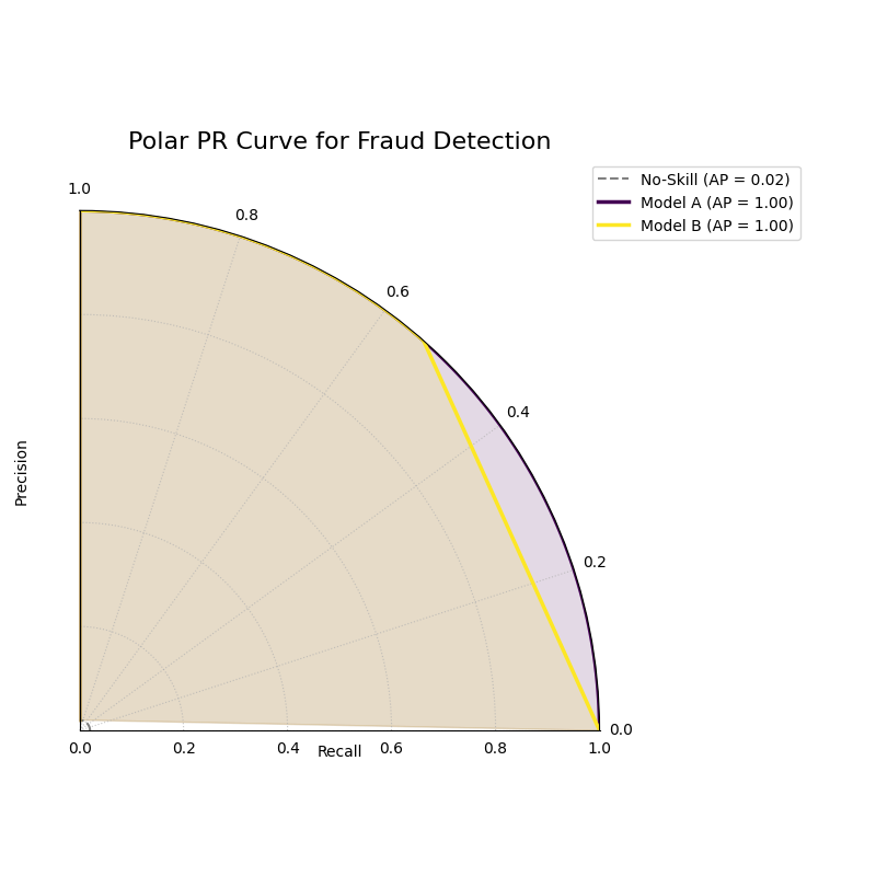
A polar PR plot comparing two models on an imbalanced fraud dataset. The better model will have a curve further from the “no-skill” circle.
This plot visualizes the critical trade-off between finding fraud and avoiding false alarms. The model whose curve is pushed further outwards is the superior choice.
- Quick Interpretation:
This plot first confirms that we are dealing with a highly imbalanced dataset, as indicated by the very low “No-Skill” Average Precision (AP) score of 0.02. Against this baseline, both “Model A” and “Model B” demonstrate exceptionally strong and, in this case, perfect performance. Their curves trace the absolute outer edge of the plot, showing that they both maintain a perfect Precision (radius of 1.0) across all levels of Recall (the full angular sweep). This ideal performance is confirmed by their identical and perfect AP scores of 1.00.
For tasks with imbalanced data, the PR curve is essential. To explore this example in more detail and learn how to apply it to your own problems, please visit the gallery.
Example: See the gallery example and code: Polar Precision-Recall Curve.
Polar Confusion Matrix (plot_polar_confusion_matrix())
Purpose This function creates a Polar Confusion Matrix, a novel visualization for the four key components of a binary confusion matrix: True Positives (TP), False Positives (FP), True Negatives (TN), and False Negatives (FN). It provides an intuitive, at-a-glance summary of a classifier’s performance and allows for the direct comparison of multiple models.
Mathematical Concept: The confusion matrix is a fundamental tool for evaluating a classifier’s performance by summarizing the counts of correct and incorrect predictions for each class. This plot maps these four components onto a polar bar chart.
True Positives (TP): Correctly predicted positive cases.
False Positives (FP): Negative cases incorrectly predicted as positive (Type I error).
True Negatives (TN): Correctly predicted negative cases.
False Negatives (FN): Positive cases incorrectly predicted as negative (Type II error).
Each of these four categories is assigned its own angular sector, and the height (radius) of the bar in that sector represents the count or proportion of samples in that category.
Interpretation: The plot provides an immediate visual summary of a binary classifier’s strengths and weaknesses.
Angle: Each of the four angular sectors represents a component of the confusion matrix.
Radius: The length of each bar represents the proportion (if normalized) or count of samples in that category.
Ideal Performance: A good model will have very long bars in the “True Positive” and “True Negative” sectors and very short bars in the “False Positive” and “False Negative” sectors.
Use Cases:
To get a quick, visual summary of a binary classifier’s performance.
To directly compare the error types (False Positives vs. False Negatives) of multiple models.
To create a more visually engaging and intuitive representation of a confusion matrix for reports and presentations.
While ROC and PR curves provide a high-level view of a classifier’s performance across different thresholds, a confusion matrix gives us a clear, quantitative breakdown of its performance at a single, chosen threshold. It answers the fundamental question: what specific types of correct and incorrect decisions is the model making?
Practical Example
Let’s consider a critical real-world problem: building an email spam filter. We have two models, an “Aggressive Filter” and a “Cautious Filter”. We need to understand the trade-offs between them.
A False Positive (a real email flagged as spam) is a very costly error.
A False Negative (a spam email reaching the inbox) is annoying but less critical.
The polar confusion matrix will give us an immediate visual comparison of how these two models handle this trade-off.
>>> import numpy as np
>>> import kdiagram as kd
>>> from sklearn.metrics import confusion_matrix
>>>
>>> # --- 1. Simulate spam classification results ---
>>> np.random.seed(0)
>>> # 1 = Spam, 0 = Not Spam
>>> y_true = np.array([0] * 900 + [1] * 100)
>>> # Aggressive Filter: Catches most spam, but has high false positives
>>> y_pred_aggressive = np.copy(y_true)
>>> y_pred_aggressive[np.random.choice(np.where(y_true==0)[0], 50, replace=False)] = 1
>>> # Cautious Filter: Misses some spam, but has very low false positives
>>> y_pred_cautious = np.copy(y_true)
>>> y_pred_cautious[np.random.choice(np.where(y_true==1)[0], 30, replace=False)] = 0
>>>
>>> # --- 2. Generate the plot ---
>>> ax = kd.plot_polar_confusion_matrix(
...     y_true,
...     y_pred_aggressive,
...     y_pred_cautious,
...     names=['Aggressive Filter', 'Cautious Filter'],
...     title='Spam Filter Performance Comparison'
... )

A polar bar chart comparing the True Positives, False Positives, True Negatives, and False Negatives for two different spam filters.
This plot directly visualizes the counts of correct and incorrect decisions for each filter. By comparing the bar lengths in each quadrant, we can select the model that best fits our business needs.
- Quick Interpretation:
This plot clearly visualizes the fundamental trade-off between the two spam filters. The “Aggressive Filter” (purple) is slightly better at catching spam (longer “True Positive” bar), but this performance comes at a significant cost: a noticeable bar in the “False Positive” quadrant, meaning it incorrectly flags legitimate emails as spam. In contrast, the “Cautious Filter” (yellow) nearly eliminates this critical False Positive error. However, this safety means it is more likely to miss some spam, as shown by its slightly longer bar in the “False Negative” quadrant. The choice depends on the priority: maximizing spam capture or protecting the user’s inbox.
Understanding the specific error types is crucial for deploying a responsible model. To see the full implementation and explore how to customize this plot, please visit the gallery.
Example See the gallery example and code: Polar Confusion Matrix.
Multiclass Polar Confusion Matrix (plot_polar_confusion_matrix_in())
Purpose: This function creates a Grouped Polar Bar Chart to visualize the performance of a multiclass classifier. It provides an intuitive, at-a-glance summary of the confusion matrix by showing how samples from each true class are distributed among the predicted classes [1].
Mathematical Concept This plot is a novel visualization of the standard confusion matrix, \(\mathbf{C}\), a fundamental tool for evaluating a classifier’s performance. Each element \(C_{ij}\) of the matrix contains the number of observations known to be in class \(i\) but predicted to be in class \(j\).
This function maps this matrix to a polar plot:
Angular Sectors: The polar axis is divided into \(K\) sectors, where \(K\) is the number of classes. Each sector corresponds to a true class \(i\).
Grouped Bars: Within each sector for true class \(i\), a set of \(K\) bars is drawn. The height (radius) of the \(j\)-th bar corresponds to the value of \(C_{ij}\), representing the count or proportion of samples from true class \(i\) that were predicted as class \(j\).
Interpretation: The plot makes it easy to identify a model’s strengths and weaknesses on a per-class basis.
Angle: Each major angular sector represents a True Class (e.g., “True Class A”).
Bars: Within each sector, the different colored bars show how the samples from that true class were predicted. The legend indicates which color corresponds to which predicted class.
Radius: The length of each bar represents the proportion (if normalized) or count of samples.
Ideal Performance: A good model will have tall bars that match the sector’s true class (e.g., the “Predicted Class A” bar is tallest in the “True Class A” sector) and very short bars for all other predicted classes.
Use Cases:
To get a detailed, visual summary of a multiclass classifier’s performance.
To quickly identify which classes a model struggles with the most.
To understand the specific patterns of confusion between classes (e.g., “Is Class A more often confused with B or C?”).
Evaluating a binary classifier is one thing, but many real-world problems require classifying items into multiple categories. This is where a multiclass confusion matrix becomes essential. This plot is specifically designed to help you untangle the complex patterns of confusion between three or more classes.
Practical Example
Imagine you are building a model for an agricultural company to automatically classify images of crops into three categories: “Corn”, “Wheat”, and “Soybeans”. After training your model, you need to diagnose its performance. Does it confuse one crop with another?
This grouped polar bar chart will show us, for each true crop type,
how the model distributed its predictions. (You can also use the
convenient alias kdiagram.plot.evaluation.plot_polar_confusion_multiclass()
for this function.)
>>> import numpy as np
>>> import kdiagram as kd
>>>
>>> # --- 1. Simulate multiclass crop classification results ---
>>> np.random.seed(42)
>>> # 0=Corn, 1=Wheat, 2=Soybeans
>>> y_true = np.repeat([0, 1, 2], 100)
>>> y_pred = np.copy(y_true)
>>> # Introduce a specific confusion: the model often mistakes Wheat (1) for Soybeans (2)
>>> wheat_indices = np.where(y_true == 1)[0]
>>> mistake_indices = np.random.choice(wheat_indices, 30, replace=False)
>>> y_pred[mistake_indices] = 2 # Wheat is predicted as Soybeans
>>>
>>> class_labels = ['Corn', 'Wheat', 'Soybeans']
>>>
>>> # --- 2. Generate the plot ---
>>> ax = kd.plot_polar_confusion_matrix_in(
...     y_true,
...     y_pred,
...     class_labels=class_labels,
...     title='Crop Image Classification Performance'
... )
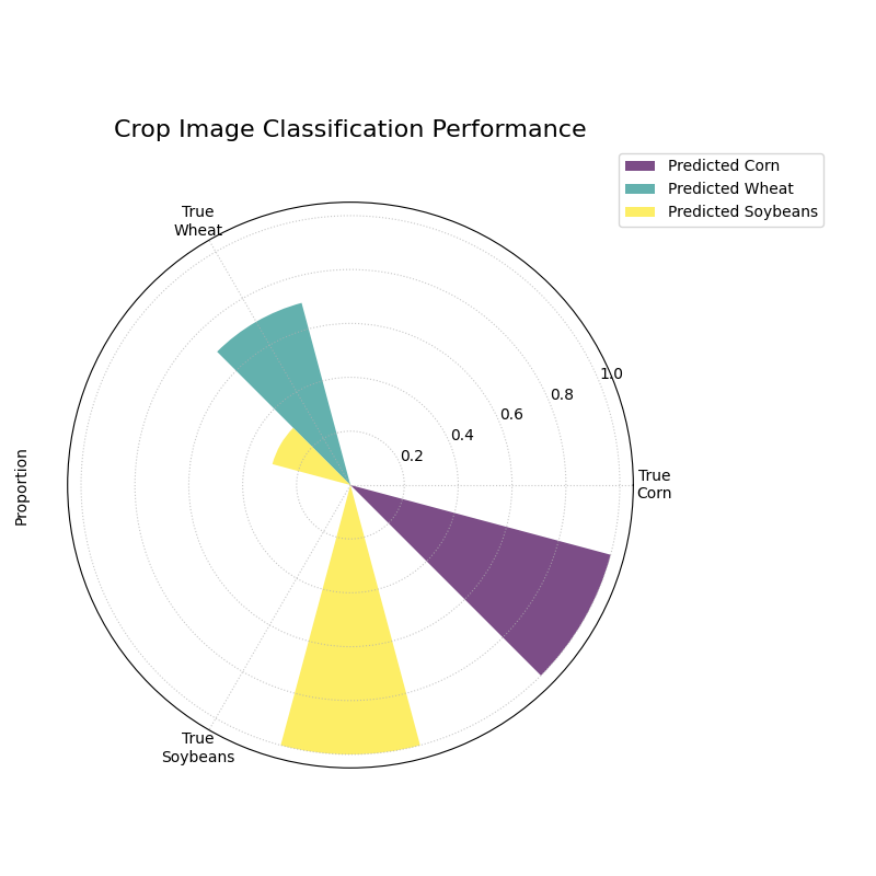
A grouped polar bar chart showing, for each true crop type, how the model’s predictions were distributed among the three classes.
This plot provides a detailed map of the model’s successes and failures. By examining the bars within each angular sector, we can pinpoint exactly where the model is getting confused.
- Quick Interpretation:
The plot reveals the model’s per-class performance and specific confusion patterns with great clarity. The model demonstrates excellent performance for “Corn” and “Soybeans”, as indicated by the dominant, correctly colored bar in each of their respective “True” sectors. The key issue, however, is revealed in the “True Wheat” sector. Here, the model is clearly confused, correctly identifying “Wheat” only about half the time, while misclassifying the other half of the samples as “Soybeans”. This pinpoints a specific weakness that needs to be addressed.
This kind of granular, per-class analysis is vital for improving multiclass models. To see the full code and learn more about this visualization, please explore the example in our gallery.
Example See the gallery example and code: Multiclass Polar Confusion Matrix.
Polar Classification Report (plot_polar_classification_report())
Purpose: This function creates a Polar Classification Report, a novel visualization that displays the key performance metrics—Precision, Recall, and F1-Score—for each class in a multiclass classification problem. It provides a more detailed and interpretable summary than a confusion matrix alone, making it easy to diagnose a model’s per-class performance at a glance.
Mathematical Concept: This plot visualizes the three most common metrics for evaluating a multiclass classifier on a per-class basis [2].
Precision: The ability of the classifier not to label as positive a sample that is negative. It answers: “Of all the predictions for this class, how many were correct?”
(5)¶\[\text{Precision} = \frac{TP}{TP + FP}\]Recall (Sensitivity): The ability of the classifier to find all the positive samples. It answers: “Of all the actual samples of this class, how many did the model find?”
(6)¶\[\text{Recall} = \frac{TP}{TP + FN}\]F1-Score: The harmonic mean of Precision and Recall, providing a single score that balances both metrics.
(7)¶\[\text{F1-Score} = 2 \cdot \frac{\text{Precision} \cdot \text{Recall}}{\text{Precision} + \text{Recall}}\]
Each class is assigned an angular sector, and within that sector, three bars are drawn, with their heights (radii) corresponding to the scores for these metrics.
Interpretation: The plot provides a granular, per-class breakdown of a classifier’s performance, making it easy to spot imbalances and trade-offs.
Angle: Each major angular sector represents a True Class (e.g., “Class Alpha”).
Bars: Within each sector, the three colored bars represent the key metrics: Precision, Recall, and F1-Score.
Radius: The length of each bar represents the score for that metric, from 0 at the center to 1 at the edge. A good model will have consistently tall bars across all metrics and classes.
Use Cases:
To get a detailed, per-class summary of a multiclass classifier’s performance beyond a single accuracy score.
To diagnose the Precision vs. Recall trade-off for each class.
To identify which specific classes a model is struggling to predict correctly, especially in imbalanced datasets.
A multiclass confusion matrix is great for seeing where a model gets confused, but sometimes you need a more direct summary of its performance on each class. The classification report, which visualizes key metrics like Precision, Recall, and F1-Score, provides exactly that, making it especially useful for diagnosing performance on imbalanced datasets.
Practical Example
Let’s continue with our agricultural company that needs to classify crop images. The dataset is imbalanced: there are many images of “Corn”, but far fewer of “Wheat”. A simple accuracy score could be misleading if the model performs poorly on the rare “Wheat” class.
This polar report will give us a detailed, per-class breakdown of Precision, Recall, and F1-Score, so we can be confident in the model’s performance on every single crop type.
>>> import numpy as np
>>> import kdiagram as kd
>>>
>>> # --- 1. Simulate imbalanced multiclass results ---
>>> np.random.seed(1)
>>> # 0=Corn (common), 1=Wheat (rare), 2=Soybeans
>>> y_true = np.repeat([0, 1, 2], [200, 50, 150])
>>> y_pred = np.copy(y_true)
>>> # Make the model struggle with the rare class (low recall for Wheat)
>>> wheat_indices = np.where(y_true == 1)[0]
>>> mistake_indices = np.random.choice(wheat_indices, 25, replace=False)
>>> y_pred[mistake_indices] = 0 # Misclassify half of Wheat as Corn
>>>
>>> class_labels = ['Corn', 'Wheat', 'Soybeans']
>>>
>>> # --- 2. Generate the plot ---
>>> ax = kd.plot_polar_classification_report(
...     y_true,
...     y_pred,
...     class_labels=class_labels,
...     title='Per-Class Performance for Crop Classifier'
... )
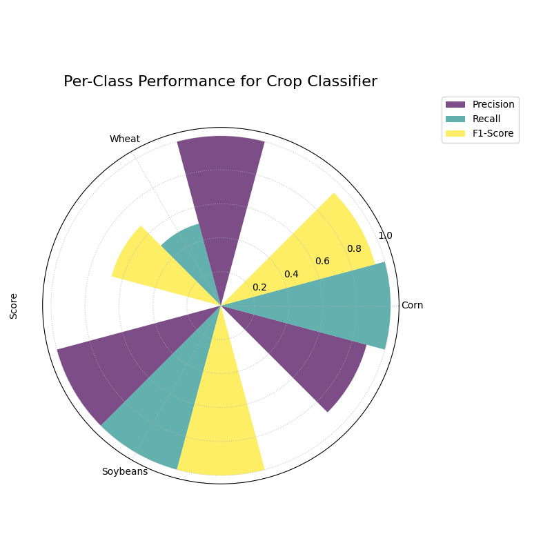
A polar bar chart showing the Precision, Recall, and F1-Score for each of the three crop classes, revealing performance imbalances.
This plot gives us a granular summary of the model’s strengths and weaknesses. By comparing the bar heights for each class, we can diagnose performance far more effectively than with a single accuracy score.
- Quick Interpretation:
This report provides a granular breakdown of the model’s performance beyond simple accuracy. The model performs exceptionally well on the “Corn” class, with all three metrics—Precision, Recall, and F1-Score—being very high. The most critical insight comes from the “Wheat” class, which represents the model’s primary weakness. While its Precision is high (when it predicts Wheat, it’s usually correct), its Recall is very low, meaning it fails to identify most of the true Wheat samples. This trade-off results in a mediocre F1-Score and suggests the model is too cautious when classifying this rare crop.
This per-class breakdown is essential for building fair and reliable classifiers. To see the full implementation and learn more, please explore the gallery example.
Example See the gallery example and code: Polar Classification Report.
Pinball Loss Plot (plot_pinball_loss())
Purpose: This function creates a Polar Pinball Loss Plot to provide a granular, per-quantile assessment of a probabilistic forecast’s accuracy [4]. While the CRPS gives a single score for the overall performance, this plot breaks that score down and shows the model’s performance at each individual quantile level.
Mathematical Concept The Pinball Loss, \(\mathcal{L}_{\tau}\), is a proper scoring rule for evaluating a single quantile forecast \(q\) at level \(\tau\) against an observation \(y\). It asymmetrically penalizes errors, giving a weight of \(\tau\) to under-predictions and \((1 - \tau)\) to over-predictions.
This plot calculates the average Pinball Loss for each provided quantile and visualizes these scores on a polar axis, where the angle represents the quantile level and the radius represents the loss.
Interpretation: The plot provides a detailed breakdown of a probabilistic forecast’s performance across its entire distribution.
Angle: Represents the Quantile Level, sweeping from 0 to 1 around the circle.
Radius: The radial distance from the center represents the Average Pinball Loss for that quantile. A smaller radius is better, indicating a more accurate forecast for that specific quantile.
Shape: A good forecast will have a small and relatively symmetrical shape close to the center. An asymmetrical shape can reveal if the model is better at predicting the lower tail of the distribution than the upper tail, or vice-versa.
Use Cases:
To get a granular, per-quantile view of a model’s performance, which is more detailed than an overall score like the CRPS.
To diagnose if a model is better at predicting the center of a distribution (e.g., the median, q=0.5) versus its tails (e.g., q=0.1 or q=0.9).
To compare the per-quantile performance of multiple models by overlaying their plots.
So far, we have focused on evaluating single-point forecasts. However, many modern applications require probabilistic forecasts that predict an entire range of possible outcomes. The Pinball Loss plot is a specialized tool designed to evaluate the accuracy of these quantile forecasts at every level of the distribution.
Practical Example
Consider the volatile energy market, where a utility company must forecast next-day electricity prices to optimize its purchasing strategy. A single price prediction is insufficient; the company needs to understand the full range of potential price outcomes to manage risk. For example, accurately predicting the 95th percentile is vital for hedging against extreme price spikes, a common feature of these markets.
The Pinball Loss plot is the perfect tool to diagnose such a probabilistic forecast. It visualizes the model’s accuracy at each specific quantile, revealing whether it is equally skilled at predicting low, median, and critically high prices.
>>> import numpy as np
>>> import kdiagram as kd
>>>
>>> # --- 1. Simulate a realistic probabilistic forecast ---
>>> np.random.seed(42)
>>> # True prices often have a right-skewed distribution (occasional spikes)
>>> y_true = np.random.lognormal(mean=3.5, sigma=0.5, size=500)
>>> quantiles = np.array([0.05, 0.25, 0.5, 0.75, 0.95])
>>> # Simulate a model that struggles more with high-volatility spikes
>>> error_noise = np.random.standard_t(df=5, size=(500, 1000)) * 10
>>> y_preds_quantiles = np.quantile(
...     y_true[:, np.newaxis] + error_noise, q=quantiles, axis=1
... ).T
>>>
>>> # --- 2. Generate the plot ---
>>> ax = kd.plot_pinball_loss(
...     y_true,
...     y_preds_quantiles,
...     quantiles=quantiles,
...     title='Pinball Loss for Electricity Price Forecast'
... )
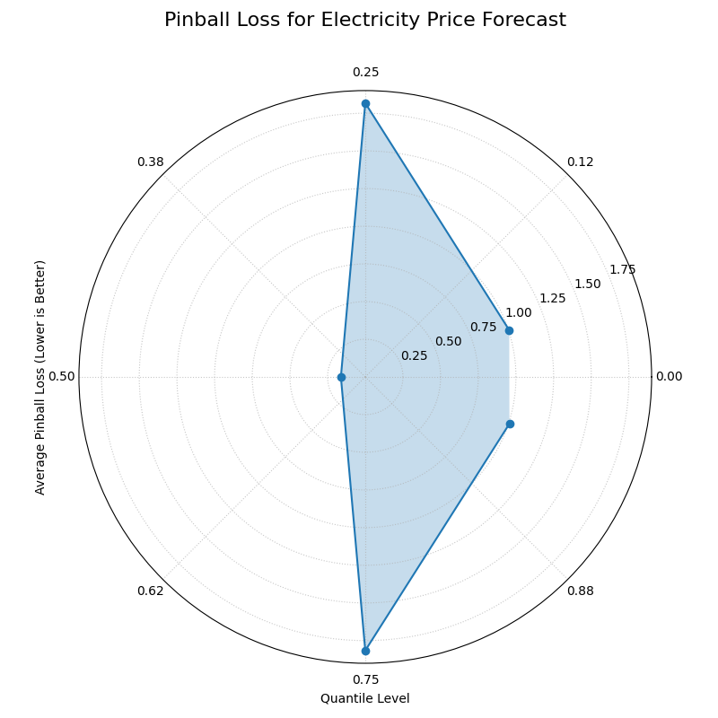
A polar plot where the angle represents the quantile level and the radius represents the average loss (lower is better).
This plot provides a granular diagnostic of our probabilistic forecast. The goal is a shape that is small and close to the center, indicating low error across all quantile levels.
- Quick Interpretation:
As a lower radius is better, the plot reveals the model’s performance across the full predictive distribution. The model is most accurate when predicting the median (0.50 quantile), as this point is closest to the center with the lowest loss. However, the plot reveals an important asymmetry: the loss is significantly higher for the upper quantiles (like 0.95) than for the lower ones. This indicates the model is much less accurate when predicting high-price spikes than it is at predicting more common, lower prices—a critical insight for risk management.
Evaluating the full predictive distribution is key to making robust, data-driven decisions. To explore this advanced evaluation technique further, please visit the example in our gallery.
Example: See the gallery example and code: Polar Pinball Loss.
Polar Performance Chart (plot_regression_performance())
Purpose: This function creates a Polar Performance Chart, a grouped polar bar chart designed to visually compare the performance of multiple regression models across several evaluation metrics simultaneously. It provides a holistic snapshot of model strengths and weaknesses, making it easier to select the best model based on criteria beyond a single score [1].
Mathematical Concept The plot visualizes a set of performance scores, which are processed in three main steps:
Score Calculation: For each model \(k\) and each metric \(m\), a score \(S_{m,k}\) is calculated. The function is designed to assume that a higher score is always better. To achieve this:
Standard scikit-learn error metrics are automatically negated (e.g., it uses
neg_mean_absolute_error).The
higher_is_betterparameter allows the user to explicitly tell the function whether a lower value is better for any given metric (e.g.,{'my_custom_error': False}). The function will then negate the scores for that metric.
Normalization: To make scores with different scales comparable, the scores for each metric are independently scaled to the range [0, 1] using Min-Max normalization. For a given metric \(m\), the normalized score for model \(k\) is:
(9)¶\[S'_{m,k} = \frac{S_{m,k} - \min(\mathbf{S}_m)}{\max(\mathbf{S}_m) - \min(\mathbf{S}_m)}\]where \(\mathbf{S}_m\) is the vector of scores for all models on metric \(m\). A score of 1 represents the best-performing model for that metric, and a score of 0 represents the worst.
Polar Mapping:
Each metric is assigned its own angular sector, \(\theta_m\).
The normalized score, \(S'_{m,k}\), is mapped to the radius (height) of the bar for model \(k\) within that sector.
Interpretation: The plot provides a holistic, multi-metric view of model performance, making it easy to identify trade-offs.
Angle: Each angular sector represents a different evaluation metric (e.g., R², MAE, RMSE).
Bars: Within each sector, the different colored bars represent the different models being compared.
Radius: The length of each bar represents the model’s normalized score for that metric. The green circle at the edge is the “Best Performance” line (a score of 1), and the red dashed circle is the “Worst Performance” line (a score of 0).
Shape: The overall shape of a model’s bars reveals its performance profile. A model with consistently long bars is a strong all-around performer.
Use Cases:
To get a quick, visual summary of how multiple models perform across a range of different metrics.
To identify the strengths and weaknesses of each model (e.g., “Is this model biased or just noisy?”).
For model selection when you need to balance trade-offs between different performance criteria.
While a simple radar chart is great for a quick comparison, sometimes you need more control over the metrics, labels, and normalization when evaluating regression models. This polar performance chart is a highly customizable tool for creating a holistic, multi-metric comparison.
Practical Example
An analyst at a real estate investment firm has two regression models for predicting property values. “Model 1” is a standard, highly accurate model. “Model 2” is a newer, experimental model which is supposedly better at identifying highly profitable deals, but its overall accuracy is suspect.
This plot allows them to visualize performance across standard metrics like R² and MAE in a single, normalized view, making it easy to quantify the trade-offs between the two approaches.
>>> import numpy as np
>>> import kdiagram as kd
>>>
>>> # --- 1. Simulate property value predictions ---
>>> np.random.seed(1)
>>> y_true = np.random.uniform(200, 1000, 50)
>>> # Model 1: Low error and low bias
>>> y_pred_1 = y_true + np.random.normal(0, 30, 50)
>>> # Model 2: Higher error and a positive bias
>>> y_pred_2 = y_true * 1.05 + np.random.normal(5, 45, 50)
>>>
>>> # --- 2. Generate the plot ---
>>> ax = kd.plot_regression_performance(
...     y_true,
...     y_pred_1,
...     y_pred_2,
...     names=['Model 1 (Accurate)', 'Model 2 (Profitable)'],
...     metrics=['r2', 'neg_mean_absolute_error'],
...     metric_labels={'r2': 'R²', 'neg_mean_absolute_error': 'Neg. MAE'},
...     min_radius=0.105, # Ensures worst bars are visible
...     title='Real Estate Model Performance'
... )
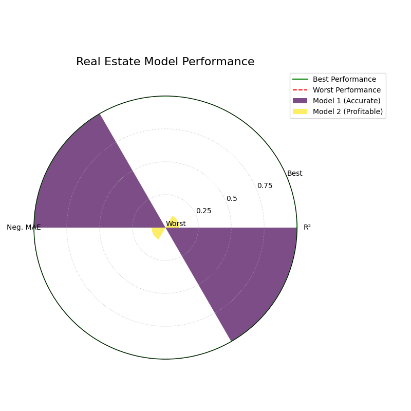
A grouped polar bar chart comparing two regression models across multiple performance metrics, where the bar height represents the normalized score.
This chart provides a clear, normalized comparison of model performance. The longest bar in each metric-sector indicates the winning model for that specific criterion.
- Quick Interpretation:
This chart compares the two models on R² and Negative MAE, where a longer bar reaching towards the outer “Best Performance” circle is better. The visualization clearly shows that “Model 1 (Accurate)” is the superior performer on both standard metrics; its purple bars are significantly longer for both R² and Neg. MAE. While the bars for “Model 2 (Profitable)” are much shorter, they remain visible, allowing us to quantify its underperformance. This plot confirms that while Model 2 may be “profitable” by some other measure, it is demonstrably less accurate according to these core metrics.
This kind of multi-metric visualization is key to selecting a model that aligns with your specific business goals, not just statistical ideals. To see the full implementation, please visit the gallery.
Example See the gallery example and code: Polar Performance Chart.
References