Model Comparison Gallery
This gallery page showcases plots from k-diagram designed for comparing the performance of multiple models across various metrics, primarily using radar charts.
Note
You need to run the code snippets locally to generate the plot
images referenced below (e.g., images/gallery_model_comparison.png).
Ensure the image paths in the .. image:: directives match where
you save the plots (likely an images subdirectory relative to
this file).
Multi-Metric Model Comparison
The plot_model_comparison() function is
a tool for moving beyond single-score evaluations. It creates
a polar radar chart to visualize and compare multiple models across
several performance metrics simultaneously, providing a holistic
“fingerprint” of each model’s strengths and weaknesses.
First, let’s break down the components of this comparative plot.
Plot Anatomy
Angle (θ): Each angular axis represents a different performance metric (e.g., R², MAE, Training Time).
Radius (r): Corresponds to the normalized performance score for that metric, typically scaled to the range [0, 1]. To maintain consistency, all metrics are scaled such that a larger radius is always better (e.g., lower MAE or faster training time results in a larger radius).
Polygon: Each colored polygon represents a model, with its vertices showing its performance on each metric. The overall shape and size of the polygon provide an at-a-glance summary of the model’s performance profile.
With this framework, we can now apply the plot to a real-world model selection problem, progressing from a standard regression task to a more nuanced classification task.
Use Case 1: Standard Regression Model Comparison
The most common use for this plot is to select the best model for a standard regression task by balancing accuracy, error, and efficiency.
Let’s imagine an analytics team at an e-commerce company has built three different models to predict sales revenue: a fast but simple Ridge regression, a Lasso model that performs feature selection, and a more complex Decision Tree. They need to choose the best all-around performer.
 1import kdiagram as kd
 2import numpy as np
 3import matplotlib.pyplot as plt
 4
 5# --- 1. Data Generation: Sales Revenue Forecast ---
 6np.random.seed(42)
 7n_samples = 100
 8y_true_reg = np.random.rand(n_samples) * 50 + 10 # True revenue
 9# Model 1 (Ridge): Good fit, fast
10y_pred_r1 = y_true_reg + np.random.normal(0, 4, n_samples)
11# Model 2 (Lasso): Similar fit, slightly slower
12y_pred_r2 = y_true_reg * 0.98 + 1 + np.random.normal(0, 4.5, n_samples)
13# Model 3 (Tree): Overfit, slower, poor on some metrics
14y_pred_r3 = y_true_reg + np.random.normal(2, 8, n_samples)
15
16times = [0.1, 0.3, 0.8] # Training times in seconds
17names = ['Ridge', 'Lasso', 'Tree']
18
19# --- 2. Plotting ---
20# Using default regression metrics: ['r2', 'mae', 'mape', 'rmse']
21kd.plot_model_comparison(
22    y_true_reg,
23    y_pred_r1, y_pred_r2, y_pred_r3,
24    train_times=times,
25    names=names,
26    title="Use Case 1: E-Commerce Sales Model Comparison",
27    scale='norm',
28    savefig="gallery/images/gallery_model_comparison_regression.png"
29)
30plt.close()

A radar chart showing the performance profiles of Ridge, Lasso, and Decision Tree models across five different metrics.
Use Case 2: Evaluating a Classification Task with a Custom Metric
This plot is equally usefull for classification. The default metrics will automatically switch to [‘accuracy’, ‘precision’, ‘recall’, ‘f1’], but we can also provide our own custom metrics to evaluate performance on criteria that are specific to our business problem.
Let’s consider a medical diagnosis model that predicts whether a patient has a rare disease. In this case, Recall (correctly identifying sick patients) is far more important than Precision. We can create a custom, weighted F-beta score to reflect this and add it to our plot.
 1from sklearn.metrics import fbeta_score
 2
 3# --- 1. Data Generation: Medical Diagnosis ---
 4np.random.seed(0)
 5n_samples = 200
 6y_true_clf = np.array([0] * 180 + [1] * 20) # Imbalanced data
 7# Model A: High precision, but misses sick patients (low recall)
 8y_pred_A = np.copy(y_true_clf)
 9y_pred_A[np.random.choice(np.where(y_true_clf==1)[0], 12, False)] = 0
10# Model B: Lower precision, but finds most sick patients (high recall)
11y_pred_B = np.copy(y_true_clf)
12y_pred_B[np.random.choice(np.where(y_true_clf==0)[0], 20, False)] = 1
13
14# --- 2. Define a custom metric that prioritizes Recall ---
15# An F-beta score with beta=2 weighs recall higher than precision
16f2_score = lambda y_true, y_pred: fbeta_score(y_true, y_pred, beta=2)
17f2_score.__name__ = "F2-Score (Recall Focus)" # Give it a nice name for the plot
18
19# --- 3. Plotting with default and custom metrics ---
20kd.plot_model_comparison(
21    y_true_clf,
22    y_pred_A,
23    y_pred_B,
24    names=['Model A (High Precision)', 'Model B (High Recall)'],
25    metrics=['accuracy', 'precision', 'recall', f2_score], # Add our custom metric
26    title="Use Case 2: Medical Diagnosis Classifier Comparison",
27    scale='norm',
28    savefig="gallery/images/gallery_model_comparison_classification.png"
29)
30plt.close()

A radar chart showing how two classifiers perform on standard metrics as well as a custom “F2-Score” that prioritizes recall.
Best Practice
Don’t rely solely on default metrics. For real-world problems,
business needs often dictate that some errors are more costly than
others. Adding custom metrics to the plot_model_comparison
function, as shown in this use case, is a powerful way to ensure your
model evaluation aligns with your specific goals.
For a deeper understanding of the statistical concepts behind these evaluation metrics, please refer back to the main Multi-Metric Model Comparison (plot_model_comparison()) section.
Model Reliability (Calibration) Diagram
The plot_reliability_diagram() is the
industry-standard tool for assessing the calibration of a binary
classifier. It answers a crucial question: “When my model predicts a
70% probability of an event, does that event actually happen 70% of the
time?” A model whose probabilities accurately reflect real-world
frequencies is considered “well-calibrated” and is essential for making
trustworthy, risk-based decisions.
Let’s begin by breaking down the components of this fundamental plot.
Plot Anatomy
X-Axis (Mean Predicted Probability): For each bin, this is the average of the probabilities predicted by the model. This is also referred to as the forecast’s confidence.
Y-Axis (Observed Frequency): For each bin, this is the actual fraction of positive cases observed in the data. This is also referred to as the forecast’s accuracy.
Diagonal Line (\(y=x\)): This is the line of perfect calibration. A model whose points fall on this line is perfectly calibrated.
Counts Panel (Bottom): A histogram showing the number of predictions that fall into each probability bin, which helps in diagnosing if the model is timid (most predictions near 0.5) or decisive (most predictions near 0 or 1).
With this in mind, let’s explore how to use this plot to diagnose and compare the reliability of different models.
Use Case 1: Basic Calibration Check with Uniform Bins
The most common use case is to get a quick, initial assessment of a single model’s calibration. For this, we can use the default uniform binning strategy, which creates equally spaced bins across the [0, 1] probability range.
Let’s evaluate a model trained to predict customer churn, where a “1” means the customer is likely to leave.
 1import kdiagram as kd
 2import numpy as np
 3import matplotlib.pyplot as plt
 4
 5# --- 1. Data Generation: Customer Churn Predictions ---
 6np.random.seed(0)
 7n_customers = 2000
 8# True outcome: ~30% of customers churn
 9y_true = (np.random.rand(n_customers) < 0.3).astype(int)
10# A reasonably good, but not perfect, model
11y_pred = np.clip(y_true * 0.4 + 0.3 + np.random.normal(0, 0.15, n_customers), 0.01, 0.99)
12
13# --- 2. Plotting ---
14kd.plot_reliability_diagram(
15    y_true, y_pred,
16    names=['Churn Model'],
17    n_bins=10,
18    strategy="uniform", # Default, but explicit here
19    title='Use Case 1: Basic Calibration Check',
20    savefig="gallery/images/gallery_reliability_diagram_basic.png"
21)
22plt.close()
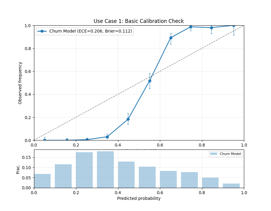
A reliability diagram showing the model’s calibration curve relative to the perfect diagonal. The counts panel below shows the distribution of its predictions.
Use Case 2: Comparing Models with Quantile Binning
A more advanced task is to compare the reliability of multiple competing models. For this, quantile binning is often superior to uniform binning, as it ensures that each bin contains an equal number of samples, providing a more stable estimate of the observed frequency.
Let’s compare our “Churn Model” to a new “Calibrated Model” that has been post-processed to improve its reliability.
 1# --- 1. Data Generation (uses y_true and y_pred from previous step) ---
 2# Create a second, better-calibrated model's predictions
 3y_pred_calibrated = np.clip(y_true * 0.35 + 0.32 + np.random.normal(0, 0.1, n_customers), 0.01, 0.99)
 4
 5# --- 2. Plotting ---
 6kd.plot_reliability_diagram(
 7    y_true, y_pred, y_pred_calibrated,
 8    names=['Original Model', 'Calibrated Model'],
 9    n_bins=12,
10    strategy="quantile", # Use quantile binning for a stable comparison
11    error_bars="wilson",  # Add Wilson confidence intervals
12    title='Use Case 2: Comparing Model Reliability',
13    savefig="gallery/images/gallery_reliability_diagram_compare.png"
14)
15plt.close()

Two calibration curves are shown. The “Calibrated Model” (orange) hugs the diagonal line more closely than the “Original Model” (blue).
Best Practice
When comparing multiple models, using strategy="quantile" is
highly recommended. It prevents bins from being empty and provides
more stable and reliable estimates of the observed frequencies, leading
to a fairer comparison between models. Also, including error bars
(e.g., error_bars="wilson") provides crucial context about the
statistical uncertainty of your assessment.
See Also
For an alternative, and often more intuitive, way to visualize model
calibration, see the plot_polar_reliability()
function. It transforms this Cartesian plot into a polar spiral,
which can make miscalibration patterns even easier to spot.
Use Case 3: Weighted Calibration for High-Value Segments
In many real-world business problems, not all prediction errors are
created equal. An error on a high-value customer can be far more costly
than an error on a standard customer. A model might appear well-calibrated
overall, but this aggregate view can hide poor performance on the most
critical segments. The sample_weight parameter is a powerful tool
for diagnosing this exact problem.
Best Practice
When the business impact of your model’s predictions is not uniform
across all samples, always perform a weighted calibration analysis.
Use the sample_weight parameter to assign higher importance to
high-value customers, critical events, or costly failure modes to
ensure your model is reliable where it matters most.
Let’s tackle a common problem in customer retention: ensuring our churn model is reliable for our most valuable “premium” subscribers.
Practical Example
A streaming service uses a model to predict the probability that a subscriber will churn (cancel their subscription). The model’s overall calibration appears to be good. However, the business is most concerned about retaining its “premium” subscribers, as they account for a disproportionate amount of revenue. Is the model’s churn probability trustworthy specifically for this high-value segment?
We will create a side-by-side comparison. The left plot will show
the standard, unweighted reliability, while the right plot will use
sample_weight to give 10x more importance to the premium
subscribers, revealing the model’s true performance for this
critical group.
 1import kdiagram as kd
 2import numpy as np
 3import pandas as pd
 4import matplotlib.pyplot as plt
 5
 6# --- 1. Data Generation: Churn with a high-value segment ---
 7np.random.seed(10)
 8n_customers = 5000
 9# True churn status
10y_true = (np.random.rand(n_customers) < 0.2).astype(int)
11# Create sample weights: 10% are "premium" customers with 10x weight
12sample_weight = np.ones(n_customers)
13premium_indices = np.random.choice(n_customers, 500, replace=False)
14sample_weight[premium_indices] = 10
15
16# --- 2. Create biased predictions FOR THE PREMIUM SEGMENT ---
17# The model is well-calibrated for standard users but overconfident
18# for premium users (predicts lower churn probability than is real)
19y_pred = np.clip(y_true * 0.5 + 0.15 + np.random.normal(0, 0.1, n_customers), 0.01, 0.99)
20# Introduce the bias for the premium segment
21y_pred[premium_indices] *= 0.5
22
23# --- 3. Create side-by-side plots ---
24fig, (ax1, ax2) = plt.subplots(1, 2, figsize=(18, 8))
25
26kd.plot_reliability_diagram(
27    y_true, y_pred,
28    ax=ax1,
29    names=['Churn Model'],
30    title='Use Case 3a: Unweighted Reliability (All Customers)',
31    savefig=None # Prevent saving from the first call
32)
33kd.plot_reliability_diagram(
34    y_true, y_pred,
35    ax=ax2,
36    sample_weight=sample_weight, # Apply the crucial sample weights
37    names=['Churn Model'],
38    title='Use Case 3b: Weighted Reliability (Premium Focus)',
39    savefig=None # Prevent saving from the second call
40)
41
42fig.suptitle('Diagnosing Hidden Bias with Weighted Calibration', fontsize=16)
43fig.tight_layout(rect=[0, 0, 1, 0.95])
44fig.savefig("gallery/images/gallery_reliability_diagram_weighted.png")
45plt.close(fig)
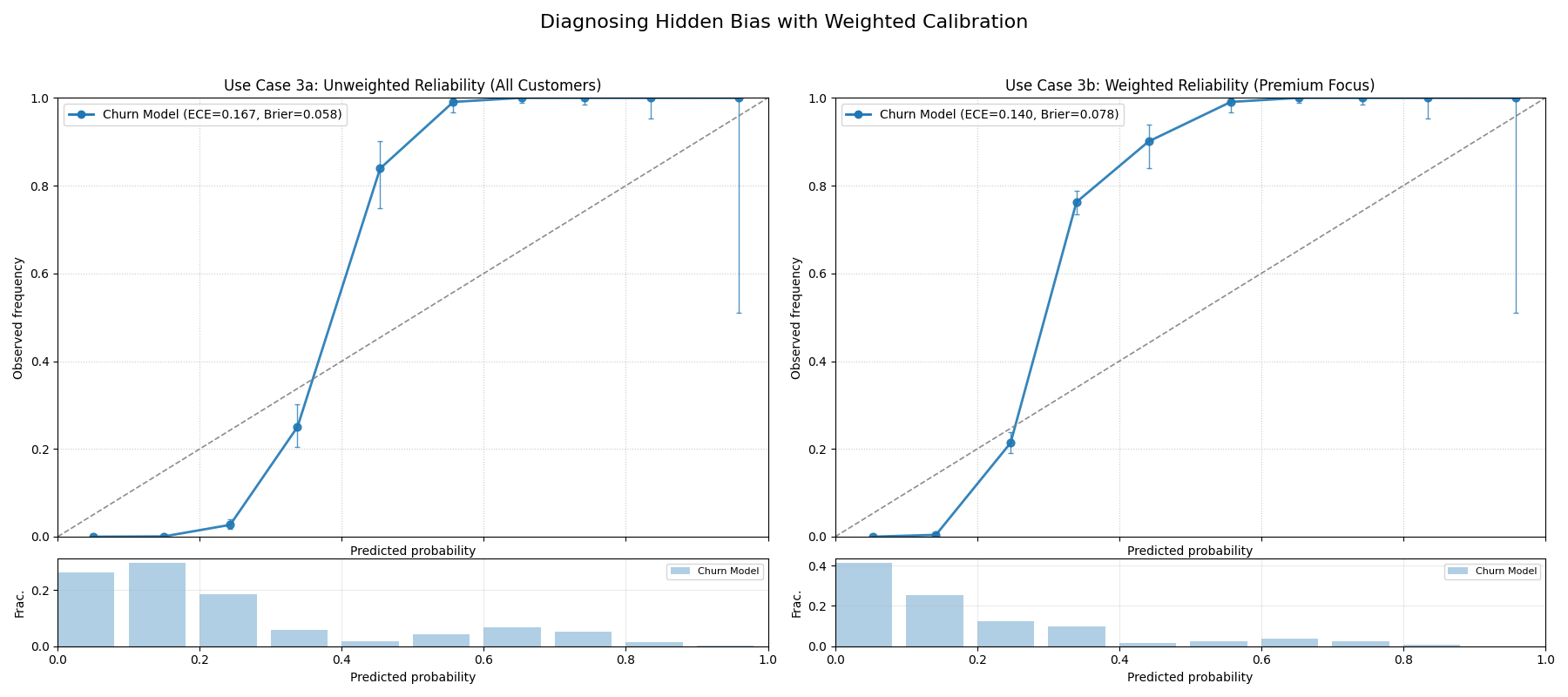
A two-panel figure. The left plot (unweighted) shows a reasonably well-calibrated model. The right plot (weighted by customer value) reveals the same model is severely overconfident for its most important customers.
For a deeper understanding of the statistical theory behind calibration and proper scoring rules, please refer back to the main Reliability Diagram (plot_reliability_diagram()) section.
Polar Reliability Diagram (Calibration Spiral)
The plot_polar_reliability() function
provides a novel and highly intuitive visualization of model calibration.
It transforms the traditional reliability diagram into a “calibration
spiral,” where deviations from a perfect spiral immediately reveal the
nature and location of a model’s miscalibrations through diagnostic
coloring.
First, let’s break down the components of this innovative plot.
Plot Anatomy
Angle (θ): Represents the mean predicted probability (\(\bar{p}_k\)) for each bin, sweeping from 0.0 at 0° to 1.0 at 90°. This is the model’s confidence.
Radius (r): Represents the observed frequency of the event (\(\bar{y}_k\)) for each bin. This is the actual outcome.
Perfect Calibration Spiral: The dashed black line represents the ideal case where \(r = \frac{2\theta}{\pi}\) (\(\bar{y}_k = \bar{p}_k\)). A model’s spiral should lie directly on this line.
Color: The color of the model’s spiral is a diagnostic tool, representing the calibration error (\(\bar{y}_k - \bar{p}_k\)). Colors on one side of the colormap’s center (e.g., reds) indicate over-confidence, while colors on the other side (e.g., blues) indicate under-confidence.
With this in mind, let’s apply the plot to a real-world problem to see how it uncovers different types of miscalibration.
Use Case 1: Diagnosing an Over-Confident Model
A common failure mode for classifiers, especially on complex tasks, is overconfidence. The model assigns high probabilities to its predictions, but its real-world accuracy doesn’t match this high level of certainty.
Let’s simulate a scenario in medical diagnostics, where a model is trained to predict the probability of a disease. An overconfident model might predict a 90% probability of disease when the actual rate for such patients is only 70%, which could lead to unnecessary treatments.
 1import kdiagram as kd
 2import numpy as np
 3import matplotlib.pyplot as plt
 4
 5# --- 1. Data Generation: A Well-Calibrated vs. Over-Confident Model ---
 6np.random.seed(0)
 7n_samples = 2000
 8# The true probability of the event is 0.4
 9y_true = (np.random.rand(n_samples) < 0.4).astype(int)
10
11# A well-calibrated model's probabilities are realistic
12calibrated_preds = np.clip(0.4 + np.random.normal(0, 0.15, n_samples), 0, 1)
13
14# An over-confident model pushes probabilities towards the extremes of 0 and 1
15overconfident_preds = np.clip(0.4 + np.random.normal(0, 0.3, n_samples), 0, 1)
16
17# --- 2. Plotting ---
18kd.plot_polar_reliability(
19    y_true,
20    calibrated_preds,
21    overconfident_preds,
22    names=["Well-Calibrated", "Over-Confident"],
23    n_bins=15,
24    cmap='coolwarm',
25    title="Use Case 1: Diagnosing an Over-Confident Model",
26    savefig="gallery/images/gallery_polar_reliability_overconfident.png"
27)
28plt.close()
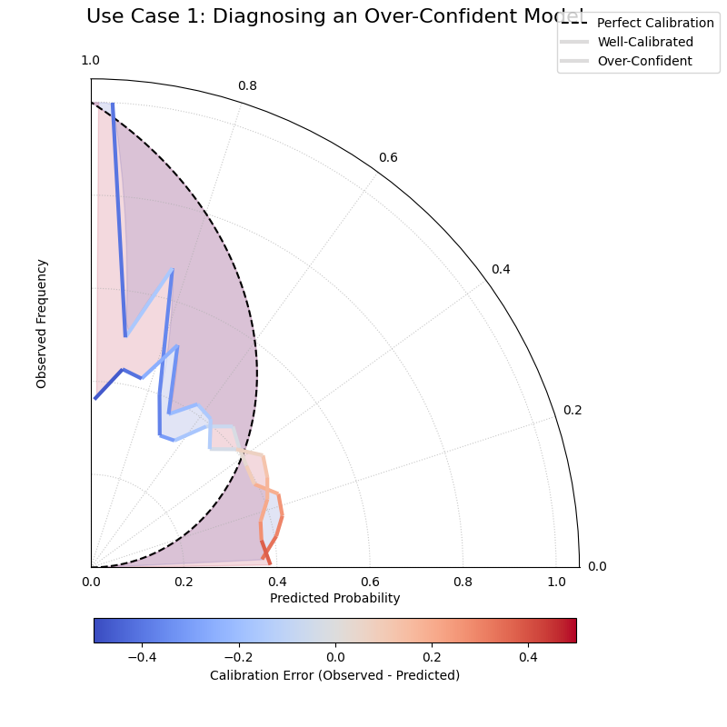
The “Well-Calibrated” model’s spiral closely follows the dashed reference line, while the “Over-Confident” model’s spiral falls inside the reference.
See Also
This plot is the polar-coordinate counterpart to the traditional
Cartesian plot_reliability_diagram().
While both show the same underlying data, the spiral format can often
make deviations and the nature of miscalibration more intuitive to
see at a glance.
For a deeper understanding of the statistical theory behind calibration and reliability, please refer back to the main Polar Reliability Diagram (plot_polar_reliability()) section.
Comparing Metrics Across Horizons
The plot_horizon_metrics() function
creates a polar bar chart designed to compare two key metrics across a
set of distinct categories, such as different forecast horizons. It’s a
powerful tool for visualizing how a model’s uncertainty (bar height)
and central tendency (bar color) evolve over time or differ between
groups.
First, let’s break down the components of this two-dimensional summary plot.
Plot Anatomy
Angle (θ): Each angular sector represents a distinct category or horizon (e.g., “H+1”, “H+2”), corresponding to a row in the input DataFrame. The labels for these sectors are provided via the
xtick_labelsparameter.Radius (r): The height of each bar represents the average value of a primary metric. By default, this is the mean prediction interval width (\(Q_{upper} - Q_{lower}\)).
Color: The color of each bar visualizes a secondary metric. By default, this is the mean of the median (Q50) predictions for that category, adding another layer of information to the comparison.
With this in mind, let’s apply the plot to a classic forecasting problem.
Use Case 1: Standard Forecast Horizon Analysis
The most common use of this plot is to see how a model’s uncertainty and central prediction change as it forecasts further into the future. It’s a typical and expected behavior for uncertainty to grow over longer lead times, and this plot quantifies that drift.
Let’s simulate a multi-step forecast where both the predicted value and its uncertainty increase for each step.
 1import kdiagram as kd
 2import pandas as pd
 3import numpy as np
 4import matplotlib.pyplot as plt
 5
 6# --- 1. Data Generation: Multi-step Forecast ---
 7# Each row represents a forecast horizon (H+1 to H+6)
 8# Each column is a different sample of that forecast
 9horizons = ["H+1", "H+2", "H+3", "H+4", "H+5", "H+6"]
10df = pd.DataFrame(index=horizons)
11q10_cols, q90_cols, q50_cols = [], [], []
12
13for i in range(len(horizons)):
14    # Both median and width increase with the horizon
15    median = 10 + 5 * i
16    width = 5 + 3 * i
17    # Create two samples for each horizon
18    df[f'q10_s{i}_1'] = median - width/2 + np.random.randn()
19    df[f'q90_s{i}_1'] = median + width/2 + np.random.randn()
20    df[f'q50_s{i}_1'] = median + np.random.randn()
21    df[f'q10_s{i}_2'] = median - width/2 + np.random.randn()
22    df[f'q90_s{i}_2'] = median + width/2 + np.random.randn()
23    df[f'q50_s{i}_2'] = median + np.random.randn()
24    q10_cols.extend([f'q10_s{i}_1', f'q10_s{i}_2'])
25    q90_cols.extend([f'q90_s{i}_1', f'q90_s{i}_2'])
26    q50_cols.extend([f'q50_s{i}_1', f'q50_s{i}_2'])
27
28# Reshape for the function: rows are horizons, cols are samples
29df_horizons = pd.DataFrame(index=horizons)
30for i in range(len(horizons)):
31    df_horizons.loc[f"H+{i+1}", 'q10_s1'] = df.loc[f"H+{i+1}", f'q10_s{i}_1']
32    df_horizons.loc[f"H+{i+1}", 'q90_s1'] = df.loc[f"H+{i+1}", f'q90_s{i}_1']
33    df_horizons.loc[f"H+{i+1}", 'q50_s1'] = df.loc[f"H+{i+1}", f'q50_s{i}_1']
34    df_horizons.loc[f"H+{i+1}", 'q10_s2'] = df.loc[f"H+{i+1}", f'q10_s{i}_2']
35    df_horizons.loc[f"H+{i+1}", 'q90_s2'] = df.loc[f"H+{i+1}", f'q90_s{i}_2']
36    df_horizons.loc[f"H+{i+1}", 'q50_s2'] = df.loc[f"H+{i+1}", f'q50_s{i}_2']
37
38# --- 2. Plotting ---
39kd.plot_horizon_metrics(
40    df=df_horizons,
41    qlow_cols=['q10_s1', 'q10_s2'],
42    qup_cols=['q90_s1', 'q90_s2'],
43    q50_cols=['q50_s1', 'q50_s2'],
44    title="Use Case 1: Mean Interval Width Across Horizons",
45    xtick_labels=horizons,
46    r_label="Mean Interval Width",
47    cbar_label="Mean Q50 Value",
48    savefig="gallery/images/gallery_horizon_metrics_basic.png"
49)
50plt.close()
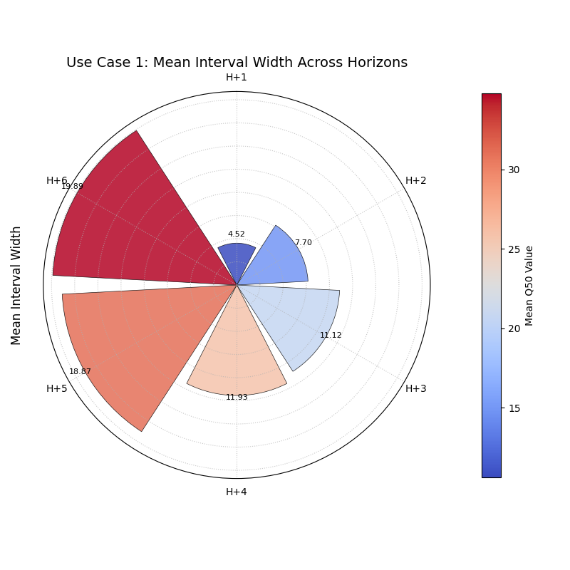
A polar bar chart where both the height of the bars (uncertainty) and their color (median prediction) increase progressively across the forecast horizons.
See Also
This plot is closely related to
plot_model_drift(). While both
visualize drift over horizons with polar bars, this function is more
general-purpose. It can be used to compare any set of distinct
categories (not just time horizons) and offers more direct control
over the data columns used for the radius and color calculations.
For a deeper understanding of the statistical concepts behind analyzing forecasts over different horizons, please refer back to the main Comparing Metrics Across Horizons (plot_horizon_metrics()) section.
Combined Analysis: Reliability and Horizon Drift
Evaluating a sophisticated forecasting model often requires more than a
single plot. A comprehensive analysis involves using multiple,
complementary visualizations to diagnose different aspects of performance.
This tutorial showcases a workflow, combining
plot_polar_reliability() and
plot_horizon_metrics() to perform a
two-part evaluation of a weather forecast.
First, let’s re-introduce the anatomy of the two plots we will be using in our combined analysis.
Plot Anatomy (Polar Reliability)
Angle (θ): Represents the mean predicted probability of an event (e.g., rain), sweeping from 0.0 to 1.0.
Radius (r): Represents the observed frequency of that event.
Reference: The dashed black spiral is the line of perfect calibration. A good model’s curve should follow this spiral.
Plot Anatomy (Horizon Metrics)
Angle (θ): Represents distinct forecast horizons (e.g., “H+6”, “H+12”).
Radius (r): The height of each bar represents the average prediction interval width (uncertainty).
Color: The color of each bar represents the average median (Q50) prediction (e.g., the expected amount of rain).
Now, let’s apply these two diagnostics to a challenging, real-world forecasting problem.
Use Case: A Holistic Evaluation of a Weather Forecast Model
A meteorological agency has a new weather model that produces two key outputs for a 24-hour period:
The probability that it will rain at all (a binary event).
A probabilistic forecast of the total rainfall amount (in mm).
To validate this new model, we need to answer two critical questions:
Is the model reliable? When it predicts a 70% chance of rain, is it trustworthy?
How does its uncertainty grow over time? Is the forecast for rainfall amount sharp and useful for the next 6 hours, but too uncertain for the full 24-hour period?
We will perform a combined analysis by creating a side-by-side plot to answer both questions at once.
Practical Example
 1import kdiagram as kd
 2import pandas as pd
 3import numpy as np
 4import matplotlib.pyplot as plt
 5
 6# --- 1. Data Generation ---
 7np.random.seed(1)
 8n_days = 1000
 9
10# --- Part A: Data for Reliability Plot (Probability of Rain) ---
11# True events: It rains on 40% of days
12y_true_rain_event = (np.random.rand(n_days) < 0.4).astype(int)
13# A slightly over-confident model for predicting the event
14y_pred_rain_prob = np.clip(0.4 + np.random.normal(0, 0.3, n_days), 0, 1)
15
16# --- Part B: Data for Horizon Metrics Plot (Amount of Rain) ---
17horizons = ["H+6", "H+12", "H+18", "H+24"]
18df_horizons = pd.DataFrame(index=horizons)
19# For each horizon, we have multiple samples (e.g., from different days)
20n_samples = 50
21q10_cols, q90_cols, q50_cols = [], [], []
22
23for i in range(len(horizons)):
24    # Both median rainfall and uncertainty increase with the horizon
25    median = 5 + 5 * i
26    width = 3 + 4 * i
27    # Create two samples for each horizon
28    df_horizons.loc[f"H+{6*(i+1)}", 'q10_s1'] = median - width/2 + np.random.randn()
29    df_horizons.loc[f"H+{6*(i+1)}", 'q90_s1'] = median + width/2 + np.random.randn()
30    df_horizons.loc[f"H+{6*(i+1)}", 'q50_s1'] = median + np.random.randn()
31    df_horizons.loc[f"H+{6*(i+1)}", 'q10_s2'] = median - width/2 + np.random.randn()
32    df_horizons.loc[f"H+{6*(i+1)}", 'q90_s2'] = median + width/2 + np.random.randn()
33    df_horizons.loc[f"H+{6*(i+1)}", 'q50_s2'] = median + np.random.randn()
34
35# --- 2. Create a figure with two polar subplots ---
36fig = plt.figure(figsize=(18, 9))
37ax1 = fig.add_subplot(1, 2, 1, projection='polar')
38ax2 = fig.add_subplot(1, 2, 2, projection='polar')
39
40# --- 3. Plot each diagnostic on its dedicated axis ---
41kd.plot_polar_reliability(
42    y_true_rain_event, y_pred_rain_prob,
43    ax=ax1,
44    names=["Forecast Model"],
45    title='Part A: Is the Rain Probability Forecast Reliable?'
46)
47kd.plot_horizon_metrics(
48    df=df_horizons,
49    ax=ax2,
50    qlow_cols=['q10_s1', 'q10_s2'],
51    qup_cols=['q90_s1', 'q90_s2'],
52    q50_cols=['q50_s1', 'q50_s2'],
53    xtick_labels=horizons,
54    title='Part B: How Does Rainfall Uncertainty Evolve?',
55    r_label="Mean Interval Width (mm)",
56    cbar_label="Mean Predicted Rainfall (mm)"
57)
58
59fig.suptitle('Combined Analysis of a Weather Forecast Model', fontsize=18)
60fig.tight_layout(rect=[0, 0.03, 1, 0.95])
61fig.savefig("gallery/images/gallery_comparison_combined.png")
62plt.close(fig)
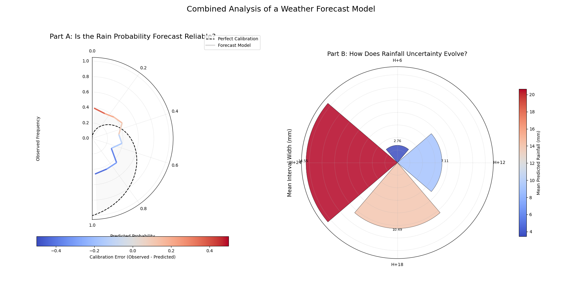
A two-panel figure providing a complete model evaluation. The left plot diagnoses the calibration of the rain probability forecast, while the right plot shows how the uncertainty of the rainfall amount forecast grows over time.
For a deeper understanding of the statistical concepts behind these evaluation techniques, please refer back to the main Model Comparison Visualization and Evaluating Probabilistic Forecasts sections.