Taylor Diagrams
This gallery page focuses on Taylor Diagrams, which provide a concise visual summary of model performance. They compare key statistics like correlation, standard deviation, and centered Root Mean Square Difference (RMSD) between one or more models (or predictions) and a reference (observed) dataset.
Note
You need to run the code snippets locally to generate the plot
images referenced below (e.g., images/gallery_taylor_diagram_rwf.png).
Ensure the image paths in the .. image:: directives match where
you save the plots (likely an images subdirectory relative to
this file).
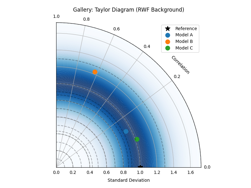
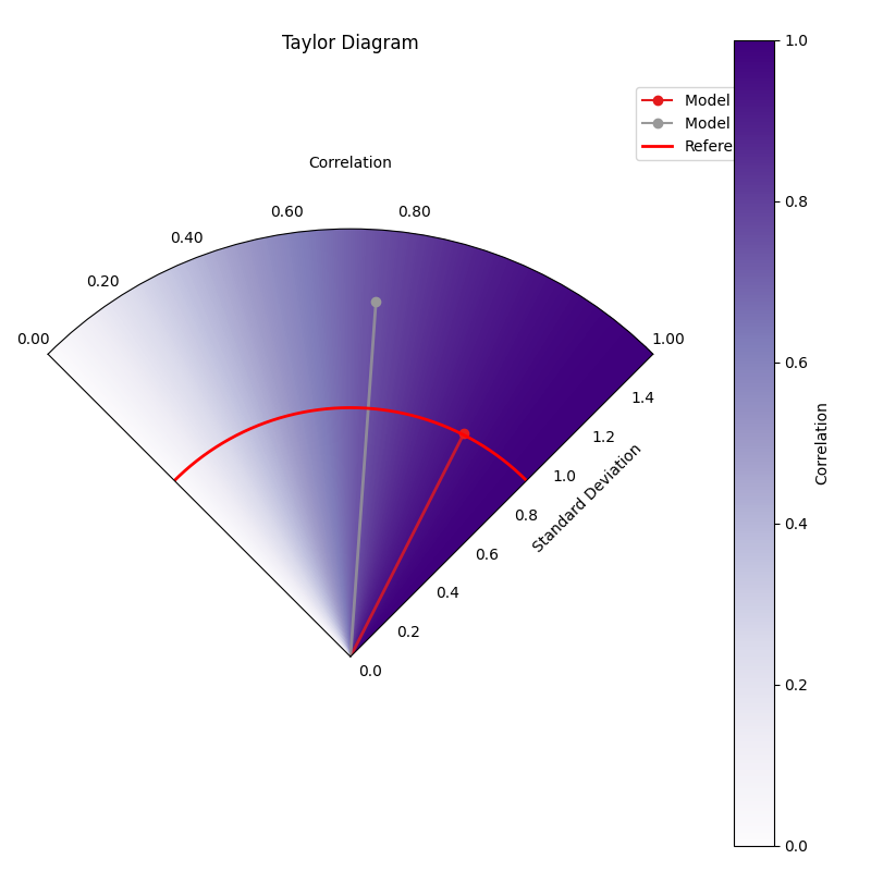
Taylor Diagram (Flexible Input & Background)
Uses taylor_diagram(). This example
shows its flexibility by accepting raw data arrays and adding a
background colormap based on the ‘rwf’ (Radial Weighting Function)
strategy, emphasizing points with good correlation and reference-like
standard deviation.
 1# Assuming plot functions are in kd.plot.evaluation
 2import kdiagram.plot.taylor_diagram as kde
 3import numpy as np
 4import matplotlib.pyplot as plt
 5
 6# --- Data Generation ---
 7np.random.seed(101)
 8n_points = 150
 9reference = np.random.normal(0, 1.0, n_points) # Ref std dev approx 1.0
10
11# Model A: High correlation, slightly lower std dev
12pred_a = reference * 0.8 + np.random.normal(0, 0.4, n_points)
13# Model B: Lower correlation, higher std dev
14pred_b = reference * 0.5 + np.random.normal(0, 1.1, n_points)
15# Model C: Good correlation, similar std dev
16pred_c = reference * 0.95 + np.random.normal(0, 0.3, n_points)
17
18y_preds = [pred_a, pred_b, pred_c]
19names = ["Model A", "Model B", "Model C"]
20
21# --- Plotting ---
22kde.taylor_diagram(
23    y_preds=y_preds,
24    reference=reference,
25    names=names,
26    cmap='Blues',             # Add background shading
27    radial_strategy='rwf',    # Use RWF strategy for background
28    norm_c=True,              # Normalize background colors
29    title='Gallery: Taylor Diagram (RWF Background)',
30    # Save the plot (adjust path relative to this file)
31    savefig="images/gallery_taylor_diagram_rwf.png"
32)
33plt.close()
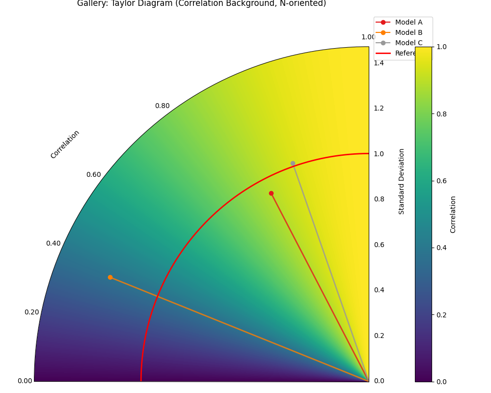
Taylor Diagram (Background Shading Focus)
Uses plot_taylor_diagram_in(). This
example highlights the background colormap feature, here using the
‘convergence’ strategy where color intensity relates directly to the
correlation coefficient. It also demonstrates changing the plot
orientation (Corr=1 at North, angles increase counter-clockwise).
 1import kdiagram.plot.taylor_diagram as kde
 2import numpy as np
 3import matplotlib.pyplot as plt
 4
 5# --- Data Generation (reusing from previous example) ---
 6np.random.seed(101)
 7n_points = 150
 8reference = np.random.normal(0, 1.0, n_points)
 9pred_a = reference * 0.8 + np.random.normal(0, 0.4, n_points)
10pred_b = reference * 0.5 + np.random.normal(0, 1.1, n_points)
11pred_c = reference * 0.95 + np.random.normal(0, 0.3, n_points)
12y_preds = [pred_a, pred_b, pred_c]
13names = ["Model A", "Model B", "Model C"]
14
15# --- Plotting ---
16kde.plot_taylor_diagram_in(
17    *y_preds,                     # Pass predictions as separate args
18    reference=reference,
19    names=names,
20    radial_strategy='convergence',# Background color shows correlation
21    cmap='viridis',
22    zero_location='N',            # Place Corr=1 at the Top (North)
23    direction=1,                  # Counter-clockwise angles
24    cbar=True,                    # Show colorbar for correlation
25    title='Gallery: Taylor Diagram (Correlation Background, N-oriented)',
26    # Save the plot (adjust path relative to this file)
27    savefig="images/gallery_taylor_diagram_in_conv.png"
28)
29plt.close()
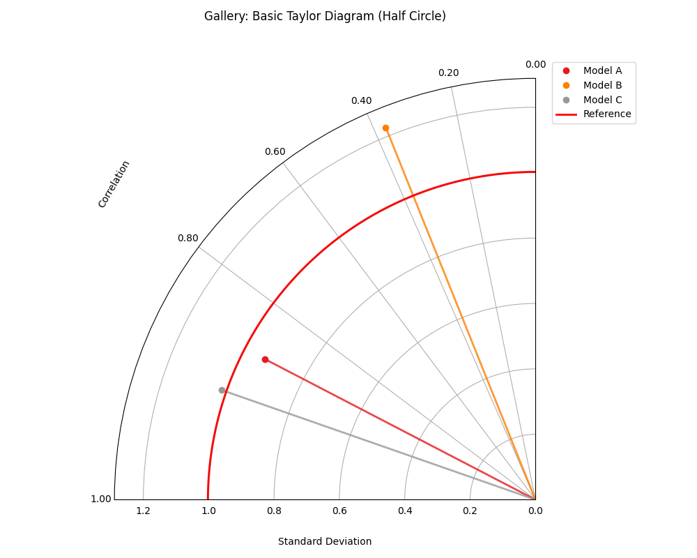
Taylor Diagram (Basic Plot)
Uses plot_taylor_diagram(). This
example shows a more standard Taylor Diagram layout without
background shading, focusing purely on the positions of the model
points relative to the reference. Uses a half-circle layout (90
degrees, showing positive correlations only) with default West
orientation for Corr=1.
 1import kdiagram.plot.taylor_diagram as kde
 2import numpy as np
 3import matplotlib.pyplot as plt
 4
 5# --- Data Generation (reusing from previous example) ---
 6np.random.seed(101)
 7n_points = 150
 8reference = np.random.normal(0, 1.0, n_points)
 9pred_a = reference * 0.8 + np.random.normal(0, 0.4, n_points)
10pred_b = reference * 0.5 + np.random.normal(0, 1.1, n_points)
11pred_c = reference * 0.95 + np.random.normal(0, 0.3, n_points)
12y_preds = [pred_a, pred_b, pred_c]
13names = ["Model A", "Model B", "Model C"]
14
15# --- Plotting ---
16kde.plot_taylor_diagram(
17    *y_preds,
18    reference=reference,
19    names=names,
20    acov='half_circle',      # Use 90-degree layout
21    zero_location='W',       # Place Corr=1 at the Left (West)
22    direction=-1,            # Clockwise angles
23    title='Gallery: Basic Taylor Diagram (Half Circle)',
24    # Save the plot (adjust path relative to this file)
25    savefig="images/gallery_taylor_diagram_basic.png"
26)
27plt.close()
Taylor Diagram (NE Orientation, Convergence BG)
Another variant using plot_taylor_diagram_in(),
this time placing perfect correlation (1.0) in the North-East (‘NE’)
quadrant, with angles increasing counter-clockwise (direction=1).
The background uses the ‘convergence’ strategy with the ‘Purples’
colormap, where color intensity maps directly to the correlation
value, and includes a colorbar.
 1import kdiagram.plot.evaluation as kde
 2import numpy as np
 3import matplotlib.pyplot as plt
 4
 5# --- Data Generation (using same data as previous examples) ---
 6np.random.seed(42) # Use same seed for consistency if desired
 7reference = np.random.normal(0, 1, 100)
 8y_preds = [
 9    reference + np.random.normal(0, 0.3, 100), # Model A (close)
10    reference * 0.9 + np.random.normal(0, 0.8, 100) # Model B (worse corr/std)
11]
12names = ['Model A', 'Model B']
13
14# --- Plotting ---
15kde.plot_taylor_diagram_in(
16    *y_preds,
17    reference=reference,
18    names=names,
19    acov='half_circle', # 90 degree span
20    zero_location='NE', # Corr = 1.0 at North-East
21    direction=1,        # Angles increase counter-clockwise
22    fig_size=(8, 8),
23    cbar=True,          # Show colorbar for correlation
24    cmap='Purples',       # Use Purples colormap for background
25    radial_strategy='convergence', # Color based on correlation
26    title='Gallery: Taylor Diagram (NE, CCW, Convergence BG)',
27    # Save the plot (adjust path relative to this file)
28    savefig="images/gallery_taylor_diagram_in_ne_ccw_conv.png"
29)
30plt.close()
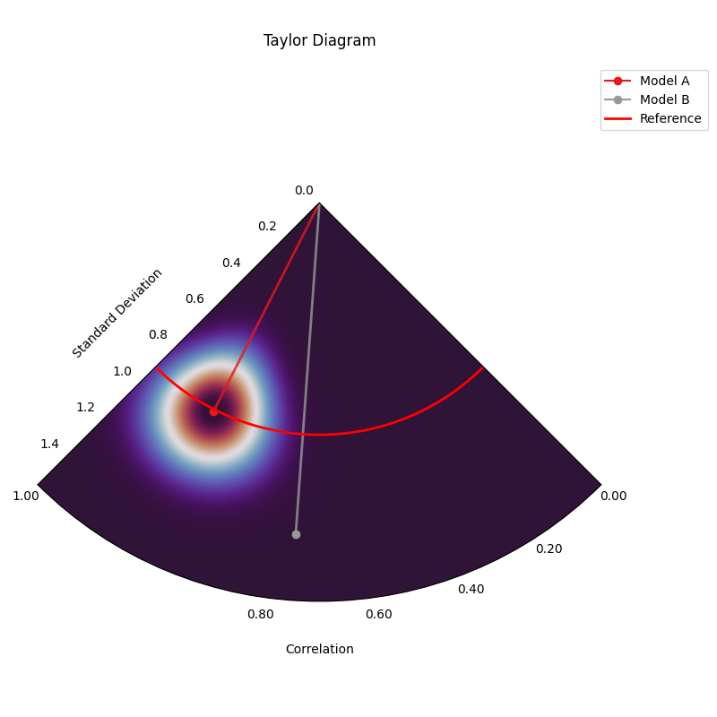
Taylor Diagram (SW Orientation, Performance BG)
This variant uses plot_taylor_diagram_in()
with perfect correlation (1.0) placed in the South-West (‘SW’)
quadrant, counter-clockwise angle increase (direction=1), and the
‘performance’ background strategy. The ‘performance’ strategy uses an
exponential decay centered on the best performing model in the input
(closest correlation and std dev to reference), highlighting the region
around it. Uses ‘gouraud’ shading for a smoother background and hides
the colorbar.
 1import kdiagram.plot.taylor_diagram as kde
 2import numpy as np
 3import matplotlib.pyplot as plt
 4
 5# --- Data Generation (using same data as previous examples) ---
 6np.random.seed(42) # Use same seed for consistency
 7reference = np.random.normal(0, 1, 100)
 8y_preds = [
 9    reference + np.random.normal(0, 0.3, 100), # Model A (close)
10    reference * 0.9 + np.random.normal(0, 0.8, 100) # Model B (worse corr/std)
11]
12names = ['Model A', 'Model B']
13
14# --- Plotting ---
15kde.plot_taylor_diagram_in(
16    *y_preds,
17    reference=reference,
18    names=names,
19    acov='half_circle',     # 90 degree span
20    zero_location='SW',     # Corr = 1.0 at South-West
21    direction=1,            # Angles increase counter-clockwise
22    fig_size=(8, 8),
23    cbar=False,             # Hide colorbar
24    cmap='twilight_shifted',# Use a cyclic map
25    shading='gouraud',      # Smoother shading
26    radial_strategy='performance', # Color based on best model proximity
27    title='Gallery: Taylor Diagram (SW, CCW, Performance BG)',
28    # Save the plot (adjust path relative to this file)
29    savefig="images/gallery_taylor_diagram_in_sw_ccw_perf.png"
30)
31plt.close()