Model Evaluation Gallery
This gallery page showcases plots from the k-diagram package designed for the evaluation of classification models. It features novel polar adaptations of standard, powerful diagnostic tools like the ROC curve and the Precision-Recall curve.
These visualizations provide an intuitive and aesthetically engaging way to compare the performance of multiple models, assess their discriminative power, and understand their behavior, especially on imbalanced datasets.
Note
You need to run the code snippets locally to generate the plot
images referenced below. Ensure the image paths in the
.. image:: directives match where you save the plots.
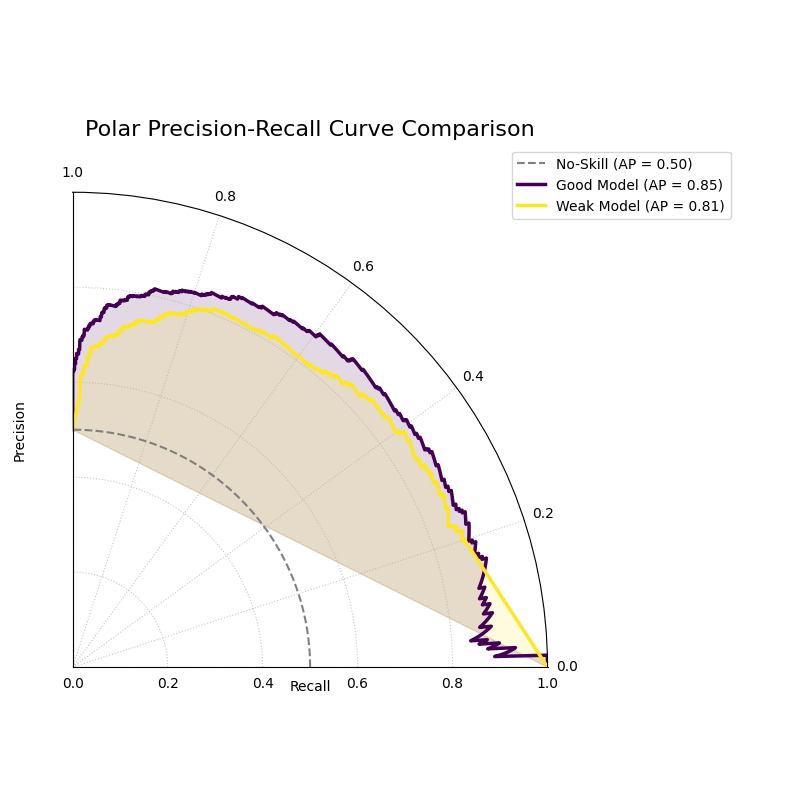
Polar Precision-Recall Curve
Visualizes the trade-off between Precision and Recall for one or more binary classifiers. This plot is particularly useful for evaluating models on imbalanced datasets where ROC curves can be misleading.
 1import kdiagram as kd
 2import numpy as np
 3from sklearn.datasets import make_classification
 4import matplotlib.pyplot as plt
 5
 6# --- Data Generation (Imbalanced) ---
 7X, y_true = make_classification(
 8    n_samples=1000,
 9    n_classes=2,
10    weights=[0.9, 0.1], # 10% positive class
11    flip_y=0.1,
12    random_state=42
13)
14
15# Simulate predictions from two models
16y_pred_good = y_true * 0.6 + np.random.rand(1000) * 0.4
17y_pred_bad = np.random.rand(1000)
18
19# --- Plotting ---
20kd.plot_polar_pr_curve(
21    y_true,
22    y_pred_good,
23    y_pred_bad,
24    names=["Good Model", "Weak Model"],
25    title="Polar Precision-Recall Curve Comparison",
26    savefig="gallery/images/gallery_evaluation_plot_polar_pr_curve.png"
27)
28plt.close()
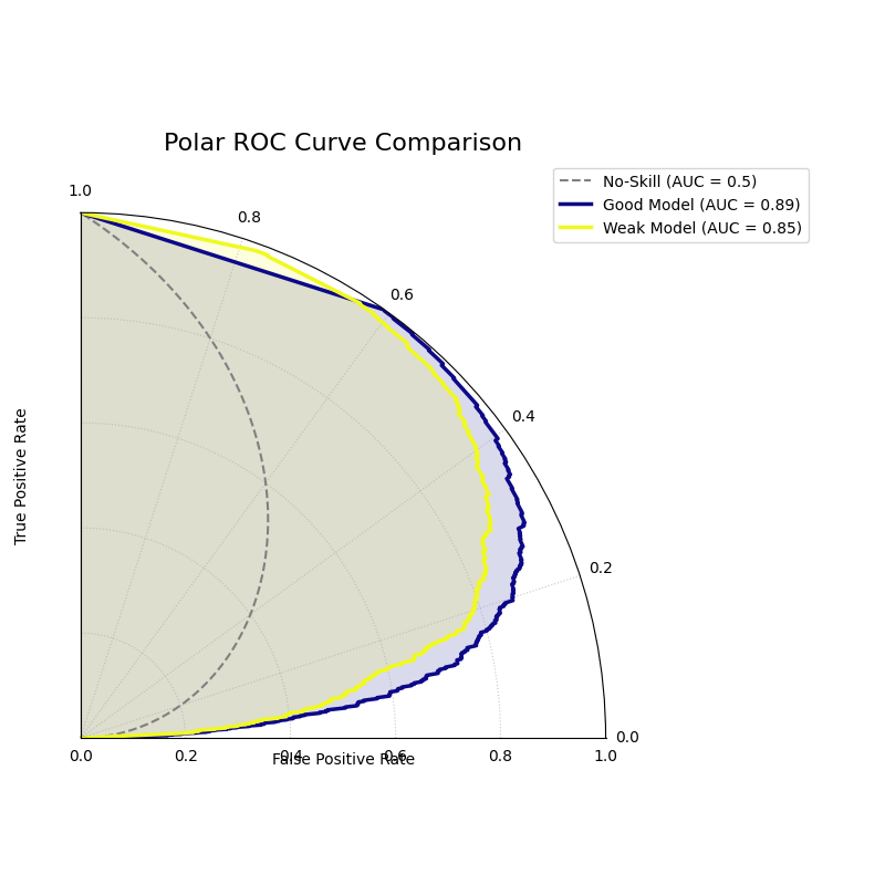
Polar ROC Curve
Visualizes the performance of one or more binary classifiers using a Receiver Operating Characteristic (ROC) curve adapted to a polar coordinate system. It plots the True Positive Rate against the False Positive Rate to assess a model’s discriminative ability.
 1import kdiagram as kd
 2import numpy as np
 3from sklearn.datasets import make_classification
 4import matplotlib.pyplot as plt
 5
 6# --- Data Generation ---
 7X, y_true = make_classification(
 8    n_samples=1000,
 9    n_classes=2,
10    flip_y=0.2, # Add some noise
11    random_state=42
12)
13
14# Simulate predictions from two models
15y_pred_good = y_true * 0.7 + np.random.rand(1000) * 0.4
16y_pred_weak = np.random.rand(1000)
17
18# --- Plotting ---
19kd.plot_polar_roc(
20    y_true,
21    y_pred_good,
22    y_pred_weak,
23    names=["Good Model", "Weak Model"],
24    title="Polar ROC Curve Comparison",
25    savefig="gallery/images/gallery_evaluation_plot_polar_roc.png"
26)
27plt.close()
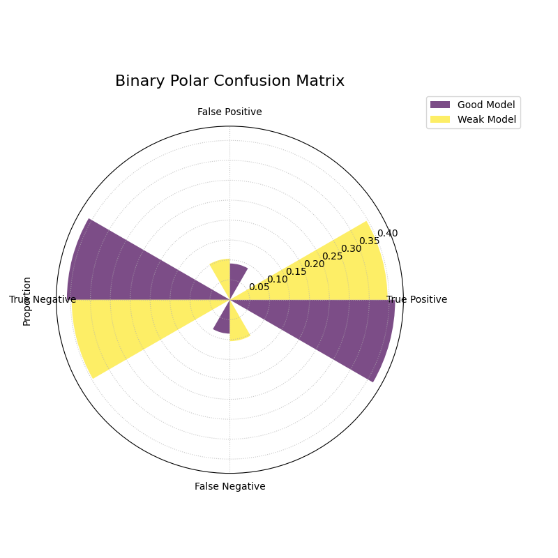
Polar Confusion Matrix
Visualizes the components of a binary confusion matrix (True Positives, False Positives, True Negatives, and False Negatives) as bars on a polar plot, allowing for a direct comparison of multiple models.
 1import kdiagram as kd
 2import numpy as np
 3from sklearn.datasets import make_classification
 4import matplotlib.pyplot as plt
 5
 6# --- Data Generation ---
 7X, y_true = make_classification(
 8    n_samples=1000,
 9    n_classes=2,
10    flip_y=0.2, # Add some noise
11    random_state=42
12)
13
14# Simulate predictions from two models
15y_pred_good = y_true * 0.8 + np.random.rand(1000) * 0.3
16y_pred_weak = np.random.rand(1000)
17
18# --- Plotting ---
19kd.plot_polar_confusion_matrix(
20    y_true,
21    y_pred_good,
22    y_pred_weak,
23    names=["Good Model", "Weak Model"],
24    title="Binary Polar Confusion Matrix",
25    savefig="gallery/images/gallery_evaluation_plot_polar_confusion_matrix.png"
26)
27plt.close()
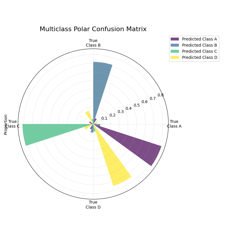
Multiclass Polar Confusion Matrix
Visualizes the performance of a multiclass classifier using a grouped polar bar chart. Each angular sector represents a true class, and the bars within it show the distribution of the model’s predictions for that class.
 1import kdiagram as kd
 2import numpy as np
 3from sklearn.datasets import make_classification
 4import matplotlib.pyplot as plt
 5
 6# --- Data Generation ---
 7X, y_true = make_classification(
 8    n_samples=1000,
 9    n_features=20,
10    n_informative=10,
11    n_classes=4,
12    n_clusters_per_class=1,
13    flip_y=0.15, # Add some noise
14    random_state=42
15)
16# Simulate predictions
17y_pred = y_true.copy()
18# Add some common confusions (e.g., confuse some 2s as 3s)
19mask = (y_true == 2) & (np.random.rand(1000) < 0.3)
20y_pred[mask] = 3
21
22# --- Plotting ---
23kd.plot_polar_confusion_matrix_in(
24    y_true,
25    y_pred,
26    class_labels=["Class A", "Class B", "Class C", "Class D"],
27    title="Multiclass Polar Confusion Matrix",
28    savefig="gallery/images/gallery_evaluation_plot_polar_confusion_matrix_in.png"
29)
30plt.close()
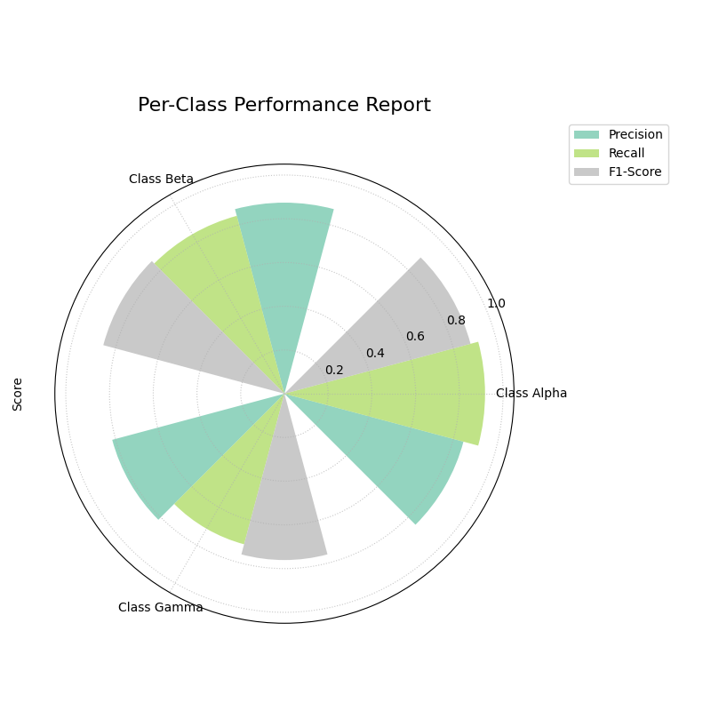
Polar Classification Report
Visualizes the key performance metrics (Precision, Recall, and F1-Score) for each class in a multiclass classification problem. This provides a more detailed summary than a confusion matrix alone.
 1import kdiagram as kd
 2import numpy as np
 3from sklearn.datasets import make_classification
 4import matplotlib.pyplot as plt
 5
 6# --- Data Generation (Imbalanced) ---
 7X, y_true = make_classification(
 8    n_samples=1000,
 9    n_features=20,
10    n_informative=10,
11    n_classes=3,
12    n_clusters_per_class=1,
13    weights=[0.5, 0.3, 0.2], # Imbalanced classes
14    flip_y=0.15,
15    random_state=42
16)
17# Simulate predictions
18y_pred = y_true.copy()
19# Add some errors, especially for the minority class
20mask = (y_true == 2) & (np.random.rand(1000) < 0.4)
21y_pred[mask] = 0
22
23# --- Plotting ---
24kd.plot_polar_classification_report(
25    y_true,
26    y_pred,
27    class_labels=["Class Alpha", "Class Beta", "Class Gamma"],
28    title="Per-Class Performance Report",
29    cmap='Set2',
30    savefig="gallery/images/gallery_evaluation_plot_polar_classification_report.png"
31)
32plt.close()
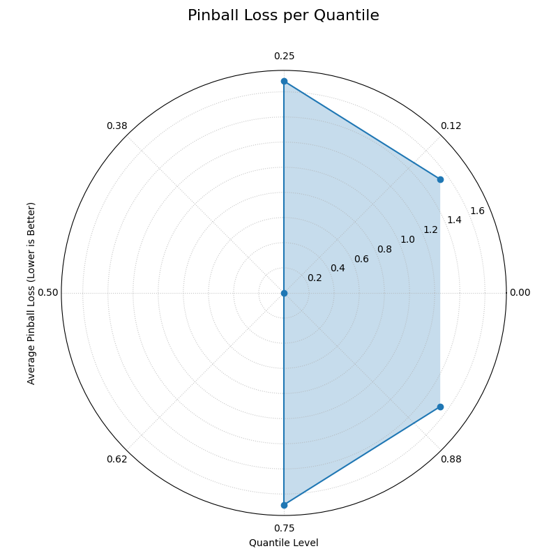
Polar Pinball Loss
Visualizes the per-quantile performance of a probabilistic forecast using the Pinball Loss. This plot provides a granular view of a model’s accuracy across its entire predictive distribution.
 1import kdiagram as kd
 2import numpy as np
 3from scipy.stats import norm
 4import matplotlib.pyplot as plt
 5
 6# --- Data Generation ---
 7np.random.seed(0)
 8n_samples = 1000
 9y_true = np.random.normal(loc=50, scale=10, size=n_samples)
10quantiles = np.array([0.1, 0.25, 0.5, 0.75, 0.9])
11
12# Simulate a model that is good at the median, worse at the tails
13scales = np.array([12, 10, 8, 10, 12]) # Different scales per quantile
14y_preds = norm.ppf(
15    quantiles, loc=y_true[:, np.newaxis], scale=scales
16)
17
18# --- Plotting ---
19kd.plot_pinball_loss(
20    y_true,
21    y_preds,
22    quantiles,
23    title="Pinball Loss per Quantile",
24    savefig="gallery/images/gallery_evaluation_plot_pinball_loss.png"
25)
26plt.close()
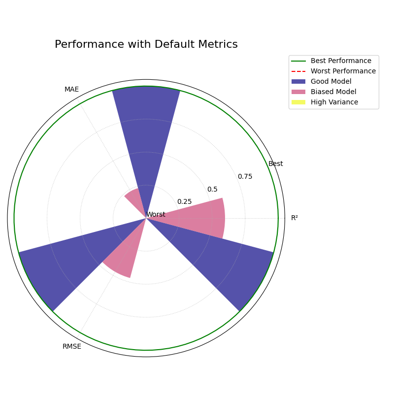
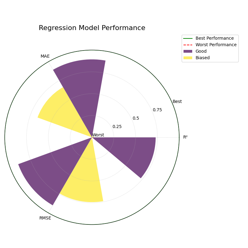
Polar Performance Chart
Visualizes and compares multiple regression models across several performance metrics simultaneously using a grouped polar bar chart. All scores are normalized so that a larger radius is always better.
Default Metrics Example
This example shows the default behavior, comparing three models
across R², Mean Absolute Error (MAE), and Root Mean Squared Error
(RMSE). The metric_labels parameter is used to provide short,
clean labels for the plot axes.
 1import kdiagram as kd
 2import numpy as np
 3import matplotlib.pyplot as plt
 4
 5# --- Data Generation ---
 6np.random.seed(0)
 7n_samples = 200
 8y_true = np.random.rand(n_samples) * 50
 9
10# Models with different performance profiles
11y_pred_good = y_true + np.random.normal(0, 5, n_samples)
12y_pred_biased = y_true - 10 + np.random.normal(0, 2, n_samples)
13y_pred_variance = y_true + np.random.normal(0, 15, n_samples)
14
15model_names = ["Good Model", "Biased Model", "High Variance"]
16
17# --- Plotting ---
18kd.plot_regression_performance(
19    y_true,
20    y_pred_good, y_pred_biased, y_pred_variance,
21    names=model_names,
22    title="Performance with Default Metrics",
23    cmap='plasma',
24    metric_labels={
25        'r2': 'R²',
26        'neg_mean_absolute_error': 'MAE',
27        'neg_root_mean_squared_error': 'RMSE'
28    },
29    savefig="gallery/images/gallery_plot_regression_performance_default.png"
30)
31plt.close()
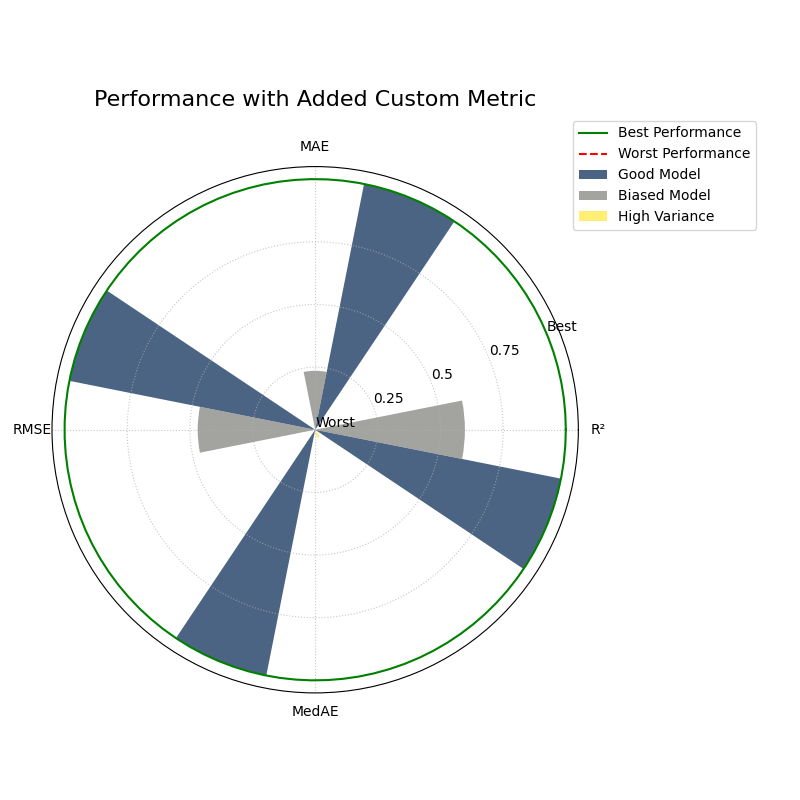
Custom and Added Metrics Example
This example demonstrates how to add a custom metric (Median
Absolute Error) to the default set of metrics using the
add_to_defaults=True parameter.
 1import kdiagram as kd
 2import numpy as np
 3import matplotlib.pyplot as plt
 4from sklearn.metrics import median_absolute_error
 5
 6# --- Data Generation (same as above) ---
 7np.random.seed(0)
 8n_samples = 200
 9y_true = np.random.rand(n_samples) * 50
10y_pred_good = y_true + np.random.normal(0, 5, n_samples)
11y_pred_biased = y_true - 10 + np.random.normal(0, 2, n_samples)
12y_pred_variance = y_true + np.random.normal(0, 15, n_samples)
13model_names = ["Good Model", "Biased Model", "High Variance"]
14
15# A custom metric function (must return a score, not an error)
16def median_abs_error_scorer(y_true, y_pred):
17    return -median_absolute_error(y_true, y_pred)
18
19# --- Plotting ---
20kd.plot_regression_performance(
21    y_true,
22    y_pred_good, y_pred_biased, y_pred_variance,
23    names=model_names,
24    metrics=[median_abs_error_scorer],
25    add_to_defaults=True,
26    title="Performance with Added Custom Metric",
27    cmap='cividis',
28    metric_labels={
29        'r2': 'R²',
30        'neg_mean_absolute_error': 'MAE',
31        'neg_root_mean_squared_error': 'RMSE',
32        'median_abs_error_scorer': 'MedAE'
33    },
34    savefig="gallery/images/gallery_plot_regression_performance_custom.png"
35)
36plt.close()
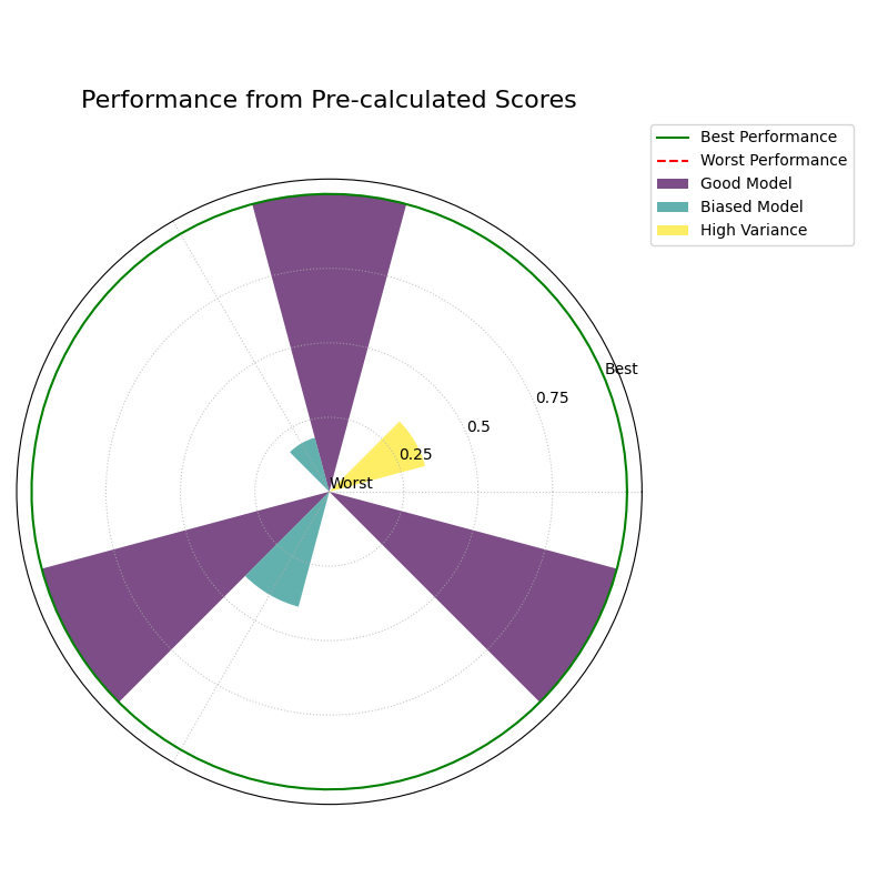
Pre-calculated Metrics Example
This example shows how to generate the plot directly from a
dictionary of pre-calculated scores using the metric_values
parameter. This is useful when you have already computed the
metrics and just want to visualize them. The axis labels are
muted for a cleaner look.
 1import kdiagram as kd
 2import matplotlib.pyplot as plt
 3
 4# --- Pre-calculated Scores ---
 5precalculated_scores = {
 6    'R²': [0.85, 0.55, 0.65],
 7    'MAE': [-4.0, -10.5, -12.0],
 8    'RMSE': [-5.0, -11.0, -15.0]
 9}
10model_names = ["Good Model", "Biased Model", "High Variance"]
11
12# --- Plotting ---
13kd.plot_regression_performance(
14    metric_values=precalculated_scores,
15    names=model_names,
16    title="Performance from Pre-calculated Scores",
17    cmap='Set2',
18    metric_labels=False, # Mute the axis labels
19    savefig="gallery/images/gallery_plot_regression_performance_precalc.png"
20)
21plt.close()
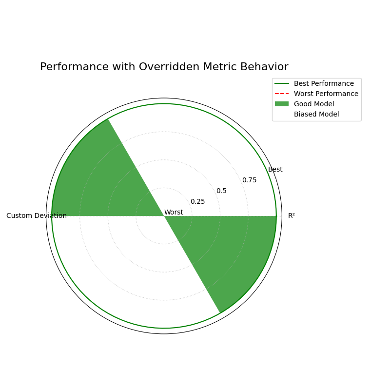
Overriding Metric Behavior
This example demonstrates how to use the higher_is_better
parameter to give the function explicit instructions on how to
interpret a custom metric. This is crucial when your metric is an
error score (where lower is better) but does not have a name that
the function would automatically recognize as an error.
 1import kdiagram as kd
 2import numpy as np
 3import matplotlib.pyplot as plt
 4
 5# --- Data Generation ---
 6np.random.seed(0)
 7n_samples = 200
 8y_true = np.random.rand(n_samples) * 50
 9y_pred_good = y_true + np.random.normal(0, 5, n_samples)
10y_pred_biased = y_true - 10 + np.random.normal(0, 2, n_samples)
11model_names = ["Good Model", "Biased Model"]
12
13# A custom error metric with a neutral name
14def my_custom_deviation(y_true, y_pred):
15    return np.mean(np.abs(y_true - y_pred))
16
17# --- Plotting ---
18kd.plot_regression_performance(
19    y_true,
20    y_pred_good,
21    y_pred_biased,
22    names=model_names,
23    metrics=['r2', my_custom_deviation],
24    title="Performance with Overridden Metric Behavior",
25    cmap='ocean',
26    metric_labels={
27        'r2': 'R²',
28        'my_custom_deviation': 'Custom Deviation'
29    },
30    higher_is_better={
31        'my_custom_deviation': False # Explicitly tell the function lower is better
32    },
33    savefig="gallery/images/gallery_plot_regression_performance_override.png"
34)
35plt.close()
Controlling Normalization Strategies
The norm parameter is a powerful feature that changes the
“perspective” of the plot. It controls how raw metric scores are
scaled to the radial axis, allowing you to switch between relative
comparisons and absolute benchmarks.
The following examples all use the same underlying data, generated once to create two models with different error profiles.
Data Generation
 1import kdiagram as kd
 2import matplotlib.pyplot as plt
 3
 4# Define distinct profiles for a good model and a biased model
 5model_profiles = {
 6    "Good Model": {"bias": 0.5, "noise_std": 4.0},
 7    "Biased Model": {"bias": -10.0, "noise_std": 2.0},
 8}
 9
10# Generate the dataset
11data = kd.datasets.make_regression_data(
12    model_profiles=model_profiles,
13    seed=42,
14    as_frame=True
15)
16
17# Prepare data and labels for plotting
18y_true = data['y_true'].values
19y_pred_good = data['pred_Good_Model'].values
20y_pred_biased = data['pred_Biased_Model'].values
21model_names = ["Good", "Biased"]
22
23metric_labels = {
24    'r2': 'R²',
25    'neg_mean_absolute_error': 'MAE',
26    'neg_root_mean_squared_error': 'RMSE',
27}
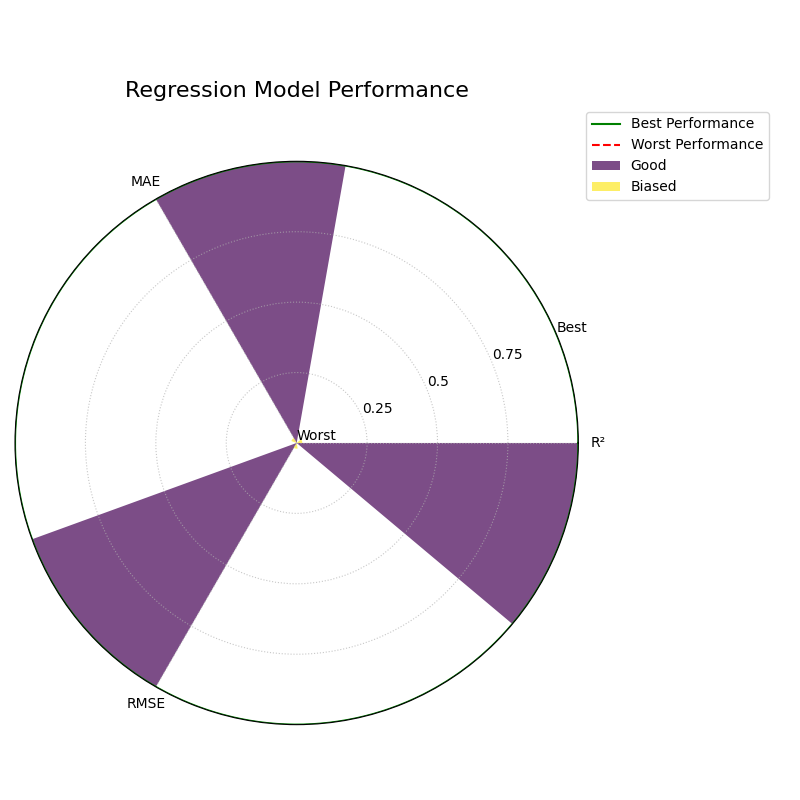
1. Relative Comparison (`norm=”per_metric”`)
This is the default behavior. It scales each metric independently to the range [0, 1]. This perspective is best for answering the question: “Which of my models is relatively better or worse on each metric?”
1kd.plot_regression_performance(
2    y_true, y_pred_good, y_pred_biased,
3    names=model_names,
4    metric_labels=metric_labels,
5    norm="per_metric",
6    title="Regression Model Performance (Per-Metric Norm)",
7    savefig="gallery/images/gallery_plot_regression_performance_per_metric.png"
8)
9plt.close()
2. Absolute Benchmark (`norm=”global”`)
This mode compares models against a fixed, meaningful scale that you
define with global_bounds. It’s best for answering: “Do my
models meet a predefined standard of ‘good’?”
 1# Define a benchmark for what "good" and "bad" means for each metric
 2global_bounds = {
 3    "r2": (0.0, 1.0),
 4    "neg_mean_absolute_error": (-15.0, 0.0),
 5    "neg_root_mean_squared_error": (-20.0, 0.0),
 6}
 7
 8kd.plot_regression_performance(
 9    y_true, y_pred_good, y_pred_biased,
10    names=model_names,
11    metric_labels=metric_labels,
12    norm="global",
13    global_bounds=global_bounds,
14    title="Regression Model Performance (Global Norm)",
15    savefig="gallery/images/gallery_plot_regression_performance_global.png"
16)
17plt.close()
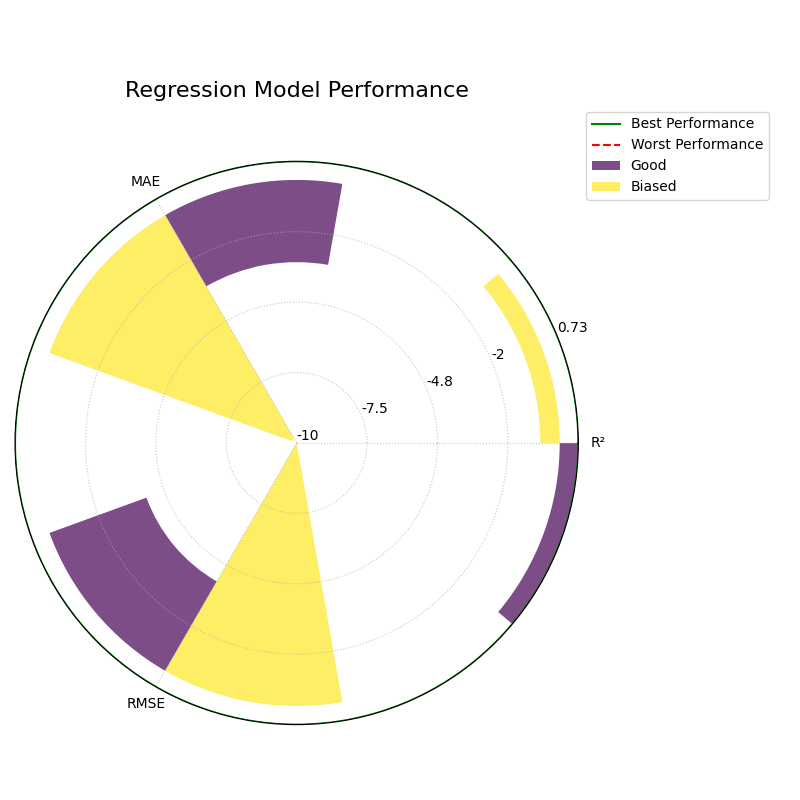
3. Raw Scores (`norm=”none”`)
This mode is for experts who want to see the un-scaled metric values directly. The radial axis is relabeled to show the raw scores.
1kd.plot_regression_performance(
2    y_true, y_pred_good, y_pred_biased,
3    names=model_names,
4    metric_labels=metric_labels,
5    norm="none",
6    title="Regression Model Performance (No Norm)",
7    savefig="gallery/images/gallery_plot_regression_performance_none.png"
8)
9plt.close()