Probabilistic Diagnostics Gallery
This gallery page showcases plots from k-diagram designed for the
comprehensive evaluation of probabilistic forecasts. These visualizations
move beyond simple interval checks to assess the two key qualities of a
probabilistic forecast: calibration (is the forecast reliable?) and
sharpness (is the forecast precise?).
The plots provide intuitive diagnostics for PIT histograms, forecast sharpness, overall performance (CRPS), and conditional uncertainty, allowing for a deeper understanding of a model’s predictive distributions.
Note
You need to run the code snippets locally to generate the plot
images referenced below. Ensure the image paths in the
.. image:: directives match where you save the plots.
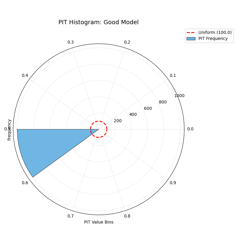
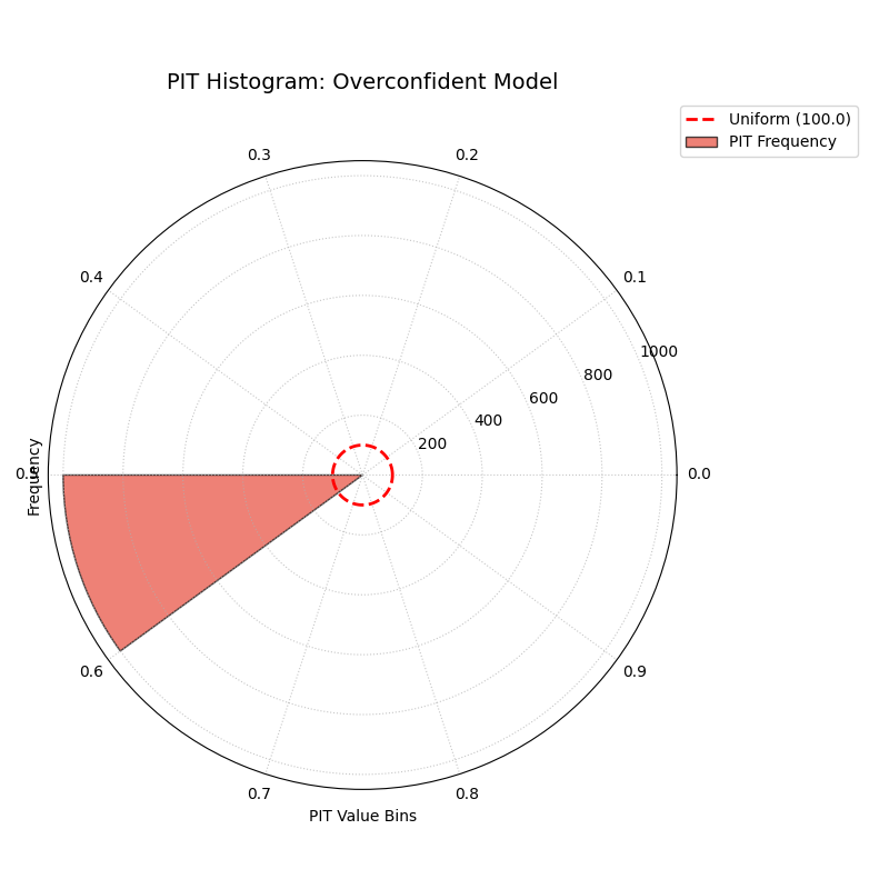
PIT Histogram (Calibration)
Assesses the calibration of a probabilistic forecast using a Polar Probability Integral Transform (PIT) histogram. For a perfectly calibrated model, the histogram should be uniform, resulting in a plot where the bars form a perfect circle.
 1import kdiagram as kd
 2import pandas as pd
 3import numpy as np
 4from scipy.stats import norm
 5import matplotlib.pyplot as plt
 6
 7# --- Data Generation ---
 8
 9np.random.seed(42)
10n_samples = 1000
11y_true = np.random.normal(loc=10, scale=5, size=n_samples)
12quantiles = np.linspace(0.05, 0.95, 19)  # 19 quantiles from 5% to 95%
13
14# Model 1: Good model (well-calibrated)
15good_model_preds = norm.ppf(quantiles, loc=y_true[:, np.newaxis], scale=5)
16
17# Model 2: Overconfident model (too sharp, poorly calibrated)
18overconfident_preds = norm.ppf(quantiles, loc=y_true[:, np.newaxis], scale=2.5)
19
20# --- Plotting ---
21kd.plot_pit_histogram(
22    y_true, good_model_preds, quantiles,
23    title="PIT Histogram: Good Model",
24    savefig="gallery/images/gallery_pit_histogram_good_model.png",
25)
26
27kd.plot_pit_histogram(
28    y_true, overconfident_preds, quantiles,
29    title="PIT Histogram: Overconfident Model",
30    color="#E74C3C",
31    savefig="gallery/images/gallery_pit_histogram_overconfident.png",
32)
33
34plt.close('all')
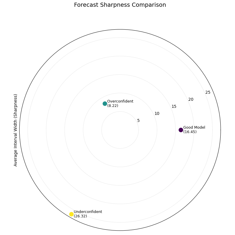
Polar Sharpness Diagram
Assesses the sharpness (or precision) of one or more probabilistic forecasts. A sharper forecast has narrower prediction intervals and is represented by a point closer to the center of the plot.
 1import kdiagram as kd
 2import pandas as pd
 3import numpy as np
 4from scipy.stats import norm
 5import matplotlib.pyplot as plt
 6
 7# --- Data Generation (using the same data as before) ---
 8
 9np.random.seed(42)
10n_samples = 1000
11y_true = np.random.normal(loc=10, scale=5, size=n_samples)
12quantiles = np.linspace(0.05, 0.95, 19)
13
14# Model 1: Good model (well-calibrated, decent sharpness)
15good_model_preds = norm.ppf(quantiles, loc=y_true[:, np.newaxis], scale=5)
16
17# Model 2: Overconfident model (too sharp)
18overconfident_preds = norm.ppf(quantiles, loc=y_true[:, np.newaxis], scale=2.5)
19
20# Model 3: Underconfident model (not sharp)
21underconfident_preds = norm.ppf(quantiles, loc=y_true[:, np.newaxis] + 2, scale=8)
22
23model_names = ["Good Model", "Overconfident", "Underconfident"]
24
25# --- Plotting ---
26kd.plot_polar_sharpness(
27    good_model_preds, overconfident_preds, underconfident_preds,
28    quantiles=quantiles,
29    names=model_names,
30    savefig="gallery/images/gallery_forecast_sharpness_comparison.png",
31)
32plt.close()
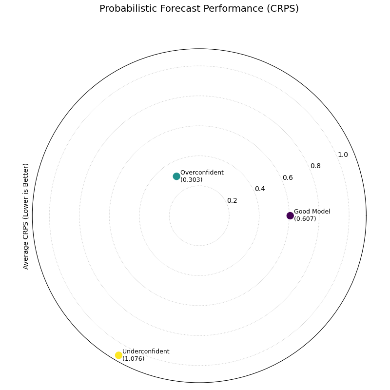
CRPS Comparison (Overall Score)
Provides a summary of overall probabilistic forecast performance using the Continuous Ranked Probability Score (CRPS). The CRPS is a proper scoring rule that assesses both calibration and sharpness simultaneously.
 1import kdiagram as kd
 2import pandas as pd
 3import numpy as np
 4from scipy.stats import norm
 5import matplotlib.pyplot as plt
 6
 7# --- Data Generation (using the same data as before) ---
 8
 9np.random.seed(42)
10n_samples = 1000
11y_true = np.random.normal(loc=10, scale=5, size=n_samples)
12quantiles = np.linspace(0.05, 0.95, 19)
13
14# Model 1: Good model (well-calibrated, decent sharpness)
15good_model_preds = norm.ppf(quantiles, loc=y_true[:, np.newaxis], scale=5)
16
17# Model 2: Overconfident model (too sharp, poorly calibrated)
18overconfident_preds = norm.ppf(quantiles, loc=y_true[:, np.newaxis], scale=2.5)
19
20# Model 3: Underconfident model (not sharp, poorly calibrated)
21underconfident_preds = norm.ppf(quantiles, loc=y_true[:, np.newaxis] + 2, scale=8)
22
23model_names = ["Good Model", "Overconfident", "Underconfident"]
24
25# --- Plotting ---
26kd.plot_crps_comparison(
27    y_true,
28    good_model_preds, overconfident_preds, underconfident_preds,
29    quantiles=quantiles,
30    names=model_names,
31    savefig="gallery/images/gallery_probabilistic_forecast_performance.png",
32)
33plt.close()
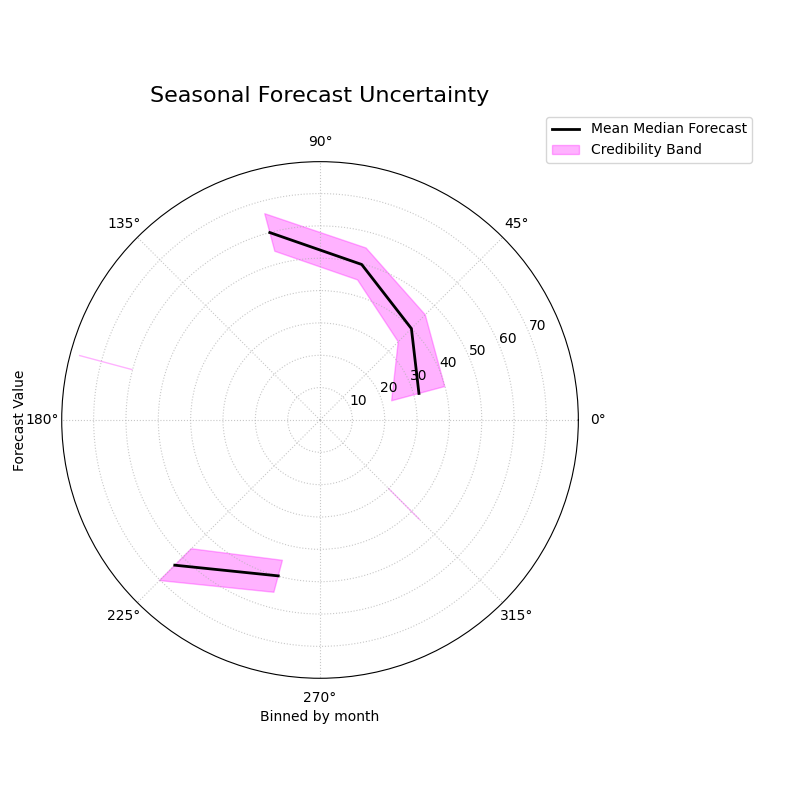
Polar Credibility Bands
Visualizes how the median forecast and the prediction interval bounds change as a function of another binned variable (e.g., month or hour). It is a descriptive tool for understanding the structure of a model’s predictions and its uncertainty.
 1import kdiagram as kd
 2import pandas as pd
 3import numpy as np
 4import matplotlib.pyplot as plt
 5
 6# --- Data Generation ---
 7
 8np.random.seed(0)
 9n_points = 500
10
11# Simulate a cyclical feature (month)
12month = np.random.randint(1, 13, n_points)
13
14# Forecast median follows a seasonal pattern
15median_forecast = 50 + 20 * np.sin((month - 3) * np.pi / 6)
16
17# Uncertainty (interval width) is also seasonal
18interval_width = 10 + 8 * np.cos(month * np.pi / 6) ** 2
19
20df_seasonal = pd.DataFrame({
21    'month': month,
22    'q50': median_forecast + np.random.randn(n_points) * 2,
23    'q10': median_forecast - interval_width / 2,
24    'q90': median_forecast + interval_width / 2,
25})
26
27# --- Plotting ---
28kd.plot_credibility_bands(
29    df=df_seasonal,
30    q_cols=('q10', 'q50', 'q90'),
31    theta_col='month',
32    theta_period=12,
33    theta_bins=12,
34    title="Seasonal Forecast Uncertainty",
35    color="magenta",
36    savefig="gallery/images/gallery_credibility_bands.png",
37)
38plt.close()
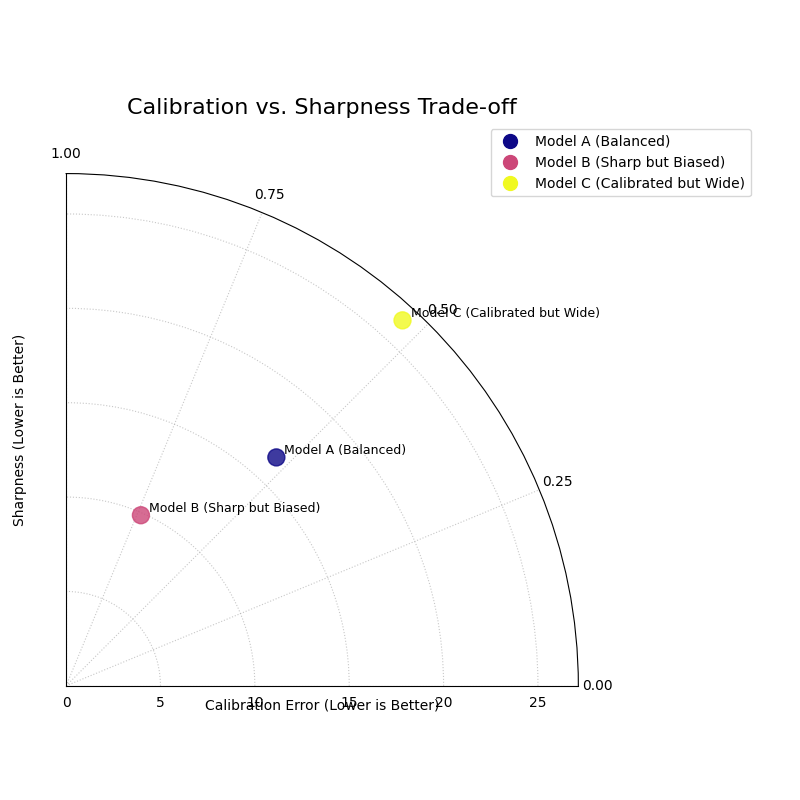
Calibration-Sharpness Diagram
Visualizes the fundamental trade-off between forecast calibration (reliability) and sharpness (precision) for multiple models. The ideal forecast is located at the center of the plot.
 1import kdiagram as kd
 2import pandas as pd
 3import numpy as np
 4from scipy.stats import norm
 5import matplotlib.pyplot as plt
 6
 7# --- Data Generation ---
 8
 9np.random.seed(42)
10n_samples = 1000
11y_true = np.random.normal(loc=10, scale=5, size=n_samples)
12quantiles = np.linspace(0.05, 0.95, 19)
13
14# Models with different trade-offs
15model_A = norm.ppf(quantiles, loc=y_true[:, np.newaxis], scale=5)
16model_B = norm.ppf(quantiles, loc=y_true[:, np.newaxis] - 2, scale=3)
17model_C = norm.ppf(quantiles, loc=y_true[:, np.newaxis], scale=8)
18model_names = ["Balanced", "Sharp/Biased", "Calibrated/Wide"]
19
20# --- Plotting ---
21kd.plot_calibration_sharpness(
22    y_true,
23    model_A, model_B, model_C,
24    quantiles=quantiles,
25    names=model_names,
26    cmap='plasma',
27    savefig="gallery/images/gallery_calibration_sharpness.png",
28)
29plt.close()