Model Comparison Gallery
This gallery page showcases plots from k-diagram designed for comparing the performance of multiple models across various metrics, primarily using radar charts.
Note
You need to run the code snippets locally to generate the plot
images referenced below (e.g., images/gallery_model_comparison.png).
Ensure the image paths in the .. image:: directives match where
you save the plots (likely an images subdirectory relative to
this file).
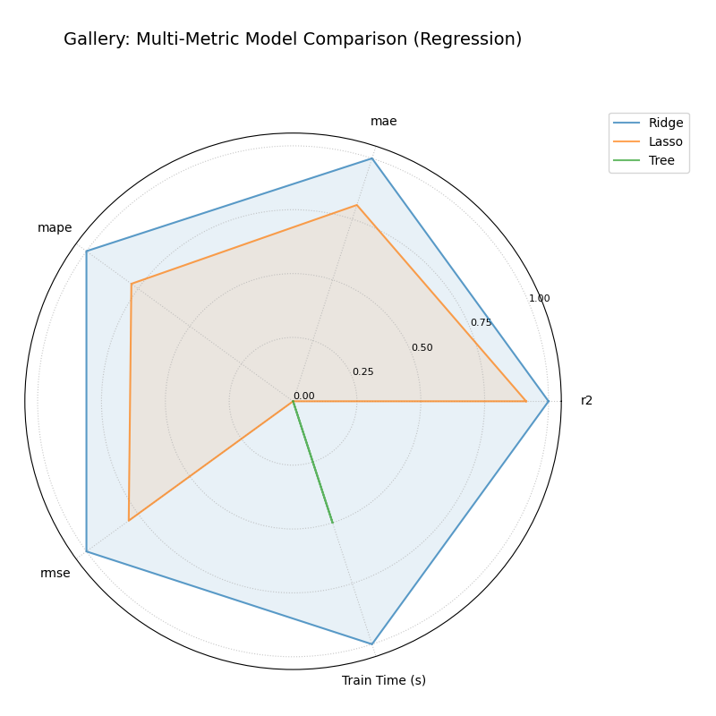
Multi-Metric Model Comparison
Uses plot_model_comparison() to generate
a radar chart comparing multiple models across several performance
metrics (R2, MAE, RMSE, MAPE by default for regression) and includes
training time as an additional axis. Scores are normalized for visual
comparison.
 1import kdiagram.plot.comparison as kdc
 2import numpy as np
 3import matplotlib.pyplot as plt
 4
 5# --- Data Generation ---
 6np.random.seed(42)
 7rng = np.random.default_rng(42)
 8n_samples = 100
 9y_true_reg = np.random.rand(n_samples) * 20 + 5 # True values
10# Model 1: Good fit
11y_pred_r1 = y_true_reg + np.random.normal(0, 2, n_samples)
12# Model 2: Slight bias, more noise
13y_pred_r2 = y_true_reg * 0.9 + 3 + np.random.normal(0, 3, n_samples)
14# Model 3: Less correlated
15y_pred_r3 = np.random.rand(n_samples) * 25 + rng.normal(0, 4, n_samples)
16
17times = [0.2, 0.8, 0.5] # Example training times
18names = ['Ridge', 'Lasso', 'Tree'] # Example model names
19
20# --- Plotting ---
21ax = kdc.plot_model_comparison(
22    y_true_reg,
23    y_pred_r1,
24    y_pred_r2,
25    y_pred_r3,
26    train_times=times,
27    names=names,
28    # metrics=['r2', 'mae'] # Optionally specify metrics
29    title="Gallery: Multi-Metric Model Comparison (Regression)",
30    scale='norm', # Normalize scores to [0, 1] (higher is better)
31    # Save the plot (adjust path relative to this file)
32    savefig="images/gallery_model_comparison.png"
33)
34plt.close() # Close plot after saving
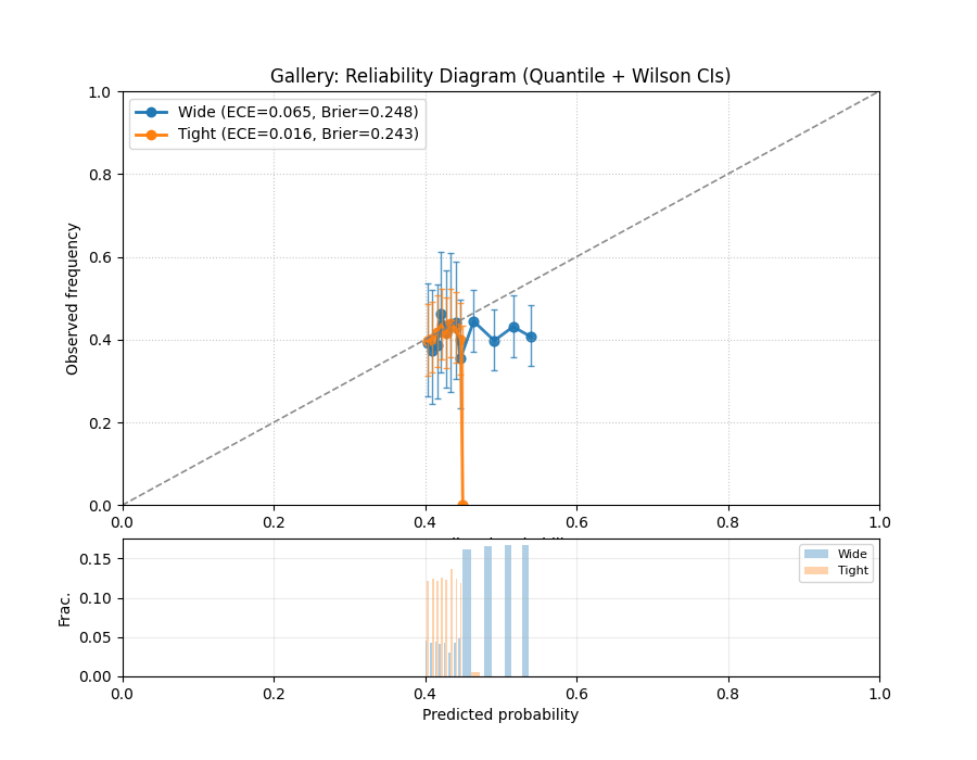
Model Reliability (Calibration) Diagram
Uses plot_reliability_diagram() to
compare predicted probabilities to observed frequencies across
probability bins. A perfectly calibrated model lies on the
\(y=x\) diagonal.
 1import numpy as np
 2import matplotlib.pyplot as plt
 3import kdiagram.plot.comparison as kdc
 4
 5# --- Binary data generation (slightly miscalibrated vs. tighter) ---
 6np.random.seed(0)
 7n = 1000
 8y = (np.random.rand(n) < 0.4).astype(int)
 9
10# Model 1: wider/noisier probabilities around 0.4
11p1 = 0.4 * np.ones_like(y) + 0.15 * np.random.rand(n)
12# Model 2: tighter probabilities around 0.4
13p2 = 0.4 * np.ones_like(y) + 0.05 * np.random.rand(n)
14
15# --- Plotting ---
16ax, data = kdc.plot_reliability_diagram(
17    y, p1, p2,
18    names=["Wide", "Tight"],
19    n_bins=12,
20    strategy="quantile",      # quantile-based binning
21    error_bars="wilson",      # 95% Wilson CIs per bin
22    counts_panel="bottom",    # show counts histogram below
23    show_ece=True,            # compute & display ECE
24    show_brier=True,          # compute & display Brier score
25    title="Gallery: Reliability Diagram (Quantile + Wilson CIs)",
26    savefig="images/gallery_reliability_diagram.png",
27    return_data=True,         # get per-bin stats back
28)
29plt.close()
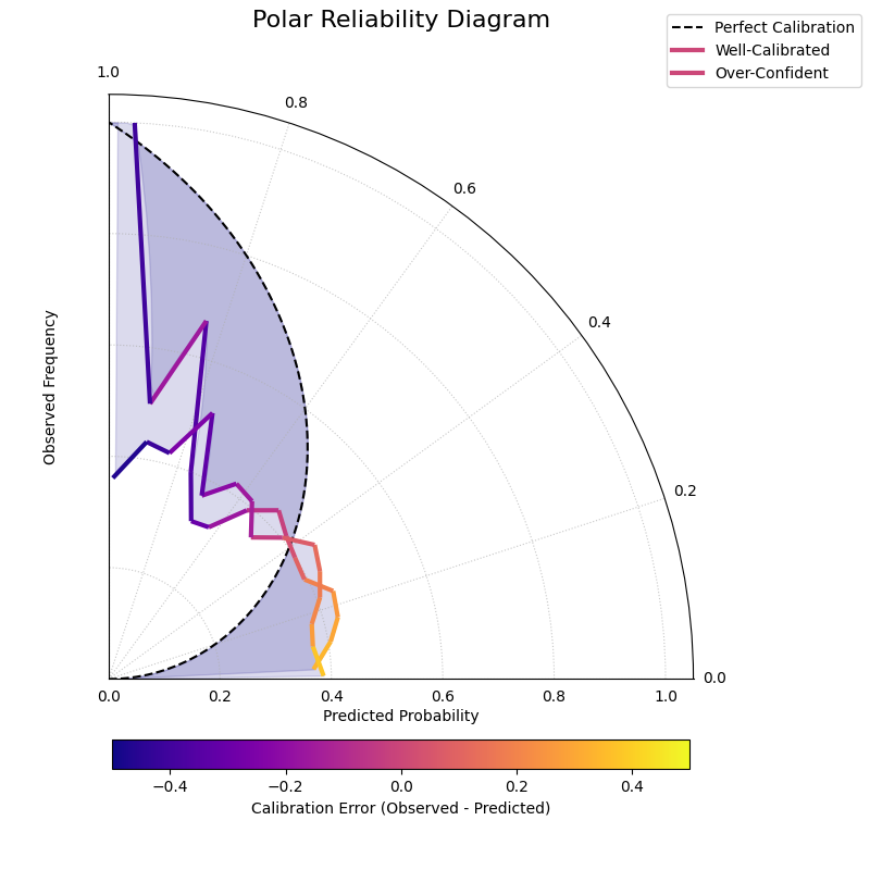
Polar Reliability Diagram (Calibration Spiral)
Provides a novel and intuitive visualization of model calibration by mapping the traditional reliability diagram onto a polar coordinate system. Perfect calibration is represented by a spiral, and the model’s performance is shown as a colored line that should follow this spiral.
 1import kdiagram as kd
 2import numpy as np
 3from scipy.stats import norm
 4import matplotlib.pyplot as plt
 5
 6# --- Data Generation ---
 7np.random.seed(0)
 8n_samples = 2000
 9# True probability of an event is 0.4
10y_true = (np.random.rand(n_samples) < 0.4).astype(int)
11
12# Model 1: Well-calibrated
13calibrated_preds = np.clip(0.4 + np.random.normal(
14    0, 0.15, n_samples), 0, 1)
15
16# Model 2: Over-confident (pushes probabilities to extremes)
17overconfident_preds = np.clip(0.4 + np.random.normal(
18    0, 0.3, n_samples), 0, 1)
19
20model_names = ["Well-Calibrated", "Over-Confident"]
21
22# --- Plotting ---
23kd.plot_polar_reliability(
24    y_true,
25    calibrated_preds,
26    overconfident_preds,
27    names=model_names,
28    n_bins=15,
29    cmap='plasma',
30    savefig="gallery/images/gallery_polar_reliability_diagram.png"
31)
32plt.close()
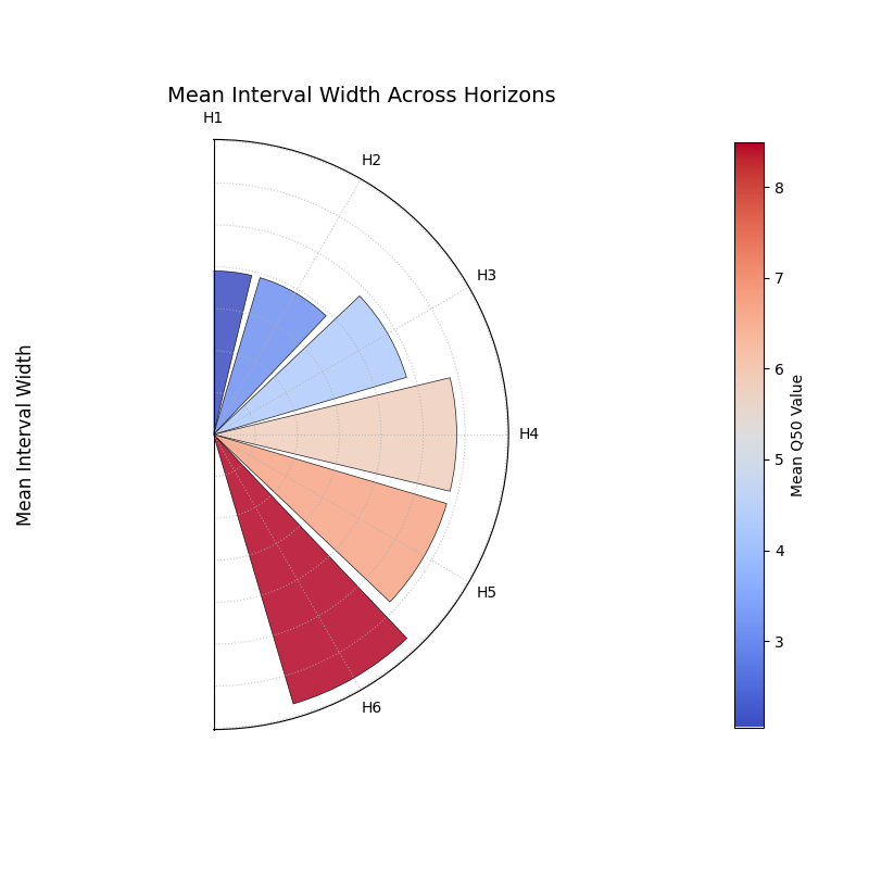
Comparing Metrics Across Horizons
Uses plot_horizon_metrics() to create
a polar bar chart. This plot is designed to compare a primary metric
(like mean interval width) and an optional secondary metric (encoded
as color) across multiple distinct categories, such as forecast
horizons.
 1import kdiagram.plot.comparison as kdc
 2import pandas as pd
 3import numpy as np
 4import matplotlib.pyplot as plt
 5
 6# --- Data Generation ---
 7
 8# Create synthetic data where each row represents a forecast horizon.
 9
10# The columns represent different samples (e.g., from different locations).
11
12horizons = ["H1", "H2", "H3", "H4", "H5", "H6"]
13df_horizons = pd.DataFrame({
14 'q10_s1': [1, 2, 3, 4, 5, 6],
15 'q10_s2': [1.2, 2.3, 3.4, 4.5, 5.6, 6.7],
16 'q90_s1': [3, 4, 5.5, 7, 8, 9.5],
17 'q90_s2': [3.1, 4.2, 5.7, 7.3, 8.4, 9.9],
18 'q50_s1': [2, 3, 4.2, 5.7, 6.5, 8.2],
19 'q50_s2': [2.1, 3.2, 4.4, 5.9, 6.9, 8.8],
20})
21
22q10_cols = ['q10_s1', 'q10_s2']
23q90_cols = ['q90_s1', 'q90_s2']
24q50_cols = ['q50_s1', 'q50_s2']
25
26# --- Plotting ---
27
28ax = kdc.plot_horizon_metrics(
29df=df_horizons,
30qlow_cols=q10_cols,
31qup_cols=q90_cols,
32q50_cols=q50_cols,
33title="Mean Interval Width Across Horizons",
34xtick_labels=horizons,
35show_value_labels=False,  # Hiding for a cleaner look
36r_label="Mean Interval Width",
37cbar_label="Mean Q50 Value",
38acov="half_circle",  # Use a 180-degree view
39# Save the plot (adjust path relative to this file)
40savefig="images/gallery_horizon_metrics.png"
41)
42plt.close()