This gallery page showcases plots from the relationship module,
which provide unique polar perspectives on the relationships between
the core components of a forecast: true values, model
predictions, and forecast errors.
These diagnostic plots are designed to reveal complex patterns such as
conditional biases, heteroscedasticity, and non-linear correlations
that are often difficult to see in standard Cartesian plots. This
module is expected to expand with more specialized relationship
diagnostics in the future.
Note
You need to run the code snippets locally to generate the plot
images referenced below. Ensure the image paths in the
..image:: directives match where you save the plots.
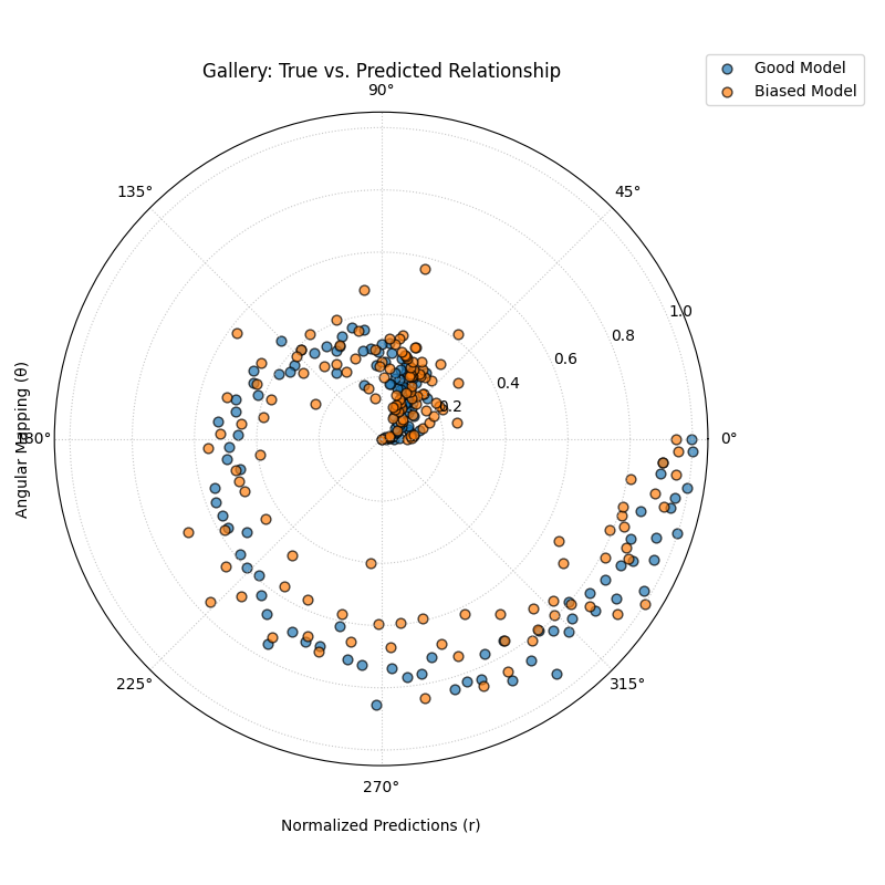
Uses plot_relationship() to map
true values to the angular axis and normalized predicted values to the
radial axis. This creates a spiral-like plot that
reveals the consistency and correlation of model predictions across the entire
range of true values.
1importkdiagram.plot.relationshipaskdr 2importpandasaspd 3importnumpyasnp 4importmatplotlib.pyplotasplt 5 6# --- Data Generation --- 7np.random.seed(42) 8n_points=150 9# Create a clear, non-linear true signal10y_true=np.linspace(0,10,n_points)**1.5+np.sin(11np.linspace(0,10,n_points)12)*21314# Model 1: Good fit with some noise15y_pred1=y_true+np.random.normal(0,1.5,n_points)16# Model 2: Worse fit, under-predicts high values17y_pred2=y_true*0.8+np.random.normal(0,2.5,n_points)1819# --- Plotting ---20kdr.plot_relationship(21y_true,22y_pred1,23y_pred2,24names=["Good Model","Biased Model"],25title="Gallery: True vs. Predicted Relationship",26theta_scale="proportional",# Map angle to y_true value27acov="default",28s=40,29# Save the plot (adjust path relative to this file)30savefig="gallery/images/gallery_plot_relationship.png",31)32plt.close()
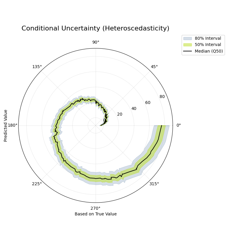
Visualizes how the predicted conditional distribution (represented
by quantile bands) changes as a function of the true observed
value. It is a powerful tool for diagnosing heteroscedasticity.
1importkdiagramaskd 2importpandasaspd 3importnumpyasnp 4fromscipy.statsimportnorm 5importmatplotlib.pyplotasplt 6 7# --- Data Generation with Heteroscedasticity --- 8np.random.seed(0) 9n_samples=20010y_true=np.linspace(0,20,n_samples)**1.511quantiles=np.array([0.1,0.25,0.5,0.75,0.9])1213# Uncertainty (interval width) increases with the true value14interval_width=5+(y_true/y_true.max())*1515y_preds=np.zeros((n_samples,len(quantiles)))16y_preds[:,2]=y_true# Median17y_preds[:,1]=y_true-interval_width*0.25# Q2518y_preds[:,3]=y_true+interval_width*0.25# Q7519y_preds[:,0]=y_true-interval_width*0.5# Q1020y_preds[:,4]=y_true+interval_width*0.5# Q902122# --- Plotting ---23kd.plot_conditional_quantiles(24y_true,25y_preds,26quantiles,27bands=[80,50],# Show 80% and 50% intervals28title="Conditional Uncertainty (Heteroscedasticity)",29savefig="gallery/images/plot_conditional_quantiles.png"30)31plt.close()
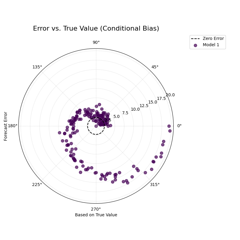
Visualizes the relationship between the forecast error and the true
observed value. This is a polar version of a classic residual plot,
designed to diagnose conditional biases and heteroscedasticity.
1importkdiagramaskd 2importpandasaspd 3importnumpyasnp 4importmatplotlib.pyplotasplt 5 6# --- Data Generation with Conditional Bias --- 7np.random.seed(0) 8n_samples=200 9y_true=np.linspace(0,20,n_samples)**1.510# Model has a bias that depends on the true value (under-predicts high values)11bias=-0.1*y_true12y_pred=y_true+bias+np.random.normal(0,2,n_samples)1314# --- Plotting ---15kd.plot_error_relationship(16y_true,17y_pred,18names=["My Model"],19title="Error vs. True Value (Conditional Bias)",20savefig="gallery/images/gallery_error_relationship.png"21)22plt.close()
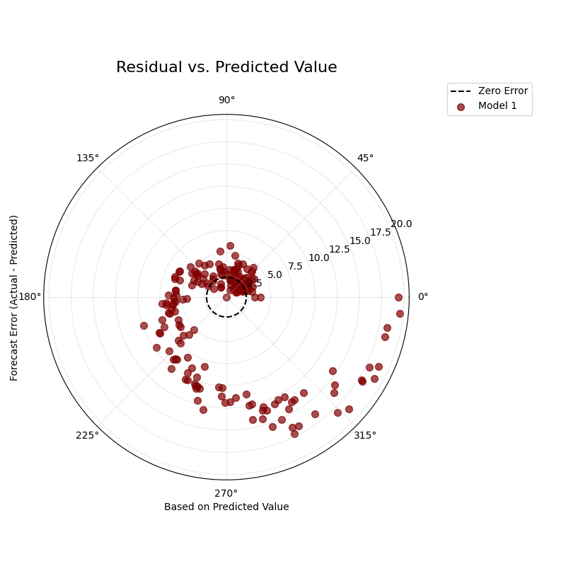
Visualizes the relationship between the forecast error (residual)
and the predicted value. This is a polar version of a classic
residual plot, designed to diagnose conditional biases and
heteroscedasticity related to the model’s own output.
1importkdiagramaskd 2importpandasaspd 3importnumpyasnp 4importmatplotlib.pyplotasplt 5 6# --- Data Generation with Heteroscedastic Errors --- 7np.random.seed(0) 8n_samples=200 9# Predictions follow a non-linear trend10y_pred=np.linspace(0,50,n_samples)+np.random.normal(0,2,n_samples)11# Error variance increases as the prediction gets larger12error_variance=(y_pred/y_pred.max())**2*1013errors=np.random.normal(0,np.sqrt(error_variance),n_samples)14y_true=y_pred+errors1516# --- Plotting ---17kd.plot_residual_relationship(18y_true,19y_pred,20names=["My Model"],21title="Residual vs. Predicted Value",22s=40,23alpha=0.6,24savefig="gallery/images/gallery_residual_relationship.png"25)26plt.close()