Feature-Based Visualization Gallery
This gallery page showcases plots from k-diagram focused on understanding feature influence and importance. Currently, it features the Feature Importance Fingerprint plot.
Note
You need to run the code snippets locally to generate the plot
images referenced below (e.g., images/gallery_feature_fingerprint.png).
Ensure the image paths in the .. image:: directives match where
you save the plots (likely an images subdirectory relative to
this file).
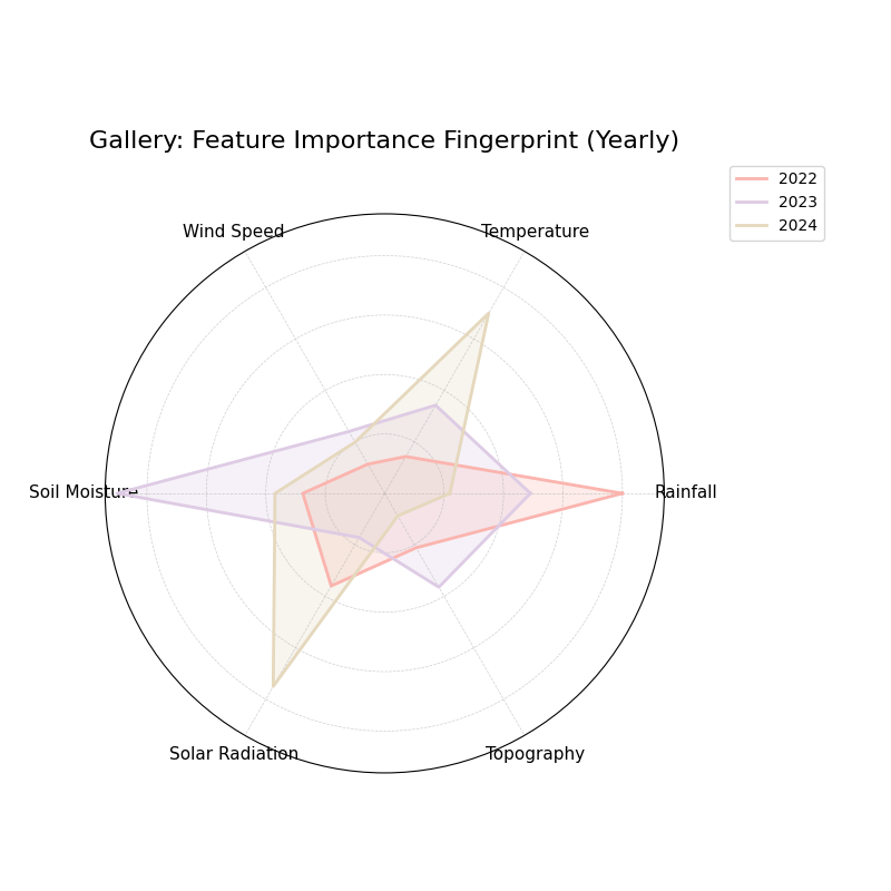
Feature Importance Fingerprint
Uses plot_feature_fingerprint().
This radar chart compares the importance profiles (“fingerprints”) of
several features across different groups or layers (e.g., different
years or models). This example shows raw (unnormalized) importance
values comparing feature influence across three years.
 1# Assuming plot function is in kd.plot.feature_based
 2import kdiagram.plot.feature_based as kdf
 3import numpy as np
 4import matplotlib.pyplot as plt
 5
 6# --- Data Generation ---
 7features = ['Rainfall', 'Temperature', 'Wind Speed',
 8            'Soil Moisture', 'Solar Radiation', 'Topography']
 9n_features = len(features)
10years = ['2022', '2023', '2024']
11n_layers = len(years)
12
13# Generate importance scores (rows=years, cols=features)
14# Make them slightly different per year
15np.random.seed(123)
16importances = np.random.rand(n_layers, n_features) * 0.5
17importances[0, 0] = 0.8 # Rainfall important in 2022
18importances[1, 3] = 0.9 # Soil Moisture important in 2023
19importances[2, 1] = 0.7 # Temperature important in 2024
20importances[2, 4] = 0.75# Solar Radiation also important in 2024
21
22# --- Plotting ---
23kdf.plot_feature_fingerprint(
24    importances=importances,
25    features=features,
26    labels=years,
27    normalize=False, # Show raw importance scores
28    fill=True,
29    cmap='Pastel1',
30    title="Gallery: Feature Importance Fingerprint (Yearly)",
31    # Save the plot relative to this file's location
32    savefig="images/gallery_feature_fingerprint.png"
33)
34plt.close()
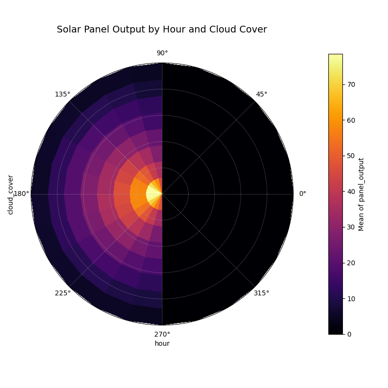
Polar Feature Interaction
Visualizes the interaction between two features by plotting a target variable’s aggregated value on a polar heatmap. This plot is designed to reveal complex, non-linear relationships that are not apparent from 1D feature-importance plots.
 1import kdiagram as kd
 2import pandas as pd
 3import numpy as np
 4import matplotlib.pyplot as plt
 5
 6# --- Data Generation ---
 7
 8np.random.seed(0)
 9n_points = 5000
10
11# Feature 1 (Angle): Hour of day
12hour_of_day = np.random.uniform(0, 24, n_points)
13
14# Feature 2 (Radius): Cloud cover
15cloud_cover = np.random.rand(n_points)
16
17# Target (Color): Solar panel output, which depends on the
18# interaction between daylight and cloud cover.
19daylight_factor = np.sin(hour_of_day * np.pi / 24) ** 2
20cloud_factor = (1 - cloud_cover ** 0.5)
21panel_output = 100 * daylight_factor * cloud_factor + np.random.rand(n_points) * 5
22panel_output[(hour_of_day < 6) | (hour_of_day > 18)] = 0
23
24df_solar = pd.DataFrame({
25    'hour': hour_of_day,
26    'cloud_cover': cloud_cover,
27    'panel_output': panel_output,
28})
29
30# --- Plotting ---
31
32kd.plot_feature_interaction(
33    df=df_solar,
34    theta_col='hour',
35    r_col='cloud_cover',
36    color_col='panel_output',
37    theta_period=24,
38    theta_bins=24,  # One bin per hour
39    r_bins=8,
40    cmap='inferno',
41    title='Solar Panel Output by Hour and Cloud Cover',
42    savefig='gallery/images/plot_feature_based_interaction.png',
43)
44plt.close()