Quick Start Guide
This guide provides a minimal, runnable example to get you started with k-diagram. We’ll generate some sample data and create our first diagnostic polar plot: the Anomaly Magnitude plot.
This plot helps identify where actual values fall outside predicted uncertainty intervals and visualizes the magnitude of those errors.
Setup and Example
Import Libraries: We need kdiagram, pandas for data handling, and numpy for data generation.
Generate Sample Data: We create a simple DataFrame with actual values and corresponding prediction interval bounds (e.g., 10th and 90th percentiles). Crucially, we’ll ensure some ‘actual’ values fall outside these bounds to simulate prediction anomalies.
Create the Plot: Call kd.plot_anomaly_magnitude, specifying the columns for actual values and the interval bounds.
Copy and run the following Python code:
 1import kdiagram as kd
 2import pandas as pd
 3import numpy as np
 4import matplotlib.pyplot as plt # Often needed alongside plotting libs
 5
 6# 1. Generate Sample Data
 7np.random.seed(42) # for reproducible results
 8n_points = 180
 9data = pd.DataFrame({'sample_id': range(n_points)})
10
11# Create base actual values and interval bounds
12data['actual'] = np.random.normal(loc=20, scale=5, size=n_points)
13data['q10'] = data['actual'] - np.random.uniform(2, 6, size=n_points)
14data['q90'] = data['actual'] + np.random.uniform(2, 6, size=n_points)
15
16# Introduce some anomalies (points outside the interval)
17# Make ~10% under-predictions
18under_indices = np.random.choice(n_points, size=n_points // 10, replace=False)
19data.loc[under_indices, 'actual'] = data.loc[under_indices, 'q10'] - \
20                                    np.random.uniform(1, 5, size=len(under_indices))
21
22# Make ~10% over-predictions (avoiding indices already used)
23available_indices = list(set(range(n_points)) - set(under_indices))
24over_indices = np.random.choice(available_indices, size=n_points // 10, replace=False)
25data.loc[over_indices, 'actual'] = data.loc[over_indices, 'q90'] + \
26                                   np.random.uniform(1, 5, size=len(over_indices))
27
28print("Sample Data Head:")
29print(data.head())
30print(f"\nTotal points: {len(data)}")
31
32# 2. Create the Anomaly Magnitude Plot
33print("\nGenerating Anomaly Magnitude plot...")
34ax = kd.plot_anomaly_magnitude(
35    df=data,
36    actual_col='actual',
37    q_cols=['q10', 'q90'], # Provide lower and upper bounds as a list
38    title="Quick Start: Anomaly Magnitude Example",
39    cbar=True,            # Show color bar indicating magnitude
40    verbose=1             # Print summary of anomalies found
41)
42
43# The plot is displayed automatically by default
44# Alternatively, save it using savefig:
45# kd.plot_anomaly_magnitude(..., savefig="quickstart_anomaly.png")
46
47# Optional: Explicitly show plot if needed in some environments
48# plt.show()
Expected Output
Running the code above will first print the head of the generated DataFrame and a summary of detected anomalies. It will then display a polar plot similar to this:
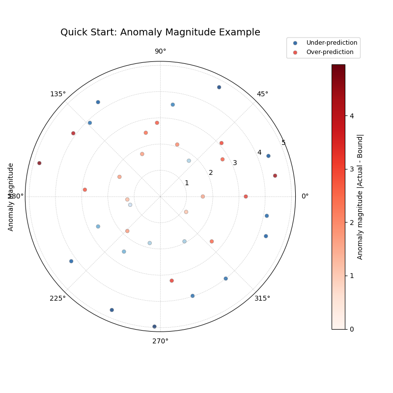
Interpreting the Plot:
Angles: Each point around the circle represents a sample from the DataFrame (ordered by index in this case).
Radius: The distance from the center indicates the magnitude of the anomaly (how far the actual value was from the interval bound). Points perfectly within the interval are not shown.
Color: Points are colored based on the type of anomaly:
Blue tones (default) indicate under-predictions (actual < q10).
Red tones (default) indicate over-predictions (actual > q90).
The color intensity corresponds to the anomaly magnitude shown on the color bar.
Next Steps
Congratulations! You’ve created your first k-diagram plot.
Explore more plot types and their capabilities in the Plot Gallery
Learn about the concepts behind the visualizations in the User Guide
Refer to the API Reference documentation for detailed function signatures and parameters.