Relationship Visualization
This gallery page showcases the plot_relationship function, which
provides a unique polar perspective on the relationship between true
observed values and model predictions.
Note
You need to run the code snippets locally to generate the plot
images referenced below. Ensure the image paths in the
.. image:: directives match where you save the plots.
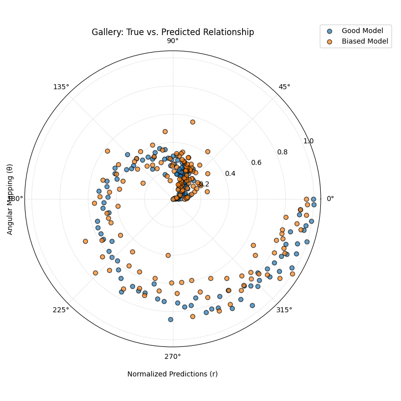
True vs. Predicted Relationship
Uses plot_relationship() to map
true values to the angular axis and normalized predicted values to the
radial axis. This creates a spiral-like plot that
reveals the consistency and correlation of model predictions across the entire
range of true values.
 1import kdiagram.plot.relationship as kdr
 2import pandas as pd
 3import numpy as np
 4import matplotlib.pyplot as plt
 5
 6# --- Data Generation ---
 7np.random.seed(42)
 8n_points = 150
 9# Create a clear, non-linear true signal
10y_true = np.linspace(0, 10, n_points)**1.5 + np.sin(
11    np.linspace(0, 10, n_points)
12) * 2
13
14# Model 1: Good fit with some noise
15y_pred1 = y_true + np.random.normal(0, 1.5, n_points)
16# Model 2: Worse fit, under-predicts high values
17y_pred2 = y_true * 0.8 + np.random.normal(0, 2.5, n_points)
18
19# --- Plotting ---
20kdr.plot_relationship(
21    y_true,
22    y_pred1,
23    y_pred2,
24    names=["Good Model", "Biased Model"],
25    title="Gallery: True vs. Predicted Relationship",
26    theta_scale="proportional",  # Map angle to y_true value
27    acov="default",
28    s=40,
29    # Save the plot (adjust path relative to this file)
30    savefig="gallery/images/gallery_plot_relationship.png",
31)
32plt.close()