This page showcases examples of plots specifically designed for
exploring, diagnosing, and communicating aspects of predictive
uncertainty using k-diagram.
Note
You need to run the code snippets locally to generate the plot
images referenced below (e.g., ../images/gallery_actual_vs_predicted.png).
Ensure the image paths in the ..image:: directives match where
you save the plots (likely an images subdirectory relative to
this file, e.g., ../images/).
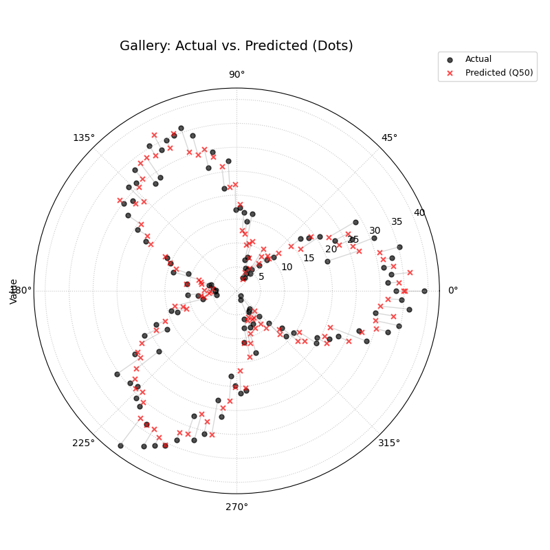
Compares actual observed values against point predictions (e.g.,
Q50) sample-by-sample. Useful for assessing basic accuracy and
bias.
1importkdiagramaskd 2importpandasaspd 3importnumpyasnp 4importmatplotlib.pyplotasplt 5 6# --- Data Generation --- 7np.random.seed(66) 8n_points=120 9df=pd.DataFrame({'sample':range(n_points)})10signal=20+15*np.cos(np.linspace(0,6*np.pi,n_points))11df['actual']=signal+np.random.randn(n_points)*312df['predicted']=signal*0.9+np.random.randn(n_points)*2+21314# --- Plotting ---15kd.plot_actual_vs_predicted(16df=df,17actual_col='actual',18pred_col='predicted',19title='Gallery: Actual vs. Predicted (Dots)',20line=False,# Use dots instead of lines21r_label="Value",22actual_props={'s':25,'alpha':0.7,'color':'black'},# Explicit color23pred_props={'s':35,'marker':'x','alpha':0.7,'color':'red'},# Explicit color & size24# Save the plot (adjust path relative to docs/source/)25savefig="gallery/images/gallery_actual_vs_predicted.png"26)27plt.close()# Close the plot window after saving
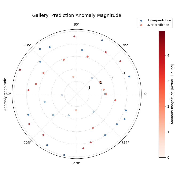
Highlights instances where the actual value falls outside the
prediction interval [Qlow, Qup]. Shows the location (angle), type
(color), and severity (radius) of anomalies.
1importkdiagramaskd 2importpandasaspd 3importnumpyasnp 4importmatplotlib.pyplotasplt 5 6# --- Data Generation --- 7np.random.seed(42) 8n_points=180 9df=pd.DataFrame({'sample_id':range(n_points)})10df['actual']=np.random.normal(loc=20,scale=5,size=n_points)11df['q10']=df['actual']-np.random.uniform(2,6,size=n_points)12df['q90']=df['actual']+np.random.uniform(2,6,size=n_points)13# Add anomalies14under_indices=np.random.choice(n_points,20,replace=False)15df.loc[under_indices,'actual']=df.loc[under_indices,'q10']- \
16np.random.uniform(1,5,size=20)17available=list(set(range(n_points))-set(under_indices))18over_indices=np.random.choice(available,20,replace=False)19df.loc[over_indices,'actual']=df.loc[over_indices,'q90']+ \
20np.random.uniform(1,5,size=20)2122# --- Plotting ---23kd.plot_anomaly_magnitude(24df=df,25actual_col='actual',26q_cols=['q10','q90'],27title="Gallery: Prediction Anomaly Magnitude",28cbar=True,29s=30,30verbose=0,# Keep output clean for gallery31# Save the plot (adjust path relative to docs/source/)32savefig="gallery/images/gallery_anomaly_magnitude.png"33)34plt.close()
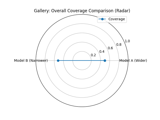
Calculates and displays the overall empirical coverage rate(s)
compared to the nominal rate. Useful for comparing average
interval calibration across models. Shown here with a radar plot
for two simulated models.
1importkdiagramaskd 2importnumpyasnp 3importmatplotlib.pyplotasplt 4 5# --- Data Generation --- 6np.random.seed(42) 7y_true=np.random.rand(100)*10 8# Model 1 (e.g., ~80% coverage) 9y_pred_q1=np.sort(np.random.normal(10loc=y_true[:,np.newaxis],scale=1.5,size=(100,2)),axis=1)11# Model 2 (e.g., ~60% coverage - narrower intervals)12y_pred_q2=np.sort(np.random.normal(13loc=y_true[:,np.newaxis],scale=0.8,size=(100,2)),axis=1)14q_levels=[0.1,0.9]# Nominal 80% interval1516# --- Plotting ---17kd.plot_coverage(18y_true,19y_pred_q1,20y_pred_q2,21names=['Model A (Wider)','Model B (Narrower)'],22q=q_levels,23kind='radar',# Use radar chart for profile comparison24title='Gallery: Overall Coverage Comparison (Radar)',25cov_fill=True,26verbose=0,27# Save the plot (adjust path relative to docs/source/)28savefig="gallery/images/gallery_coverage_radar.png"29)30plt.close()
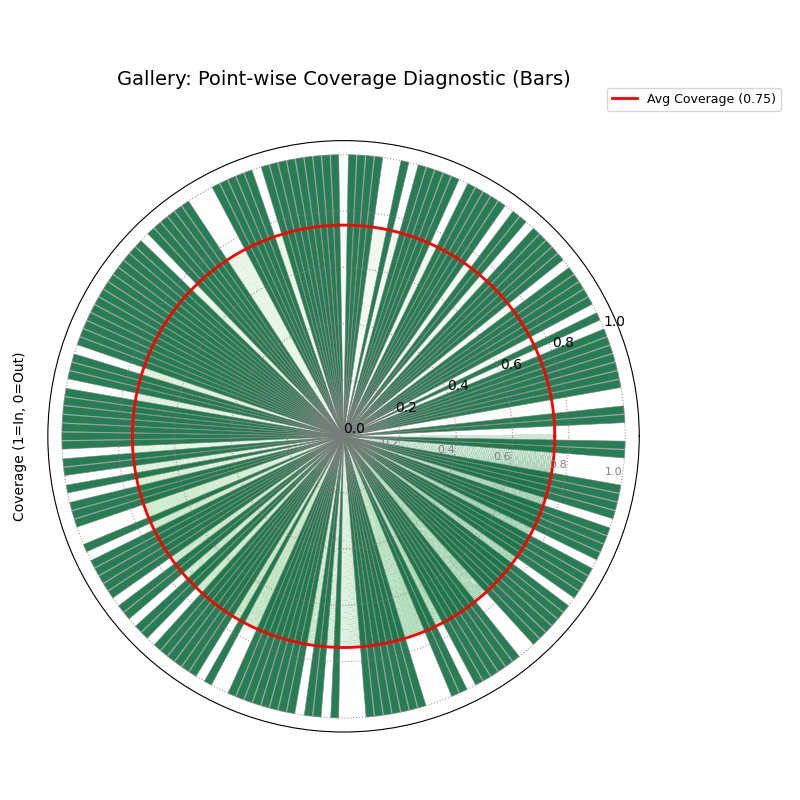
Visualizes coverage success (radius 1) or failure (radius 0) for
each individual data point. Helps diagnose where intervals fail.
The solid line shows the overall average coverage rate. Shown here
using bars.
1importkdiagramaskd 2importpandasaspd 3importnumpyasnp 4importmatplotlib.pyplotasplt 5 6# --- Data Generation --- 7np.random.seed(88) 8n_points=200 9df=pd.DataFrame({'point_id':range(n_points)})10df['actual_val']=np.random.normal(loc=5,scale=1.5,size=n_points)11df['q_lower']=5-np.random.uniform(1,3,n_points)12df['q_upper']=5+np.random.uniform(1,3,n_points)13# Some points deliberately outside14df.loc[::15,'actual_val']=df.loc[::15,'q_upper']+11516# --- Plotting ---17kd.plot_coverage_diagnostic(18df=df,19actual_col='actual_val',20q_cols=['q_lower','q_upper'],21title='Gallery: Point-wise Coverage Diagnostic (Bars)',22as_bars=True,# Display as bars instead of scatter23fill_gradient=True,# Show background gradient24coverage_line_color='darkorange',# Example customization25verbose=0,26# Save the plot (adjust path relative to docs/source/)27savefig="gallery/images/gallery_coverage_diagnostic_bars.png"28)29plt.close()
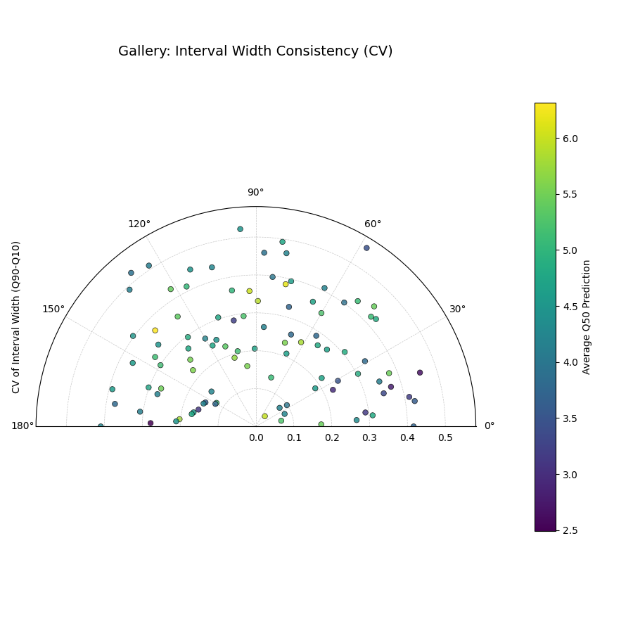
Analyzes the stability of the prediction interval width (Qup - Qlow)
for each location over multiple time steps. Radius shows
variability (CV or Std Dev); color often shows average Q50. High
radius means inconsistent width.
1importkdiagramaskd 2importpandasaspd 3importnumpyasnp 4importmatplotlib.pyplotasplt 5 6# --- Data Generation --- 7np.random.seed(42) 8n_points=100 9n_years=410years=list(range(2021,2021+n_years))11df=pd.DataFrame({'id':range(n_points)})12qlow_cols,qup_cols,q50_cols=[],[],[]13fori,yearinenumerate(years):14ql,qu,q50=f'val_{year}_q10',f'val_{year}_q90',f'val_{year}_q50'15qlow_cols.append(ql);qup_cols.append(qu);q50_cols.append(q50)16base_low=np.random.rand(n_points)*5+i*0.217width=np.random.rand(n_points)*3+1+np.sin(18np.linspace(0,np.pi,n_points))*i# Vary width19df[ql]=base_low;df[qu]=base_low+width20df[q50]=base_low+width/2+np.random.randn(n_points)*0.52122# --- Plotting ---23kd.plot_interval_consistency(24df=df,25qlow_cols=qlow_cols,26qup_cols=qup_cols,27q50_cols=q50_cols,# Color by average Q5028use_cv=True,# Radius = Coefficient of Variation of width29title='Gallery: Interval Width Consistency (CV)',30acov='half_circle',31cmap='viridis',32# Save the plot (adjust path relative to docs/source/)33savefig="gallery/images/gallery_interval_consistency_cv.png"34)35plt.close()
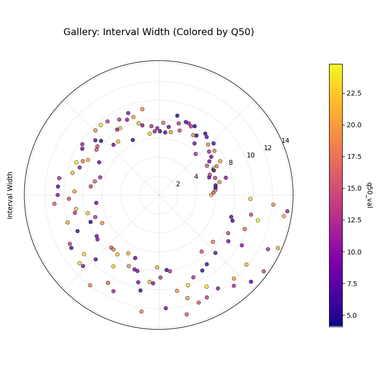
Visualizes the magnitude of the prediction interval width (Qup - Qlow)
for each sample at a single time point. Radius directly represents
the width. Color can represent width or an optional third variable
(z_col), here showing the Q50 prediction.
1importkdiagramaskd 2importpandasaspd 3importnumpyasnp 4importmatplotlib.pyplotasplt 5 6# --- Data Generation --- 7np.random.seed(77) 8n_points=150 9df=pd.DataFrame({'location':range(n_points)})10df['elevation']=np.linspace(100,500,n_points)# Example feature11df['q10_val']=np.random.rand(n_points)*2012# Width depends on elevation in this synthetic example13width=5+(df['elevation']/100)*np.random.uniform(0.5,2,n_points)14df['q90_val']=df['q10_val']+width15df['q50_val']=df['q10_val']+width/2# Use as z_col1617# --- Plotting ---18kd.plot_interval_width(19df=df,20q_cols=['q10_val','q90_val'],21z_col='q50_val',# Color points by Q50 value22title='Gallery: Interval Width (Colored by Q50)',23cmap='plasma',24cbar=True,25s=30,26# Save the plot (adjust path relative to docs/source/)27savefig="gallery/images/gallery_interval_width_z.png"28)29plt.close()
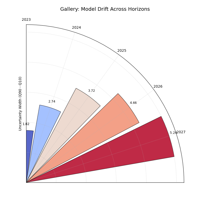
Shows how average uncertainty (mean interval width) evolves
across different forecast horizons using a polar bar chart. Helps
diagnose model degradation over lead time.
1importkdiagramaskd 2importpandasaspd 3importnumpyasnp 4importmatplotlib.pyplotasplt 5 6# --- Data Generation --- 7np.random.seed(0) 8years=[2023,2024,2025,2026,2027] 9n_samples=5010df=pd.DataFrame()11q10_cols,q90_cols=[],[]12fori,yearinenumerate(years):13ql,qu=f'val_{year}_q10',f'val_{year}_q90'14q10_cols.append(ql);q90_cols.append(qu)15q10=np.random.rand(n_samples)*5+i*0.5# Width tends to increase16q90=q10+np.random.rand(n_samples)*2+1+i*0.817df[ql]=q10;df[qu]=q901819# --- Plotting ---20kd.plot_model_drift(21df=df,22q10_cols=q10_cols,23q90_cols=q90_cols,24horizons=years,# Label bars with years25acov='quarter_circle',# Use 90 degree span26title='Gallery: Model Drift Across Horizons',27# Save the plot (adjust path relative to docs/source/)28savefig="gallery/images/gallery_model_drift.png"29)30plt.close()
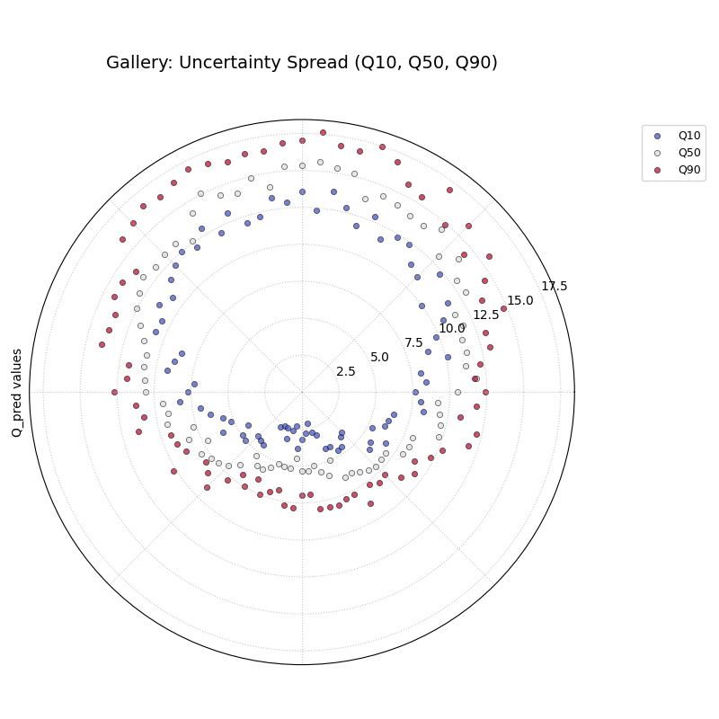
A general polar scatter plot for visualizing multiple data series.
Often used to show different quantiles (e.g., Q10, Q50, Q90) for a
single time step to illustrate the uncertainty spread across
samples.
1importkdiagramaskd 2importpandasaspd 3importnumpyasnp 4importmatplotlib.pyplotasplt 5 6# --- Data Generation --- 7np.random.seed(99) 8n_points=80 9df=pd.DataFrame({'id':range(n_points)})10base=10+5*np.sin(np.linspace(0,2*np.pi,n_points))11df['val_q10']=base-np.random.rand(n_points)*2-112df['val_q50']=base+np.random.randn(n_points)*0.513df['val_q90']=base+np.random.rand(n_points)*2+114# Ensure order for clarity in plot15df['val_q50']=np.maximum(df['val_q10']+0.1,df['val_q50'])16df['val_q90']=np.maximum(df['val_q50']+0.1,df['val_q90'])171819# --- Plotting ---20kd.plot_temporal_uncertainty(21df=df,22q_cols=['val_q10','val_q50','val_q90'],23names=['Q10','Q50','Q90'],24title='Gallery: Uncertainty Spread (Q10, Q50, Q90)',25normalize=False,# Show raw values26cmap='coolwarm',# Use diverging map for bounds27s=20,28mask_angle=True,29# Save the plot (adjust path relative to docs/source/)30savefig="gallery/images/gallery_temporal_uncertainty_quantiles.png"31)32plt.close()
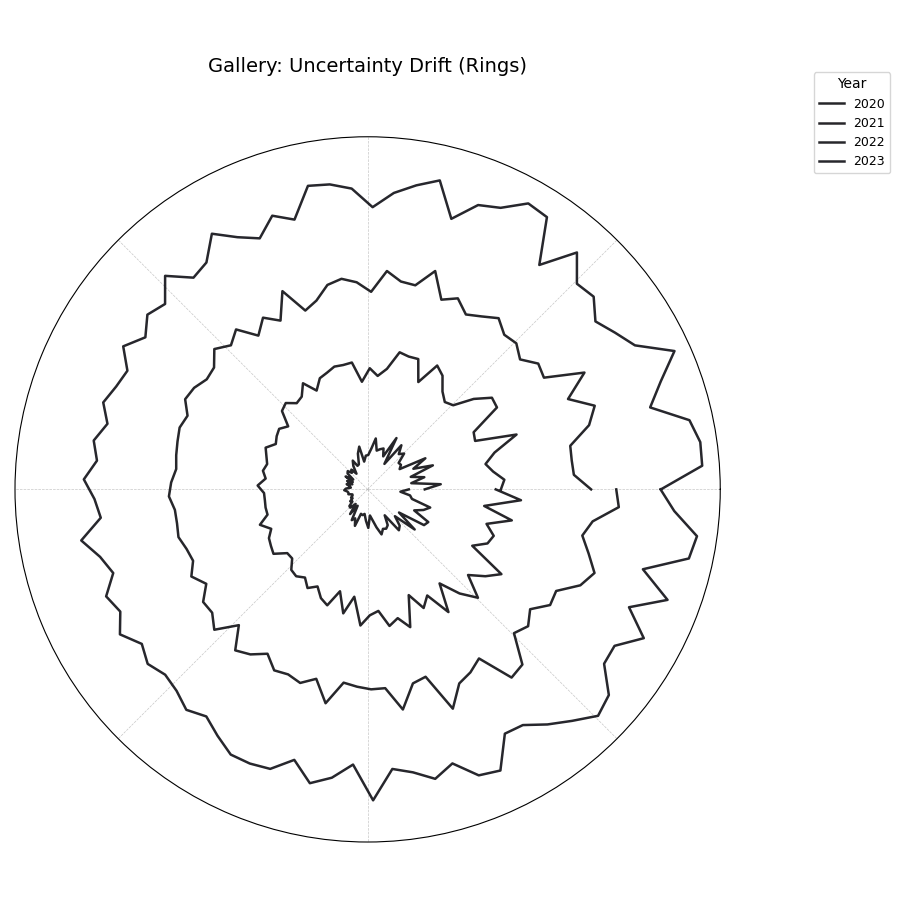
Visualizes how the interval width pattern evolves across multiple time
steps using concentric rings. Each ring represents a time step,
showing the relative uncertainty width at each angle (location).
1importkdiagramaskd 2importpandasaspd 3importnumpyasnp 4importmatplotlib.pyplotasplt 5 6# --- Data Generation --- 7np.random.seed(55) 8n_points=90;n_years=4;years=range(2020,2020+n_years) 9df=pd.DataFrame({'id':range(n_points)})10qlow_cols,qup_cols=[],[]11fori,yearinenumerate(years):12ql,qu=f'value_{year}_q10',f'value_{year}_q90'13qlow_cols.append(ql);qup_cols.append(qu)14base_low=np.random.rand(n_points)*3+i*0.115width=(np.random.rand(n_points)+0.5)*(1.5+i*0.3+np.cos(16np.linspace(0,2*np.pi,n_points)))17df[ql]=base_low;df[qu]=base_low+width18df[qu]=np.maximum(df[qu],df[ql])# Ensure non-negative width1920# --- Plotting ---21kd.plot_uncertainty_drift(22df=df,23qlow_cols=qlow_cols,24qup_cols=qup_cols,25dt_labels=[str(y)foryinyears],26title='Gallery: Uncertainty Drift (Rings)',27cmap='magma',28base_radius=0.1,band_height=0.1,29# Save the plot (adjust path relative to docs/source/)30savefig="gallery/images/gallery_uncertainty_drift_rings.png"31)32plt.close()
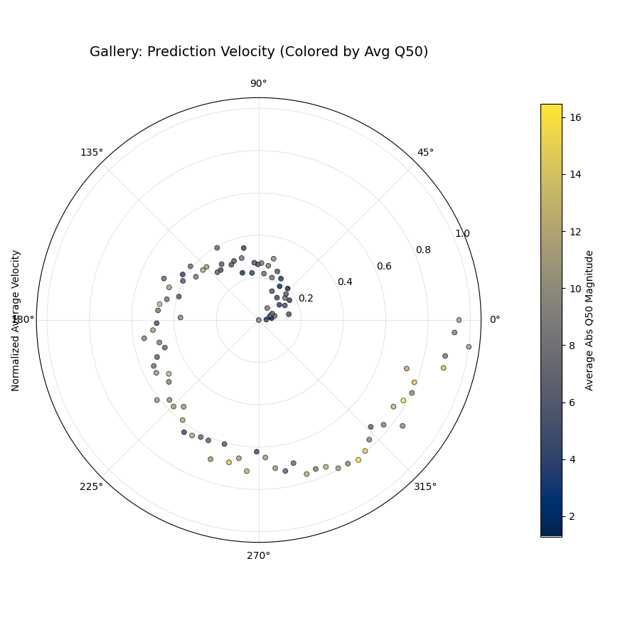
Visualizes the average rate of change (velocity) of the median (Q50)
prediction over consecutive time periods for each location. Radius
indicates velocity magnitude; color can indicate velocity or average
Q50.
1importkdiagramaskd 2importpandasaspd 3importnumpyasnp 4importmatplotlib.pyplotasplt 5 6# --- Data Generation --- 7np.random.seed(123) 8n_points=100;years=range(2020,2024) 9df=pd.DataFrame({'location_id':range(n_points)})10q50_cols=[]11base_val=np.random.rand(n_points)*1012trend=np.linspace(0,5,n_points)13fori,yearinenumerate(years):14q50_col=f'val_{year}_q50'15q50_cols.append(q50_col)16noise=np.random.randn(n_points)*0.517df[q50_col]=base_val+trend*i+noise1819# --- Plotting ---20kd.plot_velocity(21df=df,22q50_cols=q50_cols,23title='Gallery: Prediction Velocity (Colored by Avg Q50)',24use_abs_color=True,# Color by magnitude of Q5025normalize=True,# Normalize radius (velocity)26cmap='cividis',27cbar=True,28s=25,29# Save the plot (adjust path relative to docs/source/)30savefig="gallery/images/gallery_velocity_abs_color.png"31)32plt.close()
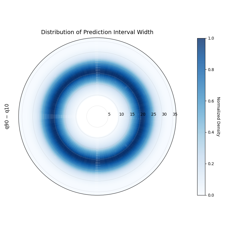
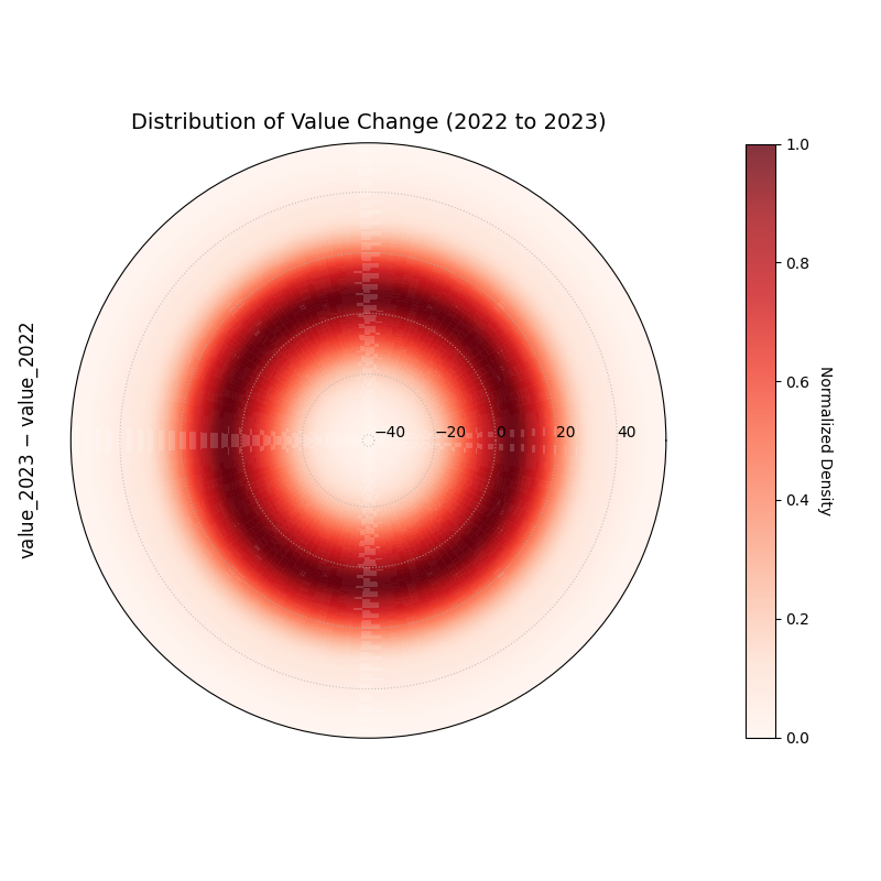
Visualizes the 1D probability distribution of a metric using
Kernel Density Estimation (KDE). This plot is a unique way to
inspect the shape, peaks, and spread of a distribution, such as
prediction interval widths or forecast errors.
The key features are:
Radius (`r`): Represents the value of the metric.
Color: Represents the probability density at that radius.
Brighter/more intense colors indicate more common values.
This example visualizes the distribution of change between two
time points (e.g., year-over-year velocity).
1# Assumes df_test is already created from the previous block 2 3kd.plot_radial_density_ring( 4df=df_test, 5kind="velocity", 6target_cols=["value_2022","value_2023"], 7title="Distribution of Value Change (2022 to 2023)", 8cmap="Reds", 9show_yticklabels=True,10r_label="value_2023 − value_2022",11savefig="gallery/images/gallery_plot_density_ring_distr_value.png"12)13plt.close()
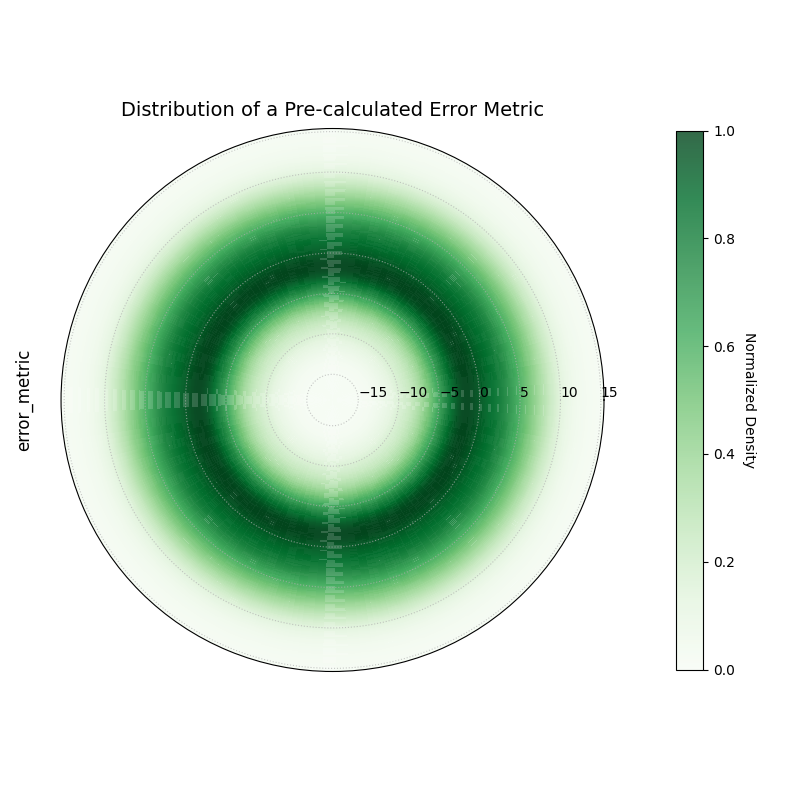
This is the most general use case, visualizing the distribution
of any pre-calculated, single-column metric.
1# Assumes df_test is already created from the first block 2 3kd.plot_radial_density_ring( 4df=df_test, 5kind="direct", 6target_cols="error_metric", 7title="Distribution of a Pre-calculated Error Metric", 8cmap="Greens", 9show_yticklabels=True,10r_label="error_metric",11savefig="gallery/images/gallery_plot_density_ring_error_metric.png"12)13plt.close()
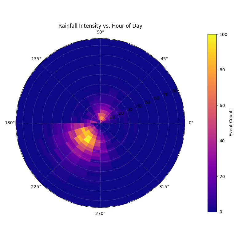
Visualizes the 2D density of data points on a polar grid, showing
the concentration of a radial variable against a cyclical or ordered
angular variable.
1importkdiagram.plot.uncertaintyaskdu 2importpandasaspd 3importnumpyasnp 4importmatplotlib.pyplotasplt 5 6# --- Data Generation --- 7 8np.random.seed(42) 9n_points=50001011# Simulate hour of day with more events in the afternoon1213hour=np.concatenate([14np.random.normal(15,2,int(n_points*0.7)),15np.random.normal(5,2,int(n_points*0.3))16])%241718# Simulate rainfall, correlated with afternoon hours1920rainfall=np.random.gamma(2,5,n_points)+21(hour>12)*np.random.gamma(3,5,n_points)2223df_weather=pd.DataFrame({'hour':hour,'rainfall_mm':rainfall})2425# --- Plotting ---2627kdu.plot_polar_heatmap(28df=df_weather,29r_col='rainfall_mm',30theta_col='hour',31theta_period=24,32r_bins=25,33theta_bins=24,34cmap='plasma',35title='Rainfall Intensity vs. Hour of Day',36cbar_label='Event Count',37savefig="gallery/images/gallery_plot_polar_heatmap.png"38)39plt.close()