Error Visualizations
Diagnosing and understanding forecast errors is a critical step in model evaluation. This gallery showcases specialized polar plots from the k-diagram package designed to visualize different aspects of model errors, from systemic biases to multi-dimensional uncertainty.
Note
You need to run the code snippets locally to generate the plot
images referenced below. Ensure the image paths in the
.. image:: directives match where you save the plots (e.g.,
images/gallery_plot_error_bands.png).
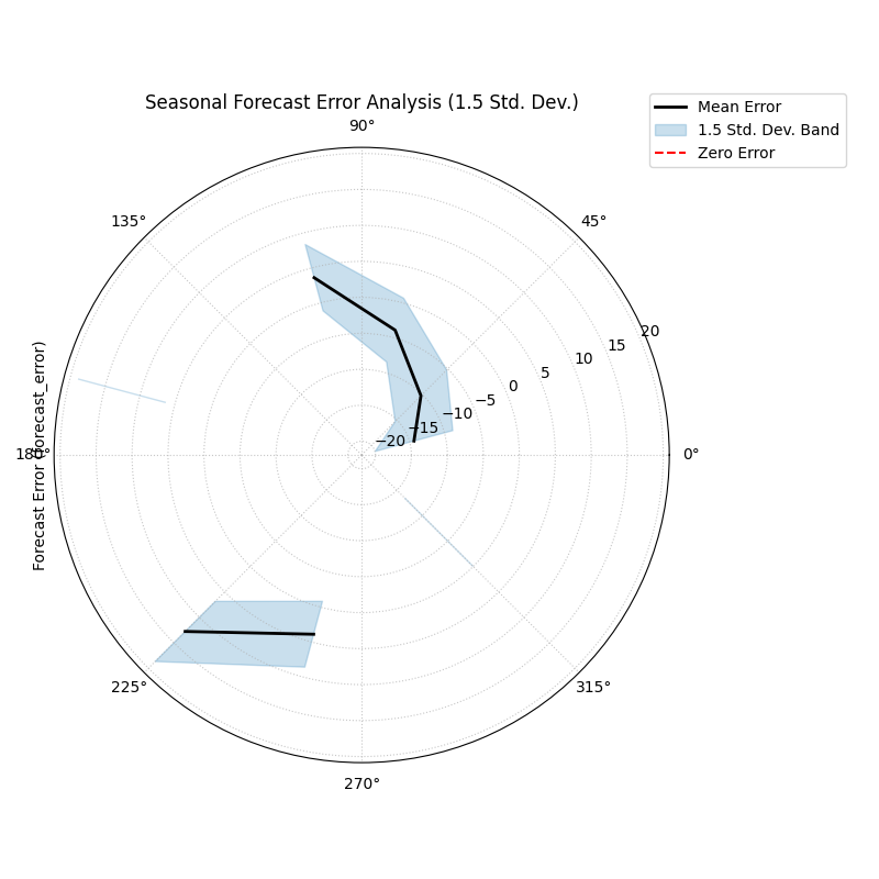
Polar Error Bands
Aggregates forecast errors across bins of a cyclical or ordered feature (like month or hour) to visualize mean error (bias) and error variance (consistency).
 1import kdiagram.plot.errors as kde
 2import pandas as pd
 3import numpy as np
 4import matplotlib.pyplot as plt
 5
 6# --- Data Generation ---
 7
 8np.random.seed(42)
 9n_points = 2000
10day_of_year = np.arange(n_points) % 365
11month = (day_of_year // 30) + 1
12
13# Create a seasonal error signal
14
15seasonal_bias = np.sin((day_of_year - 90) * np.pi / 180) * 5
16seasonal_noise = 2 + 2 * np.cos(day_of_year * np.pi / 180)**2
17errors = seasonal_bias + np.random.normal(0, seasonal_noise, n_points)
18
19df_seasonal_errors = pd.DataFrame({
20'month': month,
21'forecast_error': errors
22})
23
24# --- Plotting ---
25
26kde.plot_error_bands(
27    df=df_seasonal_errors,
28    error_col='forecast_error',
29    theta_col='month',
30    theta_period=12,
31    theta_bins=12,
32    n_std=1.5,
33    title='Seasonal Forecast Error Analysis (1.5 Std. Dev.)',
34    color='#2980B9',
35    alpha=0.25,
36    savefig="gallery/images/gallery_plot_error_bands.png"
37)
38plt.close()
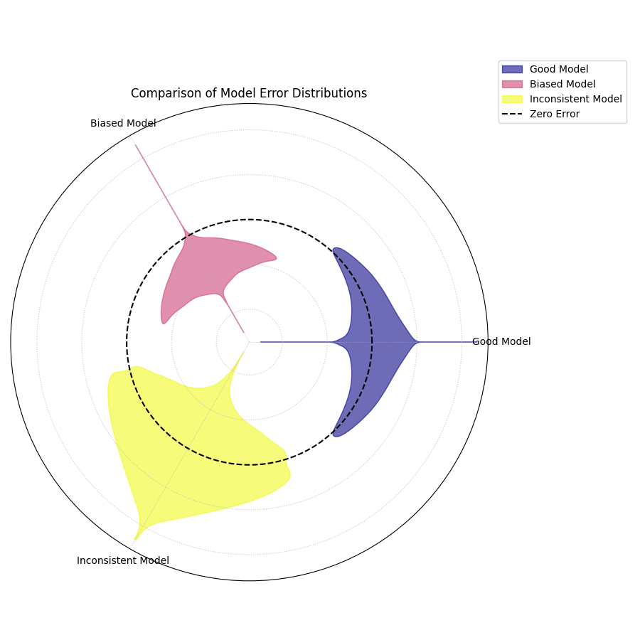
Polar Error Violins
Compares the full error distributions of multiple models on a single polar plot, revealing differences in bias, variance, and shape.
 1import kdiagram.plot.errors as kde
 2import pandas as pd
 3import numpy as np
 4import matplotlib.pyplot as plt
 5
 6# --- Data Generation ---
 7
 8np.random.seed(0)
 9n_points = 1000
10df_model_errors = pd.DataFrame({
11'Error (Model A)': np.random.normal(loc=0.5, scale=1.5, size=n_points),
12'Error (Model B)': np.random.normal(loc=-4.0, scale=1.5, size=n_points),
13'Error (Model C)': np.random.normal(loc=0, scale=4.0, size=n_points),
14})
15
16# --- Plotting ---
17
18kde.plot_error_violins(
19    df_model_errors,
20    'Error (Model A)',
21    'Error (Model B)',
22    'Error (Model C)',
23    names=['Good Model', 'Biased Model', 'Inconsistent Model'],
24    title='Comparison of Model Error Distributions',
25    cmap='plasma',
26    savefig="gallery/images/gallery_plot_error_violins.png"
27)
28plt.close()
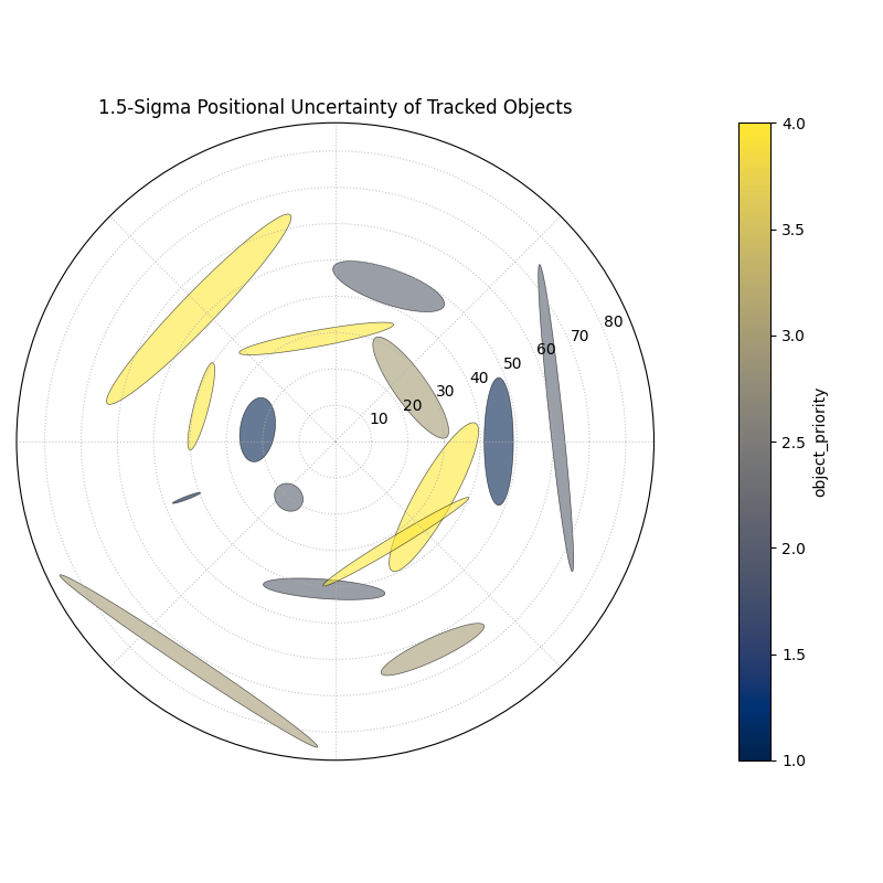
Polar Error Ellipses
Visualizes two-dimensional uncertainty by drawing an ellipse for each data point, where the ellipse’s shape and orientation represent the error (standard deviation) in both the radial and angular directions.
 1import kdiagram.plot.errors as kde
 2import pandas as pd
 3import numpy as np
 4import matplotlib.pyplot as plt
 5
 6# --- Data Generation ---
 7
 8np.random.seed(1)
 9n_points = 15
10df_tracking = pd.DataFrame({
11'angle_deg': np.linspace(0, 360, n_points, endpoint=False),
12'distance_km': np.random.uniform(20, 80, n_points),
13'distance_std': np.random.uniform(2, 7, n_points),
14'angle_std_deg': np.random.uniform(3, 10, n_points),
15'object_priority': np.random.randint(1, 5, n_points)
16})
17
18# --- Plotting ---
19
20kde.plot_error_ellipses(
21    df=df_tracking,
22    r_col='distance_km',
23    theta_col='angle_deg',
24    r_std_col='distance_std',
25    theta_std_col='angle_std_deg',
26    color_col='object_priority',
27    n_std=1.5,
28    title='1.5-Sigma Positional Uncertainty of Tracked Objects',
29    cmap='cividis',
30    alpha=0.6,
31    edgecolor='black',
32    linewidth=0.5,
33    savefig="gallery/images/gallery_plot_error_ellipses.png"
34)
35plt.close()