Datasets
The kdiagram.datasets module provides convenient functions
to access sample datasets included with the package (like the
Zhongshan subsidence data) and to generate various synthetic datasets
on the fly.
These datasets are invaluable for:
Running examples provided in the documentation and gallery.
Testing k-diagram’s plotting functions with predictable data structures.
Exploring different scenarios of uncertainty, drift, or model comparison.
Most functions allow you to retrieve data either as a standard
pandas.DataFrame or as a Bunch object
(using the as_frame parameter). The Bunch object conveniently packages
the DataFrame along with metadata like feature/target names, relevant
column lists, and a description of the dataset’s origin or generation
parameters.
Function Summary
Function |
Description |
|---|---|
|
Generates synthetic multi-period quantile data with trends, noise, and anomalies. Ideal for drift/consistency plots. |
|
Loads the included Zhongshan subsidence prediction sample dataset. |
|
Generates a reference series and multiple prediction series with controlled correlation/standard deviation for Taylor Diagrams. |
|
Generates quantile predictions from multiple simulated models for a single time period. Useful for model comparison plots. |
|
Generates data with true and predicted series exhibiting cyclical/seasonal patterns. |
|
Generates a synthetic feature importance matrix for feature fingerprint (radar) plots. |
Usage Examples
Below are examples demonstrating how to use each function.
Loading Synthetic Uncertainty Data
Generates multi-period quantile data, returned as a Bunch object by default.
 1from kdiagram.datasets import load_uncertainty_data
 2
 3# Generate as Bunch (default)
 4data_bunch = load_uncertainty_data(
 5    n_samples=10, n_periods=2, seed=1, prefix="flow"
 6    )
 7
 8print("--- Bunch Object ---")
 9print(f"Keys: {list(data_bunch.keys())}")
10print(f"Description:\n{data_bunch.DESCR[:200]}...") # Print start of DESCR
11print("\nDataFrame Head:")
12print(data_bunch.frame.head(3))
13print("\nQ10 Columns:")
14print(data_bunch.q10_cols)
--- Bunch Object ---
Keys: ['frame', 'feature_names', 'target_names', 'target', 'quantile_cols', 'q10_cols', 'q50_cols', 'q90_cols', 'n_periods', 'prefix', 'start_year', 'DESCR']
Description:
Synthetic Multi-Period Uncertainty Dataset for k-diagram

**Description:**
Generates synthetic data simulating quantile forecasts (Q10,
Q50, Q90) for 'flow' over 2 periods starting
from 2022 across 10 samples/lo...

DataFrame Head:
   location_id  longitude   latitude   elevation  flow_actual  ...
0            0 -116.8388    35.094262  366.807627    16.816179  ...
1            1 -117.8696    34.045590  247.216119     9.508103  ...
2            2 -119.749534  35.488999  353.628218     5.439137  ...

Q10 Columns:
['flow_2022_q0.1', 'flow_2023_q0.1']
Loading Zhongshan Subsidence Data
Loads the packaged sample dataset. This example loads it as a DataFrame and selects only data for specific years and quantiles.
 1from kdiagram.datasets import load_zhongshan_subsidence
 2import warnings
 3
 4# Suppress potential download warnings if data exists locally
 5warnings.filterwarnings("ignore", message=".*already exists.*")
 6
 7# Load as DataFrame, subsetting years and quantiles
 8try:
 9    df_zhongshan_subset = load_zhongshan_subsidence(
10        as_frame=True,
11        years=[2023, 2025],
12        quantiles=[0.1, 0.9],
13        include_target=False, # Exclude 'subsidence_YYYY' cols
14        download_if_missing=True # Allow download if not packaged/cached
15    )
16    print("Loaded Zhongshan Subset DataFrame:")
17    print(df_zhongshan_subset.head(3))
18    print("\nColumns:")
19    print(df_zhongshan_subset.columns)
20
21except FileNotFoundError as e:
22    print(f"Error loading Zhongshan data: {e}")
23    print("Ensure the package data was installed correctly or "
24          "download is enabled/possible.")
25except Exception as e:
26     print(f"An unexpected error occurred: {e}")
Loaded Zhongshan Subset DataFrame:
     longitude   latitude  subsidence_2023_q0.1  subsidence_2023_q0.9  subsidence_2025_q0.1  subsidence_2025_q0.9
0   113.237984  22.494591              ...              ...              ...              ...
1   113.220802  22.513592              ...              ...              ...              ...
2   113.225632  22.530231              ...              ...              ...              ...

Columns:
Index(['longitude', 'latitude', 'subsidence_2023_q0.1',
       'subsidence_2023_q0.9', 'subsidence_2025_q0.1',
       'subsidence_2025_q0.9'], dtype='object')
Generating Taylor Diagram Data
Uses make_taylor_data() to generate a
reference series and multiple prediction series suitable for Taylor
diagrams. Returns a Bunch containing arrays and calculated stats.
 1from kdiagram.datasets import make_taylor_data
 2
 3taylor_data = make_taylor_data(n_models=2, n_samples=50, seed=101)
 4
 5print("--- Taylor Data Bunch ---")
 6print(f"Reference shape: {taylor_data.reference.shape}")
 7print(f"Number of prediction series: {len(taylor_data.predictions)}")
 8print(f"Prediction shapes: {[p.shape for p in taylor_data.predictions]}")
 9print("\nCalculated Stats:")
10print(taylor_data.stats)
11print(f"\nActual Reference Std Dev: {taylor_data.ref_std:.4f}")
--- Taylor Data Bunch ---
Reference shape: (50,)
Number of prediction series: 2
Prediction shapes: [(50,), (50,)]

Calculated Stats:
           stddev  corrcoef
Model_A  0.729855  0.835114
Model_B  1.029889  0.508220

Actual Reference Std Dev: 0.9404
Generating Multi-Model Quantile Data
Uses make_multi_model_quantile_data() to
simulate quantile predictions from different models for the same
target variable.
 1from kdiagram.datasets import make_multi_model_quantile_data
 2
 3# Get as DataFrame
 4df_multi_model = make_multi_model_quantile_data(
 5    n_samples=5, n_models=2, seed=5, as_frame=True,
 6    quantiles=[0.1, 0.5, 0.9]
 7)
 8
 9print("--- Multi-Model Quantile DataFrame ---")
10print(df_multi_model)
--- Multi-Model Quantile DataFrame ---
   y_true  feature_1  feature_2  pred_Model_A_q0.1  pred_Model_A_q0.5  pred_Model_A_q0.9  pred_Model_B_q0.1  pred_Model_B_q0.5  pred_Model_B_q0.9
0  50.853502   0.533165   5.108194          43.514661          49.740457          54.158097          36.189075          46.430960          58.077600
1  46.300911   0.639037   1.962088          41.607881          45.545123          51.889254          35.546803          41.932122          51.628643
2  44.874897   0.138801   5.689870          42.241030          44.652911          49.972431          37.209904          42.587300          50.182159
3  52.396877   0.948104   2.990119          45.163347          52.437158          57.719859          45.359873          54.715327          60.382700
4  53.938741   0.776598   5.808982          43.275494          53.397751          61.104506          39.947971          52.309521          63.340564
Generating Cyclical Data
Uses make_cyclical_data() to create time
series with seasonal or cyclical patterns, useful for visualizing
relationships where angle represents phase.
 1from kdiagram.datasets import make_cyclical_data
 2
 3# Get as Bunch
 4cycle_bunch = make_cyclical_data(
 5    n_samples=12, n_series=1, cycle_period=12, seed=5,
 6    amplitude_true=5, offset_true=10
 7)
 8
 9print("--- Cyclical Data Bunch ---")
10print(f"Frame shape: {cycle_bunch.frame.shape}")
11print(f"Series names: {cycle_bunch.series_names}")
12print(cycle_bunch.frame[['time_step', 'y_true', 'model_A']].head())
--- Cyclical Data Bunch ---
Frame shape: (12, 3)
Series names: ['model_A']
   time_step     y_true    model_A
0          0   9.830655   9.801473
1          1  14.369168  14.775036
2          2  14.989960  15.554347
3          3   9.668771  10.262745
4          4   4.783064   5.812793
Generating Fingerprint Data
Uses make_fingerprint_data() to generate
a matrix of feature importances across multiple layers, suitable
for plot_feature_fingerprint().
 1from kdiagram.datasets import make_fingerprint_data
 2
 3# Get as DataFrame
 4fp_df = make_fingerprint_data(
 5    n_layers=3, n_features=5, seed=303, as_frame=True,
 6    sparsity=0.2, add_structure=True
 7)
 8
 9print("--- Fingerprint Data Frame ---")
10print(fp_df)
--- Fingerprint Data Frame ---
           Feature_1  Feature_2  Feature_3  Feature_4  Feature_5
Layer_A     0.941006   0.000000   0.000000   0.000000   0.000000
Layer_B     0.130220   0.870414   0.456472   0.769115   0.322668
Layer_C     0.391512   0.139630   1.022977   0.000000   0.000000
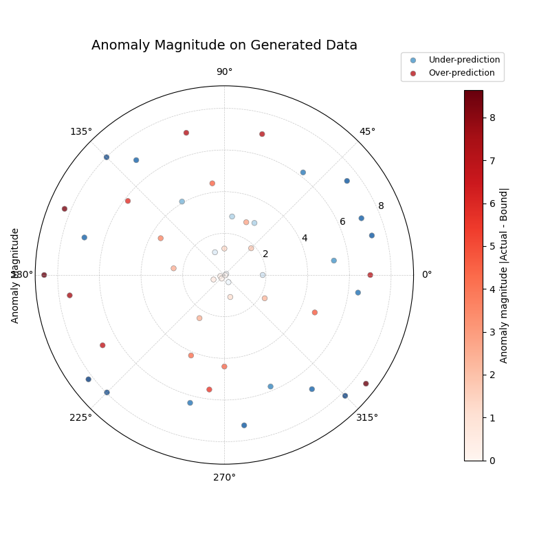
Integrated Plotting Example
This example shows how to generate a dataset using a load_ or
make_ function (requesting the DataFrame directly with
as_frame=True) and immediately pass it to a relevant k-diagram
plotting function. Here, we generate uncertainty data and create an
anomaly magnitude plot.
 1import kdiagram as kd
 2import matplotlib.pyplot as plt
 3
 4# 1. Generate data as DataFrame
 5df = kd.datasets.load_uncertainty_data(
 6    as_frame=True,
 7    n_samples=200,
 8    n_periods=1, # Only need first period for this plot
 9    anomaly_frac=0.2, # Ensure anomalies exist
10    prefix="flow",
11    start_year=2024,
12    seed=99
13)
14
15# 2. Create the plot using the generated DataFrame
16ax = kd.plot_anomaly_magnitude(
17    df=df,
18    actual_col='flow_actual',
19    q_cols=['flow_2024_q0.1', 'flow_2024_q0.9'],
20    title="Anomaly Magnitude on Generated Data",
21    cbar=True,
22    savefig="../images/dataset_plot_example_anomaly.png"
23)
24plt.close() # Close plot after saving
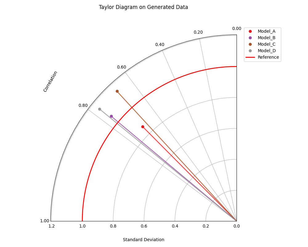
Generating Taylor Data and Plotting
This example generates data suitable for Taylor diagrams using
make_taylor_data() and plots it using
plot_taylor_diagram(). The data is
retrieved as a Bunch object, and relevant attributes are passed to the
plot function.
 1import kdiagram as kd
 2import matplotlib.pyplot as plt
 3
 4# 1. Generate data as Bunch object
 5taylor_data = kd.datasets.make_taylor_data(
 6    n_models=4,
 7    n_samples=150,
 8    seed=101,
 9    corr_range=(0.6, 0.98),
10    std_range=(0.8, 1.2)
11)
12
13# 2. Create the plot using data from the Bunch
14# Assuming plot function is kd.plot_taylor_diagram
15ax = kd.plot_taylor_diagram(
16    *taylor_data.predictions, # Unpack list of prediction arrays
17    reference=taylor_data.reference,
18    names=taylor_data.model_names,
19    title="Taylor Diagram on Generated Data",
20    acov='half_circle',
21    # Save the plot
22    savefig="../images/dataset_plot_example_taylor.png"
23)
24plt.close() # Close plot after saving
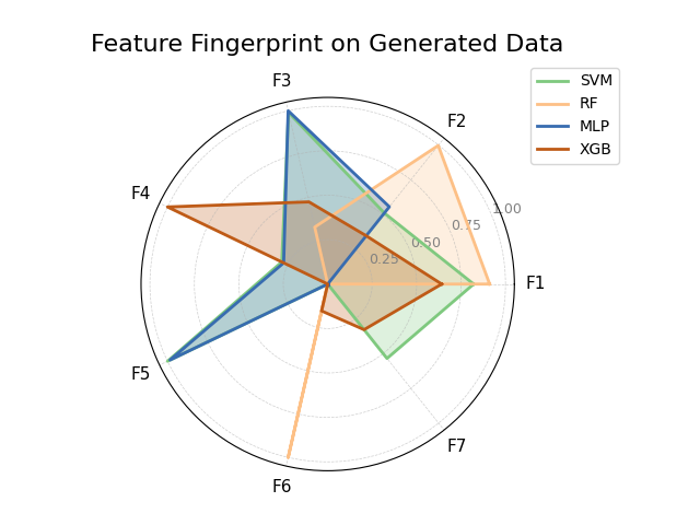
Generating Fingerprint Data and Plotting
This example uses make_fingerprint_data()
to generate a feature importance matrix (returned directly as a
DataFrame using as_frame=True) and visualizes it with
plot_feature_fingerprint().
 1import kdiagram as kd
 2import matplotlib.pyplot as plt
 3
 4# 1. Generate data as DataFrame
 5fp_df = kd.datasets.make_fingerprint_data(
 6    n_layers=4,
 7    n_features=7,
 8    layer_names=['SVM', 'RF', 'MLP', 'XGB'],
 9    feature_names=['F1', 'F2', 'F3', 'F4', 'F5', 'F6', 'F7'],
10    seed=303,
11    as_frame=True, # Get DataFrame directly
12)
13
14# 2. Create the plot using the generated DataFrame
15# plot_feature_fingerprint takes the importance matrix (df/array),
16# features (list/df.columns), and labels (list/df.index)
17ax = kd.plot_feature_fingerprint(
18    importances=fp_df, # Pass DataFrame directly
19    features=fp_df.columns.tolist(), # Get features from columns
20    labels=fp_df.index.tolist(),     # Get labels from index
21    title="Feature Fingerprint on Generated Data",
22    fill=True,
23    cmap='Accent',
24    # Save the plot
25    savefig="../images/dataset_plot_example_fingerprint.png"
26)
27plt.close() # Close plot after saving
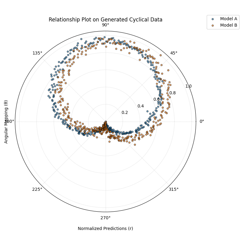
Generating Cyclical Data and Plotting Relationship
This example generates data with cyclical patterns using
make_cyclical_data() (as a DataFrame) and
then plots the relationship between the true values (mapped to angle)
and the normalized predictions (mapped to radius) using
plot_relationship().
 1import kdiagram as kd # Assuming top-level access or specific imports
 2import matplotlib.pyplot as plt
 3import numpy as np
 4
 5# 1. Generate cyclical data as DataFrame
 6cycle_df = kd.datasets.make_cyclical_data(
 7    n_samples=365, # Simulate daily data for a year
 8    n_series=2,
 9    cycle_period=365,
10    pred_bias=[0.5, -0.5],
11    pred_phase_shift=[0, np.pi / 12], # Second model lags slightly
12    seed=404,
13    as_frame=True # Get DataFrame directly
14)
15
16# 2. Create the plot using the generated DataFrame
17ax = kd.plot_relationship(
18    cycle_df['y_true'],
19    cycle_df['model_A'], # Access generated prediction columns
20    cycle_df['model_B'],
21    names=['Model A', 'Model B'], # Use generated names
22    title="Relationship Plot on Generated Cyclical Data",
23    theta_scale='uniform', # Use uniform angle spacing (like time steps)
24    acov='default',      # Full circle
25    s=15, alpha=0.6,
26    # Save the plot
27    savefig="../images/dataset_plot_example_cyclical.png"
28)
29plt.close() # Close plot after saving
Loading Uncertainty Data for Model Drift Plot
This example generates synthetic multi-period data using
load_uncertainty_data() (returned as a Bunch
object) and visualizes the uncertainty drift across horizons using
plot_model_drift(). The Bunch object
makes accessing the required column lists straightforward.
 1import kdiagram as kd # Assuming plots and datasets accessible
 2import matplotlib.pyplot as plt
 3
 4# 1. Generate data as Bunch object
 5# Generate 5 periods for a clearer drift visual
 6data = kd.datasets.load_uncertainty_data(
 7    as_frame=False, # Get Bunch object
 8    n_samples=100,
 9    n_periods=5,
10    prefix='drift_val',
11    start_year=2020,
12    interval_width_trend=0.8, # Make width increase over time
13    seed=50
14)
15
16# 2. Prepare arguments for the plot function from Bunch attributes
17# Ensure horizon labels match the generated periods
18horizons = [str(data.start_year + i) for i in range(data.n_periods)]
19
20# 3. Create the plot using the generated data and extracted info
21ax = kd.plot_model_drift(
22    df=data.frame,          # The DataFrame within the Bunch
23    q10_cols=data.q10_cols, # List of Q10 columns from Bunch
24    q90_cols=data.q90_cols, # List of Q90 columns from Bunch
25    horizons=horizons,      # Generated horizon labels
26    title="Model Drift on Generated Data",
27    acov='quarter_circle',
28    # Save the plot
29    savefig="../images/dataset_plot_example_drift.png"
30)
31plt.close() # Close plot after saving
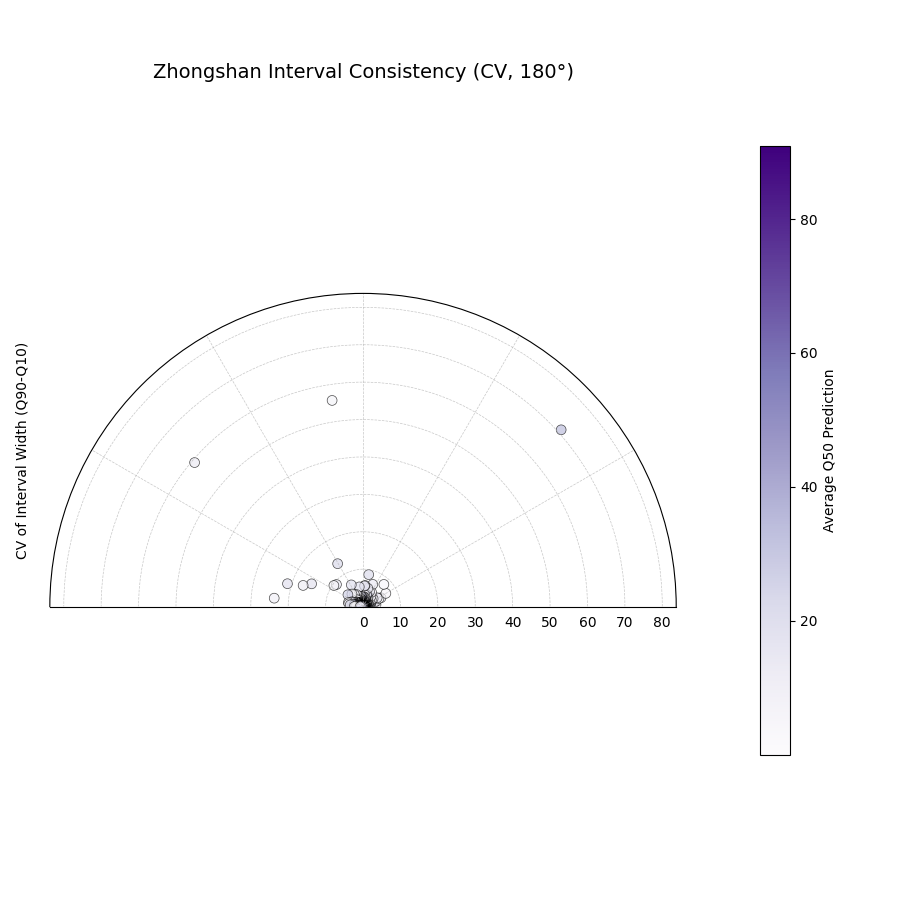
Zhongshan Data: Interval Consistency Plot (Half Circle)
Load Zhongshan data (as Bunch) and plot interval consistency (using coefficient of variation for radius) restricted to a 180-degree view.
 1import kdiagram as kd
 2import matplotlib.pyplot as plt
 3import warnings
 4import pandas as pd
 5
 6warnings.filterwarnings("ignore", message=".*already exists.*")
 7ax = None
 8try:
 9    # 1. Load data as Bunch
10    data = kd.datasets.load_zhongshan_subsidence(
11        as_frame=False, download_if_missing=True
12        )
13
14    # 2. Check data
15    if (data is not None and hasattr(data, 'frame')
16            and data.q10_cols and data.q50_cols and data.q90_cols):
17        print(f"Plotting interval consistency for Zhongshan.")
18
19        # 3. Create the Interval Consistency plot
20        ax = kd.plot_interval_consistency(
21            df=data.frame,
22            qlow_cols=data.q10_cols,
23            qup_cols=data.q90_cols,
24            q50_cols=data.q50_cols, # Use Q50 for color context
25            use_cv=True,           # Use Coefficient of Variation
26            acov='half_circle',    # <<< Use 180 degree view
27            title="Zhongshan Interval Consistency (CV, 180°)",
28            cmap='Purples',
29            s=15, alpha=0.7,
30            # Save the plot
31            savefig="../images/dataset_plot_example_zhongshan_consistency_half.png"
32        )
33        plt.close()
34    else:
35        print("Loaded data object missing required attributes.")
36
37except FileNotFoundError as e:
38    print(f"ERROR - Zhongshan data not found: {e}")
39except Exception as e:
40    print(f"An unexpected error occurred: {e}")
41
42if ax is None: print("Plot generation skipped.")