Model Comparison Gallery
This gallery page showcases plots from k-diagram designed for comparing the performance of multiple models across various metrics, primarily using radar charts.
Note
You need to run the code snippets locally to generate the plot
images referenced below (e.g., images/gallery_model_comparison.png).
Ensure the image paths in the .. image:: directives match where
you save the plots (likely an images subdirectory relative to
this file).
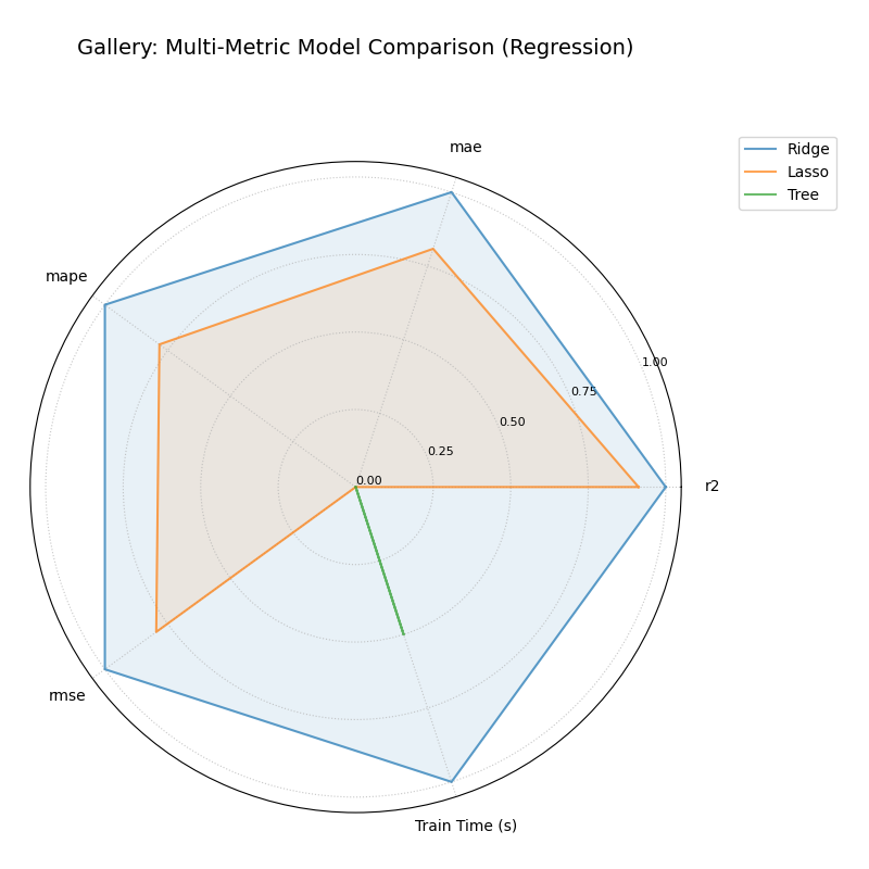
Multi-Metric Model Comparison
Uses plot_model_comparison() to generate
a radar chart comparing multiple models across several performance
metrics (R2, MAE, RMSE, MAPE by default for regression) and includes
training time as an additional axis. Scores are normalized for visual
comparison.
 1import kdiagram.plot.comparison as kdc
 2import numpy as np
 3import matplotlib.pyplot as plt
 4
 5# --- Data Generation ---
 6np.random.seed(42)
 7rng = np.random.default_rng(42)
 8n_samples = 100
 9y_true_reg = np.random.rand(n_samples) * 20 + 5 # True values
10# Model 1: Good fit
11y_pred_r1 = y_true_reg + np.random.normal(0, 2, n_samples)
12# Model 2: Slight bias, more noise
13y_pred_r2 = y_true_reg * 0.9 + 3 + np.random.normal(0, 3, n_samples)
14# Model 3: Less correlated
15y_pred_r3 = np.random.rand(n_samples) * 25 + rng.normal(0, 4, n_samples)
16
17times = [0.2, 0.8, 0.5] # Example training times
18names = ['Ridge', 'Lasso', 'Tree'] # Example model names
19
20# --- Plotting ---
21ax = kdc.plot_model_comparison(
22    y_true_reg,
23    y_pred_r1,
24    y_pred_r2,
25    y_pred_r3,
26    train_times=times,
27    names=names,
28    # metrics=['r2', 'mae'] # Optionally specify metrics
29    title="Gallery: Multi-Metric Model Comparison (Regression)",
30    scale='norm', # Normalize scores to [0, 1] (higher is better)
31    # Save the plot (adjust path relative to this file)
32    savefig="images/gallery_model_comparison.png"
33)
34plt.close() # Close plot after saving