Contextual Diagnostic Plots
While the core of k-diagram is its specialized polar visualizations,
a complete forecast evaluation often benefits from standard, familiar
plots that provide essential context. The kdiagram.plot.context
module provides a suite of these fundamental diagnostic plots, designed
to be companions to the main polar diagrams.
These functions cover essential diagnostics such as time series comparisons, scatter plots for correlation, and various checks on the distribution and structure of forecast errors. They follow the same consistent, DataFrame-centric API as the rest of the k-diagram package, creating a cohesive and complete toolkit for forecast evaluation.
Summary of Contextual Plotting Functions
Function |
Description |
|---|---|
Plots the actual and predicted values over time, with optional uncertainty bands. |
|
Creates a standard scatter plot of true vs. predicted values to assess correlation and bias. |
|
Visualizes the distribution of forecast errors with a histogram and KDE plot. |
|
Generates a Q-Q plot to check if forecast errors are normally distributed. |
|
Creates an ACF plot to check for remaining temporal patterns in the forecast errors. |
|
Creates a PACF plot to identify the specific structure of autocorrelation in the errors. |
Common Plotting Parameters
Most plotting functions in k-diagram share a common set of parameters for controlling the input data and the plot’s appearance. These are explained here once for brevity.
Parameter |
Description |
|---|---|
|
The input |
|
A list of strings to use as labels for different models or prediction sets in the legend. |
|
Strings to set the title and axis labels for the plot. |
|
A tuple of |
|
The name of the Matplotlib colormap to use for plots with multiple colors. |
|
Controls the visibility and styling of the plot’s grid lines. |
|
The file path and resolution for saving the plot to a file. |
Time Series Plot (plot_time_series())
Purpose This is the most fundamental contextual plot, providing a direct visualization of the actual and predicted values over time. It is an essential first step for understanding a model’s performance, showing how well it tracks the overall trend, seasonality, and anomalies in the data. The function is flexible, allowing for the comparison of multiple models and the inclusion of an uncertainty interval.
Key Parameters: In addition to the common parameters, this function uses:
`x_col`: The column to use for the x-axis. If not provided, the DataFrame’s index is used, which is ideal for time series data.
`actual_col`: The column containing the ground truth values, typically plotted as a solid line for reference.
`pred_cols`: A list of one or more columns containing the point forecasts from different models.
`q_lower_col` / `q_upper_col`: Optional columns that define the bounds of a prediction interval, which will be visualized as a shaded band.
Conceptual Basis:
A time series plot is a direct visualization of one or more time-
dependent variables. It maps a time-like variable \(t\) (from
x_col or the index) to the x-axis and the value of a series
\(y\) (from actual_col or pred_cols) to the y-axis.
The plot visualizes the functions \(y_{true} = f(t)\) and \(y_{pred} = g(t)\), allowing for a direct comparison of their behavior over the entire domain. The shaded uncertainty band represents the interval \([q_{lower}(t), q_{upper}(t)]\), providing a visual representation of the forecast’s uncertainty at each point in time.
Interpretation: The plot provides an immediate and intuitive overview of a forecast’s performance against the true observed values.
Tracking Performance: A good forecast (dashed line) will closely follow the true values (solid line), capturing the major trends and seasonal patterns.
Bias: A forecast that is consistently above or below the true value line has a clear systemic bias.
Uncertainty Bands: The shaded gray area shows the prediction interval. A well-calibrated model should have the true value line fall within this band most of the time.
Use Cases:
As the first step in any forecast evaluation to get a high-level sense of model performance.
To visually compare the tracking ability of multiple models.
To check if the prediction intervals are wide enough to contain the actual values and to see if the uncertainty changes over time.
Example The following example demonstrates how to plot the true values against the forecasts of two different models. It also includes a shaded uncertainty band for the “good” model.
 1import kdiagram.plot.context as kdc
 2import pandas as pd
 3import numpy as np
 4
 5# --- Generate synthetic time series data ---
 6np.random.seed(0)
 7n_samples = 200
 8time_index = pd.date_range("2023-01-01", periods=n_samples, freq='D')
 9
10# A true signal with trend and seasonality
11y_true = (np.linspace(0, 20, n_samples) +
12          10 * np.sin(np.arange(n_samples) * 2 * np.pi / 30) +
13          np.random.normal(0, 2, n_samples))
14
15# A good forecast that tracks the signal well
16y_pred_good = y_true + np.random.normal(0, 1.5, n_samples)
17# A biased forecast that misses the trend
18y_pred_biased = y_true * 0.8 + 5 + np.random.normal(0, 2, n_samples)
19
20df = pd.DataFrame({
21    'time': time_index,
22    'actual': y_true,
23    'good_model': y_pred_good,
24    'biased_model': y_pred_biased,
25    'q10': y_pred_good - 5, # Uncertainty band for the good model
26    'q90': y_pred_good + 5,
27})
28
29# --- Generate the plot ---
30kdc.plot_time_series(
31    df,
32    x_col='time',
33    actual_col='actual',
34    pred_cols=['good_model', 'biased_model'],
35    q_lower_col='q10',
36    q_upper_col='q90',
37    title="Time Series Forecast Comparison"
38)
Before diving into complex error metrics, the most fundamental step in any forecast evaluation is to simply look at the results. A time series plot provides that crucial first look, allowing for an immediate visual assessment of a model’s performance against the ground truth.
Practical Example
Imagine you’re managing an e-commerce website and need to forecast the number of daily users to prepare server resources. You have two forecasting models in competition: “Model A” and “Model B”. The most fundamental way to compare them is to simply plot their forecasts directly against the actual user traffic over a period of time.
Let’s also visualize the uncertainty for Model A, which provides us with a prediction interval.
>>> import kdiagram as kd
>>> import pandas as pd
>>> import numpy as np
>>>
>>> # --- 1. Generate synthetic website traffic data ---
>>> np.random.seed(0)
>>> time_idx = pd.date_range("2025-01-01", periods=180, freq='D')
>>> y_true = (
...     500 + np.linspace(0, 200, 180)  # Trend: growing user base
...     + 150 * np.sin(np.arange(180) * 2 * np.pi / 30)  # Monthly seasonality
...     + np.random.normal(0, 40, 180)  # Daily noise
... )
>>>
>>> # Model A: Tracks well but has uncertainty
>>> model_a_preds = y_true + np.random.normal(0, 30, 180)
>>> # Model B: Consistently underestimates traffic
>>> model_b_preds = y_true * 0.85 + 50
>>>
>>> df = pd.DataFrame({
...     'Actual Users': y_true,
...     'Model A': model_a_preds,
...     'Model B': model_b_preds,
...     'Model A Lower Bound': model_a_preds - 80,
...     'Model A Upper Bound': model_a_preds + 80,
... }, index=time_idx)
>>>
>>> # --- 2. Generate the plot ---
>>> ax = kd.plot_time_series(
...     df,
...     actual_col='Actual Users',
...     pred_cols=['Model A', 'Model B'],
...     q_lower_col='Model A Lower Bound',
...     q_upper_col='Model A Upper Bound',
...     title="Daily Website User Forecast Comparison"
... )
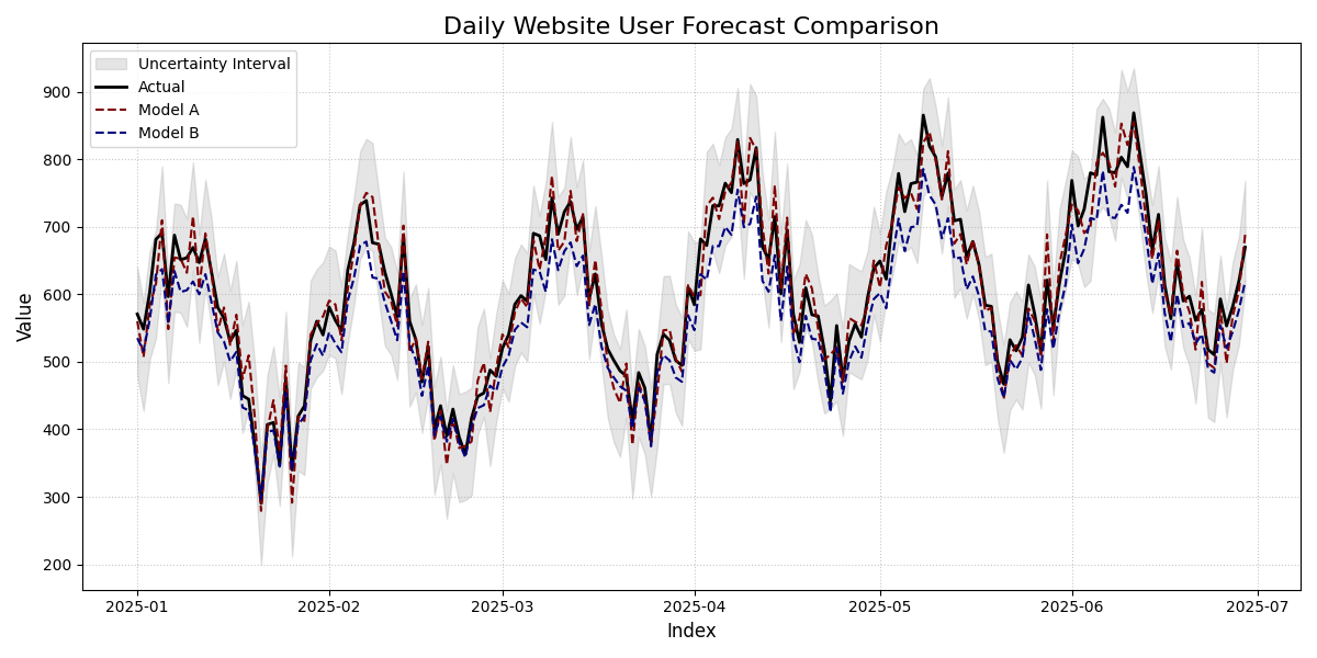
Comparison of two forecast models (Model A and Model B) against the actual daily website traffic, including an uncertainty interval for Model A.
This plot lays out the raw performance of our two forecast models against the ground truth. By examining how the lines track each other and interact with the shaded uncertainty band, we can get our first crucial insights into which model is more reliable.
- Quick Interpretation:
The plot clearly shows that
Model A(red dashed line) is a strong performer. It closely tracks theActualtraffic (black solid line), successfully capturing the seasonal peaks and the overall trend. Furthermore, theActualline remains almost entirely within the grayUncertainty Interval, suggesting the model’s uncertainty estimates are well-calibrated. In stark contrast,Model B(blue dashed line) is visibly and consistently below theActualline, revealing a clear systemic bias to under-predict website traffic.
This high-level visual check is invaluable. For a closer look at the code and parameters used to generate this comparison, please refer to the gallery.
Example: See the gallery Time Series Plot for more examples.
Scatter Correlation Plot (plot_scatter_correlation())
Purpose This function creates a classic Cartesian scatter plot to visualize the relationship between true observed values and model predictions. It is an essential tool for assessing linear correlation, identifying systemic bias, and spotting outliers. This plot serves as the standard Cartesian counterpart to the polar relationship plots.
Key Parameters Explained In addition to the common parameters, this function uses:
`actual_col`: The column containing the ground truth values, which will be plotted on the x-axis.
`pred_cols`: A list of one or more columns containing the point forecasts from different models, which will be plotted on the y-axis.
`show_identity_line`: A boolean that controls the display of the dashed y=x line. This line is the reference for a perfect forecast.
Mathematical Concept This plot directly visualizes the relationship between two variables by plotting each observation \(i\) as a point \((y_{true,i}, y_{pred,i})\).
The primary reference is the identity line, defined by the equation:
For a perfect forecast, every predicted value would equal its corresponding true value, and all points would fall exactly on this line. Deviations from this line represent prediction errors.
Interpretation: The plot provides a direct visual assessment of a point forecast’s performance.
Correlation: If the points form a tight, linear cloud around the identity line, it indicates a strong positive correlation between the predictions and the true values.
Bias: If the point cloud is systematically shifted above or below the identity line, it reveals a model bias. Points above the line are over-predictions, while points below are under-predictions.
Outliers: Individual points that are far from the main cloud of points represent significant, one-off prediction errors.
Use Cases:
To quickly assess the linear correlation between predictions and actuals.
To diagnose systemic bias by observing how the point cloud deviates from the identity line.
To identify individual outliers that are far from the main cluster of points.
While a time series plot is ideal for sequential data, the classic scatter plot is the go-to tool for regression problems to assess the direct relationship between predictions and actuals. This example shows how to use it to diagnose a model’s correlation and bias.
Practical Example
Let’s say you work for an automotive company and have developed a machine learning model to predict a car’s fuel efficiency (in Miles Per Gallon, or MPG) based on its specifications like engine size and weight. To validate this model, you need to see how well its predictions correlate with the actual, lab-tested MPG values.
A scatter correlation plot is the industry standard for this task. It plots the true value against the predicted value. For a perfect model, every single point would fall exactly on the 45-degree identity line.
>>> import kdiagram as kd
>>> import pandas as pd
>>> import numpy as np
>>>
>>> # --- 1. Define your data ---
>>> np.random.seed(42)
>>> # Actual lab-tested MPG for 150 cars
>>> y_true_mpg = np.random.uniform(15, 50, 150)
>>> # Predictions from our model (with some realistic error)
>>> y_pred_mpg = y_true_mpg + np.random.normal(loc=0, scale=3, size=150)
>>> # Let's add a subtle bias: the model overestimates for high-MPG cars
>>> y_pred_mpg[y_true_mpg > 40] += 5
>>>
>>> df = pd.DataFrame({
...     'Actual_MPG': y_true_mpg,
...     'Predicted_MPG': y_pred_mpg
... })
>>>
>>> # --- 2. Generate the plot ---
>>> ax = kd.plot_scatter_correlation(
...     df,
...     actual_col='Actual_MPG',
...     pred_cols=['Predicted_MPG'],
...     title="Correlation of Predicted vs. Actual Car MPG"
... )
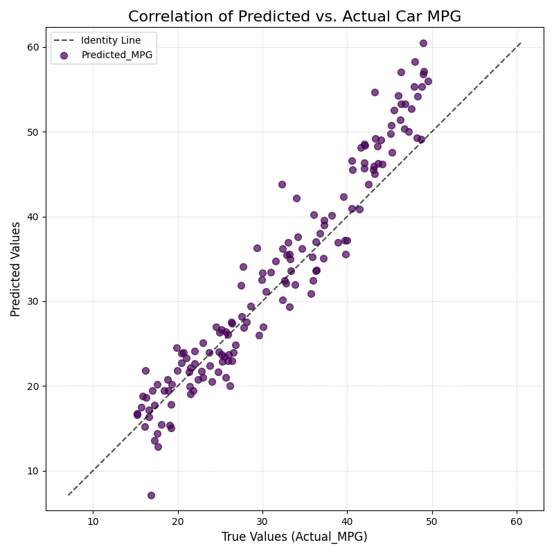
Correlation between a model’s predicted fuel efficiency and the actual lab-tested MPG values. The dashed line represents a perfect one-to-one correlation.
The scatter plot gives us a classic head-to-head comparison between our model’s predictions and reality. Now, let’s dive into the details of this point cloud to assess the model’s accuracy, bias, and any unusual errors.
- Quick Interpretation:
The plot reveals two key insights. First, the points form a tight, linear cloud around the dashed
Identity Line, indicating a strong positive correlation. This means the model is generally very effective at predicting MPG. However, for true values above 40 MPG, the points are systematically above the identity line. This shows a specific bias: the model consistently over-predicts the fuel efficiency for the most economical cars, an important finding for model refinement.
This visual diagnosis is powerful. To explore the full code and see how this plot can be customized, check out the complete example in the gallery.
Example: See the gallery example and code: Scatter Correlation Plot.
Error Distribution Plot (plot_error_distribution())
Purpose: This function creates a histogram and a Kernel Density Estimate (KDE) plot of the forecast errors. It is a fundamental diagnostic for checking if a model’s errors are unbiased (centered at zero) and normally distributed, which are key assumptions for many statistical methods.
Key Parameters: In addition to the common parameters, this function uses:
`actual_col`: The column containing the ground truth values.
`pred_col`: The column containing the point forecast values.
`**hist_kwargs`: Additional keyword arguments (e.g., bins, kde_color) are passed directly to the underlying
plot_hist_kde()function.
Mathematical Concept: The plot visualizes the distribution of the forecast errors, \(e_i = y_{true,i} - y_{pred,i}\), using two standard non-parametric methods.
Histogram: The range of errors is divided into a series of bins, and the height of each bar represents the frequency (or density) of errors that fall into that bin.
Kernel Density Estimate (KDE): This provides a smooth, continuous estimate of the error’s probability density function, \(\hat{f}_h(e)\), based on the foundational work in density estimation [1].
Interpretation: The plot provides an immediate visual summary of the error distribution’s key characteristics.
Bias (Central Tendency): The location of the highest peak of the distribution. For an unbiased model, this peak should be centered at zero.
Variance (Spread): The width of the distribution. A narrow distribution indicates low-variance, consistent errors, while a wide distribution indicates high-variance, less reliable predictions.
Shape: The overall shape of the curve. A symmetric “bell curve” suggests the errors are normally distributed. Skewness or multiple peaks (bimodality) can indicate that the model struggles with certain types of predictions.
Use Cases:
To check if a model’s errors are unbiased (i.e., have a mean of zero).
To assess if the errors follow a normal distribution, which is a key assumption for constructing valid confidence intervals.
To identify skewness or heavy tails in the error distribution, which might indicate that the model has systematic failings.
After visualizing the predictions themselves, the next step is to analyze the errors. A model’s quality is defined by its errors, and the most basic diagnostic is to examine their distribution. A good model should produce errors that are random, centered around zero, and normally distributed.
Practical Example
Let’s imagine you are a data scientist for a retail chain, and you’ve just built a model to forecast daily sales. Before deploying it, you need to check its performance. A fundamental first step is to analyze the prediction errors. Are they centered around zero? Are they skewed? An error distribution plot gives you a powerful first glance.
A model that is unbiased should have errors that are normally distributed around a mean of zero. Let’s see how our sales model did.
>>> import numpy as np
>>> import pandas as pd
>>> import kdiagram as kd
>>>
>>> # --- 1. Define your data ---
>>> np.random.seed(0)
>>> # True daily sales for 365 days
>>> y_true = np.random.poisson(lam=150, size=365)
>>> # Predictions from our model (let's introduce a slight bias)
>>> y_pred = y_true + np.random.normal(loc=5, scale=10, size=365)
>>> # Create a DataFrame
>>> df = pd.DataFrame({'Actual_Sales': y_true, 'Predicted_Sales': y_pred})
>>>
>>> # --- 2. Generate the plot ---
>>> ax = kd.plot_error_distribution(
...     df,
...     actual_col='Actual_Sales',
...     pred_col='Predicted_Sales',
...     title="Distribution of Daily Sales Forecast Errors",
...     bins=30
... )
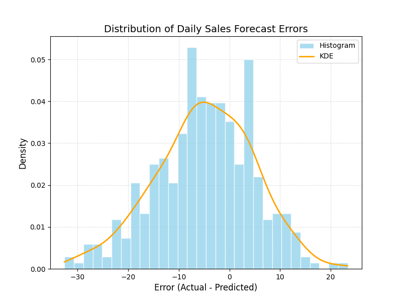
Histogram and Kernel Density Estimate (KDE) of the errors from a daily sales forecasting model.
The plot above shows a histogram of our forecast errors. Now, let’s move on to interpreting what this shape tells us about our model’s tendency to over or under-predict sales.
- Quick Interpretation:
The plot shows that the errors approximate a bell shape, which is a good sign, suggesting they are somewhat normally distributed. However, the distribution is not centered at zero. The peak of the histogram and the KDE curve is clearly shifted to the left, centered around an error value of approximately -5. Since the error is calculated as Actual - Predicted, this reveals a systematic negative bias: the model consistently over-predicts sales by about 5 units.
This kind of bias is a critical finding. To see how this plot is generated and how you can apply it to your own models, take a look at the gallery example.
Example See the gallery example and code: Error Distribution Plot.
Q-Q Plot (plot_qq())
Purpose: This function generates a Quantile-Quantile (Q-Q) plot, a standard graphical method for comparing a dataset’s distribution to a theoretical distribution (in this case, the normal distribution). It is an essential tool for visually checking if the forecast errors are normally distributed, which is a key assumption for many statistical methods.
Key Parameters: In addition to the common parameters, this function uses:
`actual_col`: The column containing the ground truth values.
`pred_col`: The column containing the point forecast values.
`**scatter_kwargs`: Additional keyword arguments are passed to the underlying scatter plot for the data points.
Mathematical Concept: A Q-Q plot is constructed by plotting the quantiles of two distributions against each other. In this case, it compares the quantiles of the empirical distribution of the forecast errors, \(e_i = y_{true,i} - y_{pred,i}\), against the theoretical quantiles of a standard normal distribution, \(\mathcal{N}(0, 1)\).
If the two distributions are identical (1), the resulting points will fall perfectly along the identity line \(y=x\).
Interpretation: The plot provides a powerful visual diagnostic for checking the normality assumption of a model’s errors.
Reference Line (Blue Line): This line represents a perfect theoretical normal distribution.
Error Quantiles (Red Dots): Each dot represents a quantile from the actual error distribution plotted against the corresponding quantile from a theoretical normal distribution.
Alignment: If the red dots fall closely along the straight blue reference line, it indicates that the error distribution is approximately normal.
Deviations: Systematic deviations from the line indicate a departure from normality. For example, an “S”-shaped curve can indicate that the error distribution has “heavy tails” (more outliers than a normal distribution).
Use Cases:
To visually verify the assumption that a model’s errors are normally distributed.
To diagnose specific types of non-normality, such as skewness or heavy tails.
As a companion to the
plot_error_distribution()to get a more rigorous check of the distribution’s shape.
A histogram gives a general sense of the error distribution, but a Q-Q plot provides a more rigorous and detailed check for normality. This is a critical step for validating the assumptions behind many statistical models.
Practical Example
Continuing with our sales forecast scenario, a histogram gave us a good general idea of the error distribution. However, to more rigorously check if the errors follow a normal distribution—a key assumption for many statistical methods—we can use a Q-Q (Quantile-Quantile) plot.
This plot compares the quantiles of our model’s errors against the quantiles of a perfect theoretical normal distribution. If the errors are truly normal, the points on the plot will lie perfectly along the diagonal line.
>>> import numpy as np
>>> import pandas as pd
>>> import kdiagram as kd
>>>
>>> # --- 1. Use the same sales data in a DataFrame ---
>>> np.random.seed(0)
>>> y_true = np.random.poisson(lam=150, size=365)
>>> y_pred = y_true + np.random.normal(loc=5, scale=10, size=365)
>>> df = pd.DataFrame({'Actual_Sales': y_true, 'Predicted_Sales': y_pred})
>>>
>>> # --- 2. Generate the plot ---
>>> ax = kd.plot_qq(
...     df,
...     actual_col='Actual_Sales',
...     pred_col='Predicted_Sales',
...     title="Q-Q Plot of Sales Forecast Errors"
... )
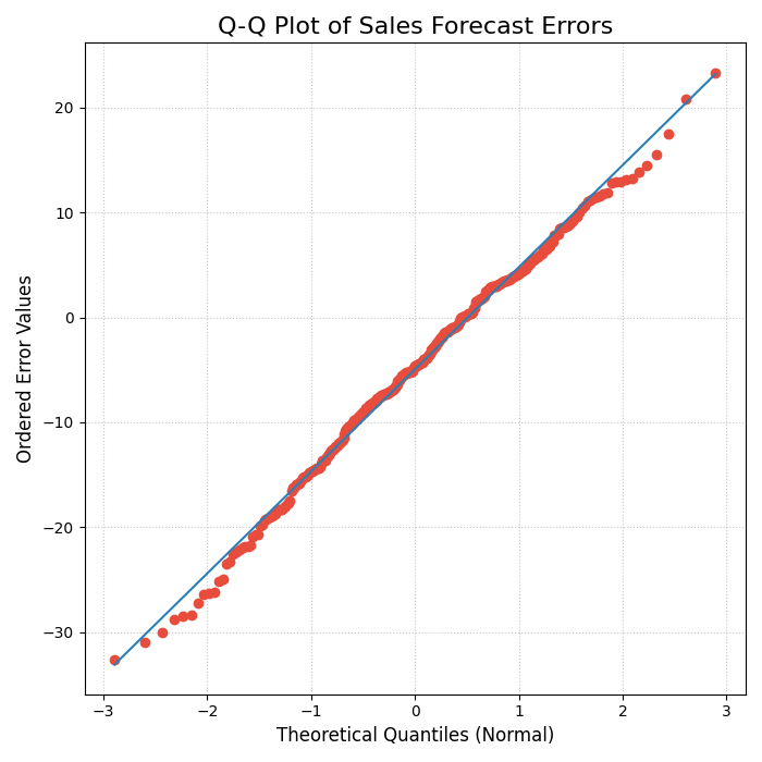
A Quantile-Quantile (Q-Q) plot comparing the distribution of model errors against a theoretical normal distribution.
This Q-Q plot provides a more forensic look at our error distribution. By observing how the red dots align with the ideal diagonal line, we can diagnose exactly how our model’s errors differ from a normal distribution. Let’s take a closer look.
- Quick Interpretation:
The plot provides strong evidence that the forecast errors are, for the most part, normally distributed. The red dots, which represent the error quantiles, align very closely with the solid diagonal line representing a theoretical normal distribution. While there are minor deviations at the extreme tails, the overall fit is excellent, suggesting that assumptions of normality for this model’s errors are valid.
Confirming the error distribution is a key step in model validation. To learn more about the implementation, please see the full example in the gallery.
Example: See the gallery example and code: Q-Q Plot for Error Normality.
Error Autocorrelation (ACF) Plot (plot_error_autocorrelation())
Purpose: This function creates an Autocorrelation Function (ACF) plot of the forecast errors. It is a critical diagnostic for time series models, used to check if there is any remaining temporal structure (i.e., patterns) in the residuals. A well-specified model should have errors that are uncorrelated over time, behaving like random noise.
Key Parameters: In addition to the common parameters, this function uses:
`actual_col`: The column containing the ground truth values.
`pred_col`: The column containing the point forecast values.
`**acf_kwargs`: Additional keyword arguments are passed directly to the underlying
pandas.plotting.autocorrelation_plotfunction.
Mathematical Concept: The Autocorrelation Function (ACF) at lag \(k\) measures the correlation between a time series and its own past values. For a series of errors \(e_t\), the ACF is defined as:
This plot displays the values of \(\rho_k\) for a range of different lags \(k\). The plot also includes significance bands (typically at 95% confidence), which provide a threshold for determining if a correlation is statistically significant or likely due to random chance.
Interpretation: The plot is used to identify if predictable patterns remain in the model’s errors.
Significance Bands: The horizontal lines or shaded area represent the significance threshold. Autocorrelations that fall inside this band are generally considered to be statistically insignificant from zero.
Significant Lags: If one or more spikes extend outside the significance bands, it indicates that the errors are correlated with their past values at those lags. This means the model has failed to capture all the predictable information in the time series.
Use Cases:
To check if a time series model’s errors are independent over time (i.e., resemble white noise), which is a key assumption for a well-specified model.
To identify remaining seasonality or trend in the residuals. If you see significant spikes at regular intervals (e.g., every 12 lags for monthly data), it means your model has not fully captured the seasonal pattern.
To guide model improvement. Significant autocorrelation suggests that the model could be improved by adding more lags or other time-based features.
For time-series data, checking for random errors is not enough; we must also ensure the errors are not correlated with each other over time. Lingering patterns in the errors suggest the model can be improved. The Autocorrelation Function (ACF) plot is the primary tool for this investigation.
Practical Example
Now, let’s switch to a new challenge: forecasting hourly traffic to a website. For time-series forecasts like this, it’s crucial that the model’s errors are independent of each other. If the error from one hour helps predict the error for the next hour, it means there is a pattern in the residuals that our model has failed to capture.
The Autocorrelation Function (ACF) plot is the perfect diagnostic tool for this, showing the correlation of the error series with itself at different time lags.
>>> import numpy as np
>>> import pandas as pd
>>> import kdiagram as kd
>>>
>>> # --- 1. Define time-series data in a DataFrame ---
>>> np.random.seed(42)
>>> time = np.arange(200)
>>> # True hourly website traffic
>>> y_true = 50 * np.sin(time * 0.2) + np.random.randn(200) * 5
>>> # Predictions from a model that slightly lags reality
>>> y_pred = 50 * np.sin((time - 2) * 0.2)
>>> df = pd.DataFrame({'Actual_Traffic': y_true, 'Predicted_Traffic': y_pred})
>>>
>>> # --- 2. Generate the plot ---
>>> ax = kd.plot_error_autocorrelation(
...     df,
...     actual_col='Actual_Traffic',
...     pred_col='Predicted_Traffic',
...     title="Autocorrelation of Website Traffic Errors",
...     n_lags=30
... )
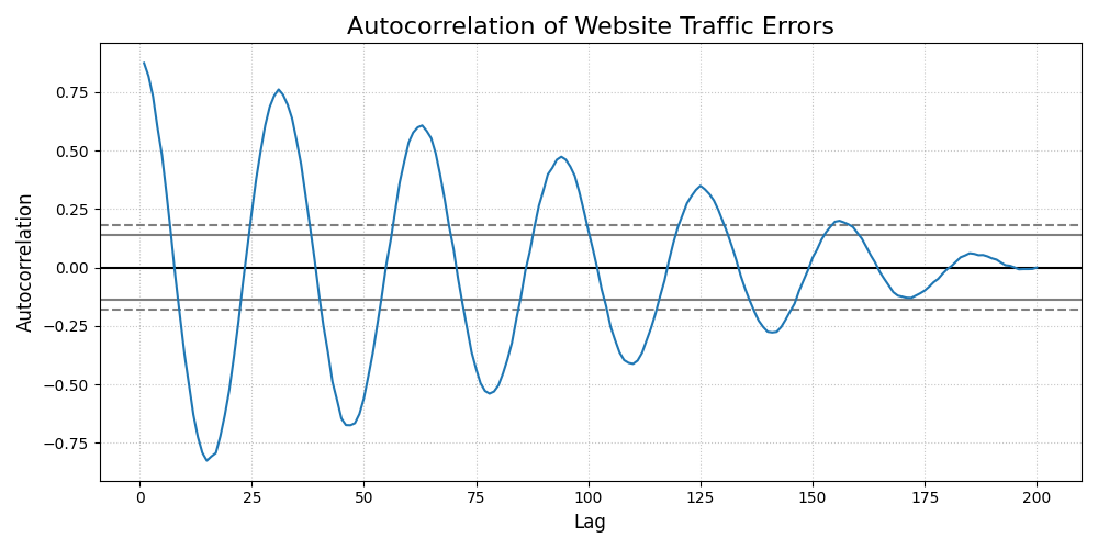
The Autocorrelation Function (ACF) of the errors from a website traffic forecast, showing correlation across different time lags.
Building the forecast was the first half of the job. This ACF plot helps us investigate the quality of its predictions by hunting for hidden, time-dependent patterns in the model’s mistakes.
- Quick Interpretation:
This plot reveals a significant issue with the forecast model. The correlation values exhibit a strong, slowly decaying sine wave pattern, with many lags extending far beyond the significance bands. This indicates that the errors are not random and contain a strong cyclical or seasonal pattern. The model has failed to capture the underlying seasonality of the data, and this repeating pattern is left over in the errors.
Identifying autocorrelation is the first step to fixing it. To see the full code for this diagnostic check, explore the example in the gallery.
Example: See the gallery example and code: Error Autocorrelation (ACF) Plot.
Error Partial Autocorrelation (PACF) Plot (plot_error_pacf())
Purpose: This function creates a Partial Autocorrelation Function (PACF) plot of the forecast errors. It is a critical companion to the ACF plot and is used to identify the direct relationship between an error and its past values, after removing the effects of the intervening lags.
Key Parameters In addition to the common parameters, this function uses:
`actual_col`: The column containing the ground truth values.
`pred_col`: The column containing the point forecast values.
`**pacf_kwargs`: Additional keyword arguments are passed directly to the underlying
statsmodels.graphics.tsaplots.plot_pacffunction.
Mathematical Concept: While the ACF at lag \(k\) shows the total correlation between \(e_t\) and \(e_{t-k}\), the PACF shows the partial correlation. It measures the correlation between \(e_t\) and \(e_{t-k}\) after removing the linear dependence on the intermediate observations \(e_{t-1}, e_{t-2}, ..., e_{t-k+1}\).
This helps to isolate the direct relationship at a specific lag, making it a key tool for identifying the order of autoregressive (AR) processes.
Interpretation: The PACF plot is used in conjunction with the ACF plot to diagnose the specific structure of any remaining patterns in the residuals.
Significance Band: The shaded area represents the significance threshold. Spikes that extend outside this band are statistically significant.
Cut-off Pattern: A key pattern to look for is a sharp “cut-off.” If the PACF plot shows a significant spike at lag \(p\) and non-significant spikes thereafter, it is a strong indication of an autoregressive (AR) process of order \(p\).
Use Cases:
To identify the order of an autoregressive (AR) model that might be missing from your forecast model.
To confirm that a model’s errors are random and that no significant direct linear relationships between lagged errors remain.
As a complementary tool to the ACF plot for a more complete diagnosis of time series residuals.
The ACF plot tells us if the errors are correlated, while its companion, the Partial Autocorrelation Function (PACF) plot, helps us understand why. It isolates the direct relationship between errors, providing specific clues on how to improve time-series models like Autoregressive Integrated Moving Average (ARIMA).
Practical Example
In our website traffic analysis, the ACF plot showed us that the errors are correlated over time. Now, we need to understand the nature of that correlation better. The Partial Autocorrelation Function (PACF) plot is the ideal companion tool.
While ACF shows the total correlation between an error and its past values (including indirect effects), PACF shows the direct correlation at a specific lag after removing the influence of shorter lags. This is extremely useful for identifying the precise order of autoregressive (AR) models.
>>> import numpy as np
>>> import pandas as pd
>>> import kdiagram as kd
>>>
>>> # --- 1. Use the same website traffic data in a DataFrame ---
>>> np.random.seed(42)
>>> time = np.arange(200)
>>> y_true = 50 * np.sin(time * 0.2) + np.random.randn(200) * 5
>>> y_pred = 50 * np.sin((time - 2) * 0.2)
>>> df = pd.DataFrame({'Actual_Traffic': y_true, 'Predicted_Traffic': y_pred})
>>>
>>> # --- 2. Generate the plot ---
>>> ax = kd.plot_error_pacf(
...     df,
...     actual_col='Actual_Traffic',
...     pred_col='Predicted_Traffic',
...     title="Partial Autocorrelation of Forecast Errors",
...     n_lags=30
... )
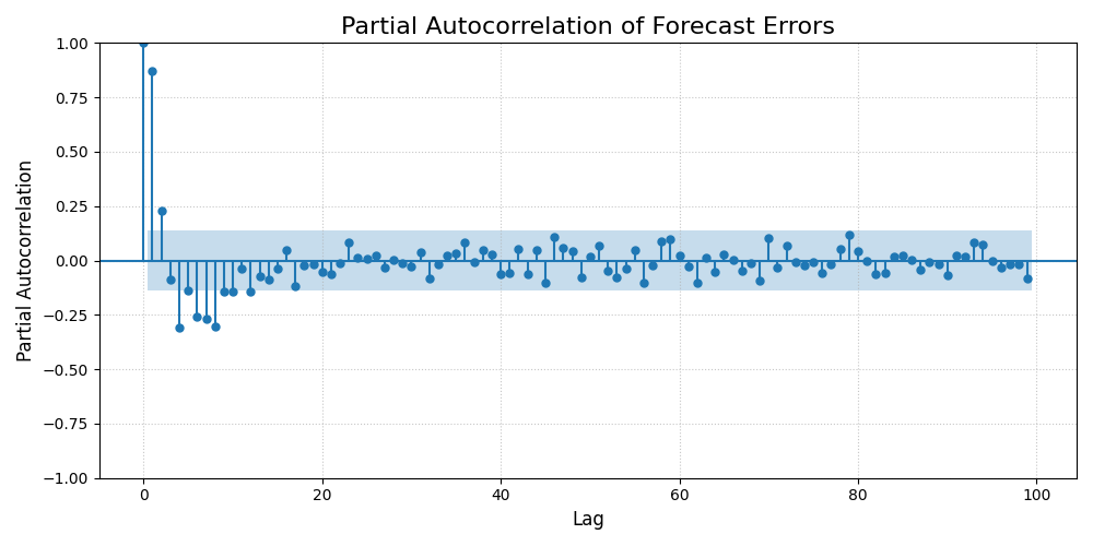
The Partial Autocorrelation Function (PACF) of forecast errors, showing the direct correlation at each lag.
This PACF plot isolates the direct relationships between errors across time. Let’s analyze the significant spikes to understand the specific lag structure our forecasting model is currently missing.
- Quick Interpretation:
While the ACF plot showed a complex wave, the PACF plot gives a much clearer, actionable insight. There are significant spikes at lags 1 and 2, after which the correlations abruptly drop within the significance bounds. This is the classic signature of an Autoregressive (AR) process of order 2. It tells us that an error is directly predicted by the errors from the two previous time steps. This suggests the forecast model could be improved by adding AR(2) terms.
This kind of specific diagnostic is crucial for refining time-series models. To see the full implementation, please refer to the gallery example.
Example: See the gallery example and code: Error Partial Autocorrelation (PACF) Plot.
References