Model Evaluation Gallery
This gallery page showcases plots from the k-diagram package designed for the evaluation of classification models. It features novel polar adaptations of standard, powerful diagnostic tools like the ROC curve and the Precision-Recall curve.
These visualizations provide an intuitive and aesthetically engaging way to compare the performance of multiple models, assess their discriminative power, and understand their behavior, especially on imbalanced datasets.
Note
You need to run the code snippets locally to generate the plot
images referenced below. Ensure the image paths in the
.. image:: directives match where you save the plots.
Polar Receiver Operating Characteristic (ROC) Curve
The plot_polar_roc() function visualizes
the performance of binary classifiers. It adapts the standard Receiver
Operating Characteristic (ROC) analysis to a polar coordinate system,
plotting the True Positive Rate against the False Positive Rate in an
intuitive quarter-circle format to assess a model’s ability to
distinguish between classes.
To appreciate how this visualization conveys such rich information, we must first understand its anatomy.
Plot Anatomy
Angle (θ): Represents the False Positive Rate (FPR), which is the fraction of negative instances incorrectly classified as positive. The angle sweeps from 0 to 1 as it moves from 0° to 90°. A smaller angle is better.
Radius (r): Represents the True Positive Rate (TPR), also known as Recall or Sensitivity. The radius extends from 0 at the center to 1 at the edge. A larger radius is better.
No-Skill Line: The dashed diagonal spiral represents a random classifier with an Area Under the Curve (AUC) of 0.5. A skillful model’s curve should bow outwards, far away from this baseline.
With this framework in mind, let’s apply the plot to a practical scenario: evaluating a new medical screening test.
Use Case 1: Comparing Medical Screening Algorithms
A biotech company has developed a new “Experimental Algorithm” to screen for a moderately common disease. They need to compare its performance against their existing “Standard Algorithm.” Since the dataset of patients is relatively balanced, the ROC curve is an appropriate tool to visualize which algorithm provides a better trade-off between correctly identifying sick patients (TPR) and incorrectly flagging healthy patients (FPR).
The following code simulates this clinical evaluation by generating prediction scores from two overlapping distributions for each model—a hallmark of realistic classification problems.
 1import kdiagram as kd
 2import numpy as np
 3from sklearn.datasets import make_classification
 4import matplotlib.pyplot as plt
 5
 6# --- 1. Simulate Balanced Medical Data ---
 7X, y_true = make_classification(
 8    n_samples=2000,
 9    n_classes=2,
10    weights=[0.5, 0.5], # Balanced dataset
11    flip_y=0,
12    n_informative=5,
13    random_state=42
14)
15
16# --- 2. Simulate Realistic Prediction Scores ---
17def generate_scores(y_true, pos_mean, scale):
18    """Generate scores from two overlapping normal distributions."""
19    scores = np.zeros_like(y_true, dtype=float)
20    pos_mask = (y_true == 1)
21    neg_mask = (y_true == 0)
22    scores[pos_mask] = np.random.normal(
23        loc=pos_mean, scale=scale, size=pos_mask.sum())
24    scores[neg_mask] = np.random.normal(
25        loc=0.5, scale=scale, size=neg_mask.sum())
26    return np.clip(scores, 0, 1)
27
28# Experimental model has better separation between classes
29y_pred_experimental = generate_scores(y_true, pos_mean=0.65, scale=0.15)
30# Standard model has more overlap
31y_pred_standard = generate_scores(y_true, pos_mean=0.58, scale=0.18)
32
33
34# --- 3. Plotting ---
35kd.plot_polar_roc(
36    y_true,
37    y_pred_experimental,
38    y_pred_standard,
39    names=["Experimental Algorithm", "Standard Algorithm"],
40    title="Medical Screening Algorithm Comparison (Polar ROC)",
41    savefig="gallery/images/gallery_evaluation_plot_polar_roc.png"
42)
43plt.close()
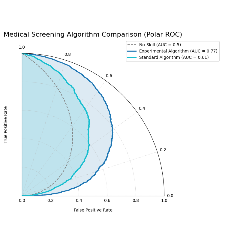
The “Experimental Algorithm” (blue) has a curve that bows out much further than the “Standard Algorithm” (orange), indicating a higher AUC and superior performance.
The generated plot provides an immediate visual verdict on the performance of the two algorithms.
While the first use case identified a clear overall winner, real-world decisions are often more nuanced. Let’s now consider a scenario where the ‘best’ model depends entirely on a specific operational constraint.
Use Case 2: Optimizing for a Specific Clinical Need
In a different clinical setting, the follow-up test for a disease is extremely expensive and invasive. A hospital’s primary goal is to strictly limit false positives to below 10% (FPR < 0.1). They are evaluating two high-performing models: one with the best overall AUC, and another specifically designed to be highly confident at low FPRs.
 1# --- 1. Use the same balanced data ---
 2# (Assuming y_true from the previous example is available)
 3
 4# --- 2. Simulate Predictions for two specialized models ---
 5# Model A (High AUC): Generally excellent across all thresholds
 6y_pred_high_auc = generate_scores(y_true, pos_mean=0.7, scale=0.2)
 7# Model B (Low-FPR Specialist): Negative scores are tightly clustered
 8# at a low value, making false positives at high thresholds rare.
 9scores_b = np.zeros_like(y_true, dtype=float)
10pos_mask_b = (y_true == 1)
11neg_mask_b = (y_true == 0)
12scores_b[pos_mask_b] = np.random.normal(0.65, 0.25, pos_mask_b.sum())
13scores_b[neg_mask_b] = np.random.normal(0.3, 0.1, neg_mask_b.sum())
14y_pred_low_fpr = np.clip(scores_b, 0, 1)
15
16
17# --- 3. Plotting ---
18kd.plot_polar_roc(
19    y_true,
20    y_pred_high_auc,
21    y_pred_low_fpr,
22    names=["Model A (High AUC)", "Model B (Low-FPR Specialist)"],
23    title="Optimizing for Low False Positive Rate",
24    cmap='viridis',
25    savefig="gallery/images/gallery_evaluation_roc_specialist.png"
26)
27plt.close()
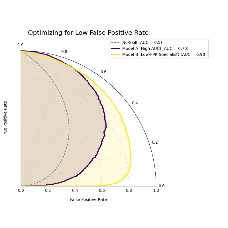
While Model A has a better overall AUC, Model B’s curve starts higher (larger radius), showing it performs better under a strict low-FPR constraint.
See Also
While the ROC curve is a standard tool for balanced datasets, for problems with significant class imbalance (e.g., fraud detection), the Polar Precision-Recall Curve is often a more informative visualization of model performance.
For a deeper dive into the mathematical concepts behind ROC analysis, please refer to the main Polar Precision-Recall Curve (plot_polar_pr_curve()) section.
Polar Precision-Recall Curve
The plot_polar_pr_curve() function
visualizes the trade-off between Precision and Recall. By mapping
these metrics to a polar coordinate system, it provides a clear view
of classifier performance. This is especially critical when dealing
with imbalanced datasets where other metrics, like the ROC curve, can be
misleadingly optimistic.
To understand how this plot visualizes this crucial trade-off, let’s first examine its components.
Plot Anatomy
Angle (θ): Represents Recall (True Positive Rate). This sweeps from 0 at the right (0°) to 1 at the top (90°). A wider angular sweep indicates the model’s ability to find more of the true positive cases.
Radius (r): Represents Precision. The distance from the center (0) to the edge (1). A larger radius means that when the model predicts a positive, it is more likely to be correct.
No-Skill Line: The dashed circle represents the performance of a random classifier, where precision is equal to the prevalence of the positive class. A skillful model’s curve should extend far beyond this baseline.
With this framework in mind, let’s apply the Polar PR Curve to a classic real-world problem where it excels: fraud detection.
Use Case 1: Detecting Fraudulent Transactions
A financial institution is developing a machine learning model to detect fraudulent credit card transactions. This is a classic imbalanced data problem: the vast majority of transactions are legitimate, and only a tiny fraction are fraudulent (the positive class). The bank needs to compare a new, sophisticated model against a simpler baseline to see if it’s better at catching fraud without overwhelming investigators with false alarms.
The following code simulates this scenario by generating prediction scores from two overlapping distributions for each model—a hallmark of realistic classification problems.
 1import kdiagram as kd
 2import numpy as np
 3from sklearn.datasets import make_classification
 4import matplotlib.pyplot as plt
 5
 6# --- 1. Simulate Imbalanced Fraud Data ---
 7X, y_true = make_classification(
 8    n_samples=2000, n_classes=2, weights=[0.95, 0.05], # 5% positive class
 9    flip_y=0.01, n_informative=5, random_state=42
10)
11
12# --- 2. Simulate Realistic Prediction Scores ---
13def generate_scores(y_true, pos_mean, scale):
14    """Generate scores from two overlapping normal distributions."""
15    scores = np.zeros_like(y_true, dtype=float)
16    pos_mask = (y_true == 1)
17    neg_mask = (y_true == 0)
18    scores[pos_mask] = np.random.normal(
19        loc=pos_mean, scale=scale, size=pos_mask.sum())
20    scores[neg_mask] = np.random.normal(
21        loc=0.4, scale=scale, size=neg_mask.sum())
22    return np.clip(scores, 0, 1)
23
24# A good model with better separation between classes
25y_pred_good = generate_scores(y_true, pos_mean=0.75, scale=0.15)
26# A weak model with significant overlap
27y_pred_bad = generate_scores(y_true, pos_mean=0.55, scale=0.2)
28
29
30# --- 3. Plotting ---
31kd.plot_polar_pr_curve(
32    y_true,
33    y_pred_good,
34    y_pred_bad,
35    names=["Good Model", "Weak Model"],
36    title="Fraud Detection Model Comparison (Polar PR Curve)",
37    savefig="gallery/images/gallery_evaluation_plot_polar_pr_curve.png"
38)
39plt.close()
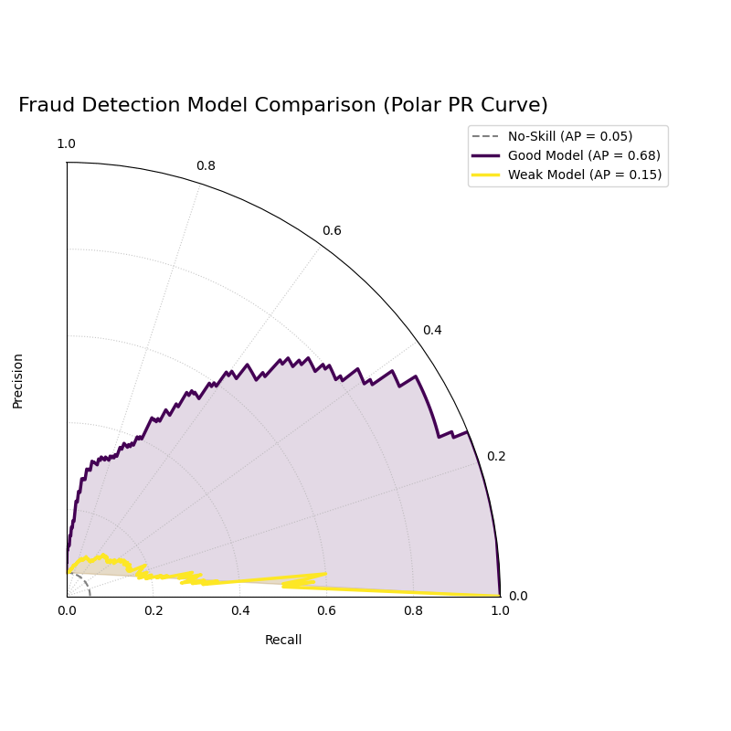
The “Good Model” (blue) shows a curve that bows out towards high precision and recall, while the “Weak Model” (orange) hugs the no-skill baseline.
The generated plot provides an immediate visual verdict on the models’ capabilities.
While the first example showed a clear winner, real-world decisions often involve choosing between two competent models with different strengths. This is where the PR curve’s ability to visualize strategic trade-offs becomes invaluable.
Use Case 2: Choosing Between Strategic Trade-offs
Let’s return to our fraud detection example. The bank has developed two final candidate models:
Model A (The “Sniper”): A high-precision model designed to minimize false alarms. Every alert it generates is highly likely to be true fraud, but it might miss some subtle cases.
Model B (The “Dragnet”): A high-recall model designed to catch as much fraud as possible, even if it generates more false alarms.
The Polar PR curve is the perfect tool to help the bank make an informed business decision by visualizing this strategic trade-off.
 1# --- 1. Use the same imbalanced data ---
 2# (Assuming y_true is available from the previous example)
 3
 4# --- 2. Simulate predictions for two specialized models ---
 5# Model A (High-Precision): Tight negative distribution
 6scores_a = np.zeros_like(y_true, dtype=float)
 7pos_mask_a = (y_true == 1)
 8neg_mask_a = (y_true == 0)
 9scores_a[pos_mask_a] = np.random.normal(0.7, 0.2, pos_mask_a.sum())
10scores_a[neg_mask_a] = np.random.normal(0.3, 0.1, neg_mask_a.sum())
11y_pred_precision = np.clip(scores_a, 0, 1)
12
13# Model B (High-Recall): Positive distribution shifted higher
14scores_b = np.zeros_like(y_true, dtype=float)
15pos_mask_b = (y_true == 1)
16neg_mask_b = (y_true == 0)
17scores_b[pos_mask_b] = np.random.normal(0.8, 0.2, pos_mask_b.sum())
18scores_b[neg_mask_b] = np.random.normal(0.4, 0.2, neg_mask_b.sum())
19y_pred_recall = np.clip(scores_b, 0, 1)
20
21
22# --- 3. Plotting ---
23kd.plot_polar_pr_curve(
24    y_true,
25    y_pred_precision,
26    y_pred_recall,
27    names=["Model A (High-Precision)", "Model B (High-Recall)"],
28    title="PR Curve: Visualizing Strategic Model Trade-offs",
29    savefig="gallery/images/gallery_evaluation_pr_curve_tradeoff.png"
30)
31plt.close()
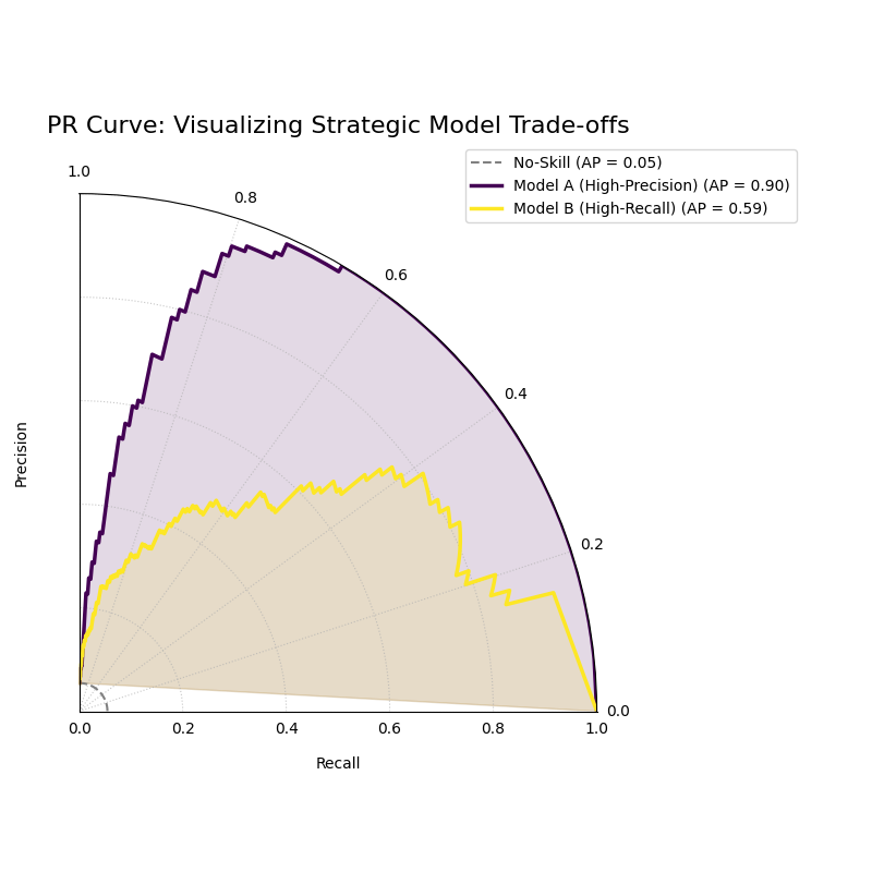
The plot shows Model A achieving high precision at low recall, while Model B achieves high recall at the cost of lower precision.
Best Practice
For classification tasks with a significant class imbalance, the Precision-Recall Curve should be your primary evaluation tool over the ROC Curve. The ROC curve’s inclusion of True Negatives can paint a deceptively optimistic picture when the negative class is vast.
For a deeper dive into the mathematical concepts behind Precision and Recall, please refer to the main Polar Precision-Recall Curve (plot_polar_pr_curve()).
Polar Confusion Matrix
The plot_polar_confusion_matrix() function
provides a visually engaging alternative to the traditional grid-based
confusion matrix. It visualizes the four core components of binary
classification performance (TP, FP, TN, FN) as bars on a polar plot,
making it an excellent tool for at-a-glance model comparison.
To see how this plot transforms a simple table of numbers into an intuitive graphic, let’s first deconstruct its components.
Plot Anatomy
Angle (θ): Each of the four angular sectors is dedicated to one component of the confusion matrix: True Positive (TP), False Positive (FP), True Negative (TN), and False Negative (FN).
Radius (r): The length of a bar represents the number of samples in that category. This can be displayed as a proportion of the total (if
normalize=True) or as raw counts. Ideally, bars in the TP and TN sectors should be long, while bars in the FP and FN sectors should be short.Model Comparison: Different models are represented by different colored bars within each of the four sectors, allowing for direct, side-by-side comparison of performance and error types.
With this framework in mind, we can now apply the plot to a practical scenario.
Use Case 1: Comparing Spam Detection Models
A cybersecurity team is evaluating two new spam detection algorithms. They need to understand not just their overall accuracy, but the specific types of errors each one makes. A “False Positive” (flagging a legitimate email as spam) is highly undesirable as it can disrupt communication, while a “False Negative” (letting a spam email through) is a nuisance.
The Polar Confusion Matrix allows the team to visually compare these error trade-offs. The following code simulates the evaluation of a “Balanced Model” against a more “Aggressive” filter.
 1import kdiagram as kd
 2import numpy as np
 3from sklearn.datasets import make_classification
 4import matplotlib.pyplot as plt
 5
 6# --- 1. Simulate Email Classification Data ---
 7X, y_true = make_classification(
 8    n_samples=2000, n_classes=2, weights=[0.7, 0.3], flip_y=0.1,
 9    random_state=42
10) # 1 = Spam, 0 = Not Spam
11
12# --- 2. Simulate Realistic Prediction Scores ---
13def generate_scores(y_true, pos_mean, scale):
14    """Generate scores from two overlapping normal distributions."""
15    scores = np.zeros_like(y_true, dtype=float)
16    pos_mask = (y_true == 1); neg_mask = (y_true == 0)
17    scores[pos_mask] = np.random.normal(loc=pos_mean, scale=scale, size=pos_mask.sum())
18    scores[neg_mask] = np.random.normal(loc=0.4, scale=scale, size=neg_mask.sum())
19    return np.clip(scores, 0, 1)
20
21# A balanced model with decent performance
22y_pred_balanced = generate_scores(y_true, pos_mean=0.65, scale=0.15)
23# An aggressive model biased towards flagging spam (higher scores overall)
24y_pred_aggressive = generate_scores(y_true, pos_mean=0.75, scale=0.2)
25
26# --- 3. Plotting ---
27kd.plot_polar_confusion_matrix(
28    y_true,
29    y_pred_balanced,
30    y_pred_aggressive,
31    names=["Balanced Model", "Aggressive Filter"],
32    normalize=True, # Show results as proportions
33    title="Spam Detection Model Comparison",
34    savefig="gallery/images/gallery_evaluation_plot_polar_confusion_matrix.png"
35)
36plt.close()
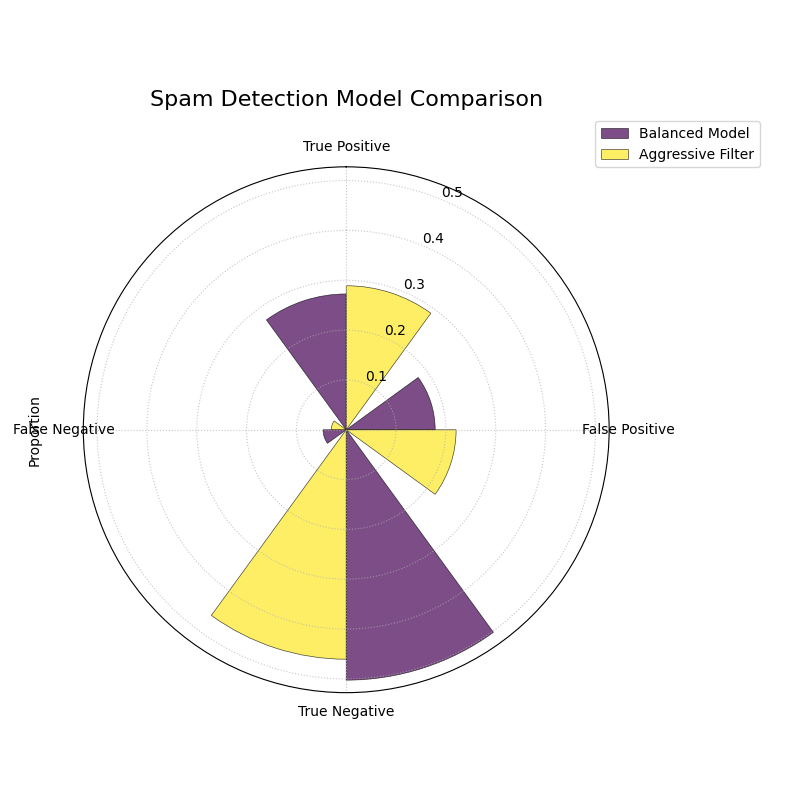
The plot shows the “Aggressive Filter” (orange) has a higher True Positive rate but also a higher False Positive rate than the “Balanced Model” (blue).
The generated plot provides an immediate visual summary of each model’s behavior.
While normalized proportions are excellent for comparing relative performance, some applications require the exact counts. The plot can be customized for this and other presentation needs, as our next use case shows.
Use Case 2: Customizing for a Clinical Trial Report
A medical research team is evaluating a new diagnostic test. For their clinical report, they must present the exact number of patients correctly and incorrectly classified. Furthermore, they want to tailor the visualization to emphasize the most critical outcomes for patient care: False Negatives (missed diagnoses) and True Positives (correct diagnoses).
By setting normalize=False and reordering the sectors with the
categories parameter, they can create a more impactful report figure.
 1# --- 1. Use the same data as the previous example ---
 2# (Assuming y_true, y_pred_balanced, y_pred_aggressive are available)
 3
 4# --- 2. Plotting with Customizations ---
 5kd.plot_polar_confusion_matrix(
 6    y_true,
 7    y_pred_balanced,
 8    y_pred_aggressive,
 9    names=["Balanced Model", "Aggressive Filter"],
10    normalize=False, # Show raw counts instead of proportions
11    title="Diagnostic Test Results (Patient Counts)",
12    # Reorder categories to group by predicted outcome
13    categories=["TP", "FP",
14                "TN", "FN"],
15    # Use custom colors for the report
16    colors=['#003f5c', '#ffa600'],
17    savefig="gallery/images/gallery_evaluation_cm_custom.png"
18)
19plt.close()
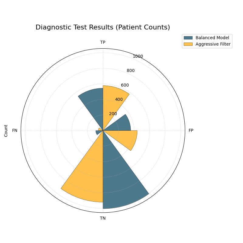
The plot now displays absolute patient counts and has been reordered to place the most critical metrics (TP and FN) side-by-side.
See Also
This plot is designed for binary classification. For tasks with
three or more classes, a different visualization is required. See
the plot_polar_confusion_multiclass()
function for an alternative designed for multiclass problems.
For a deeper dive into the concepts of confusion matrices, please refer to the main Polar Confusion Matrix (plot_polar_confusion_matrix()).
Multiclass Polar Confusion Matrix
The plot_polar_confusion_matrix_in()
function, also available as plot_polar_confusion_multiclass(),
deconstructs a multiclass confusion matrix into an intuitive
visual format. By dedicating an angular sector to each “true” class,
it uses grouped bars to show how those samples were predicted, making it
easy to spot which classes are well-predicted and which are commonly
confused.
To see how this plot transforms a complex grid of numbers into an interpretable graphic, let’s first examine its components.
Plot Anatomy
Angle (θ): Each major angular sector is dedicated to a single True Class (e.g., the actual category of a sample).
Bars Within a Sector: The different colored bars within a True Class’s sector show the distribution of the model’s Predicted Classes. In a perfect model, each sector would contain only a single, long bar corresponding to the correct prediction.
Radius (r): The length of each bar represents the number of samples. This can be displayed as a proportion of the total (if
normalize=True) or as raw counts.
With this framework in mind, we can now apply the plot to a practical scenario in image classification.
Use Case 1: Diagnosing an Image Classifier
An AI team has trained a Convolutional Neural Network (CNN) to classify animal images into four categories: ‘Cat’, ‘Dog’, ‘Fox’, and ‘Wolf’. A simple accuracy score isn’t enough; they need to diagnose the model’s behavior. Which animals does it struggle with? Does it have a specific bias, like confusing visually similar animals such as dogs and wolves?
The following code simulates the model’s predictions, introducing a plausible confusion between canid species, and then visualizes the results.
 1import kdiagram as kd
 2import numpy as np
 3from sklearn.datasets import make_classification
 4import matplotlib.pyplot as plt
 5
 6# --- 1. Simulate Image Classification Data ---
 7class_labels = ["Cat", "Dog", "Fox", "Wolf"]
 8# Create y_true with integer labels 0, 1, 2, 3
 9X, y_true = make_classification(
10    n_samples=2000, n_classes=4, weights=[0.25, 0.35, 0.15, 0.25],
11    flip_y=0.05, n_informative=8, n_clusters_per_class=1, random_state=42
12)
13
14# --- 2. Simulate Realistic Predictions with Confusion ---
15y_pred = y_true.copy()
16# Confuse 30% of Dogs (1) as Wolves (3)
17dog_mask = (y_true == 1) & (np.random.rand(2000) < 0.30)
18y_pred[dog_mask] = 3
19# Confuse 20% of Foxes (2) as Cats (0)
20fox_mask = (y_true == 2) & (np.random.rand(2000) < 0.20)
21y_pred[fox_mask] = 0
22
23# --- 3. Plotting ---
24kd.plot_polar_confusion_matrix_in(
25    y_true,
26    y_pred,
27    class_labels=class_labels,
28    normalize=True, # Show results as proportions
29    title="Animal Image Classifier Performance",
30    savefig="gallery/images/gallery_evaluation_multiclass_cm.png"
31)
32plt.close()
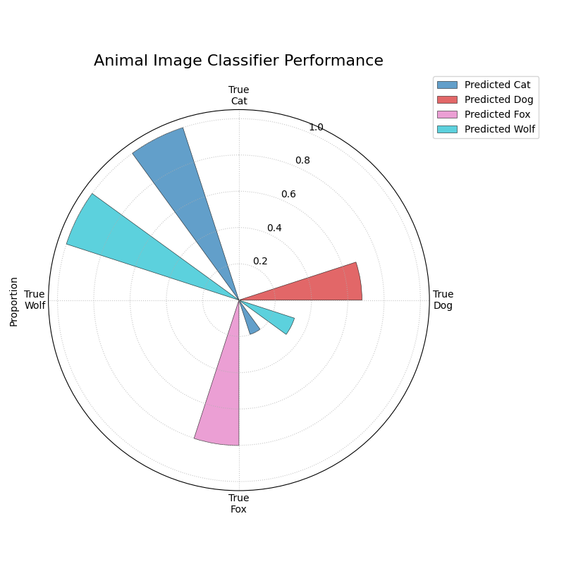
The plot reveals that the model performs well on ‘Cats’ and ‘Wolves’ but frequently confuses ‘Dogs’ with ‘Wolves’.
The generated plot provides an immediate diagnostic report on the model’s behavior.
While normalized proportions are great for understanding error rates, some applications depend on the absolute number of errors. The plot can be customized for this and other presentation needs.
Use Case 2: Customizing for an Inventory Management Report
A retail company uses an automated system to classify products into categories. Misclassifying a few expensive ‘Electronics’ items as ‘Groceries’ can be a costly error. The logistics team needs a report showing the raw count of misclassified items. For their weekly meeting, they want a plot that orients the most problematic category, ‘Electronics’, at the top for immediate focus.
 1# --- 1. Simulate Inventory Data ---
 2# (Using the same y_true and y_pred logic from Use Case 1,
 3# but with different labels for the new context)
 4inventory_labels = ["Electronics", "Apparel", "Home Goods", "Groceries"]
 5
 6# --- 2. Plotting with Customizations ---
 7kd.plot_polar_confusion_matrix_in(
 8    y_true,
 9    y_pred,
10    class_labels=inventory_labels,
11    normalize=False, # Show raw item counts
12    title="Inventory Misclassification (Weekly Report)",
13    cmap='Set2', # Use a different color palette
14    # Place the first class ('Electronics') at the North position
15    zero_at='N',
16    savefig="gallery/images/gallery_evaluation_multiclass_cm_custom.png"
17)
18plt.close()
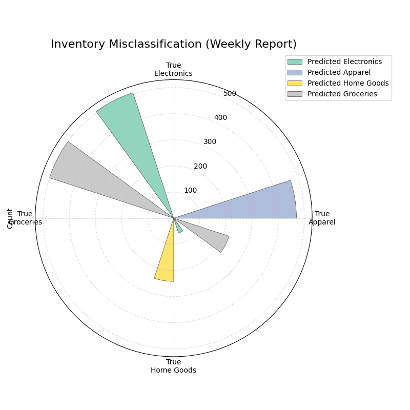
The plot now displays absolute item counts and has been oriented to place the “True Electronics” category at the top for emphasis.
See Also
This plot is designed for multiclass classification. For tasks with
only two classes, the binary version,
plot_polar_confusion_matrix(),
provides a more specialized visualization.
For a deeper dive into the concepts of confusion matrices, please refer to the Multiclass Polar Confusion Matrix (plot_polar_confusion_matrix_in()) section.
Polar Classification Report
The plot_polar_classification_report()
function provides a detailed, per-class performance breakdown for a
multiclass classifier. It moves beyond a single accuracy score to
visualize the key metrics of Precision, Recall, and F1-Score for
each class in an intuitive polar bar chart, making it easy to diagnose
a model’s specific strengths and weaknesses.
To appreciate how this plot effectively summarizes a standard classification report, let’s first deconstruct its components.
Plot Anatomy
Angle (θ): Each major angular sector is dedicated to a single Class from the dataset (e.g., “Class Alpha”).
Bars Within a Sector: The three different colored bars within a class’s sector represent the key performance metrics: Precision, Recall, and the F1-Score.
Radius (r): The length of each bar represents the score for that metric, on a scale from 0 (at the center) to 1 (at the edge). Taller bars indicate better performance for that specific metric and class.
With this framework in mind, let’s apply the plot to a common challenge in machine learning: evaluating a model trained on imbalanced data.
Use Case 1: Diagnosing an Imbalanced Classifier
A data science team is classifying customer support tickets into three categories: ‘Technical Issue’, ‘Billing Inquiry’, and ‘General Feedback’. The dataset is naturally imbalanced—most tickets are ‘Technical’, while ‘General Feedback’ is rare. A high overall accuracy score could be misleading if the model is simply ignoring the minority class.
The Polar Classification Report is the perfect tool to diagnose this per-class performance and uncover any hidden weaknesses.
 1import kdiagram as kd
 2import numpy as np
 3from sklearn.datasets import make_classification
 4import matplotlib.pyplot as plt
 5
 6# --- 1. Simulate Imbalanced Support Ticket Data ---
 7class_labels = ["Technical Issue", "Billing Inquiry", "General Feedback"]
 8X, y_true = make_classification(
 9    n_samples=2000, n_classes=3, weights=[0.6, 0.3, 0.1], # Imbalanced
10    flip_y=0.1, n_informative=10, n_clusters_per_class=1, random_state=42
11)
12
13# --- 2. Simulate predictions where model struggles with minority class ---
14y_pred = y_true.copy()
15# Confuse 50% of the rare 'General Feedback' class (2) as 'Technical' (0)
16feedback_mask = (y_true == 2) & (np.random.rand(2000) < 0.5)
17y_pred[feedback_mask] = 0
18
19# --- 3. Plotting ---
20kd.plot_polar_classification_report(
21    y_true,
22    y_pred,
23    class_labels=class_labels,
24    title="Support Ticket Classifier Performance (Initial Model)",
25    savefig="gallery/images/gallery_evaluation_class_report.png"
26)
27plt.close()
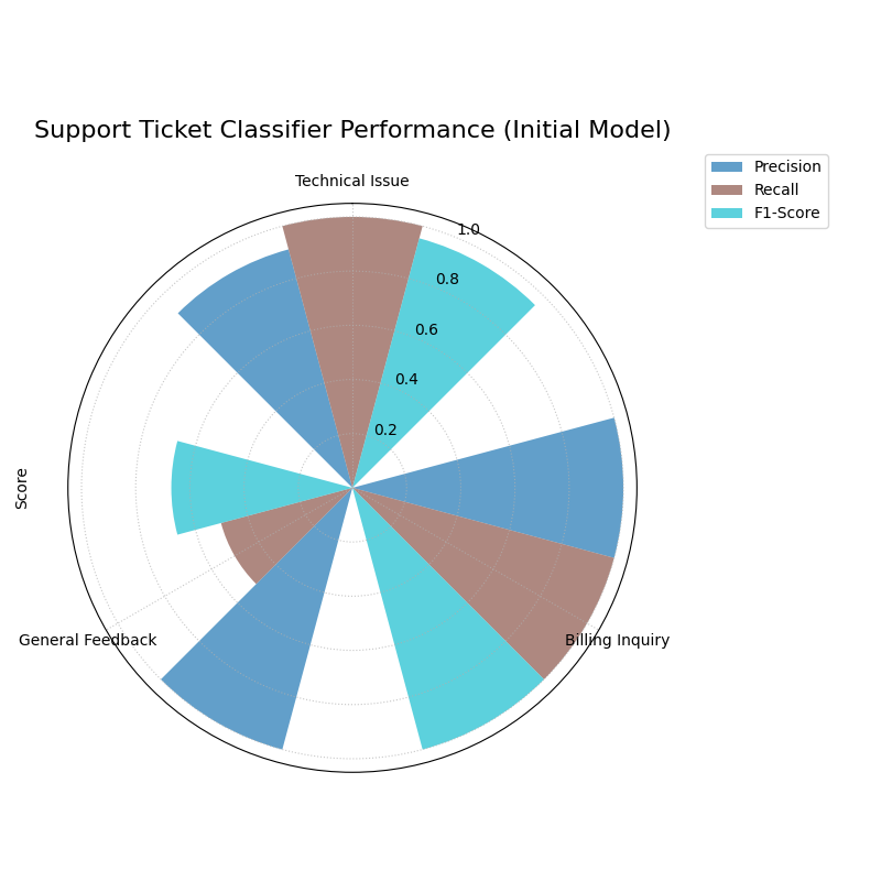
The plot shows high scores for the majority class (‘Technical Issue’) but very poor scores, especially Recall, for the minority class (‘General Feedback’).
The generated plot immediately highlights the problem.
This plot is not just a static diagnostic tool; it is also invaluable for demonstrating the impact of model improvements, as our next use case shows.
Use Case 2: Comparing Models Before and After Tuning
After diagnosing the problem, the team retrains their model, this time using class weights to force it to pay more attention to the minority ‘General Feedback’ class. To showcase their success to stakeholders, they need a clear, side-by-side comparison of the model’s performance before and after this tuning.
By passing an ax object, we can create subplots to generate a powerful comparative visualization.
 1# --- 1. Use y_true and the initial y_pred from Use Case 1 ---
 2y_pred_before = y_pred
 3
 4# --- 2. Simulate improved predictions after tuning ---
 5y_pred_after = y_true.copy()
 6# Now, only 20% of 'General Feedback' are confused
 7feedback_mask_after = (y_true == 2) & (np.random.rand(2000) < 0.2)
 8y_pred_after[feedback_mask_after] = 0
 9
10# --- 3. Plotting side-by-side ---
11fig, axes = plt.subplots(1, 2, figsize=(16, 8),
12                         subplot_kw={'projection': 'polar'})
13
14# Plot Before
15kd.plot_polar_classification_report(
16    y_true, y_pred_before, class_labels=class_labels,
17    title="Before Tuning", ax=axes[0],
18    # Use custom colors for metrics for visual consistency
19    colors=['#1f77b4', '#ff7f0e', '#2ca02c']
20)
21# Plot After
22kd.plot_polar_classification_report(
23    y_true, y_pred_after, class_labels=class_labels,
24    title="After Tuning (with Class Weights)", ax=axes[1],
25    colors=['#1f77b4', '#ff7f0e', '#2ca02c']
26)
27fig.savefig("gallery/images/gallery_evaluation_class_report_comparison.png")
28plt.close(fig)
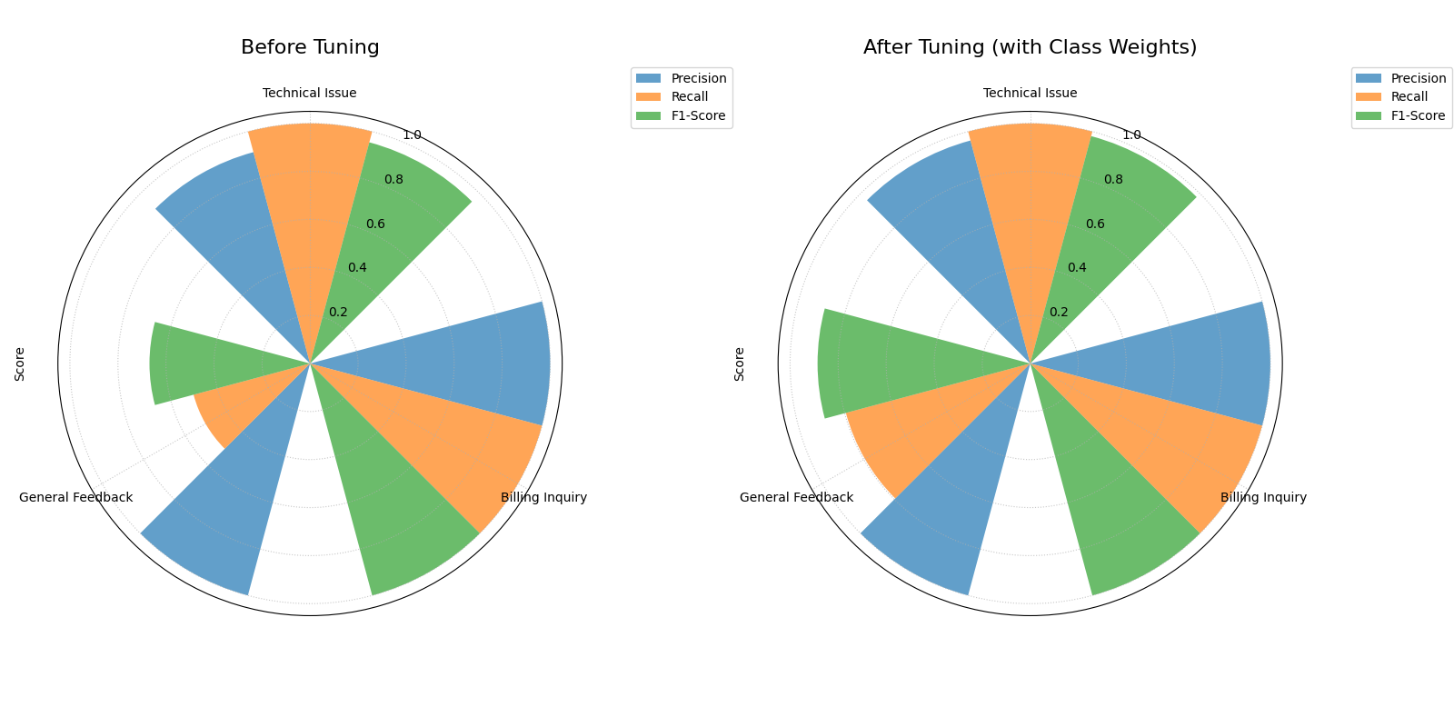
The side-by-side plots clearly show the significant improvement in Recall and F1-Score for the ‘General Feedback’ class after tuning.
Best Practice
Use this plot in conjunction with a Multiclass Polar Confusion Matrix. The classification report shows you how well a model performs on a class, while the confusion matrix shows you where the errors are going—the specific patterns of misclassification.
For a deeper dive into the definitions of Precision, Recall, and F1-Score, please refer to the main Polar Classification Report (plot_polar_classification_report()) section.
Application: A Holistic View of Classifier Performance
Individual evaluation plots are excellent for diagnosing specific aspects of a model’s performance. However, their true power is unlocked when they are used together as a visual dashboard to build a complete, holistic understanding of a classifier’s behavior.
This application demonstrates how to combine the polar confusion matrix, classification report, and PR curve to solve a realistic business problem, leading to a nuanced and data-driven decision.
The Problem: Classifying E-Commerce Support Tickets
Practical Example
An e-commerce company uses an AI model to automatically classify incoming customer support emails into three categories - ‘Returns’, ‘Shipping Inquiry’, and ‘Product Feedback’. The business has specific, and sometimes conflicting, operational needs:
‘Returns’ are time-sensitive and costly if misclassified. They must be identified with the highest possible Recall, even if it means some other tickets are incorrectly flagged as returns.
‘Shipping Inquiry’ tickets must be routed to the correct department. High Precision is critical to avoid sending customers down the wrong path and increasing resolution time.
‘Product Feedback’ is a lower priority and can tolerate more errors.
The dataset is highly imbalanced, with ‘Returns’ being the rarest category. The team needs to evaluate two models—a baseline Logistic Regression and a more complex Random Forest—to determine which one best meets these complex business requirements.
Translating the Problem into a Visual Dashboard
To get a complete picture, we will generate a three-panel dashboard. This will allow us to move from a high-level overview of errors to a detailed, per-class metric analysis, and finally to a focused comparison on the most critical business task.
The following code simulates the models’ performance and creates this diagnostic dashboard.
 1import kdiagram as kd
 2import numpy as np
 3from sklearn.datasets import make_classification
 4import matplotlib.pyplot as plt
 5
 6# --- 1. Simulate Imbalanced E-Commerce Support Data ---
 7class_labels = ["Shipping Inquiry", "Product Feedback", "Returns"]
 8# Class 2 ('Returns') is the rare, critical class
 9X, y_true = make_classification(
10    n_samples=3000, n_classes=3, weights=[0.45, 0.45, 0.1],
11    flip_y=0.1, n_informative=12, n_clusters_per_class=1, random_state=42
12)
13
14# --- 2. Simulate Realistic Predictions from Two Models ---
15def generate_scores(y_true, class_means, class_scales):
16    """Generate scores from class-specific normal distributions."""
17    n_classes = len(class_means)
18    scores = np.zeros((len(y_true), n_classes))
19    for i in range(n_classes):
20        mask = (y_true == i)
21        scores[mask, :] = np.random.normal(
22            loc=class_means[i], scale=class_scales[i], size=(mask.sum(), n_classes)
23        )
24    return np.exp(scores) / np.exp(scores).sum(axis=1, keepdims=True)
25
26# Logistic Regression: Modest performance
27lr_scores = generate_scores(y_true,
28    class_means=[[1, 0, 0], [0, 1, 0], [0, 0, 1]],
29    class_scales=[0.8, 0.8, 1.2]
30)
31y_pred_lr = np.argmax(lr_scores, axis=1)
32
33# Random Forest: Better overall, especially at identifying 'Returns'
34rf_scores = generate_scores(y_true,
35    class_means=[[2, 0, 0.5], [0, 2, 0.5], [0.5, 0, 3]],
36    class_scales=[0.5, 0.5, 0.8]
37)
38y_pred_rf = np.argmax(rf_scores, axis=1)
39
40# --- 3. Create the 2x2 Dashboard ---
41fig, axes = plt.subplots(2, 2, figsize=(18, 18),
42                         subplot_kw={'projection': 'polar'})
43fig.suptitle("E-Commerce Classifier Evaluation Dashboard", fontsize=24, y=1.02)
44
45# Top-Left: Confusion Matrix for the best model (Random Forest)
46kd.plot_polar_confusion_matrix_in(
47    y_true, y_pred_rf, class_labels=class_labels, ax=axes[0, 0],
48    title="Random Forest: Confusion Patterns", normalize=False,
49    colors=['#1a5f7a', '#57c5b6', '#ffc93c']
50)
51
52# Top-Right: Classification Report for the Random Forest
53kd.plot_polar_classification_report(
54    y_true, y_pred_rf, class_labels=class_labels, ax=axes[0, 1],
55    title="Random Forest: Per-Class Metrics",
56    colors=['#003f5c', '#bc5090', '#ffa600']
57)
58
59# Bottom-Left: PR Curve for the critical 'Returns' class (Class 2)
60# We treat this as a one-vs-rest problem for the PR curve
61y_true_returns = (y_true == 2).astype(int)
62# Use the probability of the 'Returns' class for the PR curve
63lr_scores_returns = lr_scores[:, 2]
64rf_scores_returns = rf_scores[:, 2]
65kd.plot_polar_pr_curve(
66    y_true_returns, rf_scores_returns, lr_scores_returns,
67    names=["Random Forest", "Logistic Regression"], ax=axes[1, 0],
68    title="PR Curve for 'Returns' Class",
69)
70# Hide the unused subplot in the bottom-right
71fig.delaxes(axes[1, 1])
72fig.savefig("gallery/images/gallery_evaluation_dashboard_2x2.png")
73plt.close(fig)
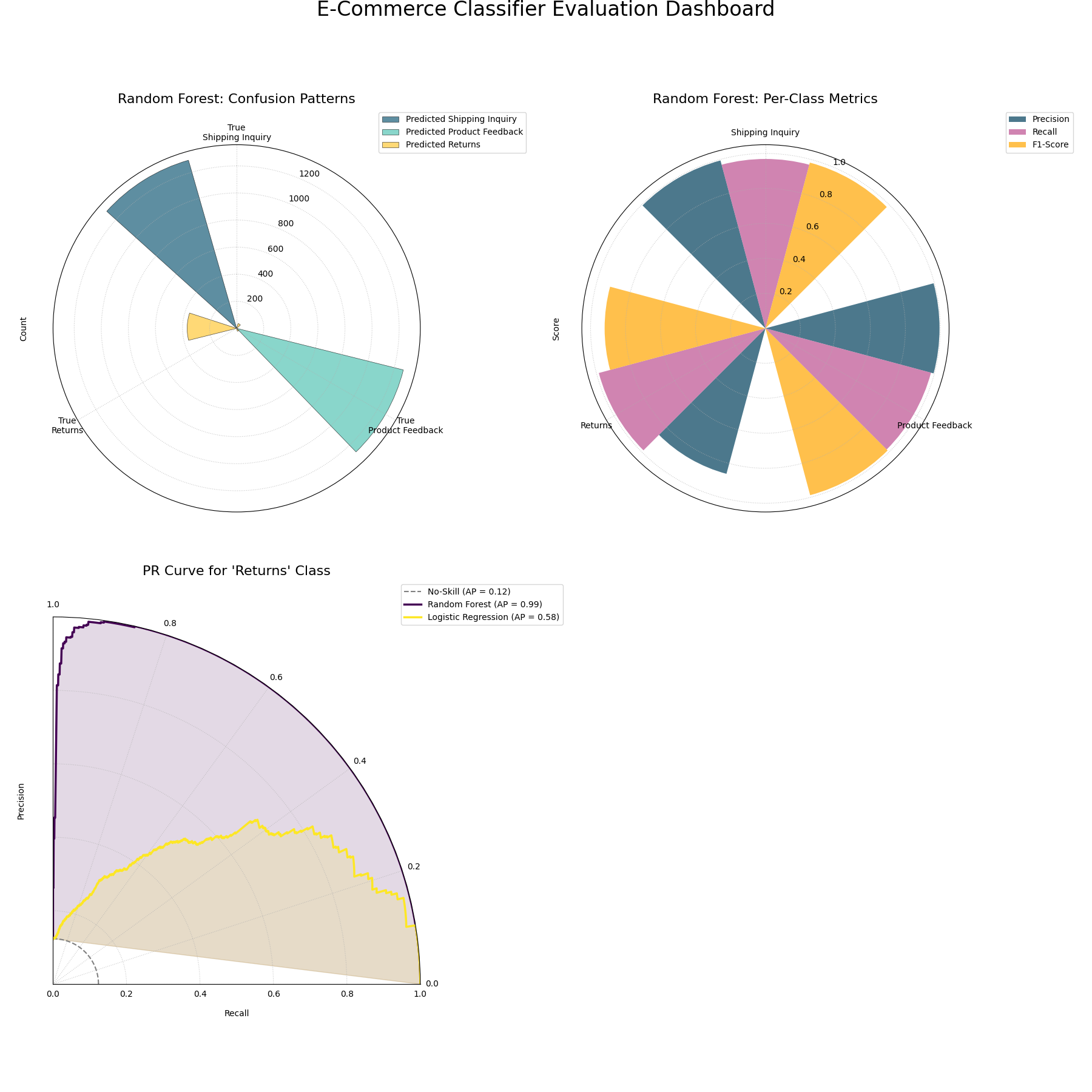
A comprehensive evaluation dashboard using three polar plots to provide a holistic view of classifier performance.
Polar Pinball Loss
The plot_pinball_loss() function
provides a granular view of a probabilistic forecast’s performance by
visualizing the Pinball Loss for each predicted quantile. While a
single score like the CRPS gives an overall average error, this plot
diagnoses where in the distribution a model is accurate and where it
struggles.
To understand how this plot reveals a model’s predictive characteristics, let’s first deconstruct its components.
Plot Anatomy
Angle (θ): Represents the Quantile Level, sweeping from 0 to 1 around the circle. For example, the 0.5 quantile (the median) is typically at the bottom of the plot.
Radius (r): The radial distance from the center represents the Average Pinball Loss for that specific quantile. Unlike other plots, here a smaller radius is better, indicating a more accurate forecast for that quantile level.
Shape: The overall shape of the resulting polygon is highly informative. A symmetrical “butterfly” shape often indicates a well-calibrated model that is more certain about the median than the tails, while a lopsided shape can reveal a systematic bias in the forecast.
With this framework in mind, let’s apply the plot to a practical forecasting problem.
Use Case 1: Diagnosing a Temperature Forecast Model
A meteorology team has developed a new model to predict the next day’s temperature range. Instead of a single value, it predicts a full probability distribution, which is summarized by various quantiles (e.g., the 10th, 50th, and 90th percentiles). A key question is whether the model is equally good at predicting the median temperature as it is at predicting the extreme cold or hot temperatures in the tails of the distribution.
The following code simulates a common scenario: a model that is very accurate at predicting the median but less certain about the extremes.
 1import kdiagram as kd
 2import numpy as np
 3from scipy.stats import norm
 4import matplotlib.pyplot as plt
 5
 6# --- 1. Simulate True Values and Quantile Predictions ---
 7np.random.seed(0)
 8n_samples = 1000
 9y_true = np.random.normal(loc=15, scale=5, size=n_samples) # Daily temps
10quantiles = np.array([0.05, 0.1, 0.25, 0.5, 0.75, 0.9, 0.95])
11
12# Simulate a model that is better at the median, worse at the tails
13# This is done by varying the scale of the normal distribution
14scales = np.array([8, 6, 4, 3, 4, 6, 8])
15y_preds = norm.ppf(
16    quantiles, loc=y_true[:, np.newaxis], scale=scales
17)
18
19# --- 2. Plotting ---
20kd.plot_pinball_loss(
21    y_true,
22    y_preds,
23    quantiles,
24    title="Temperature Forecast Performance by Quantile",
25    savefig="gallery/images/gallery_evaluation_plot_pinball_loss.png"
26)
27plt.close()
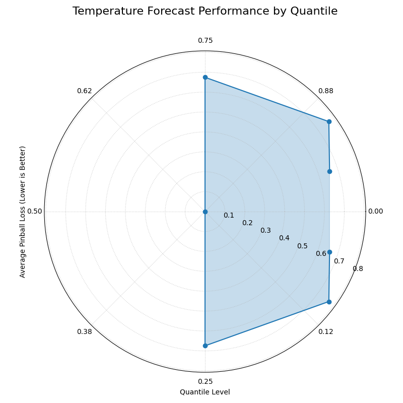
The plot shows a “butterfly” shape, with the smallest loss (radius) at the 0.5 quantile and the largest losses at the extreme tails.
The generated plot provides an immediate diagnostic report on the model’s behavior.
While a single plot is great for diagnosis, the next step is often to compare a new model against an existing one. For such comparisons, focusing on the shape of the loss profile can be more insightful than the exact loss values.
Use Case 2: Comparing Model Performance Profiles
The meteorology team now wants to compare their new, sophisticated model against a simpler baseline model. For their report, they want a side-by-side visualization that emphasizes the difference in the performance shape of the two models. They decide to mask the radial tick labels to focus the audience’s attention on the contrasting shapes of the loss curves.
 1# --- 1. Use data from Use Case 1 for the sophisticated model ---
 2# (Assuming y_true, quantiles, and y_preds are available)
 3y_preds_sophisticated = y_preds
 4
 5# --- 2. Simulate a simpler baseline model ---
 6# This model has a constant, larger uncertainty across all quantiles
 7y_preds_baseline = norm.ppf(
 8    quantiles, loc=y_true[:, np.newaxis], scale=7
 9)
10
11# --- 3. Plotting side-by-side ---
12fig, axes = plt.subplots(1, 2, figsize=(16, 8),
13                         subplot_kw={'projection': 'polar'})
14
15# Plot Sophisticated Model
16kd.plot_pinball_loss(
17    y_true, y_preds_sophisticated, quantiles,
18    title="Sophisticated Model Profile",
19    ax=axes[0],
20    colors='r'
21)
22# Plot Baseline Model and mask the radius labels
23kd.plot_pinball_loss(
24    y_true, y_preds_baseline, quantiles,
25    title="Baseline Model Profile",
26    mask_radius=True, # Focus on the shape
27    ax=axes[1],
28    colors='r',
29)
30fig.savefig("gallery/images/gallery_evaluation_pinball_comparison.png")
31plt.close(fig)
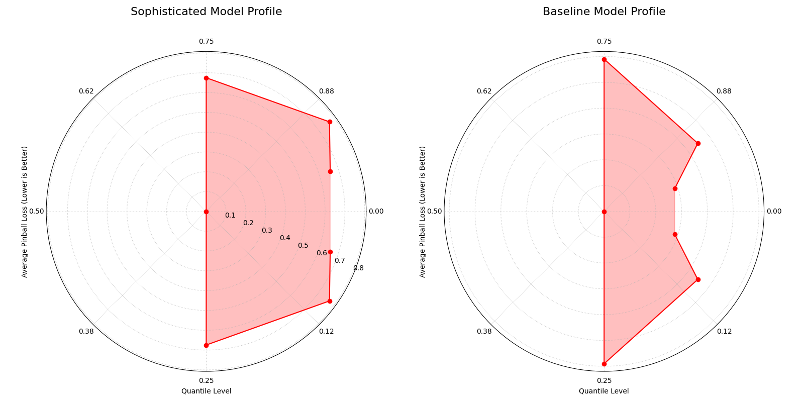
The side-by-side plots contrast the specialized “butterfly” shape of the sophisticated model with the more uniform, circular loss profile of the baseline model.
Best Practice
Pinball Loss is the only strictly proper scoring rule for evaluating quantile forecasts. Unlike Mean Squared Error, it correctly penalizes under-prediction and over-prediction asymmetrically, in proportion to the quantile level, making it the industry standard for this task.
For a deeper dive into the mathematical definition of the Pinball Loss function, please refer to the main Pinball Loss Plot (plot_pinball_loss()).
Polar Performance Chart
The plot_regression_performance()
function provides a holistic, multi-metric dashboard for comparing
regression models. It uses a grouped polar bar chart to visualize
several performance scores at once, making it an exceptional tool for
understanding the unique strengths, weaknesses, and trade-offs of each
model at a single glance.
To appreciate how this plot can distill a complex comparison into a clear visual summary, let’s first deconstruct its components.
Plot Anatomy
Angle (θ): Each major angular sector is dedicated to a single Evaluation Metric, such as R², MAE, or RMSE.
Bars Within a Sector: The different colored bars within a metric’s sector represent the different Models being compared.
Radius (r): The length of a bar represents the model’s Normalized Score for that metric. For this plot, all metrics are scaled so that a longer bar is always better.
Reference Rings: The plot includes two rings for context. The outer solid green ring is the “Best Performance” line (a normalized score of 1), while the inner dashed red ring is the “Worst Performance” line (a score of 0).
With this framework in mind, let’s apply the plot to a common challenge in machine learning: diagnosing the nature of model errors.
Default Metrics & Custom Metric Addition
Use Case 1: Diagnosing Model Error Types
A financial firm is building a model to predict house prices. After training, they have three candidate models with very different behaviors:
A “Good Model” that serves as a solid baseline.
A “Biased Model” that is consistently off by a fixed amount (e.g., always predicts $10k too low).
A “High Variance Model” whose predictions are on average correct, but individual errors are large and unpredictable.
The team needs to diagnose and quantify these issues. They start by visualizing the standard regression metrics.
Default Metrics Analysis
 1import kdiagram as kd
 2import numpy as np
 3import matplotlib.pyplot as plt
 4
 5# --- 1. Simulate Housing Price Data and Predictions ---
 6np.random.seed(0)
 7n_samples = 200
 8y_true = np.random.rand(n_samples) * 500 # Price in $1000s
 9
10y_pred_good = y_true + np.random.normal(0, 25, n_samples)
11y_pred_biased = y_true - 50 + np.random.normal(0, 10, n_samples)
12y_pred_variance = y_true + np.random.normal(0, 75, n_samples)
13model_names = ["Good Model", "Biased Model", "High Variance"]
14
15# --- 2. Plotting with Default Metrics ---
16kd.plot_regression_performance(
17    y_true,
18    y_pred_good, y_pred_biased, y_pred_variance,
19    names=model_names,
20    title="Performance with Default Metrics",
21    metric_labels={'r2': 'R²', 'neg_mean_absolute_error': 'MAE',
22                   'neg_root_mean_squared_error': 'RMSE'},
23    colors = ["g", "b", "r"],
24    savefig="gallery/images/gallery_plot_regression_performance_default.png"
25)
26plt.close()
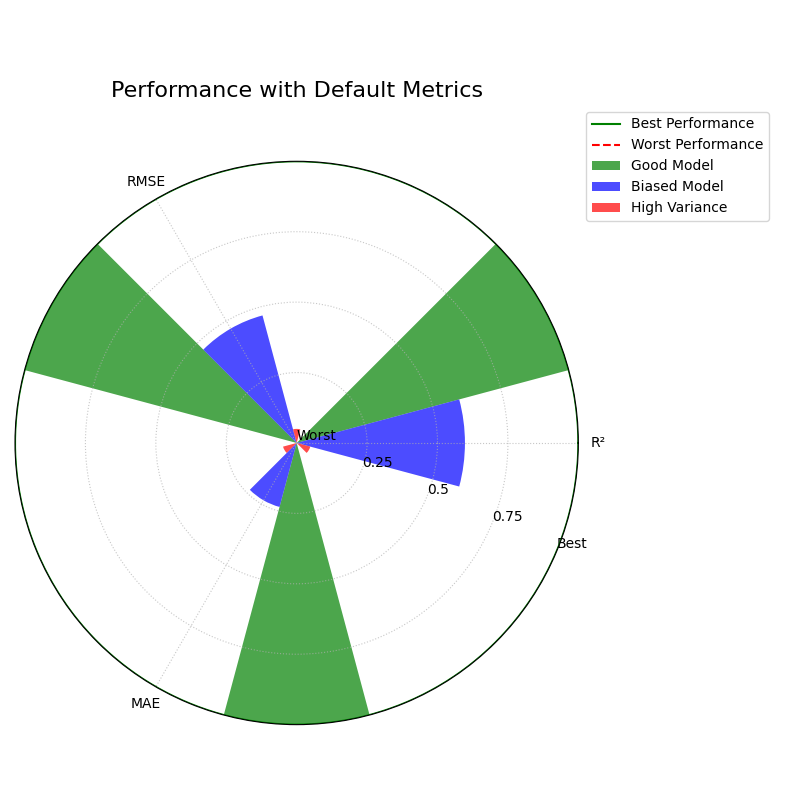
The plot shows the “Biased Model” performing best on MAE but worst on R², revealing its specific error profile.
Adding a Custom Metric for Deeper Insight
Now, the team suspects the “High Variance” model is particularly affected by a few extreme outliers. To investigate this, they add a more robust metric, Median Absolute Error (MedAE), which is less sensitive to outliers than MAE or RMSE.
 1from sklearn.metrics import median_absolute_error
 2
 3# --- 1. Use the same data as above ---
 4# (Assuming y_true, y_preds, and model_names are available)
 5
 6# --- 2. Define a custom scorer function ---
 7# Note: Scikit-learn convention is "higher is better," so we negate errors.
 8def median_abs_error_scorer(y_true, y_pred):
 9    return -median_absolute_error(y_true, y_pred)
10
11# --- 3. Plotting with Added Custom Metric ---
12kd.plot_regression_performance(
13    y_true,
14    y_pred_good, y_pred_biased, y_pred_variance,
15    names=model_names,
16    metrics=[median_abs_error_scorer], # Add the custom metric
17    add_to_defaults=True,           # Keep the default metrics
18    title="Performance with Added Custom Metric",
19    metric_labels={'r2': 'R²', 'neg_mean_absolute_error': 'MAE',
20                   'neg_root_mean_squared_error': 'RMSE',
21                   'median_abs_error_scorer': 'MedAE'},
22    bp_padding=0.98, # Out the best performance to the main circle.
23    colors = ["g", "b", "r"],
24    savefig="gallery/images/gallery_plot_regression_performance_custom.png"
25)
26plt.close()
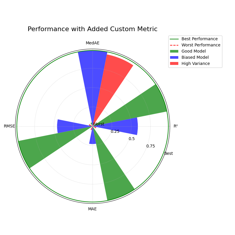
The addition of the MedAE metric provides a more complete picture of each model’s error characteristics.
While the previous use case focused on relative performance, sometimes we must judge models against a fixed, absolute standard.
Use Case 2: Evaluating Against Production Benchmarks
The housing price prediction team now wants to evaluate two new “Challenger” models against their current “Champion” model, which is already in production. The company has established minimum performance criteria for production models (e.g., R² must be > 0.8).
To do this, they use the function’s “values mode” by passing
pre-computed scores, and they set norm='global' to compare all
models against a fixed, absolute scale.
 1# --- 1. Define pre-computed scores and model names ---
 2model_names = ["Champion", "Challenger A", "Challenger B"]
 3metric_values = {
 4    'r2': [0.92, 0.95, 0.78],  # R² (higher is better)
 5    'neg_mean_absolute_error': [-15.5, -18.2, -12.1] # MAE (negated)
 6}
 7
 8# --- 2. Define absolute bounds for normalization ---
 9# These are the business-defined ranges for performance.
10global_bounds = {
11    'r2': (0.80, 1.0), # Min acceptable R² is 0.8
12    'neg_mean_absolute_error': (-25.0, -10.0) # Acceptable MAE is 10-25
13}
14
15# --- 3. Plotting with Global Normalization ---
16kd.plot_regression_performance(
17    names=model_names,
18    metric_values=metric_values,
19    norm='global',
20    global_bounds=global_bounds,
21    title="Evaluating Challengers Against Production Benchmarks",
22    metric_labels={'r2': 'R²', 'neg_mean_absolute_error': 'MAE'},
23    savefig="gallery/images/gallery_regression_perf_global_norm.png"
24)
25plt.close()
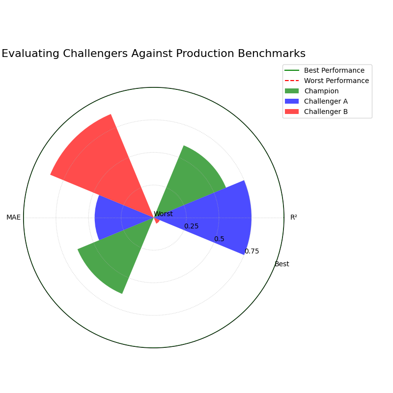
The plot shows absolute performance, revealing that Challenger B fails to meet the minimum R² threshold.
Best Practice
Use
norm='per_metric'(the default) for exploratory analysis to quickly identify the relative strengths and weaknesses of a set of candidate models.Use
norm='global'for model monitoring or when comparing candidates against established, fixed performance benchmarks.
Pre-calculated & Overriding Metrics Behavior
While the previous use case focused on relative performance, sometimes we must judge models against a fixed, absolute standard or visualize scores that have already been computed.
Use Case 3: Plotting Pre-calculated Scores
Often, performance metrics are generated by an automated pipeline or a colleague and exist in a table or report. The analyst’s job is not to re-run the models, but to create a compelling visualization from these existing scores.
This example shows how to use the metric_values parameter to plot a
dictionary of pre-calculated scores directly, decoupling the
visualization from the model execution.
 1import kdiagram as kd
 2import matplotlib.pyplot as plt
 3
 4# --- 1. Assume these scores came from a report ---
 5precalculated_scores = {
 6    'R²': [0.85, 0.55, 0.65],
 7    'MAE': [-4.0, -10.5, -12.0], # Negated errors
 8    'RMSE': [-5.0, -11.0, -15.0] # Negated errors
 9}
10model_names = ["Good Model", "Biased Model", "High Variance"]
11
12# --- 2. Plotting ---
13kd.plot_regression_performance(
14    metric_values=precalculated_scores,
15    names=model_names,
16    title="Performance from Pre-calculated Scores",
17    cmap='Set2',
18    # Optional: Mute axis labels for a cleaner look
19    metric_labels={'R²':'R²', 'MAE': 'MAE', 'RMSE': 'RMSE'},
20    colors = ["g", "b", "r"],
21    savefig="gallery/images/gallery_plot_regression_performance_precalc.png"
22)
23plt.close()
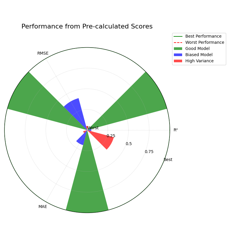
The chart accurately visualizes the pre-calculated scores, providing an instant comparison of the three models.
The function’s flexibility extends to how it interprets metrics themselves, ensuring correct visualization even for non-standard, user-defined functions.
Use Case 4: Overriding Metric Behavior
A data scientist creates a new, domain-specific error metric called
custom_deviation. Because the function name does not contain “error”
or “loss,” the plotting function would incorrectly assume a higher
score is better. This would lead to a completely inverted and misleading
visualization for that metric.
This use case demonstrates how the crucial higher_is_better
parameter is used to give the function explicit instructions, ensuring
the plot correctly represents the metric’s intent.
 1# --- 1. Use data from the first example ---
 2# (Assuming y_true, y_pred_good, y_pred_biased, etc.
 3# are available from previous examples)
 4
 5# --- 2. A custom error metric with a neutral name ---
 6def custom_deviation(y_true, y_pred):
 7    return np.mean(np.abs(y_true - y_pred)) # Lower is better
 8
 9# --- 3. Plotting with the override ---
10kd.plot_regression_performance(
11    y_true,
12    y_pred_good, y_pred_biased,
13    names=["Good Model", "Biased Model"],
14    metrics=['r2', custom_deviation],
15    title="Ensuring Correct Metric Interpretation",
16    metric_labels={'r2': 'R²', 'custom_deviation': 'Custom Deviation'},
17    # Explicitly tell the function lower is better for our metric
18    higher_is_better={'custom_deviation': False},
19    colors = ["g", "b"],
20    savefig="gallery/images/gallery_plot_regression_performance_override.png"
21)
22plt.close()
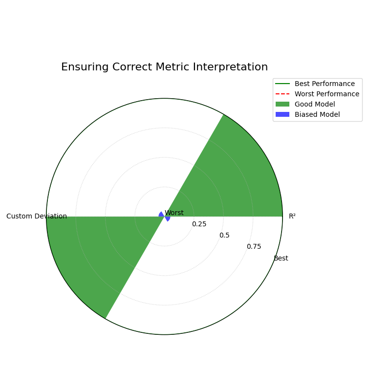
By explicitly setting higher_is_better to False, the plot correctly shows the “Biased Model” as the top performer on the custom error metric.
Best Practice
Always use higher_is_better to manually specify the behavior
of custom error metrics with ambiguous names to ensure your
visualizations are correct.
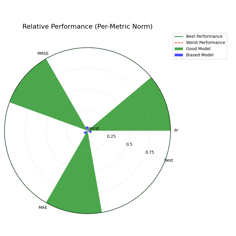
Controlling Normalization Strategies
Use Case 5: Controlling Perspective with Normalization
Beyond adding or removing metrics, one of this plot’s most powerful
features is its ability to change the entire analytical “perspective”
using the norm parameter. This controls how raw scores are scaled
into bar lengths, allowing you to seamlessly switch between asking
“Which model is relatively better?” and “Does this model meet our
absolute quality standards?”.
To demonstrate this, we will generate data for a “Good Model” and a “Biased Model” and visualize their performance using all three normalization strategies.
 1import kdiagram as kd
 2import matplotlib.pyplot as plt
 3import numpy as np
 4
 5# --- 1. Define distinct model error profiles ---
 6np.random.seed(0)
 7n_samples = 200
 8y_true = np.random.rand(n_samples) * 50
 9
10y_pred_good = y_true + np.random.normal(0, 5, n_samples)
11y_pred_biased = y_true - 10 + np.random.normal(0, 2, n_samples)
12model_names = ["Good Model", "Biased Model"]
13
14# --- 2. Define consistent labels for all plots ---
15metric_labels = {'r2': 'R²', 'neg_mean_absolute_error': 'MAE',
16                 'neg_root_mean_squared_error': 'RMSE'}
17
18colors =['green', 'blue']
Perspective 1: Relative Comparison (norm=”per_metric”)
This is the default and most common mode. It scales each metric independently, setting the best-performing model for that metric to 1 (“Best”) and the worst to 0 (“Worst”). This is ideal for quickly understanding the relative strengths and weaknesses of the models you are comparing.
 1kd.plot_regression_performance(
 2    y_true, y_pred_good, y_pred_biased,
 3    names=model_names,
 4    metric_labels=metric_labels,
 5    norm="per_metric",
 6    title="Relative Performance (Per-Metric Norm)",
 7    colors = colors,
 8    savefig="gallery/images/gallery_plot_regression_performance_per_metric.png"
 9)
10plt.close()
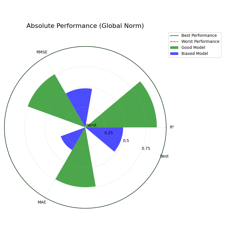
Perspective 2: Absolute Benchmarks (norm=”global”)
A relative ranking is useful, but in production, models often need to
meet fixed quality standards. This mode compares models against a
predefined, absolute scale that you define with global_bounds.
 1# Define a benchmark for what "good" and "bad" means for each metric
 2global_bounds = {
 3    "r2": (0.0, 1.0),
 4    "neg_mean_absolute_error": (-15.0, 0.0),
 5    "neg_root_mean_squared_error": (-20.0, 0.0),
 6}
 7
 8kd.plot_regression_performance(
 9    y_true, y_pred_good, y_pred_biased,
10    names=model_names,
11    metric_labels=metric_labels,
12    norm="global",
13    global_bounds=global_bounds,
14    title="Absolute Performance (Global Norm)",
15    colors = colors,
16    savefig="gallery/images/gallery_plot_regression_performance_global.png"
17)
18plt.close()
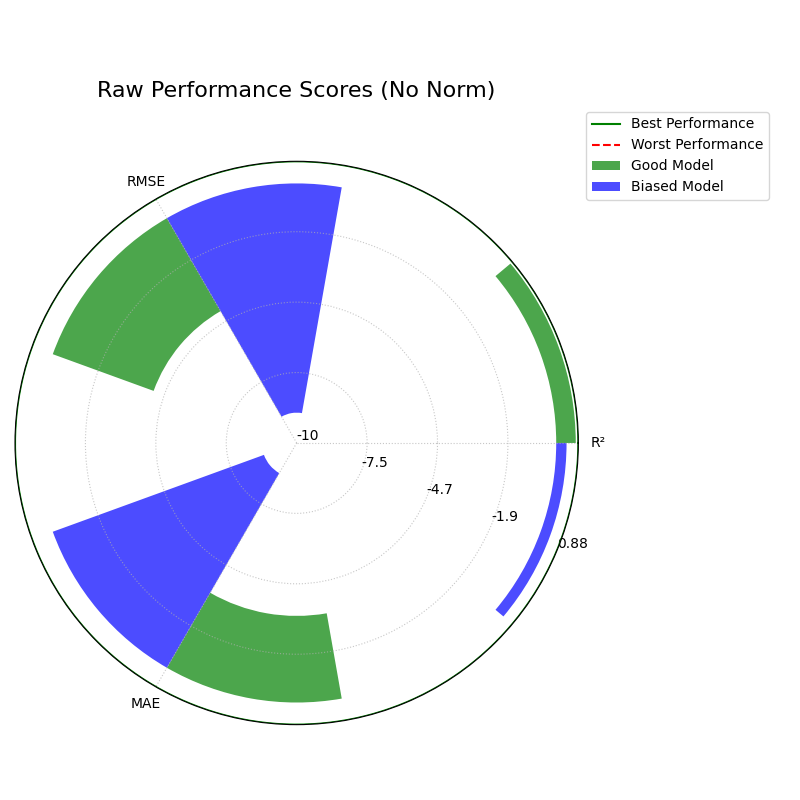
Perspective 3: Raw Scores (norm=”none”) or Expert Mode
Finally, for expert analysis or technical reports, you may need to see the un-scaled metric values directly. This mode provides the most direct, unfiltered view, but requires careful interpretation as each axis has a different scale.
Warning
In Expert Mode, do not visually compare the length of a bar for one metric to the length of a bar for another. This view is for reading the exact numerical scores, not for comparing shapes.
 1kd.plot_regression_performance(
 2    y_true, y_pred_good, y_pred_biased,
 3    names=model_names,
 4    metric_labels=metric_labels,
 5    norm="none",
 6    title="Raw Performance Scores (No Norm)",
 7    colors = colors,
 8    savefig="gallery/images/gallery_plot_regression_performance_none.png"
 9)
10plt.close()
For a deeper dive into the definitions of these regression metrics and normalization strategies, please refer to the Polar Performance Chart (plot_regression_performance()) section.
Application: Evaluating Probabilistic Energy Forecasts
In many critical industries, a single-point forecast is not enough. Decision-makers need to understand the full range of potential outcomes—the uncertainty—to manage risk effectively. This is especially true in energy markets.
This application demonstrates how to combine the Polar Pinball Loss plot and the Polar Performance Chart into a single diagnostic dashboard to conduct a comprehensive evaluation of probabilistic forecasts.
The Problem: Forecasting National Grid Electricity Demand
Practical Example
A national grid operator needs to forecast the next day’s electricity demand. This is a high-stakes problem with significant financial and societal consequences — Under-prediction If demand is higher than predicted, the operator may need to purchase emergency power at exorbitant prices or, in the worst case, initiate rolling blackouts. This means the model’s performance at high quantiles (e.g., the 95th percentile, representing peak demand) is critical — Over-prediction If demand is lower than predicted, costly power generation is wasted. This makes performance at low quantiles important as well.
The operator is evaluating two new probabilistic forecasting models: a complex Deep Learning (N-BEATS) model and a robust Quantile Regression Forest (QRF). A comprehensive evaluation must assess both the accuracy of the median (point) forecast and the reliability of the full predicted distribution.
Translating the Problem into a Visual Dashboard
To get a complete picture, we will generate a dashboard that allows us to move from a granular, quantile-by-quantile diagnosis to a holistic comparison of standard performance metrics. A 2x2 layout provides a compact and effective way to arrange these plots.
The following code simulates the models’ performance on this task and creates the diagnostic dashboard.
 1import kdiagram as kd
 2import numpy as np
 3from scipy.stats import norm
 4import matplotlib.pyplot as plt
 5
 6# --- 1. Simulate Electricity Demand Data ---
 7np.random.seed(42)
 8n_samples = 2000
 9y_true = 50 + 10 * np.sin(np.arange(n_samples) * np.pi / 12) \
10         + np.random.normal(0, 3, n_samples) # in Gigawatts (GW)
11
12quantiles = np.array([0.05, 0.1, 0.25, 0.5, 0.75, 0.9, 0.95])
13q_map = {q: i for i, q in enumerate(quantiles)}
14
15# --- 2. Simulate Quantile Predictions from Two Models ---
16# N-BEATS: Excellent at the median, slightly less certain at tails
17nbeats_scales = np.array([5, 4, 3, 2, 3, 4, 5])
18y_preds_nbeats = norm.ppf(
19    quantiles, loc=y_true[:, np.newaxis], scale=nbeats_scales)
20
21# QRF: Very robust at the tails, slightly less accurate at the median
22qrf_scales = np.array([4.5, 3.8, 3.2, 2.5, 3.2, 3.8, 4.5])
23y_preds_qrf = norm.ppf(
24    quantiles, loc=y_true[:, np.newaxis] + 0.5, scale=qrf_scales)
25
26# Extract the median (0.5 quantile) as the point forecast
27y_pred_nbeats_median = y_preds_nbeats[:, q_map[0.5]]
28y_pred_qrf_median = y_preds_qrf[:, q_map[0.5]]
29
30# --- 3. Create the 2x2 Dashboard ---
31fig, axes = plt.subplots(2, 2, figsize=(18, 18),
32                         subplot_kw={'projection': 'polar'})
33fig.suptitle("Electricity Demand Forecast Evaluation Dashboard",
34             fontsize=24, y=0.98)
35
36# Top Row: Pinball Loss profiles for each model
37kd.plot_pinball_loss(
38    y_true, y_preds_nbeats, quantiles, ax=axes[0, 0],
39    title="Pinball Loss Profile (N-BEATS)", colors=['#8a2be2']
40)
41kd.plot_pinball_loss(
42    y_true, y_preds_qrf, quantiles, ax=axes[0, 1],
43    title="Pinball Loss Profile (QRF)", colors=['#de3163']
44)
45
46# Bottom-Left: Performance of the median forecasts
47kd.plot_regression_performance(
48    y_true, y_pred_nbeats_median, y_pred_qrf_median,
49    names=["N-BEATS (Median)", "QRF (Median)"], ax=axes[1, 0],
50    title="Median Forecast Performance",
51    metric_labels={'r2': 'R²', 'neg_mean_absolute_error': 'MAE',
52                   'neg_root_mean_squared_error': 'RMSE'},
53    colors = ['#8a2be2', '#de3163'],
54)
55
56# Hide the unused subplot in the bottom-right
57fig.delaxes(axes[1, 1])
58
59fig.tight_layout(pad=2.0)
60fig.savefig("gallery/images/gallery_evaluation_regression_dashboard.png")
61plt.close(fig)
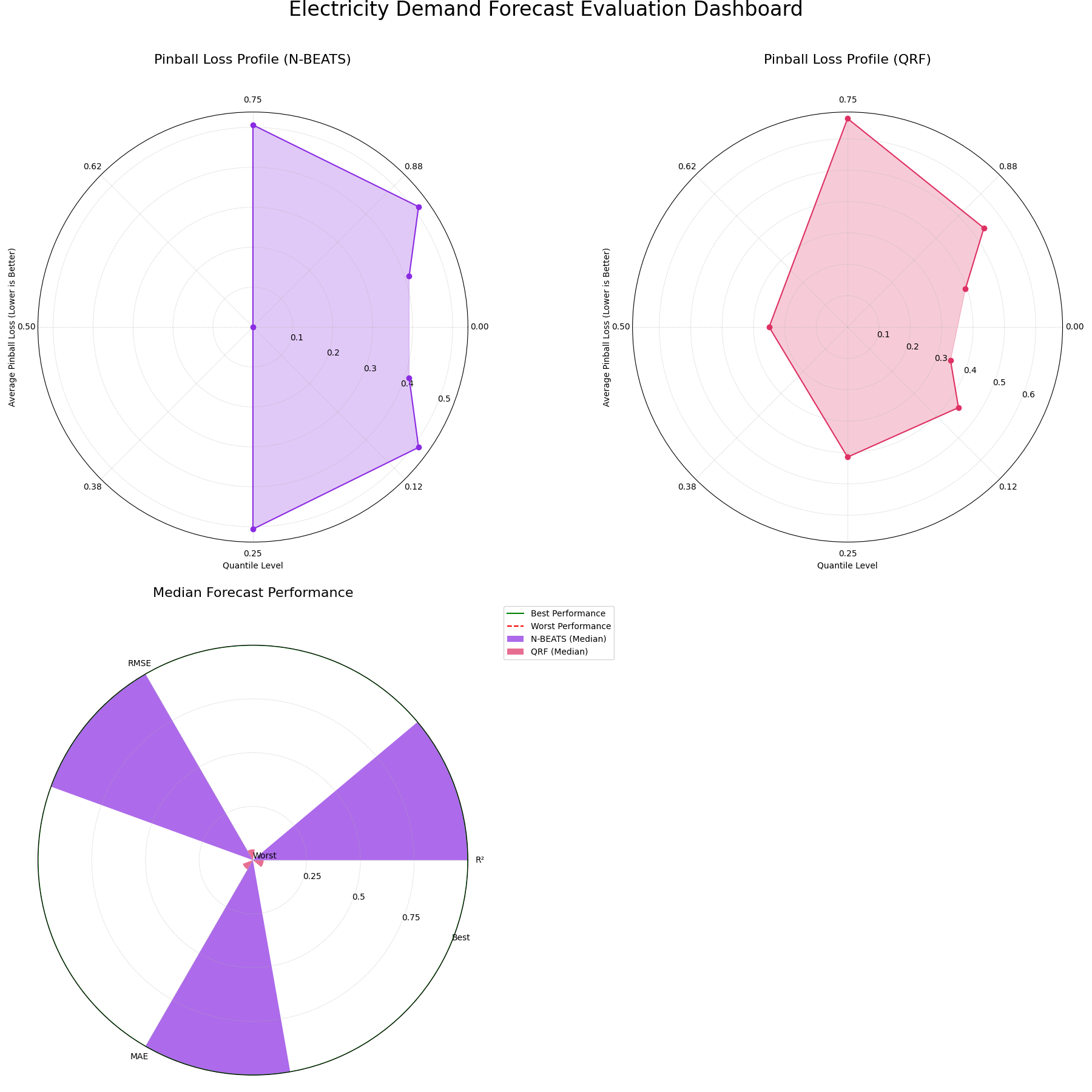
A comprehensive dashboard using Pinball Loss and standard regression metrics to provide a holistic view of probabilistic forecast skill.
For a deeper dive into the mathematical concepts behind these evaluation metrics, please refer to the main User Guide Evaluating Classification Models.