Feature Importance Visualization
Understanding which input features most significantly influence a model’s predictions is crucial for interpretation, debugging, and building trust in forecasting models. While overall importance scores are useful, visualizing how these importances compare across different contexts (e.g., different models, time periods, spatial regions) can reveal deeper insights [1][2].
k-diagram provides a specialized radar chart, the “Feature
Fingerprint,” to effectively visualize and compare these multi-
dimensional feature importance profiles.
Summary of Feature-Based Functions
This section focuses on functions for visualizing how model predictions and performance are influenced by input features, either individually or in combination.
Function |
Description |
|---|---|
Creates a radar chart comparing feature importance profiles across different groups or layers. |
|
Advanced version of the
|
|
Creates a polar heatmap to visualize how a target variable is affected by the interaction between two features. |
Detailed Explanations
Let’s explore the feature based plots.
Feature Importance Fingerprint (plot_feature_fingerprint())
Purpose: This function generates a polar radar chart designed to visually compare the importance or contribution profiles of multiple features across different groups, conditions, or models (referred to as “layers”). Each layer is represented by a distinct colored polygon on the chart, creating a unique “fingerprint” of feature influence for that layer [3]. It allows for easy identification of dominant features, relative-importance patterns, and shifts in influence across the layers being compared. When feature scores originate from model- agnostic tools (e.g., permutation importance) or model-specific methods (e.g., gradient/attention based for TFT), the fingerprint helps synthesize those signals into a single comparative view [1][2].
Mathematical Concept: Let \(\mathbf{R}\) be the input importances matrix of shape \((M, N)\), where \(M\) is the number of layers and \(N\) is the number of features.
Angle Assignment: Each feature \(j\) is assigned an axis on the radar chart at an evenly spaced angle:
(1)¶\[\theta_j = \frac{2 \pi j}{N}, \quad j = 0, 1, \dots, N-1\]Radial Value (Importance): For each layer \(i\) and feature \(j\), the radial distance \(r_{ij}\) represents the importance value from the input matrix \(\mathbf{R}\).
Normalization (Optional): If
normalize=True, the importances within each layer (row) \(i\) are scaled independently to the range [0, 1]:(2)¶\[r'_{ij} = \frac{r_{ij}}{\max_{k}(r_{ik})}\]If the maximum importance in a layer is zero or less, the normalized values for that layer are set to zero. The radius plotted is then \(r'_{ij}\). If
normalize=False, the raw radius \(r_{ij}\) is used.Plotting: Points \((r, \theta)\) are plotted for each feature and connected to form a polygon for each layer. The shape is closed by connecting the last feature’s point back to the first. The area can optionally be filled (
fill=True).
Interpretation:
Axes: Each angular axis corresponds to a specific input feature.
Polygons (Layers): Each colored polygon represents a different layer (e.g., Model A vs. Model B, or Zone 1 vs. Zone 2).
Radius: The distance from the center along a feature’s axis indicates the importance of that feature for a given layer.
Shape (Normalized View): When
normalize=True, compare the shapes of the polygons. This highlights the relative importance patterns. Which features are most important within each layer, regardless of overall magnitude? Do different layers rely on vastly different feature subsets?Size (Raw View): When
normalize=False, compare the overall size of the polygons. A larger polygon indicates that the layer generally assigns higher absolute importance scores across features compared to a smaller polygon (though interpretation depends on the nature of the importance metric).Dominant Features: Features corresponding to axes where polygons extend furthest are the most influential for those respective layers.
Use Cases:
Comparing Model Interpretations: Visualize and contrast feature importance derived from different model types (e.g., Random Forest vs. Gradient Boosting) trained on the same data.
Analyzing Importance Drift: Plot importance profiles calculated for different time periods or spatial regions to see if feature influence changes.
Identifying Characteristic Fingerprints: Understand the typical pattern of feature reliance for a specific system or model setup.
Debugging and Validation: Check if the feature importance profile aligns with domain knowledge or expectations.
Advantages (Polar/Radar Context):
Excellent for simultaneously comparing multiple multi-dimensional profiles (feature importance vectors) against a common set of axes (features).
The closed polygon shape provides a distinct visual “fingerprint” for each layer.
Makes it easy to spot the most dominant features (those axes with the largest radial values) for each layer.
Normalization allows comparing relative patterns effectively, even if absolute importance scales differ significantly between layers.
Understanding which features a model relies on is a cornerstone of interpretation and trust. While a simple bar chart can show feature importance for a single model, the real insights often come from comparing these patterns across different models or contexts. This “Feature Fingerprint” plot is designed for exactly that kind of comparative analysis.
Practical Example
A telecommunications company has two models competing to predict
customer churn: a classic Logistic Regression model and a more
complex Gradient Boosting model. To trust and deploy one of
them, the company needs to understand their decision-making
processes. Which features does each model consider most important?
Do they rely on the same information, or do they have fundamentally
different “views” of the problem?
This plot will create a unique “fingerprint” for each model, visualizing their feature importance profiles on the same set of axes for a direct comparison.
>>> import numpy as np
>>> import kdiagram as kd
>>>
>>> # --- 1. Define feature names and model importance scores ---
>>> features = [
...     'tenure', 'monthly_charges', 'total_charges',
...     'data_usage', 'support_calls', 'contract_type'
... ]
>>> labels = ['Logistic Regression', 'Gradient Boosting']
>>>
>>> # Logistic Regression relies heavily on a few key features
>>> logreg_importances = [0.8, 0.9, 0.7, 0.1, 0.2, 0.6]
>>> # Gradient Boosting uses a wider range of features
>>> boosting_importances = [0.5, 0.6, 0.6, 0.8, 0.7, 0.4]
>>>
>>> importances = np.array([logreg_importances, boosting_importances])
>>>
>>> # --- 2. Generate the plot ---
>>> ax = kd.plot_feature_fingerprint(
...     importances,
...     features=features,
...     labels=labels,
...     title='Churn Model Feature Importance Fingerprints'
... )
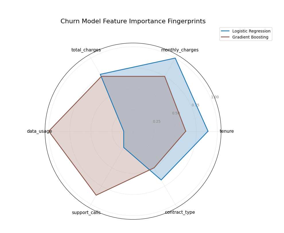
A polar radar chart comparing the feature importance profiles (“fingerprints”) of a Logistic Regression and a Gradient Boosting model for customer churn prediction.
This plot allows for an immediate visual comparison of the models’ internal logic. By comparing the shapes of the colored polygons, we can see which features dominate each model’s decision-making.
- Quick Interpretation:
The plot reveals the distinctly different “fingerprints” of the two models. The
Logistic Regressionmodel (blue) has a spiky profile, indicating it relies heavily on a few core features liketenure,monthly_charges, andtotal_charges, while paying little attention to others. In contrast, theGradient Boostingmodel (brown) displays a more well-rounded fingerprint, showing that it has learned to incorporate a wider array of information, assigning significant importance to features likedata_usageandsupport_callsas well.
This ability to compare feature importance profiles is crucial for model selection, debugging, and ensuring alignment with domain knowledge. To see the full implementation, please explore the gallery.
Example: See the gallery example and code: Feature Importance Fingerprint.
Dynamic Feature Fingerprint (plot_fingerprint())
Purpose:
This function is an advanced version of the
plot_feature_fingerprint().
It not only visualizes pre-computed importance scores but can also
dynamically calculate them from raw data. It generates a polar
radar chart to compare feature profiles across different groups or
“layers” defined within a dataset. The function can operate in two
modes:
Unsupervised: To measure and compare feature variability (e.g., standard deviation) across different data segments.
Supervised: To measure and compare feature correlation with a target variable across different groups.
This integrated approach allows for rapid, code-efficient exploration of feature characteristics directly from a DataFrame.
Mathematical Concept: The plot is generated from an importance matrix \(\mathbf{R}\) of shape \((M, N)\), where \(M\) is the number of layers (groups) and \(N\) is the number of features.
Case 1: Pre-computed Scores (`precomputed=True`) When using a pre-computed array of importances, the mathematical process is identical to that of
plot_feature_fingerprint(). Features are assigned angles, and the matrix values \(r_{ij}\) are used as the radial distance, with optional normalization.Case 2: Dynamic Calculation (`precomputed=False`) When given a raw DataFrame, the function first partitions the data into \(M\) groups based on the unique values in
group_col. For each group \(i\) and feature \(j\), it calculates an importance score \(r_{ij}\) based on the chosenmethod:`method=’abs_corr’` (Supervised): The score is the absolute Pearson correlation between the feature column \(\mathbf{x}_j\) and the target column \(\mathbf{y}\) within group \(i\).
(3)¶\[r_{ij} = \left| \frac{\text{cov}(\mathbf{x}_{ji}, \mathbf{y}_i)}{\sigma_{\mathbf{x}_{ji}} \sigma_{\mathbf{y}_i}} \right|\]`method=’std’` (Unsupervised): The score is the standard deviation of the feature column \(\mathbf{x}_j\) within group \(i\).
(4)¶\[r_{ij} = \sqrt{\frac{1}{K-1} \sum_{k=1}^{K} (x_{jk} - \bar{x}_j)^2}\]Where \(K\) is the number of samples in group \(i\). Other methods like variance (
'var') and median absolute deviation ('mad') are also available.
Normalization (Optional): If
normalize=True, the dynamically calculated scores are row-wise normalized to the range [0, 1], allowing for the comparison of relative patterns across groups.(5)¶\[r'_{ij} = \frac{r_{ij}}{\max_{k}(r_{ik})}\]
Interpretation:
Axes: Each angular axis corresponds to a specific input feature.
Polygons (Layers): Each colored polygon represents a data segment (e.g., Customer Segment A vs. Segment B).
Radius: The distance from the center now represents a specific metric, such as the feature’s variability (standard deviation) or its correlation with a target.
Shape (Normalized View): The shape highlights the relative pattern of the chosen metric. For std, it shows which features are most volatile within a group. For abs_corr, it shows which features are most predictive within a group.
Size (Raw View): When
normalize=False, the size indicates the absolute magnitude of the metric. A group with a larger polygon might be inherently more variable or have stronger overall correlations than a group with a smaller one.
Use Cases:
Comparing Feature Variability: Identify which features are most diverse or inconsistent across different product categories, customer segments, or geographic regions (unsupervised).
Analyzing Conditional Correlation: Discover if the drivers of a target variable (e.g., sales) change depending on context, such as the time of year or marketing campaign (supervised).
Data Characterization: Quickly profile new datasets to understand the defining characteristics of different sub-populations.
Advantages (Polar/Radar Context):
Integrates calculation and visualization, enabling rapid exploration without manual data processing steps.
The group_col parameter provides a powerful and intuitive way to perform comparative analysis on data subsets.
Flexibility to switch between supervised and unsupervised analysis allows for a deeper understanding of the dataset’s structure.
The visual “fingerprint” makes it easy to communicate complex, multi-group comparisons effectively.
This function moves beyond model interpretation to direct data interpretation, providing a powerful lens to explore and compare the behavior of features within your dataset.
Practical Example
A winery wants to understand the chemical characteristics that define its different wine cultivars. They are not trying to predict a specific outcome, but rather to see which chemical properties are the most variable within each cultivar. This information can help in quality control and marketing by highlighting the most diverse and stable traits of each wine type.
Using plot_fingerprint, we can dynamically calculate the standard deviation of each chemical property for each cultivar and plot the resulting “variability fingerprints” for comparison.
>>> from sklearn.datasets import load_wine
>>> import pandas as pd
>>> import numpy as np
>>> import kdiagram as kd
>>>
>>> # --- 1) Load and tidy
>>> wine = load_wine()
>>> df = pd.DataFrame(wine.data, columns=wine.feature_names)
>>> df["cultivar"] = pd.Series(wine.target).map(
...     {0: "Cultivar A", 1: "Cultivar B", 2: "Cultivar C"}
... )
>>>
>>> # --- 2) Standardize features globally to remove scale effects
>>> X = df.drop(columns=["cultivar"])
>>> Z = (X - X.mean()) / X.std(ddof=0)
>>> Z["cultivar"] = df["cultivar"]
>>>
>>> # --- 3) Pick a compact, readable subset of axes
>>> # Compute per-cultivar std on standardized features,
>>> # then rank features by average variability across cultivars.
>>> std_by_cultivar = (
...     Z.groupby("cultivar").std(ddof=0).rename_axis(index=None)
... )
>>> features_top6 = (
...     std_by_cultivar.mean(axis=0)
...     .sort_values(ascending=False)
...     .head(6)
...     .index
...     .tolist()
... )
>>>
>>> # --- 4) Plot directly from the standardized DataFrame
>>> ax = kd.plot_fingerprint(
...     Z[features_top6 + ["cultivar"]],  # give just the needed columns
...     precomputed=False,                # compute per-group std dynamically
...     group_col="cultivar",
...     method="std",                     # variability metric
...     normalize=True,                   # compare shapes per cultivar
...     title="Chemical Variability Fingerprint by Cultivar",
...     acov="full",             # compact 360° coverage
... )
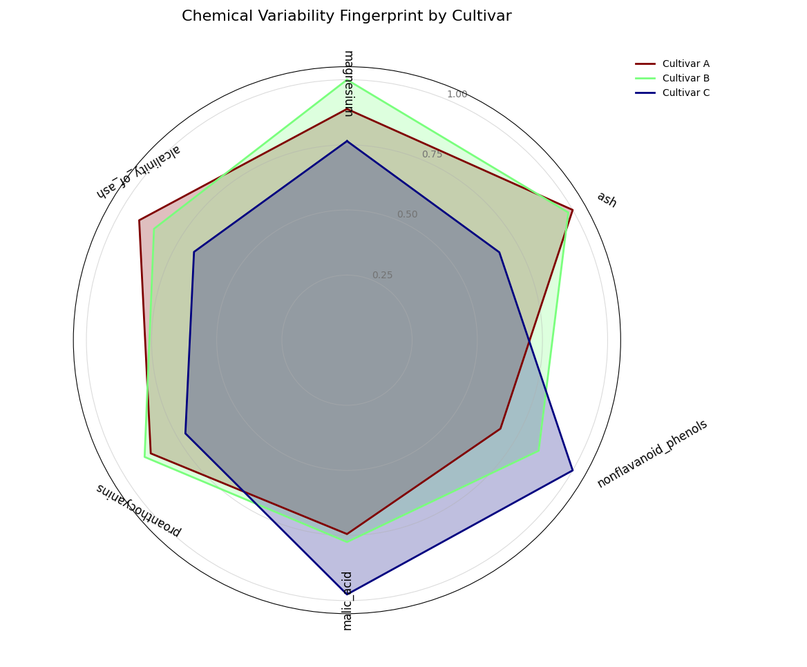
A semi-circular polar chart comparing the chemical variability (“fingerprints”) of three different wine cultivars, calculated directly from the data.
Quick Interpretation: The plot reveals the unique variability profile for each cultivar, with each being defined by a different dominant chemical trait. Cultivar B (light green) has a fingerprint that extends furthest along the magnesium axis, indicating this is its most inconsistent property. In contrast, the fingerprint for Cultivar A (maroon) peaks sharply at ash, while Cultivar C (dark blue) is defined by its high variability in nonflavanoid_phenols. This unsupervised analysis provides a powerful and immediate summary of what makes each group chemically distinct.
Example: See the gallery example and code: Feature Fingerprint (Dynamic).
Feature Interaction Plot (plot_feature_interaction())
Purpose: This function creates a Polar Feature Interaction Plot to visualize how a target variable is affected by the interaction between two features. It is a powerful diagnostic tool for moving beyond one-dimensional feature importance to understand complex, non-linear relationships that a model may have learned.
Mathematical Concept: This plot is a polar heatmap, a novel visualization method developed as part of the analytics framework [3]. It displays the conditional expectation of a target variable, \(z\), given the values of two features, one mapped to an angular coordinate, \(\theta\), and the other to a radial coordinate, \(r\).
Coordinate Mapping and Binning: The 2D feature space is first mapped to polar coordinates. The data is then partitioned into a grid of \(K_r \times K_{\theta}\) polar bins, where \(K_r\) is
r_binsand \(K_{\theta}\) istheta_bins.Aggregation: For each bin, \(B_{ij}\), which corresponds to a specific range of values for
r_colandtheta_col, an aggregate statistic (e.g., the mean) of the target variable,color_col(\(z\)), is computed.(6)¶\[C_{ij} = \text{statistic}(\{z_k \mid (r_k, \theta_k) \in B_{ij}\})\]The resulting value, \(C_{ij}\), determines the color of the corresponding polar sector on the heatmap.
Interpretation: The plot reveals how the two features jointly influence the target.
Angle (θ): Represents the first feature (
theta_col). If the feature is cyclical (like the hour of the day), the plot will wrap around seamlessly.Radius (r): Represents the second feature (
r_col), with lower values near the center and higher values at the edge.Color: The color of each polar sector shows the average value of the target variable (
color_col). “Hot spots” (bright, intense colors) indicate a strong interaction effect, where a specific combination of the two features leads to a notable outcome.
Use Cases:
To diagnose how pairs of features interact to affect a model’s prediction or error, moving beyond simple feature importance.
To identify non-linear relationships and conditional patterns in your data.
To visually confirm that a model has learned an expected physical or logical interaction (e.g., high solar output only occurs at midday with low cloud cover).
While individual feature importances are revealing, they do not tell the whole story. In many complex systems, the most powerful predictive signals come from the interaction between two or more features. This polar heatmap is designed to move beyond one-dimensional analysis and uncover these crucial two-way feature interactions.
Practical Example
An energy analyst is modeling the power output of a solar farm. They know that the output depends on both the time of day and the cloud cover. However, the effect is not simply additive; these two features interact strongly. High energy output is only possible when it is both midday AND cloud cover is low. At night, the level of cloud cover is completely irrelevant.
This plot will visualize this interaction by mapping the time of day to the angle, cloud cover to the radius, and the resulting energy output to the color, revealing the “hot spot” of peak performance.
>>> import numpy as np
>>> import pandas as pd
>>> import kdiagram as kd
>>>
>>> # --- 1. Simulate solar farm output data ---
>>> np.random.seed(42)
>>> n_points = 5000
>>> df = pd.DataFrame({
...     'hour_of_day': np.random.uniform(0, 24, n_points),
...     'cloud_cover_pct': np.random.uniform(0, 100, n_points)
... })
>>> # Output depends on time (peaks at noon) AND low cloud cover
>>> time_effect = np.sin(df['hour_of_day'] * np.pi / 24)**2
>>> cloud_effect = (100 - df['cloud_cover_pct']) / 100
>>> df['energy_output_kw'] = 150 * time_effect * cloud_effect + np.random.randn(n_points) * 5
>>>
>>> # --- 2. Generate the plot ---
>>> ax = kd.plot_feature_interaction(
...     df,
...     theta_col='hour_of_day',
...     r_col='cloud_cover_pct',
...     color_col='energy_output_kw',
...     theta_period=24,
...     title='Solar Energy Output (kW) vs. Time and Cloud Cover'
... )
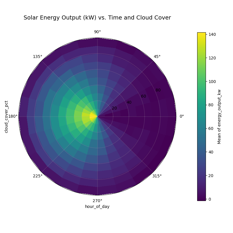
A polar heatmap visualizing the interaction between the hour of the day (angle) and cloud cover (radius) on solar energy output (color).
This plot translates a complex, three-dimensional relationship into an intuitive 2D visualization. The location of the most intense colors reveals the conditions that lead to the strongest outcomes.
- Quick Interpretation:
This polar heatmap clearly visualizes the strong interaction between the time of day (angle) and cloud cover (radius) on energy output (color). The most intense energy generation, shown by the bright yellow “hot spot,” occurs only under a specific combination of conditions: near midday (top of the plot) and with very low cloud cover (close to the center). The plot also confirms that during the night (bottom of the plot), energy output is near zero regardless of cloud cover, effectively demonstrating that the two features are not merely additive but have a powerful interactive effect.
Understanding feature interactions is key to unlocking deeper insights from your data and models. To see the full code for this example, please visit the gallery.
Example See the gallery example and code: Polar Feature Interaction.
References