Error Visualizations
Diagnosing and understanding forecast errors is a critical step in model evaluation. This gallery showcases specialized polar plots from the k-diagram package designed to visualize different aspects of model errors, from systemic biases to multi-dimensional uncertainty.
Note
You need to run the code snippets locally to generate the plot
images referenced below. Ensure the image paths in the
.. image:: directives match where you save the plots (e.g.,
images/gallery_plot_error_bands.png).
Polar Error Bands
The plot_error_bands() function is a
diagnostic tool designed to decompose a model’s forecast error
into two fundamental components: systemic error (bias) and random
error (variance). By aggregating errors as a function of a cyclical or
ordered feature (like the month of the year), it reveals conditional
patterns in a model’s performance that a single error score would miss.
First, let’s break down the components of this diagnostic plot.
Plot Anatomy
Angle (θ): Represents the binned values of the feature from the
theta_col(e.g., month, hour). This allows you to see how performance changes as this feature’s value changes.Radius (r): Represents the magnitude of the forecast error. The dashed red circle at a radius of 0 is the crucial “Zero Error” reference line.
Mean Error (Black Line): This line tracks the average error for each angular bin. A consistent deviation of this line from the zero-circle reveals a systemic bias.
Shaded Band: The width of this band is proportional to the standard deviation of the error in each bin. A wide band indicates high variance and inconsistent performance.
Now, let’s apply this plot to a real-world problem to see how it can be used to generate critical insights.
Use Case 1: Basic Seasonal Error Analysis
The most common application of this plot is to diagnose if a model’s performance changes with the seasons. A good forecast should be reliable all year round, but many models struggle during specific periods.
Let’s simulate a forecast where a model has a clear seasonal bias, over-predicting in the summer and under-predicting in the winter, and is also more inconsistent during the winter months.
 1import kdiagram as kd
 2import pandas as pd
 3import numpy as np
 4import matplotlib.pyplot as plt
 5
 6# --- 1. Data Generation: A forecast with seasonal error patterns ---
 7np.random.seed(42)
 8n_points = 2000
 9day_of_year = np.arange(n_points) % 365
10month = (day_of_year // 30) + 1
11# Create a bias (positive error) in summer and more noise in winter
12seasonal_bias = np.sin((day_of_year - 90) * np.pi / 180) * 10
13seasonal_noise = 4 + 3 * np.cos(day_of_year * np.pi / 180)**2
14errors = seasonal_bias + np.random.normal(0, seasonal_noise, n_points)
15
16df_seasonal_errors = pd.DataFrame({'month': month, 'forecast_error': errors})
17
18# --- 2. Plotting ---
19kd.plot_error_bands(
20    df=df_seasonal_errors,
21    error_col='forecast_error',
22    theta_col='month',
23    theta_period=12,
24    theta_bins=12,
25    n_std=1.5,
26    title='Use Case 1: Seasonal Forecast Error Analysis',
27    color='#2980B9',
28    alpha=0.25,
29    savefig="gallery/images/gallery_plot_error_bands_basic.png"
30)
31plt.close()
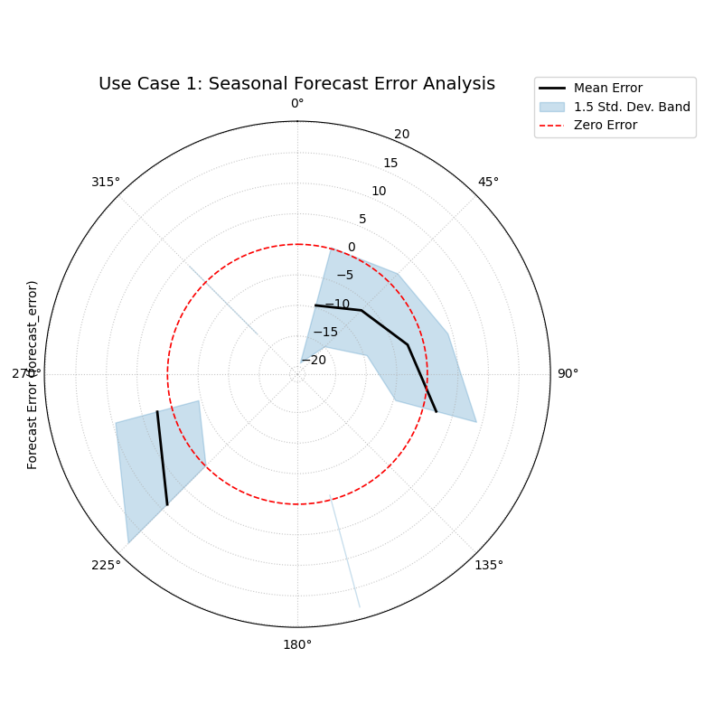
A polar plot where the black line (mean error) oscillates around the red zero-error circle, and the blue shaded band (variance) changes width, indicating seasonal patterns.
Use Case 2: Comparing Competing Models (Bias vs. Variance)
A more advanced use case is to compare two competing models to understand not just which is “better,” but how they differ in their failure modes. One model might be consistently wrong (biased), while another might be right on average but highly unpredictable (high variance).
Let’s consider a city’s electricity provider evaluating two models for forecasting energy demand. They need to know which model is more reliable during the critical, high-demand afternoon hours.
 1# --- 1. Data Generation: Two models with different error profiles ---
 2np.random.seed(10)
 3n_points = 5000
 4hour = np.random.randint(0, 24, n_points)
 5# Model A is consistently wrong (biased) in the afternoon but has low variance
 6bias_A = np.where((hour >= 15) & (hour <= 19), 20, 0)
 7error_A = bias_A + np.random.normal(0, 5, n_points)
 8# Model B is right on average (unbiased) but highly inconsistent in the afternoon
 9noise_B = np.where((hour >= 15) & (hour <= 19), 25, 5)
10error_B = np.random.normal(0, noise_B, n_points)
11
12df_model_A = pd.DataFrame({'hour': hour, 'error': error_A})
13df_model_B = pd.DataFrame({'hour': hour, 'error': error_B})
14
15# --- 2. Create side-by-side plots for comparison ---
16fig, (ax1, ax2) = plt.subplots(1, 2, figsize=(16, 8), subplot_kw={'projection': 'polar'})
17
18kd.plot_error_bands(
19    df=df_model_A, ax=ax1, error_col='error', theta_col='hour',
20    theta_period=24, theta_bins=24, title='Model A (Biased but Consistent)'
21)
22kd.plot_error_bands(
23    df=df_model_B, ax=ax2, error_col='error', theta_col='hour',
24    theta_period=24, theta_bins=24, title='Model B (Unbiased but Inconsistent)',
25    color='darkgreen', alpha=0.2
26)
27fig.suptitle('Use Case 2: Comparing Model Error Profiles (Bias vs. Variance)', fontsize=16)
28fig.tight_layout(rect=[0, 0.03, 1, 0.95])
29fig.savefig("gallery/images/gallery_plot_error_bands_compare.png")
30plt.close(fig)
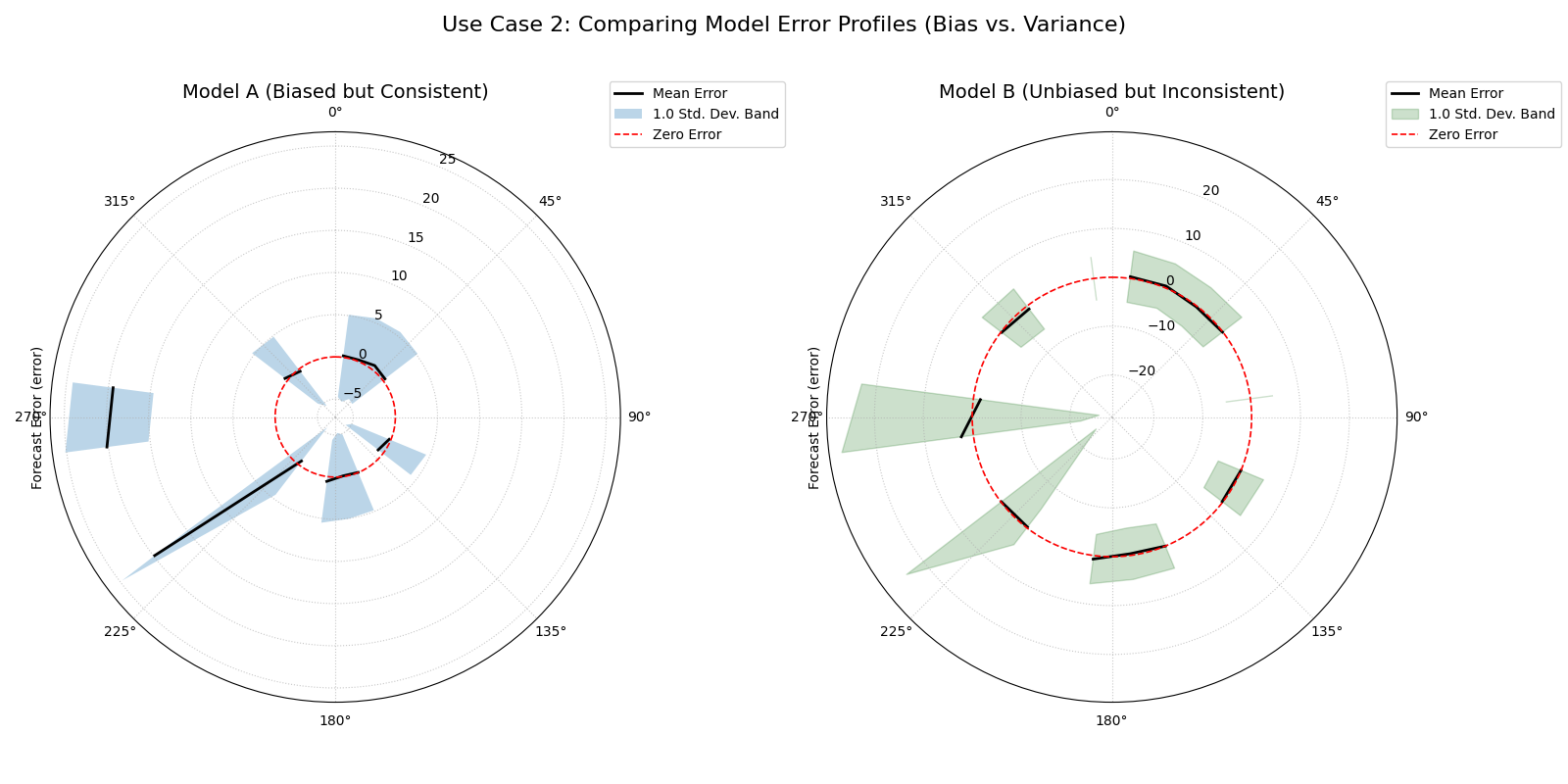
Two plots showing different failure modes. The left plot shows a mean error line far from the center but a narrow band. The right plot shows a mean error line near the center but a very wide band.
Best Practice
Use this plot not just to see if a model is wrong, but to understand how it is wrong. Distinguishing between a predictable systemic bias (which can sometimes be corrected with post-processing) and high random error (which indicates fundamental model instability) is crucial for effective model improvement.
For a deeper understanding of the statistical concepts behind bias and variance in forecasting, please refer back to the main Systemic vs. Random Error (plot_error_bands()) section.
Polar Error Violins
The plot_error_violins() function provides a
rich, comparative view of the full error distributions for multiple
models. By adapting the traditional violin plot to a polar layout, it
allows for an immediate visual assessment of each model’s bias,
variance, and overall error shape, making it a premier tool for model
selection.
First, let’s break down how to interpret these informative shapes.
Plot Anatomy
Angle (θ): Each angular sector is dedicated to a different model being compared. The angle itself is for separation and has no numeric meaning.
Radius (r): Represents the forecast error value. The dashed black circle at a radius of 0 is the “Zero Error” reference line.
Violin Shape: The width of the violin at any given radius shows the probability density of errors at that value. Wide sections indicate common error values, while narrow sections indicate rare ones. The overall shape reveals the error distribution’s character (e.g., symmetric, skewed, etc.).
Now, let’s apply this plot to a real-world model selection problem.
Use Case 1: The Classic Trade-off (Bias vs. Variance)
The most common use of this plot is to visualize the classic trade-off between a model that is consistently wrong (biased) and a model that is right on average but highly unpredictable (high variance).
Let’s imagine a financial firm has three models for predicting a stock’s price. They need to choose the one with the most desirable error profile for their trading strategy.
 1import kdiagram as kd
 2import pandas as pd
 3import numpy as np
 4import matplotlib.pyplot as plt
 5
 6# --- 1. Data Generation: Three models with different error profiles ---
 7np.random.seed(0)
 8n_points = 2000
 9df_model_errors = pd.DataFrame({
10    # Low bias and low variance
11    'Error Model A': np.random.normal(loc=0.5, scale=1.5, size=n_points),
12    # Strong negative bias
13    'Error Model B': np.random.normal(loc=-4.0, scale=1.5, size=n_points),
14    # Unbiased but high variance
15    'Error Model C': np.random.normal(loc=0, scale=4.0, size=n_points),
16})
17
18# --- 2. Plotting ---
19kd.plot_error_violins(
20    df_model_errors,
21    'Error Model A', 'Error Model B', 'Error Model C',
22    names=['A (Balanced)', 'B (Biased)', 'C (Inconsistent)'],
23    title='Use Case 1: Comparing Model Error Distributions',
24    cmap='plasma',
25    savefig="gallery/images/gallery_plot_error_violins_basic.png"
26)
27plt.close()
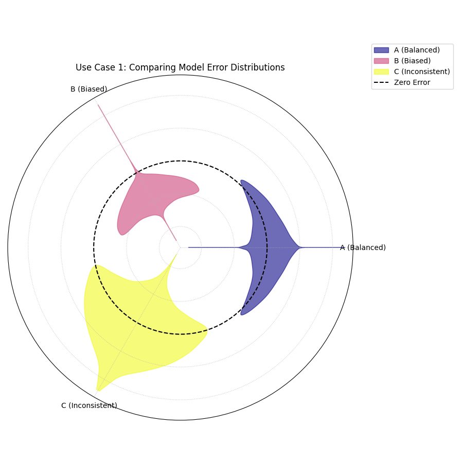
Three violins showing different error profiles: one is centered and narrow (good), one is shifted off-center (biased), and one is centered but very wide (inconsistent).
Use Case 2: Uncovering Skewed and Bimodal Error Distributions
Standard error metrics like Mean Absolute Error assume that errors are symmetrically distributed. However, this is often not the case. A model might be prone to making very large errors in one direction but not the other (skew) or have two different common types of errors (bimodality). The violin plot is the perfect tool to diagnose these complex error shapes.
Let’s simulate two new models for our stock prediction task:
A model with skewed error: it rarely makes large positive errors but is prone to “crash” predictions with large negative errors.
A model with bimodal error: it is either very accurate (errors near zero) or very inaccurate, with few errors in between.
 1# --- 1. Data Generation: Complex Error Distributions ---
 2np.random.seed(42)
 3# Skewed errors (e.g., from a log-normal distribution)
 4skewed_errors = 5 - np.random.lognormal(mean=1, sigma=0.5, size=n_points)
 5# Bimodal errors (mixture of two normal distributions)
 6bimodal_errors = np.concatenate([
 7    np.random.normal(loc=-5, scale=1, size=n_points // 2),
 8    np.random.normal(loc=5, scale=1, size=n_points // 2)
 9])
10df_complex_errors = pd.DataFrame({
11    'Skewed Model': skewed_errors,
12    'Bimodal Model': bimodal_errors
13})
14
15# --- 2. Plotting ---
16kd.plot_error_violins(
17    df_complex_errors,
18    'Skewed Model', 'Bimodal Model',
19    title='Use Case 2: Diagnosing Skewed and Bimodal Errors',
20    cmap='viridis',
21    savefig="gallery/images/gallery_plot_error_violins_complex.png"
22)
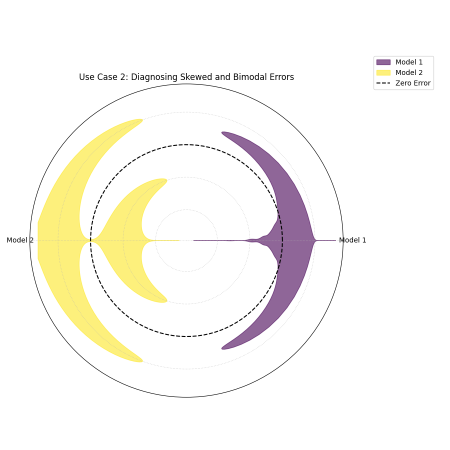
Two violins showing complex shapes. The “Skewed Model” violin has a long tail in one direction. The “Bimodal Model” violin has two distinct wide sections, with a narrow part in the middle.
Use Case 3: Reviewer-Inspired Overlay — a Two-Model Face-Off
This view implements mode="optimized" by applying the reviewer’s
suggestion directly. When you compare only a few models (here, k=2),
overlay="auto" places them on a single spoke with transparency
so differences are visible at a glance. Positive and negative
errors form two lobes around the spoke (asymmetry ≈ skew). Summary
stats (median, skew) stay in the legend, and the zero-error
reference is a dot at the center.
 1import kdiagram as kd
 2import pandas as pd
 3import numpy as np
 4import matplotlib.pyplot as plt
 5
 6# --- Data: two contrasting models ---
 7
 8np.random.seed(0)
 9n_points = 2000
10df_two = pd.DataFrame({
11"Error Model A": np.random.normal(loc=0.5,  scale=1.5, size=n_points),
12"Error Model B": np.random.normal(loc=-4.0, scale=1.5, size=n_points),
13})
14
15# --- Plot: overlay with transparency; stats in legend ---
16
17kd.plot_error_violins(
18  df_two,
19  "Error Model A", "Error Model B",
20  names=["A (Balanced)", "B (Biased)"],
21  title="Two-Model Overlay",
22  mode="optimized",
23  overlay="auto",         # overlay when k <= 2
24  show_stats=True,        # (median, skew) in legend
25  cmap="plasma",
26  savefig="gallery/images/errors/gallery_plot_error_violins_cbueth_overlay.png",
27)
28plt.close()
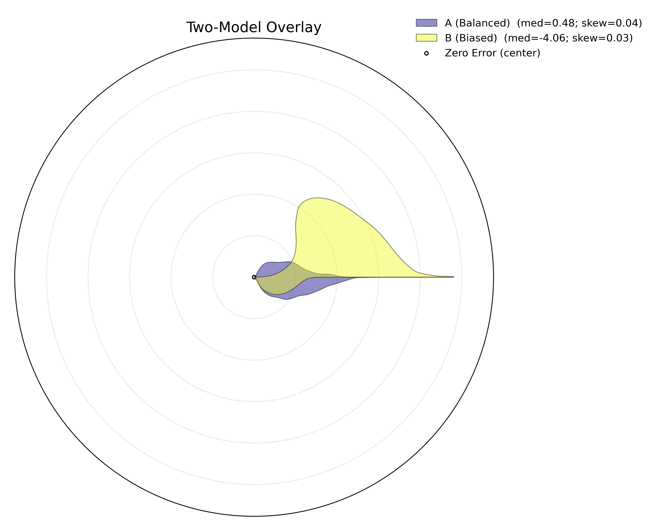
Two transparent violins share one spoke. The center dot marks zero error; the legend reports median and skew, keeping the plot uncluttered.
Try it
Rotate the shared spoke:
overlay_angle=0(horizontal) ornp.pi/2(vertical).Smooth more/less with
bw_method="scott"or a float like0.3.Force split-spokes by setting
overlay=False(see Use Case 4).
Use Case 4: Three-Model Split-Spokes — Outside Labels, Clean Plot
For 3+ models, mode="optimized" switches to split-spokes. Model names
are drawn outside the circle to keep the plot readable; the legend
continues to carry compact statistics.
 1import kdiagram as kd
 2import pandas as pd
 3import numpy as np
 4import matplotlib.pyplot as plt
 5
 6# --- Data: balanced, biased, high-variance ---
 7
 8np.random.seed(0)
 9n_points = 2000
10df_three = pd.DataFrame({
11   "Error Model A": np.random.normal(loc=0.5,  scale=1.5, size=n_points),
12   "Error Model B": np.random.normal(loc=-4.0, scale=1.5, size=n_points),
13   "Error Model C": np.random.normal(loc=0.0,  scale=4.0, size=n_points),
14})
15
16# --- Plot: split spokes + outside labels; stats in legend ---
17
18kd.plot_error_violins(
19   df_three,
20   "Error Model A", "Error Model B", "Error Model C",
21   names=["A (Balanced)", "B (Biased)", "C (Inconsistent)"],
22   title="Three-Model Comparison (cbueth split-spokes)",
23   mode="optimized",
24   overlay=False,           # split spokes; model labels outside rim
25   show_stats=True,
26   colors = ["green", "red", "blue"], # take precedence over cmap
27   cmap="viridis",
28   savefig="gallery/images/errors/gallery_plot_error_violins_cbueth_split.png",
29)
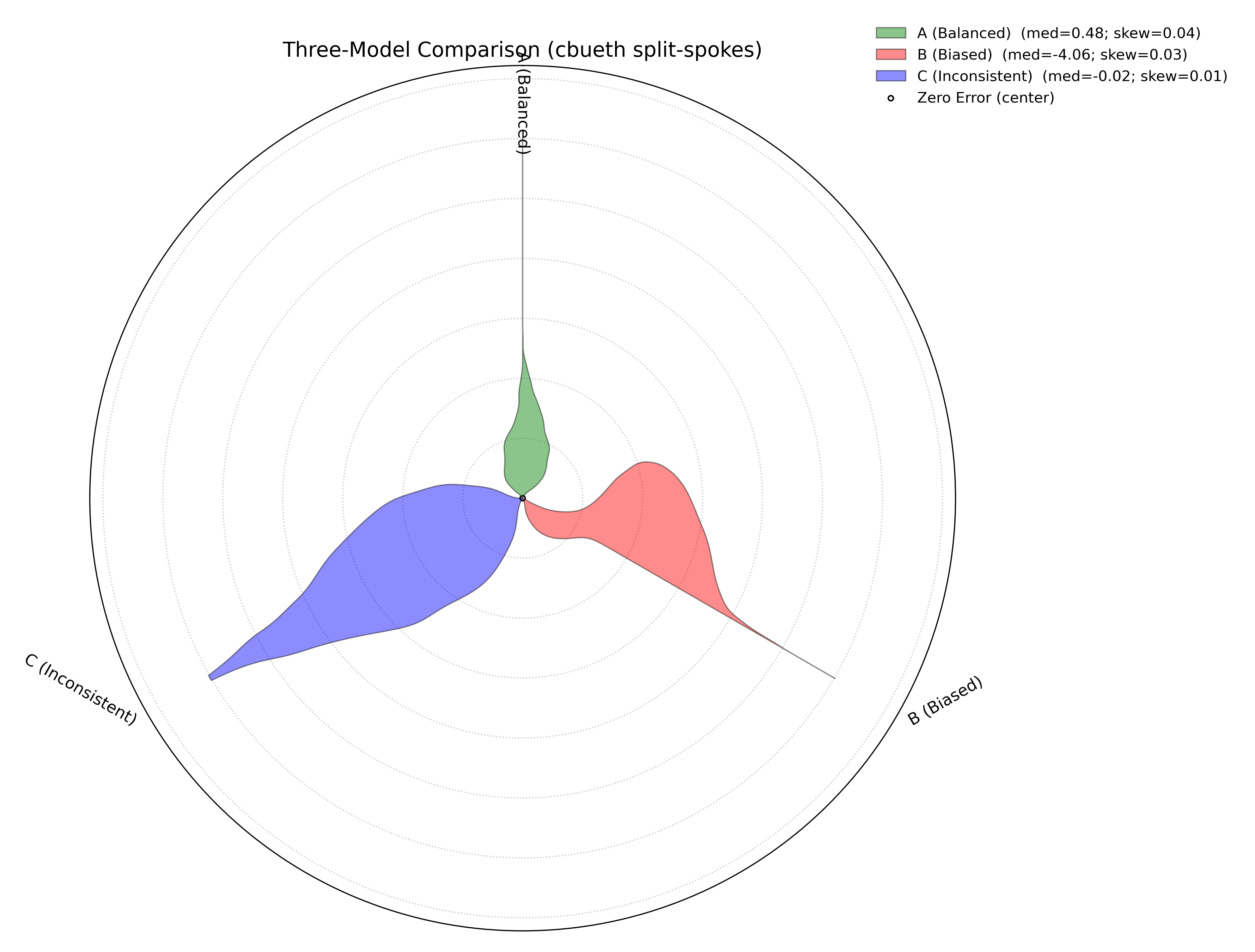
Each model occupies its own spoke; labels sit just outside the rim. The center dot is the zero-error reference; legend shows median and skew for quick comparison.
Try it
Toggle outside labels by switching
overlaybetweenFalseand"auto".Compare palettes with
cmap="plasma"or pass customcolors=....Stress-test variance: increase
scalefor one model and observe the radial extent and lobe widths grow.
For a deeper understanding of the statistical concepts behind probability distributions and Kernel Density Estimation, please refer back to the main Comparing Error Distributions (plot_error_violins()) section.
Polar Error Ellipses
The plot_error_ellipses() function is a
specialized tool for visualizing two-dimensional uncertainty. In many
real-world problems, particularly in spatial or positional forecasting,
error is not a single number but has components in multiple
directions. This plot represents the uncertainty for each data point as
an ellipse, where the ellipse’s size and shape reveal the magnitude and
directionality of the error.
Let’s begin by understanding the components of this advanced plot.
Plot Anatomy
Angle (θ): Represents the mean angular position of a data point, as specified by
theta_col. For cyclical data like degrees in a circle, this wraps around seamlessly when atheta_period(e.g., 360) is provided.Radius (r): Represents the mean radial position of a data point, as specified by
r_col.Ellipse Shape: The size and orientation of each ellipse are determined by the standard deviations in the radial (
r_std_col) and tangential (theta_std_col) directions. A large, elongated ellipse indicates high and directional uncertainty, while a small, circular ellipse indicates low and uniform uncertainty.
Now, let’s apply this plot to a real-world scientific problem where 2D uncertainty is a critical factor.
Use Case 1: Visualizing Positional Uncertainty in Tracking
The primary application of this plot is in tracking problems, where the goal is to predict an object’s future position.
Imagine an air traffic control system that uses a model to predict the position of aircraft. For each aircraft, the model outputs a predicted location (distance and angle from the control tower) and an estimate of the uncertainty in both of those dimensions. Visualizing this uncertainty is critical for maintaining safe separation between aircraft.
 1import kdiagram as kd
 2import pandas as pd
 3import numpy as np
 4import matplotlib.pyplot as plt
 5
 6np.random.seed(1)
 7n_aircraft = 20
 8
 9# Generate distance first so we can reuse it
10distance_km = np.random.uniform(20, 80, n_aircraft)
11
12# Std in degrees grows with distance; same length as distance_km
13angle_std_deg = 2 + np.random.uniform(5, 10, n_aircraft) * (distance_km / 80.0)
14
15df_tracking = pd.DataFrame({
16    "angle_deg":     np.linspace(0, 360, n_aircraft, endpoint=False),
17    "distance_km":   distance_km,
18    "distance_std":  np.random.uniform(2, 4, n_aircraft),
19    # convert to radians for the plotting function
20    "angle_std_rad": np.deg2rad(angle_std_deg),
21    "aircraft_type": np.random.randint(1, 4, n_aircraft),
22})
23
24kd.plot_error_ellipses(
25    df=df_tracking,
26    r_col="distance_km",
27    theta_col="angle_deg",        # degrees are fine; function maps internally
28    r_std_col="distance_std",
29    theta_std_col="angle_std_rad",# radians expected
30    color_col="aircraft_type",
31    n_std=2.0,
32    title="Use Case 1: 2-Sigma Positional Uncertainty for Aircraft",
33    cmap="cividis",
34    alpha=0.7,
35    edgecolor="black",
36    linewidth=0.5,
37    savefig="gallery/images/gallery_plot_error_ellipses_basic.png"
38)
39plt.close()
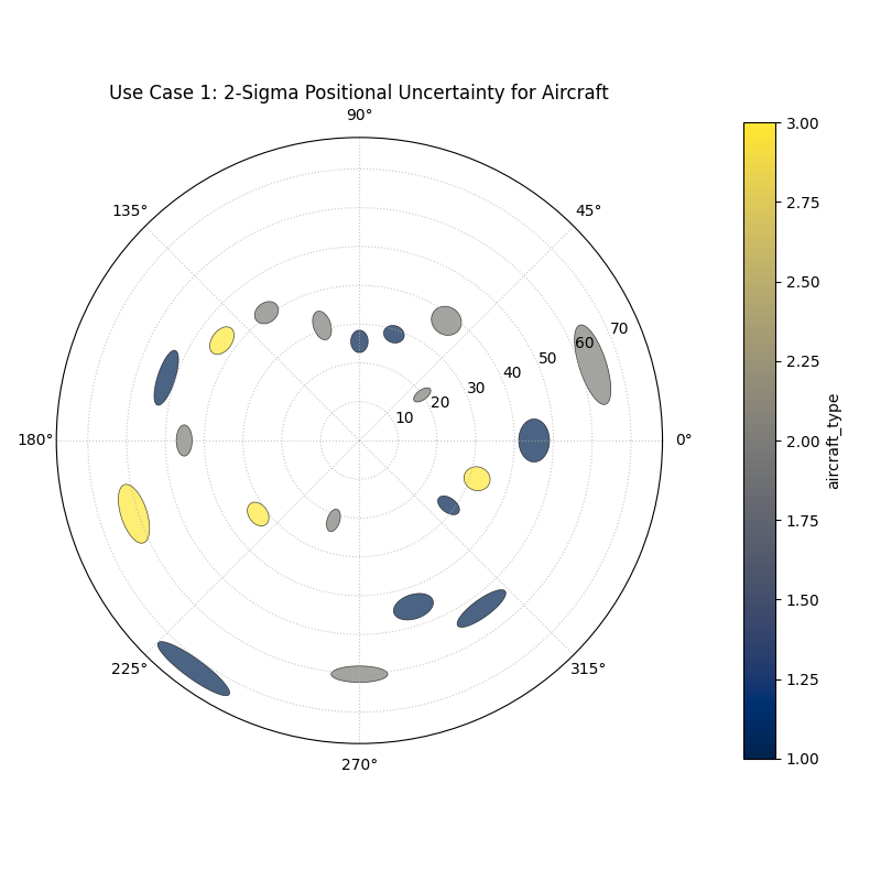
Each ellipse represents the 95% confidence region for a predicted aircraft position, revealing the magnitude and directionality of the uncertainty.
Best Practice
The n_std parameter is key to interpreting this plot correctly.
Setting n_std=1.0, n_std=2.0, or n_std=3.0 corresponds to
visualizing the 68%, 95%, and 99.7% confidence regions, respectively
(assuming a normal error distribution). Choosing the appropriate
level is crucial for risk assessment in your specific application.
For a deeper understanding of the mathematical concepts behind two-dimensional uncertainty and confidence ellipses, please refer back to the main Visualizing 2D Uncertainty (plot_error_ellipses()) section.
Practical Application
While the sections above demonstrate each function in isolation, the
true power of k-diagram lies in using these tools together to conduct
a comprehensive, multi-faceted analysis. A thorough model evaluation
is not just about a single score; it’s about building a deep
understanding of a model’s behavior, its strengths, and its hidden
weaknesses.
This case study will walk you through a realistic workflow, showing how
the different plots from the errors module can be combined to move
from a high-level model comparison to a detailed, actionable diagnosis.
Case Study: Selecting a Drone Navigation System
The Business Problem: A new logistics company, “AeroDeliver,” is finalizing the design for its fleet of delivery drones. The most critical component is the navigation system responsible for the final landing phase. An accurate and reliable landing is paramount for safety and customer satisfaction.
The Models: The engineering team is evaluating two competing systems:
“Standard GPS”: A reliable, cost-effective model based on traditional GPS.
“AI Vision”: A new, more expensive model that fuses GPS with computer vision to improve accuracy, especially under challenging conditions.
The Core Questions: The team needs to answer three key questions to make a data-driven decision:
Which model has the best overall error profile in terms of bias and consistency?
Does the performance of the chosen model degrade under specific, predictable conditions, like the time of day (which affects lighting for the vision system)?
What is the precise two-dimensional positional uncertainty of the final, chosen system for a safety and compliance report?
Let’s use k-diagram to answer each of these questions in turn.
Step 1: Overall Performance Comparison with Error Violins
Our first step is a high-level comparison. We need to look at the entire distribution of landing errors for both models. A simple metric like “average error” could be misleading. One model might have a zero average error but make occasional, catastrophic mistakes. The polar violin plot is the perfect tool for this initial, holistic comparison.
Practical Example
We will simulate the final landing error (in meters) for hundreds of test flights for both the “Standard GPS” and “AI Vision” systems.
 1import kdiagram as kd
 2import pandas as pd
 3import numpy as np
 4import matplotlib.pyplot as plt
 5
 6# --- 1. Data Generation: Landing Errors ---
 7np.random.seed(0)
 8n_landings = 2000
 9# The Standard GPS has a slight positive bias and moderate variance
10gps_errors = np.random.normal(loc=0.5, scale=1.0, size=n_landings)
11# The AI Vision model is unbiased and more consistent (lower variance)
12ai_vision_errors = np.random.normal(loc=0.0, scale=0.6, size=n_landings)
13
14df_errors = pd.DataFrame({
15    'Standard GPS': gps_errors,
16    'AI Vision': ai_vision_errors
17})
18
19# --- 2. Plotting ---
20kd.plot_error_violins(
21    df_errors,
22    'Standard GPS', 'AI Vision',
23    names = ['Standard GPS', 'AI Vision'],
24    title='Step 1: Overall Landing Error Comparison',
25    savefig="gallery/images/casestudy_error_violins.png"
26)
27plt.close()
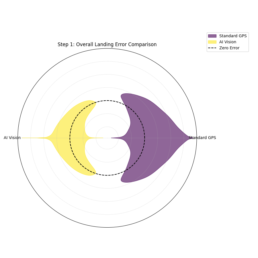
- Quick Interpretation:
The violin plot provides a clear verdict on overall performance. The violin for the “Standard GPS” model is wider and its peak is visibly shifted slightly outside the “Zero Error” circle, indicating a small positive bias and higher variance. In contrast, the “AI Vision” model’s violin is significantly narrower and is perfectly centered on zero. This indicates it is both unbiased and more consistent. Based on this initial analysis, the AI Vision model is the superior system.
Step 2: Diagnosing Conditional Performance with Error Bands
Now that we’ve selected the AI Vision model as the better performer, we need to stress-test it. We suspect that its performance might degrade at dawn and dusk, when difficult lighting conditions could challenge the computer vision algorithms. The polar error band plot is the ideal tool to investigate if the model’s error is conditional on the time of day.
Practical Example
We will simulate the AI model’s landing errors across a full 24-hour cycle, introducing a slight degradation in performance (higher bias and variance) during sunrise (around 6:00) and sunset (around 18:00).
 1# --- 1. Data Generation: Time-Dependent Errors for the AI Model ---
 2np.random.seed(42)
 3n_landings = 3000
 4hour_of_day = np.random.uniform(0, 24, n_landings)
 5# Introduce a bias and higher noise during dawn (5-7) and dusk (17-19)
 6is_twilight = ((hour_of_day > 5) & (hour_of_day < 7)) | ((hour_of_day > 17) & (hour_of_day < 19))
 7bias = np.where(is_twilight, 0.3, 0)
 8noise_scale = np.where(is_twilight, 1.0, 0.5)
 9errors = bias + np.random.normal(0, noise_scale, n_landings)
10
11df_hourly_errors = pd.DataFrame({'hour': hour_of_day, 'landing_error': errors})
12
13# --- 2. Plotting ---
14kd.plot_error_bands(
15    df=df_hourly_errors,
16    error_col='landing_error',
17    theta_col='hour',
18    theta_period=24,
19    theta_bins=24,
20    n_std=2.0,
21    title='Step 2: AI Model Error vs. Time of Day',
22    savefig="gallery/images/casestudy_error_bands.png"
23)
24plt.close()
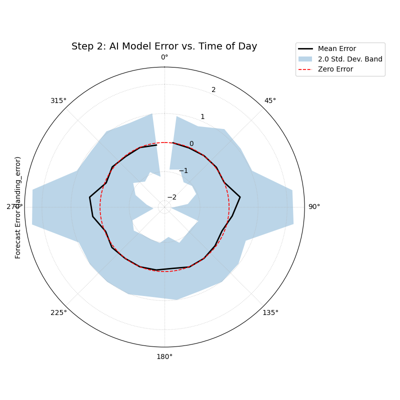
- Quick Interpretation:
This plot reveals a subtle but important conditional pattern. For most of the day, the black “Mean Error” line is flat on the red “Zero Error” circle, and the blue shaded band is very narrow, confirming the model’s excellent performance. However, in the angular sectors corresponding to the dawn and dusk hours, the mean error line pushes slightly outwards, and the shaded band becomes noticeably wider. This is a critical finding: while the AI model is excellent overall, its performance degrades slightly in challenging lighting conditions, becoming both slightly biased and less consistent.
Step 3: Visualizing 2D Positional Uncertainty with Error Ellipses
Finally, for the safety and compliance report, AeroDeliver needs to provide a clear visualization of the AI model’s 2D landing uncertainty. The error isn’t just one number; it has a North-South and an East-West component. The polar error ellipse plot is designed to show exactly this.
Practical Example
We will simulate the predicted landing positions and the associated uncertainties (standard deviations) in both the radial (distance from target) and tangential (directional) axes for several landing sites.
 1# --- 1. Data Generation: 2D Positional Uncertainty ---
 2np.random.seed(1)
 3n_sites = 15
 4df_tracking = pd.DataFrame({
 5    'angle_deg': np.linspace(0, 360, n_sites, endpoint=False),
 6    'distance_km': np.random.uniform(2, 8, n_sites),
 7    'distance_std_m': np.random.uniform(0.2, 0.8, n_sites), # Radial error in meters
 8    'angle_std_deg': np.random.uniform(0.5, 1.5, n_sites), # Angular error in degrees
 9    'site_priority': np.random.randint(1, 4, n_sites)
10})
11
12# --- 2. Plotting ---
13kd.plot_error_ellipses(
14    df=df_tracking,
15    r_col='distance_km',
16    theta_col='angle_deg',
17    r_std_col='distance_std_m',
18    theta_std_col='angle_std_deg',
19    color_col='site_priority',
20    n_std=2.5, # Plot a 2.5-sigma (approx. 99%) confidence ellipse
21    title='Step 3: 99% Confidence Landing Ellipses for AI Model',
22    savefig="gallery/images/casestudy_error_ellipses.png"
23)
24plt.close()
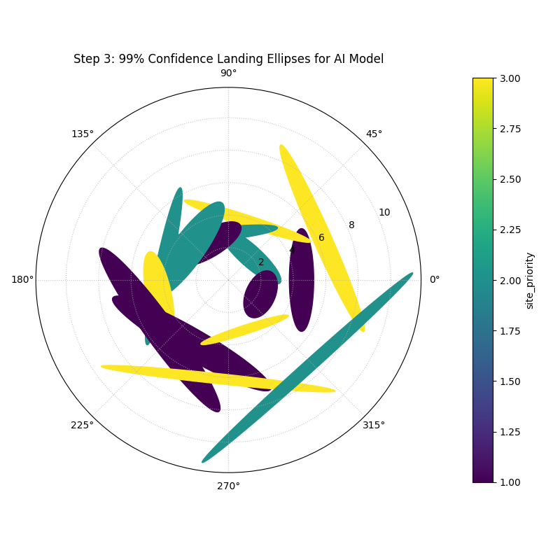
- Quick Interpretation:
This final plot provides a clear, actionable summary of the AI model’s spatial uncertainty. Each ellipse represents the 99% confidence region for a drone landing at a specific site. We can see that the ellipses are all small and nearly circular, indicating that the positional error is low and uniform in all directions. This visualization would be a key figure in a safety report, as it provides a clear and honest depiction of the system’s expected landing precision.
For a deeper understanding of the statistical concepts behind these advanced error diagnostics, please refer back to the main Visualizing Forecast Errors section.