Model Comparison Visualization
Comparing the performance of different forecasting or simulation models is a common task in model development and selection. Often, evaluation requires looking at multiple performance metrics simultaneously to understand the trade-offs and overall suitability of each model for a specific application.
The kdiagram.plot.comparison module provides tools specifically
for this purpose, currently featuring radar charts for multi-metric,
multi-model comparisons.
Summary of Comparison Functions
Function |
Description |
|---|---|
Generates a radar chart comparing multiple models across various performance metrics (e.g., R2, MAE, Accuracy). |
|
Draws a standard reliability (calibration) diagram to assess how well predicted probabilities match observed frequencies. |
|
Draws a novel polar reliability spiral with diagnostic coloring to visualize model calibration. |
|
Draws a polar bar chart to visually compare key metrics across a set of distinct categories, such as forecast horizons. |
Detailed Explanations
Let’s explore the model comparison function.
Multi-Metric Model Comparison (plot_model_comparison())
Purpose: This function generates a radar chart (also known as a spider or star chart) to visually compare the performance of multiple models across multiple evaluation metrics simultaneously. It provides a holistic snapshot of model strengths and weaknesses, making it easier to select the best model based on criteria beyond a single score. Optionally, training time can be included as an additional comparison axis.
Mathematical Concept:
For each model \(k\) (with predictions \(\hat{y}_k\)) and each chosen metric \(m\), a score \(S_{m,k}\) is calculated using the true values \(y_{true}\):
The metrics used can be standard ones (like R2, MAE, Accuracy, F1) or custom functions. If train_times are provided, they are treated as another dimension.
The scores for each metric \(m\) are typically scaled across the models (using scale=’norm’ for Min-Max or scale=’std’ for Standard Scaling) before plotting, to bring potentially different metric ranges onto a comparable radial axis:
Each metric \(m\) is assigned an angle \(\theta_m\) on the radar chart, and the scaled score \(S'_{m,k}\) determines the radial distance along that axis for model \(k\). These points are connected to form a polygon representing each model’s overall performance profile.
Interpretation:
Axes: Each axis radiating from the center represents a different performance metric (e.g., ‘r2’, ‘mae’, ‘accuracy’, ‘train_time_s’).
Polygons: Each colored polygon corresponds to a different model, as indicated by the legend.
Radius: The distance from the center along a metric’s axis shows the model’s (potentially scaled) score for that metric.
Important: By default (scale=’norm’ with internal inversion for error metrics), a larger radius generally indicates better performance (higher score for accuracy/R2, lower score for MAE/RMSE/MAPE/time after inversion during scaling). Check the scale parameter used. If scale=None, interpret radius based on the raw metric values.
Shape Comparison: Compare the overall shapes and sizes of the polygons. A model with a consistently large polygon across multiple desirable metrics might be considered the best overall performer. Different shapes highlight trade-offs (e.g., one model might excel in R2 but be slow, while another is fast but has lower R2).
Use Cases:
Multi-Objective Model Selection: Choose the best model when performance needs to be balanced across several, potentially conflicting, metrics (e.g., high accuracy vs. low error vs. fast training time).
Visualizing Strengths/Weaknesses: Quickly identify which metrics a particular model excels or struggles with compared to others.
Communicating Comparative Performance: Provide stakeholders with an intuitive visual summary of how different candidate models stack up against each other based on chosen criteria.
Comparing Regression and Classification: Use appropriate default or custom metrics to compare models for either task type.
Advantages (Radar Context):
Effectively displays multiple performance dimensions (>2) for multiple entities (models) in a single, relatively compact plot.
Allows direct comparison of the profiles of different models – are they generally good/bad, or strong in some areas and weak in others?
Facilitates the identification of trade-offs between different metrics.
Now that you understand the concepts behind the radar chart, let’s apply it to a common scenario: choosing the best model to predict house prices.
Practical Example
Imagine you’ve trained two different regression models: a simple
Linear Regression model and a more complex Gradient Boosting
model. You want to compare them not just on one metric, but on a
balance of accuracy (r2), error (mae), and training speed.
Here’s how you could generate a comparison plot:
>>> import numpy as np
>>> import kdiagram as kd
>>>
>>> # --- 1. Define your data ---
>>> # True house prices (in $1000s)
>>> y_true = np.array([250, 300, 450, 500, 720])
>>> # Predictions from Model 1 (Linear Regression)
>>> y_pred_lr = np.array([265, 310, 430, 515, 700])
>>> # Predictions from Model 2 (Gradient Boosting)
>>> y_pred_gb = np.array([255, 305, 445, 505, 715])
>>> # Training times in seconds
>>> train_times = [0.05, 1.2] # Linear Regression is much faster
>>> model_names = ['Linear Regression', 'Gradient Boosting']
>>>
>>> # --- 2. Generate the plot ---
>>> ax = kd.plot_model_comparison(
...     y_true,
...     y_pred_lr,
...     y_pred_gb,
...     train_times=train_times,
...     names=model_names,
...     metrics=['r2', 'mae', 'rmse'],
...     title="House Price Model Comparison",
...     scale='norm'
... )
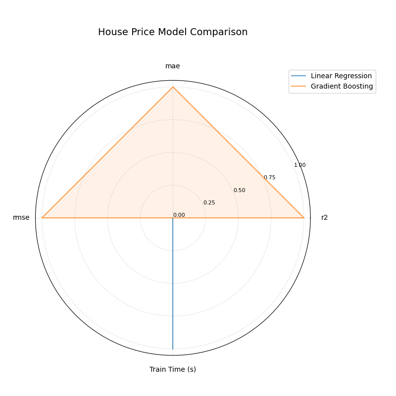
A radar chart comparing a Linear Regression and a Gradient Boosting model across performance metrics and training time.
This chart provides an immediate, holistic comparison of the two models. Let’s break down what the shapes tell us about their respective strengths and weaknesses.
- Quick Interpretation:
The plot starkly illustrates a classic performance trade-off. The
Gradient Boostingmodel (orange triangle) forms a large polygon that fully extends to the outer edge on all three predictive metrics (r2,mae, andrmse), indicating its superior accuracy. In complete contrast, theLinear Regressionmodel (blue line) scores perfectly on theTrain Time (s)axis, highlighting its significant speed advantage, but shows minimal performance on the accuracy axes. This visualization instantly clarifies the choice: select Gradient Boosting for maximum accuracy, or Linear Regression for maximum speed.
This summary provides the key takeaways from the plot. For a complete, runnable example and a more detailed analysis, explore the full example in our gallery.
Example: (See the Model Comparison Example in the Gallery).
Reliability Diagram (plot_reliability_diagram())
Purpose: This function draws a reliability (calibration) diagram, a standard method in forecast verification [1], to assess how well predicted probabilities match observed frequencies. It supports one or many models on the same figure, multiple binning strategies, optional error bars (e.g., Wilson intervals), and a counts panel for diagnosing data sparsity across probability ranges.
Mathematical Concept: Given binary labels \(y_j \in \{0,1\}\) and predicted probabilities \(p_j \in [0,1]\) (optionally with per-sample weights \(w_j \ge 0\)), probabilities are partitioned into bins via a binning rule \(b(\cdot)\) (uniform or quantile).
For bin \(i\), define the (weighted) bin weight
Within each bin, compute the mean confidence (x–axis) and observed frequency (y–axis):
Each bin yields a point \((\mathrm{conf}_i, \mathrm{acc}_i)\). A perfectly calibrated model satisfies \(\mathrm{acc}_i \approx \mathrm{conf}_i\) for all bins, i.e., points lie on the diagonal \(y=x\).
Uncertainty in observed frequency. When \(W_i\) is sufficiently large, a normal approximation can be used for \(\mathrm{acc}_i\) with standard error
Alternatively, the Wilson interval (95%) for a binomial proportion with \(z = 1.96\) provides a more stable interval, especially for small counts:
(With sample weights, \(n\) is treated as an effective count.)
Aggregate calibration metrics.
Expected Calibration Error (ECE) (L1 form):
(8)¶\[\mathrm{ECE} \;=\; \sum_{i} \frac{W_i}{W} \;\big|\mathrm{acc}_i - \mathrm{conf}_i\big|.\]Maximum Calibration Error (MCE) (optional concept):
(9)¶\[\mathrm{MCE} \;=\; \max_i \;\big|\mathrm{acc}_i - \mathrm{conf}_i\big|.\]Brier score (mean squared error on probabilities):
(10)¶\[\mathrm{Brier} \;=\; \frac{1}{W}\sum_{j=1}^{N} w_j \, (p_j - y_j)^2.\]
Lower ECE/MCE/Brier indicate better calibration (and accuracy for Brier).
Interpretation:
Diagonal (:math:`y=x`): Reference for perfect calibration.
Points above diagonal \((\mathrm{acc}_i > \mathrm{conf}_i)\) ⇒ model is under-confident in that bin.
Points below diagonal \((\mathrm{acc}_i < \mathrm{conf}_i)\) ⇒ model is over-confident in that bin.
Counts panel: A histogram of \(p_j\) per bin reveals data coverage; sparse bins tend to have larger uncertainty intervals.
Multiple models: Curves are overlaid; compare proximity to the diagonal and reported ECE/Brier in the legend.
Binning strategies:
Uniform: fixed-width bins on \([0,1]\) (e.g., 10 bins).
Quantile: bins formed so each has (approximately) equal counts. This stabilizes variance of \(\mathrm{acc}_i\) but can yield irregular edges if many identical scores occur.
Use Cases:
Calibrating classifiers that output probabilities (logistic regression, gradient boosting, neural nets).
Comparing models or calibration methods (e.g., Platt scaling vs. isotonic regression).
Communicating reliability: the diagram shows at a glance if a model is systematically over-/under-confident and where.
Advantages:
Local view of calibration (per bin) instead of a single scalar.
Uncertainty-aware via bin-wise intervals.
Distribution-aware with the counts panel, showing score sharpness and data coverage.
Understanding the theory of calibration is crucial. Now, let’s ground it in a practical use case where reliable probabilities are not just a technicality, but a business necessity: predicting loan defaults.
Practical Example
You’ve learned the theory, so let’s consider a practical use case: a bank needs to predict the probability that a loan applicant will default. It’s not enough for the model to be accurate; the predicted probabilities must be reliable.
Let’s compare a model’s raw, uncalibrated probabilities with probabilities that have been improved using a calibration technique.
>>> import numpy as np
>>> import kdiagram as kd
>>>
>>> # --- 1. Define your data ---
>>> # True outcomes (1 = default, 0 = no default)
>>> np.random.seed(0)
>>> y_true = (np.random.rand(500) < 0.3).astype(int)
>>> # Model 1: An over-confident, uncalibrated model
>>> uncalibrated_probs = np.clip(y_true * 0.5 + 0.25 + np.random.randn(500) * 0.2, 0.01, 0.99)
>>> # Model 2: A better-calibrated model
>>> calibrated_probs = np.clip(y_true * 0.4 + 0.3 + np.random.randn(500) * 0.1, 0.01, 0.99)
>>> model_names = ['Uncalibrated Model', 'Calibrated Model']
>>>
>>> # --- 2. Generate the plot ---
>>> ax = kd.plot_reliability_diagram(
...     y_true,
...     uncalibrated_probs,
...     calibrated_probs,
...     names=model_names,
...     n_bins=10,
...     title="Loan Default Model Calibration"
... )
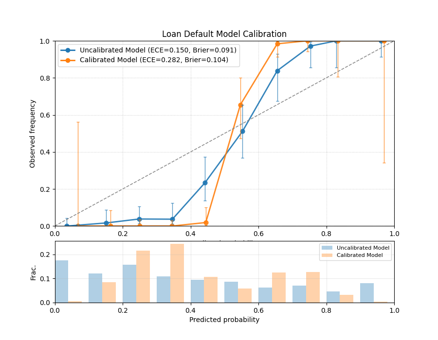
A reliability diagram showing an uncalibrated model’s curve deviating from the ideal diagonal, while a calibrated model’s curve follows it closely.
The resulting plot directly compares the reliability of the two approaches. Let’s analyze the curves to see the impact of calibration.
- Quick Interpretation:
The plot clearly shows the effect of calibration. The blue line (
Uncalibrated Model) deviates from the dashed diagonal, especially for predicted probabilities between 0.4 and 0.8, where it falls below the line. This indicates the model is over-confident. In contrast, the orange line (Calibrated Model) follows the diagonal much more closely, demonstrating that its predicted probabilities are far more reliable and trustworthy.
This analysis provides the main visual takeaways. To generate this plot yourself and see how to retrieve the underlying per-bin statistics, dive into the detailed gallery example.
Example: (See the Gallery example for a complete, runnable snippet that saves an image and returns per-bin statistics.)
Polar Reliability Diagram (plot_polar_reliability())
Purpose This function creates a Polar Reliability Diagram, a novel visualization that transforms the standard calibration plot into an intuitive spiral [2]. It is designed to diagnose model calibration by comparing predicted probabilities (mapped to the angle) to observed frequencies (mapped to the radius), with diagnostic coloring to reveal the nature of any miscalibration.
Mathematical Concept: This plot is a polar adaptation of the standard reliability diagram, a key tool in forecast verification [1].
Binning: First, the predicted probabilities \(p_i\) are partitioned into \(K\) bins. For each bin \(k\), the mean predicted probability (\(\bar{p}_k\)) and the mean observed frequency (\(\bar{y}_k\)) are calculated.
Polar Mapping: These binned statistics are then mapped to polar coordinates:
(11)¶\[\begin{split}\theta_k &= \bar{p}_k \cdot \frac{\pi}{2} \\ r_k &= \bar{y}_k\end{split}\]The plot is constrained to a 90-degree quadrant, where the angle \(\theta\) represents the predicted probability from 0 to 1, and the radius \(r\) represents the observed frequency from 0 to 1.
Perfect Calibration: A perfectly calibrated model, where \(\bar{p}_k = \bar{y}_k\) for all bins, will form a perfect Archimedean spiral defined by \(r = \frac{2\theta}{\pi}\). This is drawn as a dashed black reference line.
Diagnostic Coloring: The calibration error for each bin is calculated as \(e_k = \bar{y}_k - \bar{p}_k\). The line segments of the model’s spiral are colored based on this error:
\(e_k < 0\): The model is over-confident (observed frequency is lower than predicted probability).
\(e_k > 0\): The model is under-confident (observed frequency is higher than predicted probability).
Interpretation: The plot provides an intuitive visual assessment of model calibration by comparing the model’s spiral to the perfect calibration reference.
Alignment: A well-calibrated model will have a spiral that lies directly on top of the dashed black reference spiral.
Deviation:
If the model’s spiral is inside the reference, it indicates over-confidence (the model predicts higher probabilities than are observed).
If the model’s spiral is outside the reference, it indicates under-confidence.
Color: The color of the line provides a direct diagnostic. Using a diverging colormap like ‘coolwarm’, red areas might show over-confidence while blue areas show under-confidence.
Use Cases:
To get a more intuitive and visually engaging assessment of model calibration compared to a traditional Cartesian plot.
To quickly identify in which probability ranges a model is over- or under-confident.
To effectively communicate the calibration performance of one or more models in a single, diagnostic-rich figure.
While the standard reliability diagram is effective, sometimes a different perspective can make model behavior even more intuitive. Let’s revisit the loan default scenario using the novel polar reliability plot to see how it visualizes over- and under-confidence.
Practical Example
Let’s use the novel polar diagram to get a more intuitive feel for model calibration. We’ll stick with the loan default prediction scenario but visualize the model’s performance in a different way. This format can be very effective for quickly diagnosing where a model’s probabilities are misleading.
Let’s compare an over-confident model with an under-confident one.
>>> import numpy as np
>>> import kdiagram as kd
>>>
>>> # --- 1. Define your data ---
>>> np.random.seed(42)
>>> y_true = (np.random.rand(1000) < 0.4).astype(int)
>>> # Model 1: Over-confident (predicts probabilities that are too extreme)
>>> overconfident_preds = np.clip(0.4 + np.random.normal(0, 0.3, 1000), 0.01, 0.99)
>>> # Model 2: Under-confident (cautious probabilities)
>>> underconfident_preds = 0.5 - np.abs(np.clip(
...     0.4 + np.random.normal(0, 0.1, 1000), 0, 1) - 0.5)
>>> model_names = ['Over-Confident', 'Under-Confident']
>>>
>>> # --- 2. Generate the plot ---
>>> ax = kd.plot_polar_reliability(
...     y_true,
...     overconfident_preds,
...     underconfident_preds,
...     names=model_names,
...     n_bins=15,
...     title="Calibration Spiral for Loan Default Models"
... )
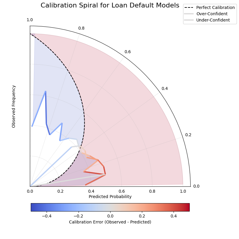
A polar reliability spiral where an over-confident model’s curve falls inside the perfect calibration line and an under-confident model’s curve falls outside.
This spiral visualization offers a unique diagnostic view. By comparing the model’s spiral to the perfect calibration reference, we can instantly spot issues.
- Quick Interpretation:
This spiral plot makes miscalibration intuitive to see. The segments of the spiral colored red, corresponding to the “Over-Confident” model’s predictions, fall significantly inside the dashed black reference line. This visually shows that the model’s predicted probabilities are higher than the actual observed outcomes. Conversely, the blue segments, representing the “Under-Confident” model, lie outside the reference line, indicating the model consistently underestimates the true event frequency.
This summary covers the key insights from the plot. For a complete, step-by-step code example and a more detailed breakdown of the analysis, please explore the full example in the gallery.
Example: See the gallery example and code: Polar Reliability Diagram (Calibration Spiral).
Comparing Metrics Across Horizons (plot_horizon_metrics())
Purpose: This function creates a polar bar chart, a novel visualization developed as part of the analytics framework in Kouadio[2], to visually compare key metrics across a set of distinct categories, most commonly different forecast horizons (e.g., H+1, H+2, etc.). It is designed to answer questions like: “How does my model’s uncertainty (interval width) and central tendency (median prediction) evolve as it forecasts further into the future?”
Mathematical Concept: The plot summarizes metrics for \(N\) horizons (corresponding to the rows in the input df) using data from \(M\) samples (corresponding to the provided columns for each quantile). Let the input data be represented by matrices for the lower, upper, and median quantiles: \(\mathbf{L}\), \(\mathbf{U}\), and \(\mathbf{Q50}\), all of shape \((N, M)\).
Interval Width Calculation: First, a matrix of interval widths \(\mathbf{W}\) of shape \((N, M)\) is computed by element-wise subtraction. Each element \(W_{j,i}\) represents the interval width for horizon \(j\) and sample \(i\).
(12)¶\[W_{j,i} = U_{j,i} - L_{j,i}\]Radial Value (Bar Height): The primary metric plotted as the bar height (radial value \(r_j\)) for each horizon \(j\) is the mean of its interval widths across all \(M\) samples.
(13)¶\[r_j = \frac{1}{M} \sum_{i=0}^{M-1} W_{j,i}\]If normalize_radius=True, these values are then min-max scaled to the range [0, 1].
Color Value: The secondary metric, encoded as color, is the mean of the Q50 values for each horizon \(j\).
(14)¶\[c_j = \frac{1}{M} \sum_{i=0}^{M-1} Q50_{j,i}\]If q50_cols are not provided, the color value defaults to the radial value, \(c_j = r_j\). These color values are then mapped to a colormap via a standard normalization.
Interpretation:
Angle: Each angular segment represents a different horizon or category, as specified by the
xtick_labelsparameter. The plot typically starts at the top (12 o’clock) and proceeds clockwise.Radius (Bar Height): The length of each bar indicates the magnitude of the primary metric (e.g., mean interval width). Longer bars signify larger values.
Color: The color of each bar represents the magnitude of the secondary metric (e.g., mean Q50 value). The color bar on the side of the plot provides the scale for this metric.
Use Cases:
Analyzing Uncertainty Drift: Track how a model’s predictive uncertainty (interval width) grows or shrinks over a forecast horizon.
Comparing Forecast Magnitudes: Simultaneously visualize how the central tendency (Q50) of the forecast changes along with its uncertainty.
Comparing Models: Generate this plot for multiple models to compare their uncertainty profiles over time. A model with shorter, more stable bars may be preferable.
Categorical Performance: The “horizons” can represent any set of categories, such as different geographic regions or model configurations, to compare aggregated metrics.
Advantages (Polar Bar Context):
Intuitive Comparison: The circular layout allows for easy comparison of values across sequential categories.
Two-Dimensional Insight: It effectively encodes two different metrics (bar height and bar color) for each category in a single, compact plot.
Highlights Trends: Trends across horizons, such as consistently increasing uncertainty, are immediately apparent.
Beyond single predictions, a common challenge is understanding how a model’s performance evolves over a forecast horizon. This example tackles that problem by visualizing how both the uncertainty and the central tendency of a forecast change over time.
Practical Example
Let’s apply this unique plot to a common time-series forecasting problem: predicting electricity demand for the next 12 hours. A key challenge is that uncertainty typically increases for forecasts further in the future. We want to visualize two things at once: (1) How does the model’s uncertainty (prediction interval width) change? (2) How does the central forecast (the median) change?
>>> import pandas as pd
>>> import numpy as np
>>> import kdiagram as kd
>>>
>>> # --- 1. Create synthetic forecast data ---
>>> horizons = [f"H+{i+1}" for i in range(12)]
>>> # Create increasing uncertainty and a rising/falling demand pattern
>>> base_q50 = 100 + 20 * np.sin(np.linspace(0, np.pi, 12))
>>> base_width = np.linspace(5, 25, 12) # Uncertainty grows
>>> df_flat = pd.DataFrame(index=horizons)
>>> df_flat['q10_s1'] = base_q50 - base_width/2 + np.random.randn(12)
>>> df_flat['q10_s2'] = base_q50 - base_width/2 + np.random.randn(12)
>>> df_flat['q90_s1'] = base_q50 + base_width/2 + np.random.randn(12)
>>> df_flat['q90_s2'] = base_q50 + base_width/2 + np.random.randn(12)
>>> df_flat['q50_s1'] = base_q50 + np.random.randn(12)
>>> df_flat['q50_s2'] = base_q50 + np.random.randn(12)
>>>
>>> # --- 2. Generate the plot ---
>>> ax = kd.plot_horizon_metrics(
...     df=df_flat,
...     qlow_cols=['q10_s1', 'q10_s2'],
...     qup_cols=['q90_s1', 'q90_s2'],
...     q50_cols=['q50_s1', 'q50_s2'],
...     xtick_labels=horizons,
...     title="Electricity Demand Forecast: Uncertainty & Median",
...     r_label="Mean Prediction Interval Width",
...     cbar_label="Mean Median Demand (kW)"
... )
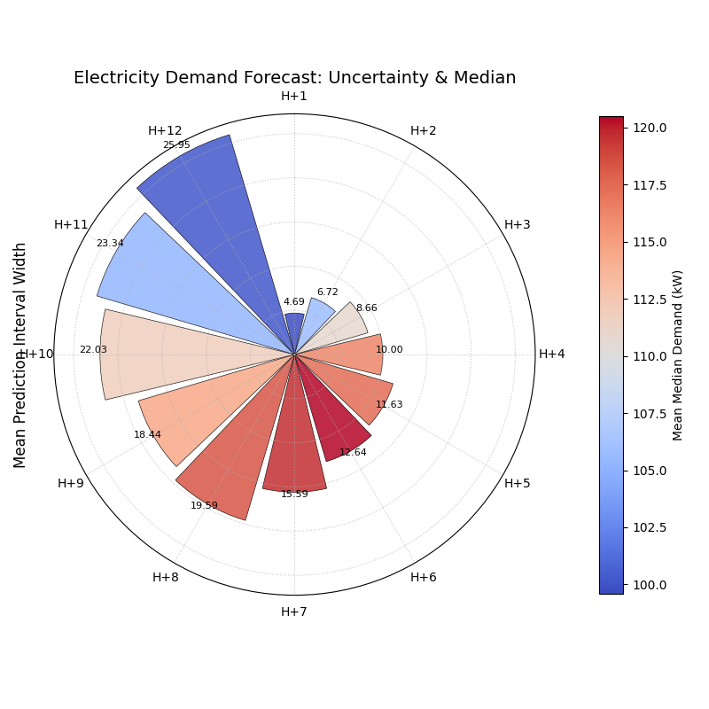
A polar bar chart where bar height represents forecast uncertainty and color represents the median predicted value across 12 forecast horizons.
The polar bar chart summarizes the entire 12-hour forecast in a single snapshot. Let’s examine the bars’ height and color to understand the evolving forecast.
- Quick Interpretation:
This plot provides a rich, two-dimensional summary of the forecast. As you move clockwise from “H+1” to “H+12”, the bar heights (radius) get progressively longer. This is a clear visual confirmation that the model’s uncertainty grows as it forecasts further into the future. Simultaneously, the bar colors show the trend in the median prediction, shifting from blue (lower demand) to red (higher demand) around the “H+5” to “H+9” horizons, indicating a peak in predicted electricity demand.
This summary covers the key insights from the plot. For a complete, step-by-step code example and a more detailed breakdown of the analysis, please explore the full example in the gallery.
Example: (See the Horizon Metrics Example in the Gallery)
References