Taylor Diagrams
Evaluating the performance of forecast or simulation models often requires considering multiple aspects simultaneously. How well does the model capture the overall variability (standard deviation) of the observed phenomenon? How well does the pattern of the model’s output correlate with the observed pattern? A Taylor Diagram, developed by Karl E. Taylor [1], provides an elegant solution by graphically summarizing these key statistics in a single, concise plot.
Taylor diagrams are widely used, particularly in climate science and meteorology, but are applicable to any field where model outputs need rigorous comparison against a reference dataset (observations). They allow for the simultaneous assessment of correlation, standard deviation, and (implicitly) the centered root-mean-square difference (RMSD) between different models and the reference.
k-diagram provides flexible functions to generate these informative
diagrams.
Summary of Evaluation Functions
The following functions generate variations of the Taylor Diagram:
Function |
Description |
|---|---|
Flexible Taylor Diagram plotter; accepts pre-computed statistics (std. dev., correlation) or raw prediction/reference arrays. Includes options for background shading based on different weighting strategies. |
|
Taylor Diagram plotter featuring a background colormap encoding correlation or performance zones, with specific shading strategies. Requires raw prediction/reference arrays. |
|
A potentially simpler interface for plotting Taylor Diagrams, requiring raw prediction/reference arrays. (May share features with the other functions). |
Interpreting Taylor Diagrams
Regardless of the specific function used, interpreting a Taylor Diagram involves looking at the position of points (representing models or predictions) relative to the reference point and the axes:
Reference Point/Arc: Typically marked on the horizontal axis (at angle 0) or as an arc. Its radial distance from the origin represents the standard deviation of the reference (observed) data (\(\sigma_r\)).
Radial Axis (Distance from Origin): Represents the standard deviation of the prediction (\(\sigma_p\)). Models with standard deviations similar to the reference will lie near the reference arc.
Angular Axis (Angle from Horizontal/Reference): Represents the correlation coefficient (\(\rho\)) between the prediction and the reference, usually via the relation \(\theta = \arccos(\rho)\). Points closer to the horizontal axis (smaller angle) have higher correlations.
Distance to Reference Point: The straight-line distance between a model point and the reference point is proportional to the centered Root Mean Square Difference (RMSD) between the prediction and the reference.
Overall Skill: Generally, models plotted closer to the reference point are considered more skillful, indicating a better balance of correlation and amplitude of variations (standard deviation).
Detailed Explanations
Let’s explore the specific functions.
Flexible Taylor Diagram (taylor_diagram())
Purpose: This function provides a highly flexible way to generate Taylor Diagrams. It uniquely accepts either pre-computed statistics (standard deviations and correlation coefficients) or the raw data arrays (predictions and reference) from which it calculates these statistics internally. It also offers several strategies for adding an optional background color mesh to highlight specific regions of the diagram.
Mathematical Concept: The plot is based on the geometric relationship between the standard deviations of the reference (\(\sigma_r\)) and prediction (\(\sigma_p\)), their correlation coefficient (\(\rho\)), and the centered Root Mean Square Difference (RMSD):
On the diagram:
Radius (distance from origin) = \(\sigma_p\)
Angle (from reference axis) = \(\theta = \arccos(\rho)\)
Distance from Reference Point = RMSD
Interpretation:
Evaluate model points based on their proximity to the reference point (lower RMSD is better), their angular position (lower angle means higher correlation), and their radial position relative to the reference arc/point (matching standard deviation is often desired).
If cmap is used, the background shading provides additional context based on the radial_strategy:
‘rwf’: Emphasizes points with high correlation and standard deviation close to the reference.
‘convergence’ / ‘norm_r’: Simple radial gradients.
‘center_focus’: Highlights a central region.
‘performance’: Highlights the area around the best-performing point based on correlation and std. dev. matching the reference.
Use Cases:
Comparing multiple model results when only summary statistics (std. dev., correlation) are available.
Generating standard Taylor diagrams from raw model output and observation arrays.
Creating visually enhanced diagrams with background shading to guide interpretation towards specific performance criteria.
Customizing the appearance of the reference marker and plot labels.
Advantages:
High flexibility in accepting either pre-computed statistics or raw data arrays.
Offers multiple strategies for informative background shading to enhance interpretation.
Provides options for customizing reference display and label sizes.
Taylor Diagram with Background Shading (plot_taylor_diagram_in())
Purpose: This function specializes in creating Taylor Diagrams with a prominent background color mesh that visually encodes the correlation domain or other performance metrics. It requires raw prediction and reference arrays as input and offers specific strategies for generating the background.
Mathematical Concept: Same fundamental relationship as taylor_diagram: maps standard deviation (\(\sigma_p\)) to radius and correlation (\(\rho\)) to angle (\(\theta = \arccos(\rho)\)). The key feature is the generation of the background color field CC based on radial_strategy:
‘convergence’: \(CC = \cos(\theta)\) (directly maps correlation).
‘norm_r’: \(CC = r / \max(r)\) (maps normalized radius).
‘performance’: \(CC = \exp(-(\sigma_p - \sigma_{best})^2 / \epsilon_\sigma) \cdot \exp(-(\theta - \theta_{best})^2 / \epsilon_\theta)\) (Gaussian-like function centered on the best model point).
Interpretation:
Interpret model points relative to the reference point/arc as described in the general interpretation guide.
The background color provides context:
With ‘convergence’, colors directly map to correlation values (e.g., warmer colors for higher correlation).
With ‘norm_r’, colors show relative standard deviation.
With ‘performance’, the brightest color highlights the region closest to the best-performing input model.
The zero_location and direction parameters change the orientation of the plot, affecting where correlation=1 appears and whether angles increase clockwise or counter-clockwise.
Use Cases:
Creating visually rich Taylor diagrams where the background emphasizes correlation levels or proximity to the best model.
Comparing models when a strong visual cue for correlation or relative performance across the diagram space is desired.
Generating diagrams with specific orientations (e.g., correlation=1 at the top North position).
Advantages:
Provides built-in, visually informative background shading options focused on correlation or performance.
Offers fine control over plot orientation (zero_location, direction).
Basic Taylor Diagram (plot_taylor_diagram())
Purpose: This function appears to offer a potentially simpler interface for generating a standard Taylor Diagram, requiring raw prediction and reference arrays as input. It compares models based on standard deviation (radius) and correlation (angle).
Mathematical Concept: Utilizes the same core principles as the other Taylor diagram functions, mapping standard deviation (\(\sigma_p\)) to the radial coordinate and correlation (\(\rho\)) to the angular coordinate (\(\theta = \arccos(\rho)\)).
Interpretation:
Interpret points based on their standard deviation (radius), correlation (angle), and distance to the reference point (RMSD) as outlined in the general interpretation guide above.
Customization options like zero_location, direction, and angle_to_corr allow tailoring the plot’s appearance and labeling.
Use Cases:
Generating standard Taylor diagrams for model evaluation when background shading is not required.
Comparing multiple predictions against a common reference based on correlation and standard deviation.
Advantages:
May offer a more streamlined interface if fewer customization options are needed compared to taylor_diagram or plot_taylor_diagram_in.
A Practical Case Study: Evaluating Climate Models
The Taylor Diagram is an indispensable tool in fields like climate
science for evaluating the performance of complex simulations. Let’s
walk through a realistic case study to see how each of the k-diagram
Taylor Diagram functions can be used in a complete analysis workflow.
Practical Example
A climate research institute has developed three different Global Climate Models (GCMs) to simulate historical monthly surface temperatures. They need to compare how well each model’s output corresponds to a reference dataset of actual observations. The goal is to find the model that best captures both the pattern (correlation) and the magnitude of climate variability (standard deviation).
Step 1: The Standard Comparison with ``plot_taylor_diagram``
The first step is always a clean, standard comparison. The
researchers want to see the performance of their three models—“A
(High-Var)”, “B (Low-Corr)”, and “C (Balanced)”—on a single,
uncluttered plot. The plot_taylor_diagram function is perfect
for this initial assessment.
>>> import numpy as np
>>> import kdiagram as kd
>>>
>>> # --- 1. Simulate historical observations and model outputs ---
>>> np.random.seed(0)
>>> reference = np.random.normal(15, 2.5, 360) # Observed temperatures
>>>
>>> # Model A: Good correlation, but too much variability
>>> y_pred_A = reference + np.random.normal(0, 1.5, 360)
>>> # Model B: Lower variability, but lower correlation
>>> y_pred_B = reference * 0.7 + np.random.normal(0, 1.2, 360)
>>> # Model C: A well-balanced model
>>> y_pred_C = reference * 0.95 + np.random.normal(0, 0.8, 360)
>>>
>>> # --- 2. Generate the standard Taylor Diagram ---
>>> ax1 = kd.plot_taylor_diagram(
...     y_pred_A, y_pred_B, y_pred_C,
...     reference=reference,
...     names=['A (High-Var)', 'B (Low-Corr)', 'C (Balanced)'],
...     title='Step 1: Standard Climate Model Comparison'
... )
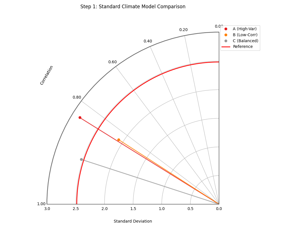
A standard Taylor Diagram showing the performance of three climate models relative to the reference observations.
This initial plot gives us our first look at the models’ performance. Let’s analyze the position of each point relative to the “Reference” marker.
Step 2: Adding Context with ``plot_taylor_diagram_in``
Next, the researchers want to add more visual context to their
analysis. They decide to create a version of the diagram where the
background is colored based on the correlation value, providing an
intuitive heatmap of performance. The plot_taylor_diagram_in
function, with its built-in background shading, is ideal for this.
>>> # --- Use the same data as Step 1 ---
>>>
>>> # --- Generate the Taylor Diagram with background shading ---
>>> ax2 = kd.plot_taylor_diagram_in(
...     y_pred_A, y_pred_B, y_pred_C,
...     reference=reference,
...     names=['A (High-Var)', 'B (Low-Corr)', 'C (Balanced)'],
...     radial_strategy='convergence', # Color by correlation
...     cmap='plasma',
...     title='Step 2: Comparison with Correlation Shading'
... )
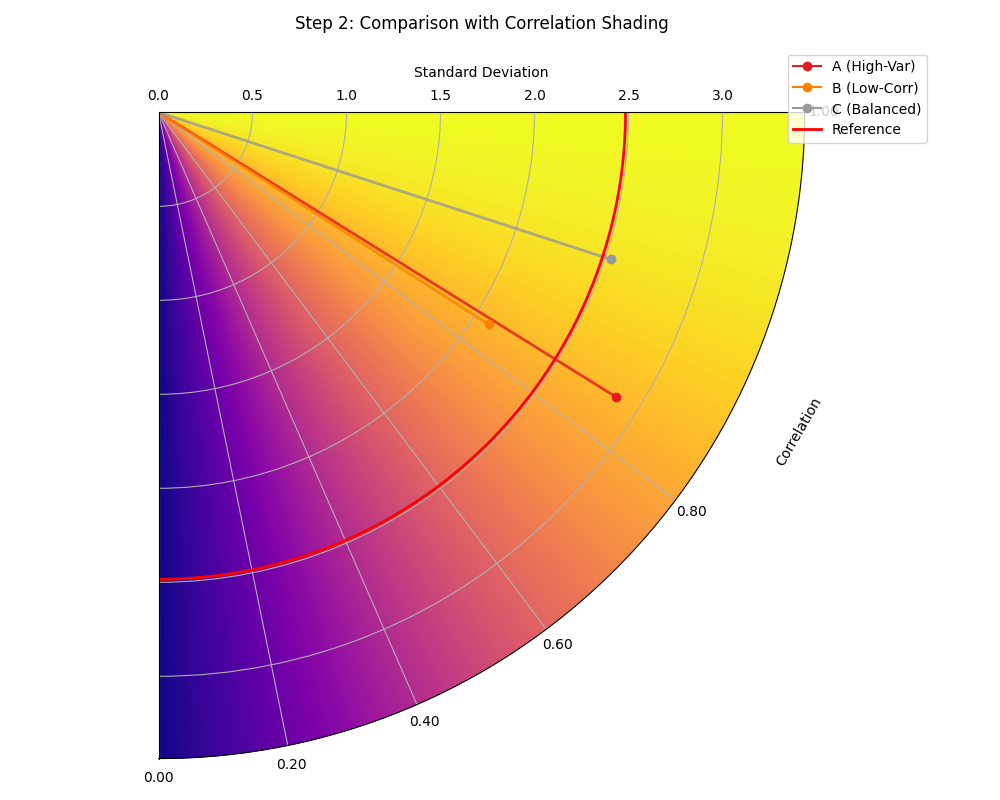
A Taylor Diagram where the background color directly visualizes the correlation, with warmer colors indicating higher correlation.
The background color now provides an immediate visual guide to the high-performance regions of the plot, making the interpretation even more intuitive.
Step 3: Incorporating External Data with ``taylor_diagram``
Finally, a collaborating institution sends in summary statistics for a fourth, computationally expensive model, “D (External)”. The researchers do not have the raw prediction data, only the pre-computed standard deviation and correlation coefficient.
The highly flexible taylor_diagram function is the only one that
can handle this situation, as it accepts pre-computed statistics
directly. They can use it to add Model D to their original comparison.
>>> # --- 1. Use pre-computed stats for the first three models ---
>>> stddevs = [np.std(y_pred_A), np.std(y_pred_B), np.std(y_pred_C)]
>>> corrs = [
...     np.corrcoef(reference, y_pred_A)[0, 1],
...     np.corrcoef(reference, y_pred_B)[0, 1],
...     np.corrcoef(reference, y_pred_C)[0, 1]
... ]
>>> names = ['A (High-Var)', 'B (Low-Corr)', 'C (Balanced)']
>>>
>>> # --- 2. Add the stats for the new external model ---
>>> stddevs.append(2.6) # Pre-computed std. dev. for Model D
>>> corrs.append(0.98)  # Pre-computed correlation for Model D
>>> names.append('D (External)')
>>>
>>> # --- 3. Generate the plot from statistics ---
>>> ax3 = kd.taylor_diagram(
...     stddev=stddevs,
...     corrcoef=corrs,
...     names=names,
...     reference=reference, # Still need reference for its std. dev.
...     title='Step 3: Adding a Model from External Statistics'
... )
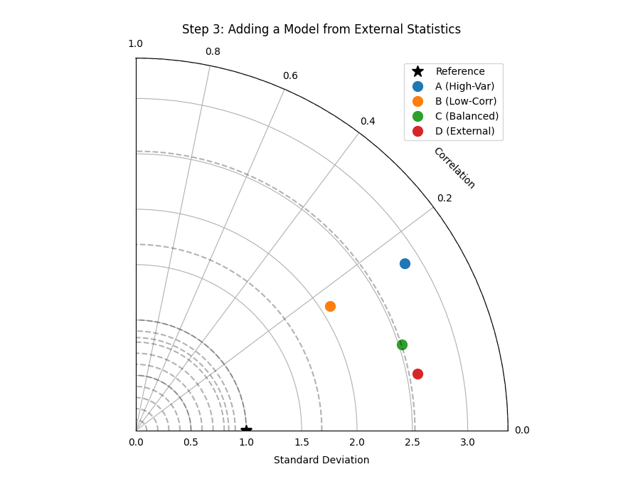
A Taylor Diagram generated from a mix of calculated and pre-computed statistics, demonstrating the function’s flexibility.
This final diagram allows for a complete comparison across all four models, even when the raw data for one is unavailable.
This comprehensive workflow demonstrates how the different Taylor
Diagram functions in k-diagram can be used together to conduct a
thorough and flexible model evaluation. To explore these examples in
more detail, please visit the gallery.
Example: See the gallery Taylor Diagrams for code and plot examples.
References