Diagnosing Forecast Anomalies
A critical aspect of evaluating probabilistic forecasts is moving beyond aggregate scores to understand the specific nature of a model’s failures. A forecast interval can fail in many ways: the error might be small or large, random or systematic, biased towards over- or under-prediction. Understanding these patterns is essential for building trustworthy models, especially in high- stakes applications where the cost of an error is significant [1].
The kdiagram.plot.anomaly module provides a suite of
specialized visualizations designed to dissect these forecast
failures, which we term anomalies. These plots are built upon
the Clustered Anomaly Severity (CAS) score, a novel metric
that quantifies not just the magnitude of an error but also its
concentration. This allows for a deeper diagnosis of whether a
model’s failures are random noise or indicative of a systematic,
clustered bias.
Summary of Anomaly Diagnostic Functions
Function |
Description |
|---|---|
A polar scatter plot to visualize anomaly location, magnitude, type, and cluster density. |
|
A stylized “fiery ring” plot for a high-impact summary of anomaly hotspots and severity. |
|
An informative polar plot using custom glyphs to encode multiple anomaly characteristics. |
|
A Cartesian (non-polar) profile of anomalies, ideal for sequential or time-series data. |
|
A layered Cartesian plot showing the forecast, anomalies, and severity scores in stacked panels. |
Polar Anomaly Severity Plot (plot_anomaly_severity())
Purpose: This function creates a Polar Anomaly Severity Plot, a primary diagnostic for analyzing forecast failures. It identifies anomalies (where the true value falls outside the predicted interval) and visualizes their location, magnitude, type, and clustering density in a single, compact polar view. It answers not just if a model fails, but how and where it fails.
Mathematical Concept This plot visualizes the key components of the Clustered Anomaly Severity (CAS) score. For each anomaly, it maps four distinct dimensions of information to visual properties.
Anomaly Magnitude (\(m_i\)): The severity of a failure, mapped to the radius.
Local Cluster Density (\(d_i\)): The concentration of failures, mapped to the color.
Anomaly Type: Whether the failure was an over- or under-prediction, mapped to the marker shape.
Location: The sample index, mapped to the angle.
For the full mathematical definitions of these components,
please see the documentation for the
cluster_aware_severity_score().
Interpretation: The plot provides a rich, multi-dimensional view of a model’s failure modes.
Radius: The distance from the center shows the magnitude of an anomaly. Points far from the center are severe failures.
Color: The color of a point shows its cluster density. “Hotter” (brighter) colors indicate the anomaly is part of a dense cluster of other failures—a potential “hotspot”.
Marker Shape: The marker distinguishes the type of failure. By default, circles (o) are over-predictions (risk underestimated), while X’s are under-predictions.
Angle: The angular position shows where in the dataset (sequentially) the failure occurred. Look for clusters of hot-colored, high-radius points at specific angles.
Use Cases:
To get a detailed summary of forecast failures, moving beyond a simple coverage score.
To diagnose if a model’s failures are random noise or part of a systematic, clustered pattern.
To identify “hotspots” of poor performance in a dataset.
While a simple coverage score tells you how often a model is wrong, it doesn’t tell you the story of how it’s wrong. This plot is designed to tell that story, revealing whether failures are minor and scattered or severe and systematic—a critical distinction for any high-stakes forecasting application.
Practical Example
A logistics company uses a probabilistic model to forecast delivery times. An “anomaly” occurs when a package arrives outside its predicted window. It is critical to understand these failures: are they minor, random delays, or are there systematic issues causing large, clustered delays on specific routes or days?
This plot will ignore all on-time deliveries and create a focused visualization of only the failures. The radius will show how severe each delay was, and the color will reveal if these delays are clustered together, pointing to a systemic problem that needs to be addressed.
>>> import numpy as np
>>> import pandas as pd
>>> import kdiagram as kd
>>>
>>> # --- 1. Simulate delivery time forecast data ---
>>> np.random.seed(0)
>>> n_deliveries = 500
>>> y_true = np.random.lognormal(mean=1, sigma=0.5, size=n_deliveries) * 2
>>> y_pred_q10 = y_true * 0.8 - np.random.uniform(0.5, 1, n_deliveries)
>>> y_pred_q90 = y_true * 1.2 + np.random.uniform(0.5, 1, n_deliveries)
>>>
>>> # --- 2. Manually introduce a cluster of severe anomalies ---
>>> late_indices = np.arange(100, 150)
>>> y_true[late_indices] += np.random.uniform(3, 6, 50)
>>>
>>> df = pd.DataFrame({
...     'actual_days': y_true, 'predicted_q10': y_pred_q10,
...     'predicted_q90': y_pred_q90
... })
>>>
>>> # --- 3. Generate the plot ---
>>> ax = kd.plot_anomaly_severity(
...     df,
...     actual_col='actual_days',
...     q_low_col='predicted_q10',
...     q_up_col='predicted_q90',
...     title='Analysis of Delivery Time Anomalies'
... )
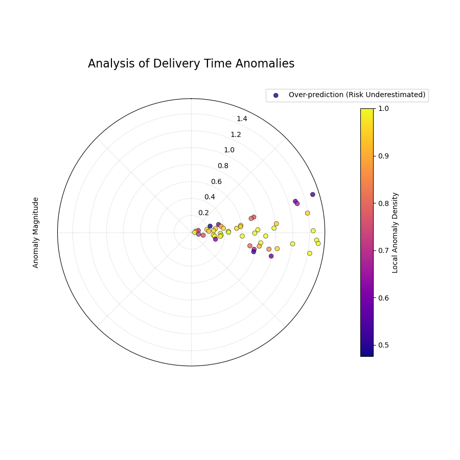
A polar scatter plot showing forecast failures, where radius is the severity, angle is the location, and color shows if the failures are clustered.
This plot acts as a magnifying glass for your model’s most significant errors. A sparse plot with cool-colored points near the center is ideal.
Quick Interpretation: This plot instantly reveals a critical issue with the forecast model. There is a distinct cluster of bright yellow points in one angular region. These points are also located far from the center. This tells us two things simultaneously: (1) the failures in this region are severe (high magnitude), and (2) they are systematically clustered (high local density). This is a clear “hotspot” of poor performance that requires immediate investigation.
Focusing on the structure of failures is essential for risk assessment and building robust models. To learn more about this diagnostic, please explore the full example in the gallery.
Example: See the gallery example and code at Polar Anomaly Severity Plot (Scatter Version).
Polar Anomaly Profile (plot_anomaly_profile())
Purpose: This function creates a Polar Anomaly Profile, a stylized and aesthetically focused visualization for forecast failures. It is designed for high-impact figures in scientific papers, using the metaphor of a “fiery ring” to represent hotspots of clustered anomalies, with individual failures erupting from it as flares.
Mathematical Concept This plot is a stylized representation of the key components of the Clustered Anomaly Severity (CAS) score, transforming them into a visual narrative.
Central Ring: The angular dimension is divided into bins. Within each angular bin, the average local anomaly density is calculated. This average density determines the color of that segment of the ring, creating a smooth heatmap of failure concentration.
Flares: Each individual anomaly is drawn as a line or “flare” that originates from the central ring.
The length of the flare is directly proportional to the Anomaly Magnitude of that specific failure.
The direction of the flare indicates the Type of anomaly: outward flares for over-predictions (risk underestimated) and inward flares for under-predictions.
Interpretation: The plot provides an immediate, intuitive summary of a model’s failure characteristics.
The “Fiery Ring”: The color of the central ring diagnoses hotspots. Bright, hot colors indicate angular regions where anomalies are highly clustered and systematic.
The “Flares”: The flares diagnose individual severity and bias.
Long flares represent severe, high-magnitude failures that demand investigation.
A dominance of outward flares indicates a systematic bias towards underestimating risk (over-prediction).
A dominance of inward flares indicates a systematic bias towards overestimating risk (under-prediction).
Use Cases:
To create a visually compelling summary of a model’s failure profile for publications and presentations.
To quickly identify not just where failures are clustered but also the severity of individual failures within those clusters.
To communicate the nature of a model’s bias (over- vs. under- prediction) in an intuitive way.
While a scatter plot shows the raw data, this profile plot tells a story. It transforms a cloud of points into a clear picture of risk hotspots and the severe events that erupt from them, making it a powerful tool for communicating the nuances of forecast reliability.
Practical Example
An energy company needs to present the risk profile of their wind power forecast to stakeholders. A simple scatter plot of errors might look cluttered and difficult to interpret. They need a single, powerful image that summarizes where the model tends to fail and how severe those failures are.
The Polar Anomaly Profile will provide this. The central ring will immediately show if failures are concentrated at certain times of day. The flares will vividly illustrate the magnitude of the largest forecast errors, providing a clear picture of the worst-case scenarios that the company needs to be prepared for.
>>> import numpy as np
>>> import pandas as pd
>>> import kdiagram as kd
>>>
>>> # --- 1. Simulate data with mixed failure types ---
>>> np.random.seed(30)
>>> n_samples = 500
>>> y_true = np.sin(np.linspace(0, 6*np.pi, n_samples))*10 + 20
>>> y_qlow = y_true - 5
>>> y_qup = y_true + 5
>>> # Cluster of over-predictions
>>> y_true[100:130] += np.random.uniform(6, 12, 30)
>>> # Cluster of under-predictions
>>> y_true[300:330] -= np.random.uniform(6, 12, 30)
>>>
>>> df = pd.DataFrame({
...     "actual": y_true, "q10": y_qlow, "q90": y_qup
... })
>>>
>>> # --- 2. Generate the plot ---
>>> ax = kd.plot_anomaly_profile(
...     df,
...     actual_col="actual",
...     q_low_col="q10",
...     q_up_col="q90",
...     window_size=31,
...     title="Anomaly Profile with Mixed Failure Types"
... )
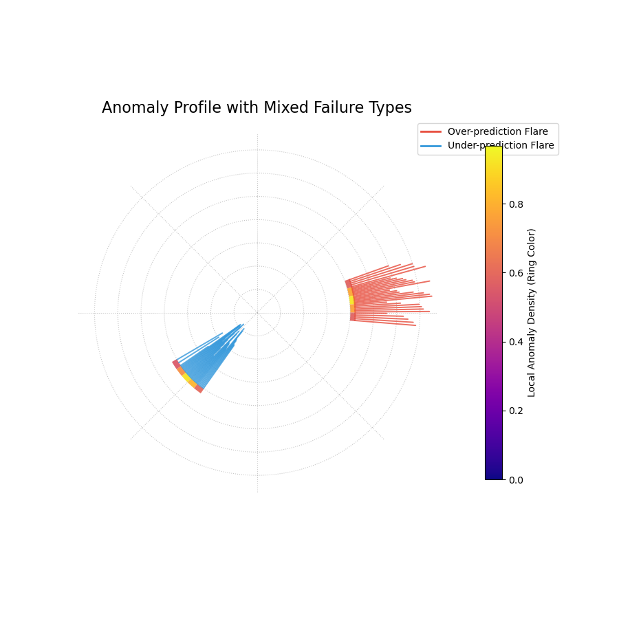
A stylized “fiery ring” plot where the ring’s color shows anomaly hotspots and flares show the magnitude and type of individual failures.
This plot provides a dramatic and intuitive visualization of the model’s most significant errors, transforming raw data into an actionable diagnostic.
Quick Interpretation: This plot clearly identifies two distinct hotspots of model failure. The central ring is brightly colored in two separate angular regions, indicating that the anomalies are not random but clustered. The flares reveal the nature of these failures: the hotspot on the right consists entirely of outward red flares, showing a systematic underestimation of risk. The hotspot on the left consists of inward blue flares, showing a systematic overestimation of risk. This powerful visualization instantly diagnoses two separate, systematic problems with the model.
This stylized plot is key to communicating complex failure modes in an accessible way. To see the full implementation, please explore the gallery example.
Example: See the gallery example and code at Polar Anomaly Profile (“Fiery Ring”).
Polar Anomaly Glyph Plot (plot_glyphs())
Purpose: This function creates a Polar Anomaly Glyph Plot, an informative diagnostic where each forecast failure (anomaly) is represented by a custom symbol, or “glyph.” The glyph’s properties—its location, shape, and color—encode multiple characteristics of the anomaly simultaneously, offering a clear and scientifically rigorous visualization suitable for in-depth analysis and publication.
Mathematical Concept
This plot uses a glyph-based approach to encode multiple
dimensions of information for each forecast failure. The function
first calculates the detailed anomaly characteristics using the
clustered_anomaly_severity() helper. It
then maps these characteristics to visual properties.
Angular Position (`θ`): The angle is determined by the sort_by parameter, which provides a meaningful order to the data points (e.g., by time or a spatial coordinate).
Radial Position (`r`): The radius is determined by the metric specified in the radius parameter (e.g., ‘magnitude’, ‘severity’). This value is normalized to [0, 1] for consistent visual scaling.
Glyph Color: The color is determined by the metric specified in the color_by parameter (e.g., ‘local_density’).
Glyph Shape: The shape of the marker distinguishes the Type of anomaly.
Interpretation: Each glyph on the plot is a rich, multi-dimensional data point.
Angle: Shows where in the sorted sequence the anomaly occurred.
Radius: Shows the normalized value of the chosen radial metric. A larger radius means a higher value. For radius=’magnitude’, it shows the relative severity.
Color: Reveals the value of the color_by metric. By default, “hotter” colors indicate the anomaly is part of a dense cluster, a “hotspot” of failures.
Shape: Provides an intuitive visual metaphor for the anomaly type:
▲ (up-triangle): Over-prediction, where the true value was higher than the upper bound (risk underestimated).
▼ (down-triangle): Under-prediction, where the true value was lower than the lower bound (risk overestimated).
Use Cases:
For a comprehensive, multi-faceted diagnosis of forecast failures in a single plot.
To create publication-quality figures that are both aesthetically pleasing and information-dense.
To explore complex relationships between the magnitude, clustering, and type of anomalies.
A standard scatter plot can become cluttered. By using glyphs, this plot packs more information into each point, allowing for a deeper and more intuitive understanding of exactly how and where a model is failing.
Practical Example
A climate scientist is analyzing a model that predicts daily sea surface temperatures. They need to understand not just the size of the prediction errors, but also whether these errors are clustered during specific times of the year (e.g., during summer heatwaves) and whether the model tends to under- or over-predict extreme events.
The Polar Anomaly Glyph Plot is the perfect tool for this. By setting sort_by=’time’, the angle will represent the day of the year. The radius (magnitude) will show how large the errors are, and the color (local_density) will reveal if these errors are clustered. The glyph shape will instantly show if the model failed by predicting temperatures that were too high or too low.
>>> import numpy as np
>>> import pandas as pd
>>> import kdiagram as kd
>>>
>>> # --- 1. Simulate temperature forecast data ---
>>> np.random.seed(0)
>>> n_samples = 365
>>> time = pd.to_datetime(pd.date_range(
...     "2024-01-01", periods=n_samples)
... )
>>> y_true = 20 + 10 * np.sin(np.arange(n_samples) * 2 * np.pi / 365)
>>> y_qlow = y_true - 2
>>> y_qup = y_true + 2
>>> # Add a summer heatwave the model misses (over-prediction)
>>> y_true[180:210] += np.random.uniform(2.5, 5, 30)
>>>
>>> df = pd.DataFrame({
...     "time": time, "actual_temp": y_true,
...     "q10_temp": y_qlow, "q90_temp": y_qup
... })
>>>
>>> # --- 2. Generate the plot ---
>>> ax = kd.plot_glyphs(
...     df,
...     actual_col="actual_temp",
...     q_low_col="q10_temp",
...     q_up_col="q90_temp",
...     sort_by="time",
...     radius="magnitude",
...     color_by="local_density",
...     acov="eighth",
...     title="Glyph Plot of Seasonal Forecast Anomalies"
... )
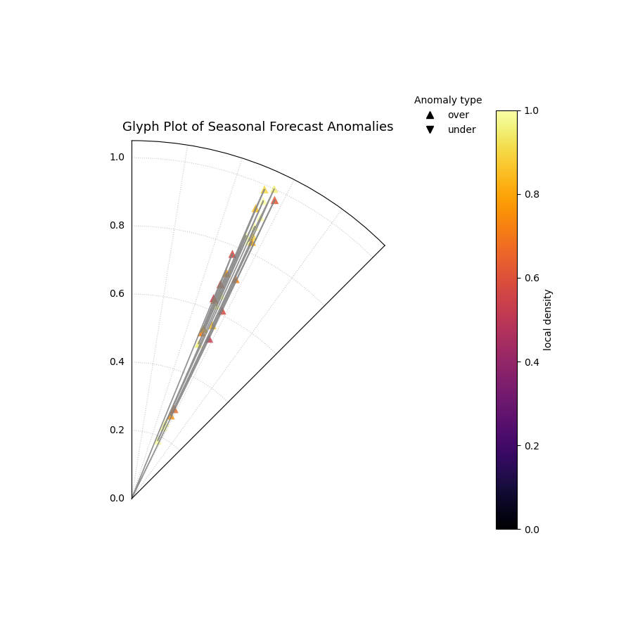
A polar glyph plot where each triangle represents a forecast failure. Its position, shape, and color reveal the failure’s location, type, magnitude, and clustering.
This plot reveals the specific character of the model’s failures at a glance, turning a complex dataset into an actionable diagnostic.
Quick Interpretation: This glyph plot immediately reveals a systematic, seasonal failure in the forecast model. There is a distinct cluster of bright yellow, outward-pointing triangles (`▲`) in the angular region corresponding to the summer months. This tells us several things: (1) The failures are clustered (bright color), not random. (2) They are all over-predictions, meaning the model systematically underestimated the summer temperatures. (3) The large radius of these glyphs shows that the magnitudes of these failures were significant.
This level of detail is crucial for diagnosing and improving sophisticated forecasting models. To see the full implementation, please explore the gallery example.
Example: See the gallery example and code at Polar Anomaly Glyph Plot.
Cartesian Anomaly Profile (plot_cas_profile())
Purpose: This function creates a Cartesian Anomaly Profile, a non-polar diagnostic plot of forecast failures. It is highly effective for sequential data, such as time series, where the x-axis can represent time or sample index. The plot visualizes an anomaly’s location, magnitude, type, and clustering density.
Mathematical Concept: This plot uses a standard Cartesian coordinate system to visualize the key components of the Clustered Anomaly Severity (CAS) score. It is the direct, non-polar counterpart to the polar glyph plot, maintaining the same core principles for encoding information Kouadio and Liu[1].
X-axis: Represents the sample index, showing when or where in the sequence a failure occurred.
Y-axis: Represents the Anomaly Magnitude (\(m_i\)), showing the severity of each failure.
Color: Represents the Local Cluster Density (\(d_i\)), with hotter colors indicating “hotspots” of concentrated failures.
Marker Shape: Represents the Type of anomaly (over- vs. under-prediction).
Interpretation: The plot provides a clear, sequential view of a model’s failure modes.
X-axis: Shows the location of failures. Look for failures concentrated in specific ranges (e.g., at the beginning or end of a time series).
Y-axis: The height of each point shows its magnitude. Taller points are more severe failures.
Color: The color of each point reveals if it is part of a cluster. A group of bright yellow points indicates a “hotspot” of systematic failure.
Marker Shape: The shape distinguishes the failure type. Upward triangles (▲) are over-predictions (risk underestimated), while downward triangles (▼) are under- predictions.
Use Cases:
To diagnose forecast failures in a familiar, non-polar format.
To clearly visualize trends or regime changes in model performance over time.
To identify if failure hotspots are persistent or transient in sequential data.
While polar plots excel at showing cyclical patterns, a Cartesian plot is often superior for analyzing linear or sequential data. This plot provides a powerful and intuitive way to see not just if your model is failing, but exactly when and how.
Practical Example
An economist is using a model to forecast monthly inflation. They need to diagnose if the model’s prediction interval failures are random, or if they are clustered during specific economic conditions (e.g., at the start of a recession).
The Cartesian Anomaly Profile is the ideal tool. The x-axis will represent the month, and the plot will show the magnitude and type of any forecast failures over time. A cluster of brightly colored, high-magnitude triangles at the end of the time series would be a clear signal that the model is failing to adapt to a new economic regime.
>>> import numpy as np
>>> import pandas as pd
>>> import kdiagram as kd
>>>
>>> # --- 1. Simulate a time series with a failure hotspot ---
>>> np.random.seed(0)
>>> n_samples = 400
>>> y_true = 20 * np.sin(np.arange(n_samples) * np.pi / 100)
>>> y_qlow = y_true - 10
>>> y_qup = y_true + 10
>>> # Introduce a cluster of severe failures toward the end
>>> y_true[300:340] += np.random.uniform(12, 20, 40)
>>>
>>> df = pd.DataFrame({
...     "actual": y_true, "q10": y_qlow, "q90": y_qup
... })
>>>
>>> # --- 2. Generate the plot ---
>>> ax = kd.plot_cas_profile(
...     df,
...     actual_col="actual",
...     q_low_col="q10",
...     q_up_col="q90",
...     title="Cartesian Anomaly Severity Profile"
... )
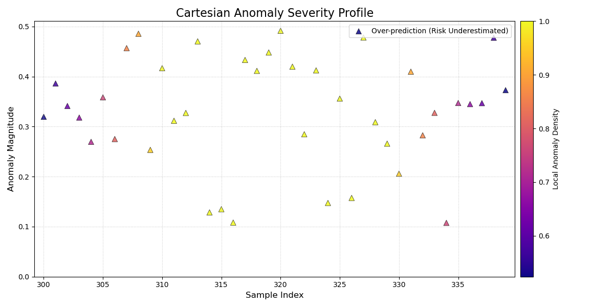
A Cartesian plot showing forecast failures over time, where the y-axis is the failure magnitude, and the color reveals failure hotspots.
This plot provides a clear, sequential story of model performance, making it easy to spot trends in forecast failures.
Quick Interpretation: This profile plot clearly reveals a change in the model’s performance over time. For the first ~300 samples, there are no anomalies. However, a distinct cluster of bright yellow, high-magnitude, upward-pointing triangles (`▲`) appears towards the end of the series. This provides a critical insight: the model was reliable initially, but it has recently started to systematically underestimate risk in a severe and clustered manner, signaling a potential regime change or model degradation.
Diagnosing failures in a sequential context is key to maintaining model performance. To see the full implementation, please visit the gallery example.
Example: See the gallery example and code at Cartesian Anomaly Profile.
Layered Anomaly Profile (plot_cas_layers())
Purpose: This function creates a Layered Anomaly Profile, a comprehensive, non-polar diagnostic that visualizes a forecast, its failures, and its severity scores in a set of stacked, linked panels. It is especially powerful for analyzing sequential data, such as time series, providing a clear, layered story of model performance.
Mathematical Concept This plot decomposes the components of the Clustered Anomaly Severity (CAS) score and visualizes them in relation to the original forecast. The visualization is constructed in two linked panels, an approach common in advanced data visualization to show both raw data and derived metrics simultaneously.
Top Panel: This panel shows the primary forecast context. It plots the true values, \(y_i\), against the prediction interval, \([\hat{y}_{i,q_{lower}}, \hat{y}_{i,q_{upper}}]\). Anomalies are overlaid as glyphs, where the color is mapped to the severity score, \(s_i = m_i \cdot d_i\).
Bottom Panel: This panel provides a detailed breakdown of the severity. It displays the per-sample severity score \(s_i\) as vertical bars. Optionally, it can overlay a line representing the local anomaly density \(d_i\), making it easy to see how the “hotspots” contribute to the final severity score.
Interpretation:
The linked panels provide a rich, multi-layered view for diagnosing model performance.
Top Panel (Forecast Context):
The shaded area shows the model’s prediction interval.
The dark line shows the true values.
▲ and ▼ markers appear wherever the true value escapes the interval. Their color indicates the severity of the failure—brighter, hotter colors are more severe.
Bottom Panel (Severity Breakdown):
The height of the vertical bars shows the severity score for each point. Tall, hot-colored bars pinpoint the most critical failures.
The solid black line (show_density=True) traces the local anomaly density. Peaks in this line correspond to the “hotspots” of clustered failures.
Use Cases:
For a complete, all-in-one diagnosis of a forecast and its failures.
To clearly link anomaly severity back to the original forecast context (e.g., “Do severe failures only happen when the true value is high?”).
To create detailed, publication-quality figures that present a full story of model performance.
This plot is arguably the most comprehensive diagnostic in the module, moving beyond a simple plot of failures to show the full context of the forecast, the anomalies, and the underlying components of their severity score in a single, coherent visualization.
Practical Example
A financial analyst needs to present a complete picture of a stock price forecasting model to their risk management team. They need to show not just the forecast itself, but also clearly identify any prediction interval failures and explain why some failures are considered more severe than others.
The Layered Anomaly Profile is the perfect tool. The top panel will show the familiar time series of the true price against the model’s prediction band, with severe failures clearly marked. The bottom panel will provide the “reasoning,” showing the severity score for each day and highlighting the hotspots where the model’s performance was most unreliable.
>>> import numpy as np
>>> import pandas as pd
>>> import kdiagram as kd
>>>
>>> # --- 1. Simulate a time series with a failure hotspot ---
>>> np.random.seed(0)
>>> n_samples = 400
>>> x_axis = np.arange(n_samples)
>>> y_true = 20 * np.sin(x_axis * np.pi / 100)
>>> y_qlow = y_true - 10
>>> y_qup = y_true + 10
>>> # Introduce a cluster of severe failures
>>> y_true[180:220] += np.random.uniform(12, 20, 40)
>>>
>>> df = pd.DataFrame({
...     "x": x_axis, "actual": y_true,
...     "q10": y_qlow, "q90": y_qup
... })
>>>
>>> # --- 2. Generate the plot ---
>>> axes = kd.plot_cas_layers(
...     df,
...     actual_col="actual",
...     q_low_col="q10",
...     q_up_col="q90",
...     sort_by=x_axis,
...     title="Layered CAS Diagnostic Profile"
... )
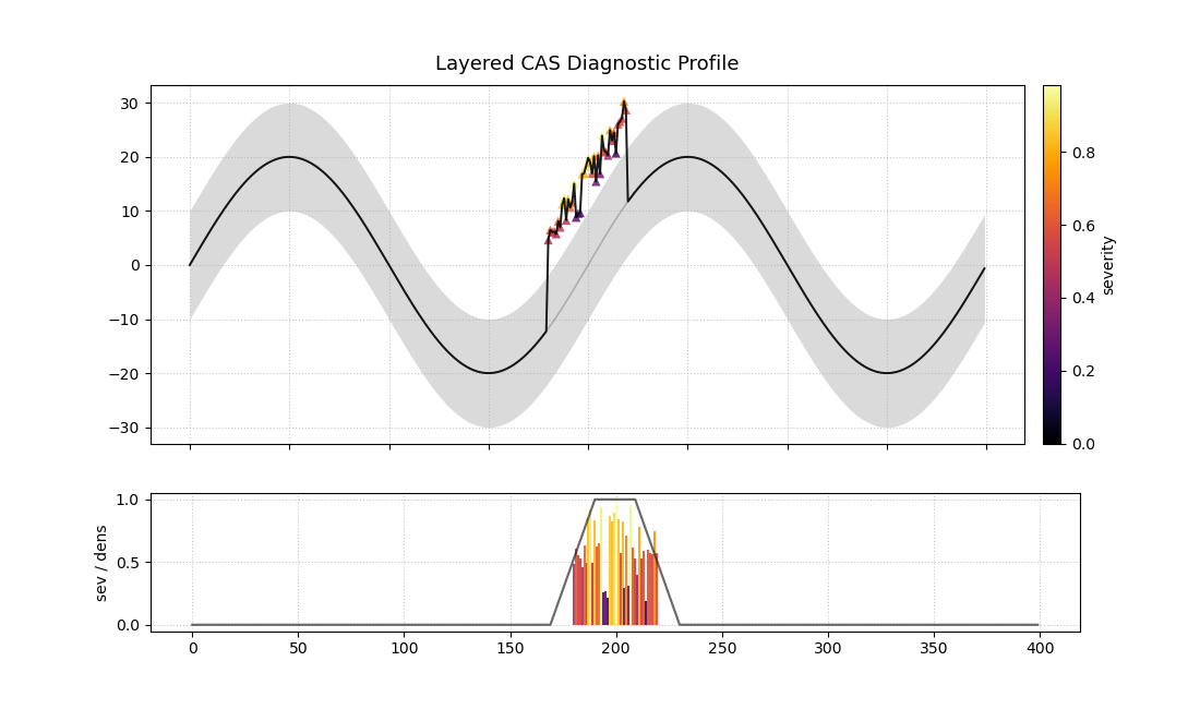
A two-panel plot. The top shows a time series forecast with anomalies marked. The bottom shows the severity of those anomalies.
This plot provides a full narrative of model performance, from the high-level forecast to the granular details of each failure.
Quick Interpretation: This layered plot provides a complete story. The top panel shows that the model’s prediction interval (shaded area) successfully tracks the true value (black line) for most of the period. However, a significant failure occurs around sample 200, where a cluster of bright red and yellow upward-pointing triangles (▲) appear. The bottom panel explains why these failures are critical: the vertical bars show extremely high severity scores in this region, and the black line confirms that this is a hotspot of high anomaly density.
This comprehensive diagnostic is essential for moving from simply identifying errors to truly understanding them. To see the full implementation, please visit the gallery example.
Example: See the gallery example and code at Layered Anomaly Profile.
References